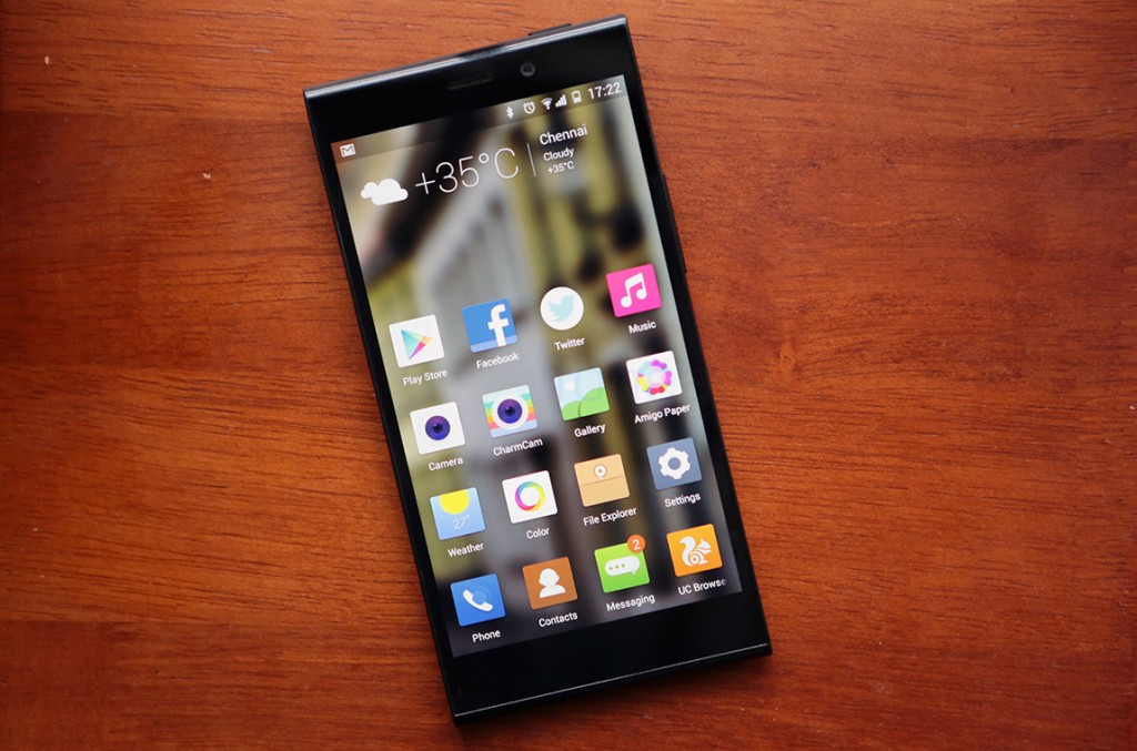
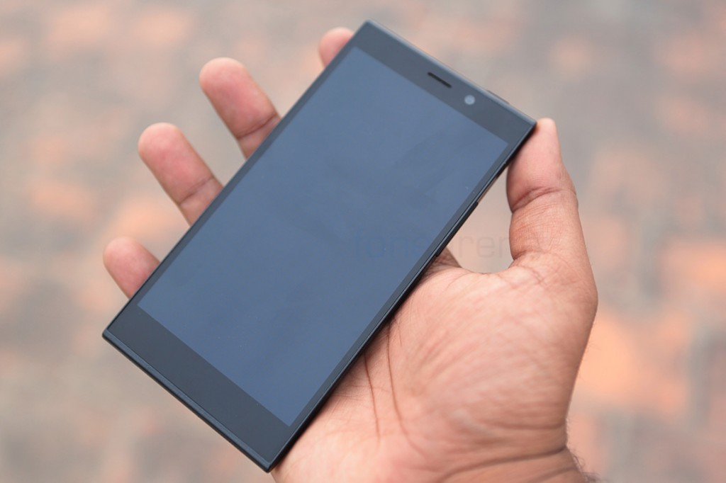
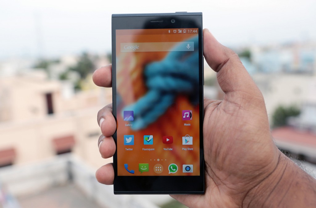
The Elife E7 is Gionee’s first flagship smartphone that is aimed at the premium high end segment of the market. The device is powered by the powerful Snapdragon 800 processor and sports a seemingly good 16 MP camera, which brings it closer to the likes of other flagships like Nexus 5 and the even the S5 to an extent, but offers a price advantage making it one of the best VFM products out there. But can a newer brand like Gionee instill confidence in the high end consumer, with its hardware and software package? Lets find out in our Gionee Elife E7 Review.
httpv://www.youtube.com/watch?v=e9QnwfoiMKo
Check out our unboxing, in case you are interested in finding out what the retail version packs.
Design, Build and Ergonomics
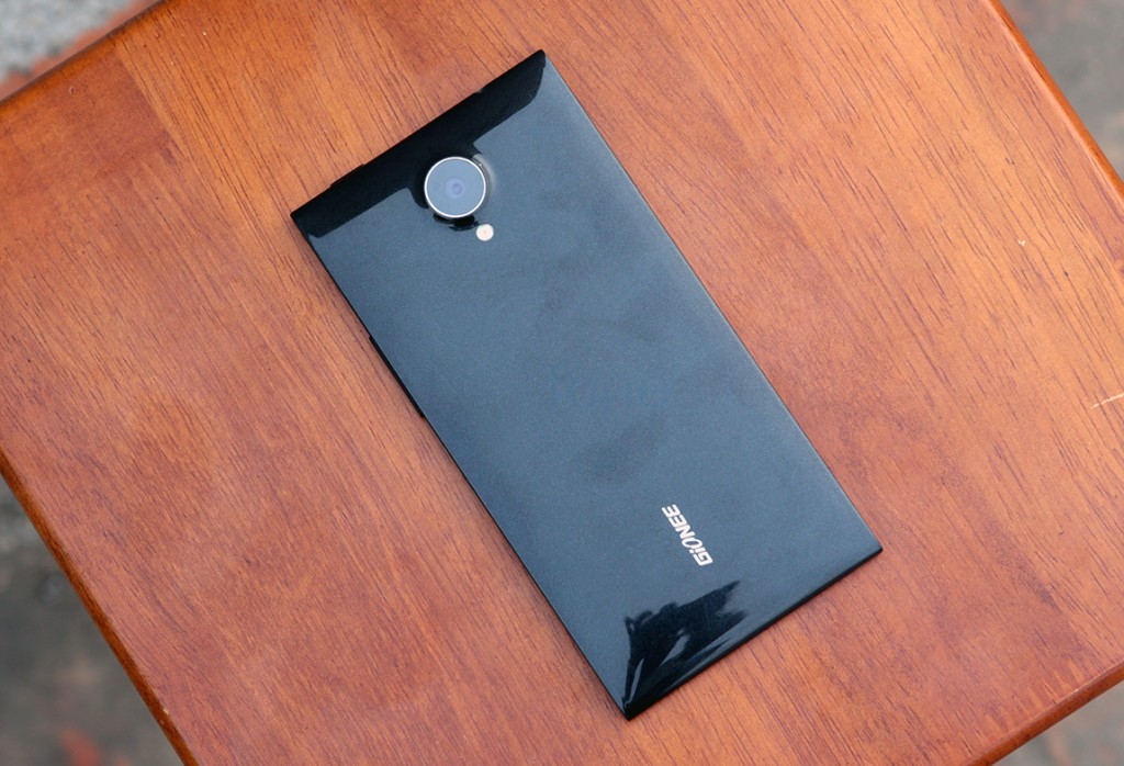
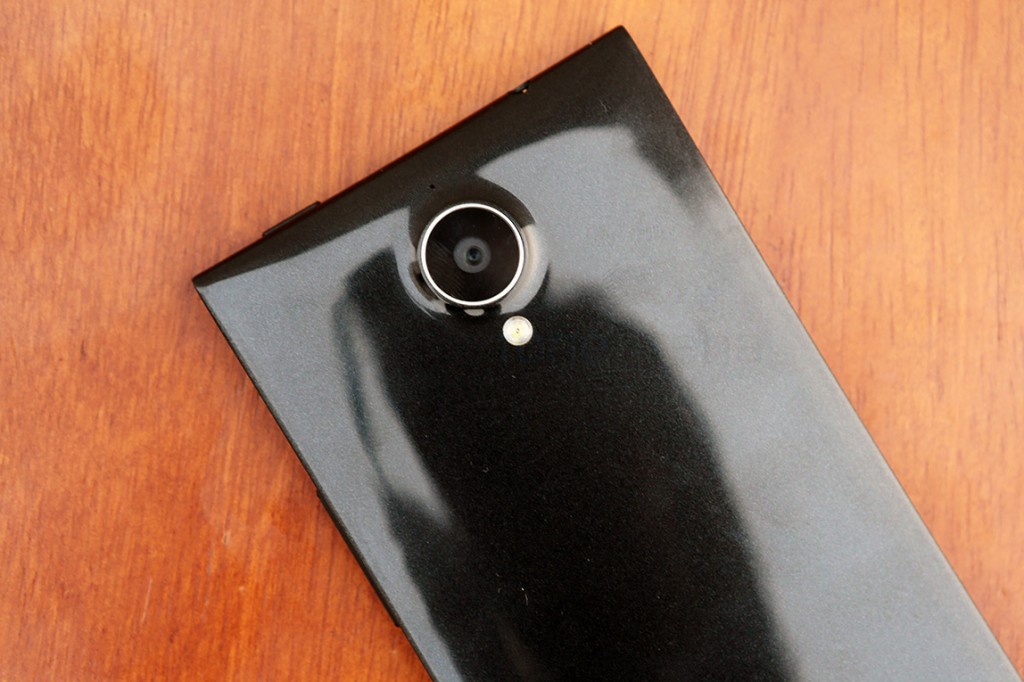
Design of the E7 is very similar to what we have been seeing with other Gionee devices. It’s kind of the anti thesis of Nokia’s popular “Fabula” design which has a flat top and bottom with curved sides, while the Elife E7 has flat sides and a curved top and bottom. We’ve got the black version here, which is really dark, and blends really nicely with the display. Apart from the camera unit sticking out, this is a really minimalistic approach to design.
Talking of minimalism, the whole phone is made from a single piece of plastic on the back and the sides while a sheet of glass covers the front. The unibody plastic is of really high quality and has a glossy finish with a graphite texture that reflects from the inside under light. This is finer than what you might have seen on the Nexus 4 and is more subtle. That said, this is also a really sturdy phone. The plastic is very dense and you will feel confident that it can take a good beating.
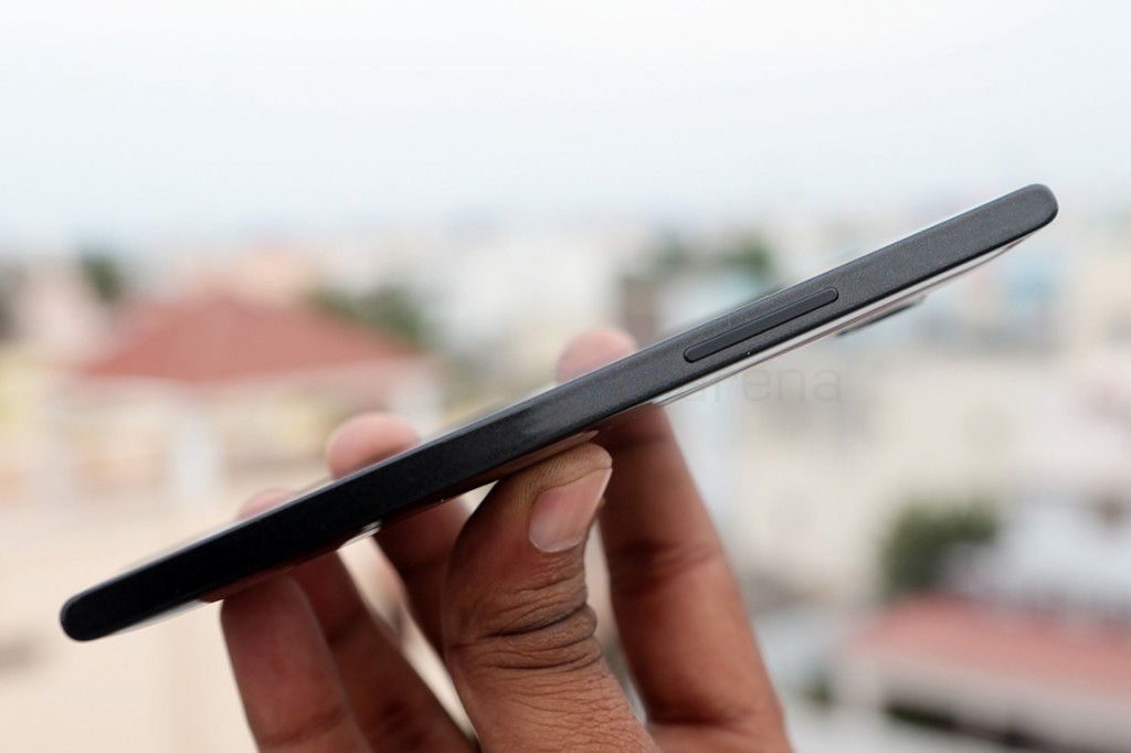
Coming to dimensions, since the phone is sturdy, it is also relatively thicker and heavier than other phones, may be we can attribute it for the strength more than anything. It measures 9.2 mm at its thickest point and weighs 150g. It is big because of the phablet sized screen, but not bulky and the back is also slightly curved to fit the hand nicely, with the glossy finish lending a smooth and comfortable feel. Sporting a long and narrow body, it will still be daunting for some, even when it is 6.2mm at its thinnest point. But if you are already used to 5 inch screens, the 5.5 inch Elife E7 should be rather easy, mainly because of the thin 2.3mm bezels.
Hardware Walkthrough
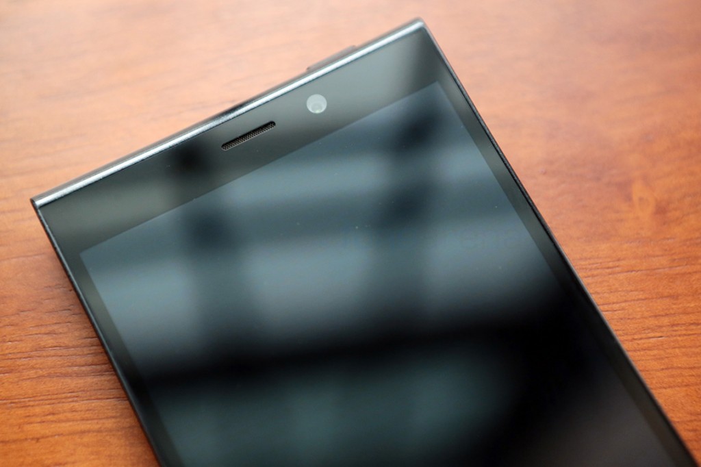
As mentioned earlier, the phone is entirely covered by glass on the front, more specifically, Gorilla Glass 3 by Corning, underneath which lies the 5.5 inch 1080p display. Above the display we have the ear piece, the 8 megapixel front facing camera and the usual couple of sensors for proximity and ambient light sensing, along with the notification LED.
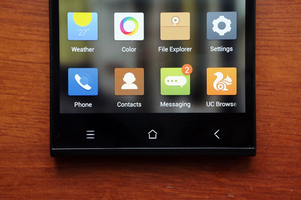
Below the display are the three capacitive buttons for home, contextual menu and back. They are backlit and offer haptic feedback but are nearly invisible otherwise. They blend too much with the black of the body and are spread apart, making it tough for us to hit the right targets when they are off. Surprisingly we couldn’t find an option to keep it on.
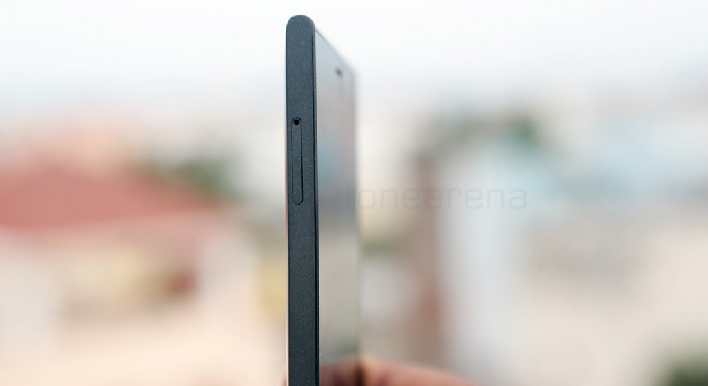
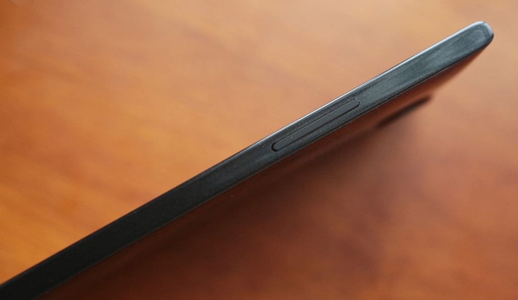
Turning to the sides, the left side houses the lone micro SIM card slot and the right side has just the single piece volume rocker.
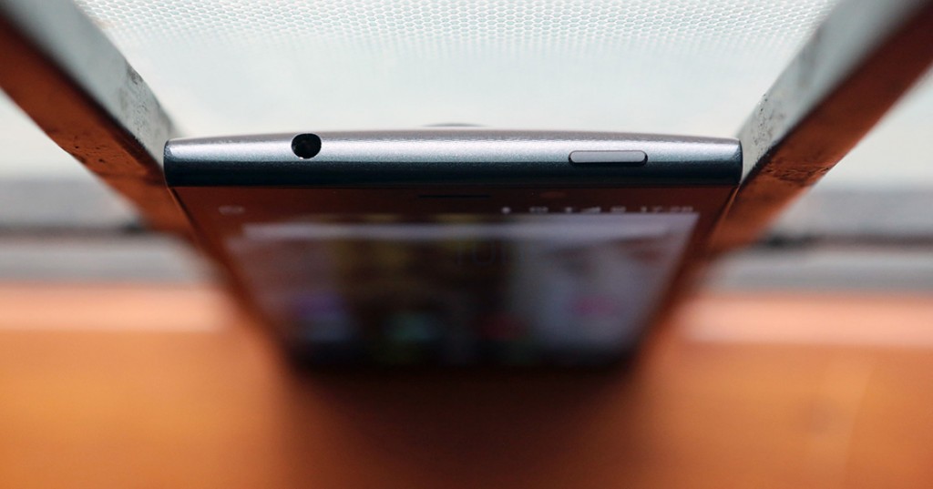
The top is occupied by the 3.5mm audio jack and the power button, which is really hard to reach on a tall device like this. We really wished it was on the side, even after enabling the double tap to wake gesture, because we had to reach it anyway for locking the device.
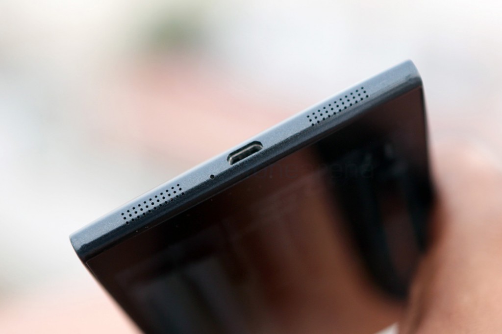
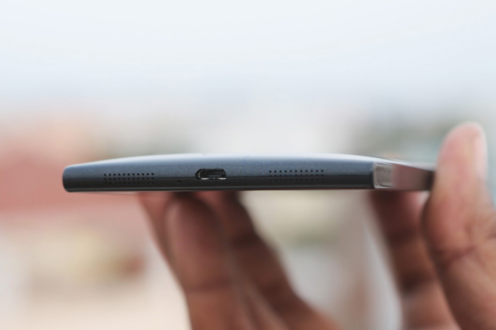
The other side sports the micro USB port, the primary microphone and the loud speakers, very similar to the iPhone.
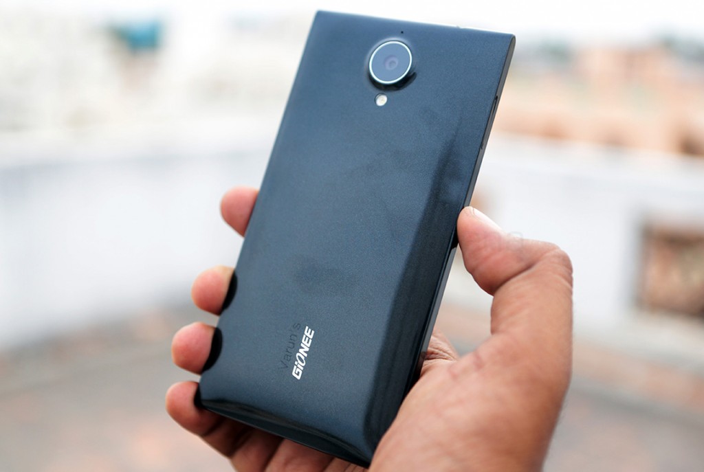
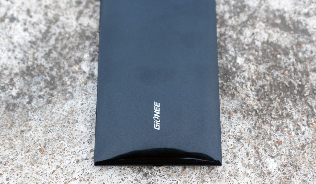
The back, which has a glossy finish with a graphite texture under the skin, boasts the 16 MP camera that slightly peeks out from the body, accompanied by a secondary microphone above and the LED flash below. Further down we have the Gionee logo and that’s about it. There is no removable battery or a micro SD card slot, owing to the unibody design.
Moving on to the finer details, lets start with the display.
Display
The Gionee Elife E7 sports a 5.5 inch IPS LCD from JDI, a Japanese display manufacturer. It displays great contrast and brightness, and we feel 1080p is sharp enough on a 5.5 inch display with about 480 PPI. Sporting great viewing angles, we never felt the need to correct the orientation. While we have come to a point where most displays are really good, and the Elife E7 is definitely among the best we have seen so far. Auto brightness works decently well and gets reasonably bright in sun light, so outdoor visibility is still very good, and there is indeed less reflectivity for the same. Overall an awesome display for the price it comes at and is great for all kinds of consumption including gaming, watching movies and reading articles on the go. You might want to use the in-box desk stand accessory though, for watching movies comfortably.
Cameras
The Elife E7 is one of the first devices to sport a Omnivision OV1685 16 megapixel sensor, of the 1/2.3″ type. This gives it a pixel size of 1.34 microns, which is higher than the industry standard of 1.1, only to be bested by the Ultrapixel sensor’s 2.0 microns. This BSI 2 CMOS sensor is coupled with a big Largan M8 lens unit, which has an aperture of f2.2. The lens unit with sapphire glass for extra hardness and clarity. Sporting a big sensor with a decently big lens unit, the Elife E7 was expected to take great pictures with good dynamic range, and boy, does it deliver.
The camera samples that we took earlier turned out to be really clean and balanced, without any trace of the aberrations that we usually look for in a smartphone image. No signs of over processing, no white balance issues or shutter actuation problems. Everything felt very reliable, and that’s largely thanks to the performance and the UI.
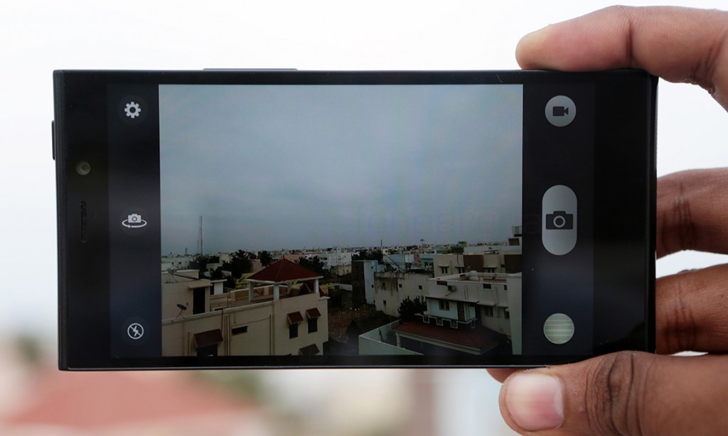
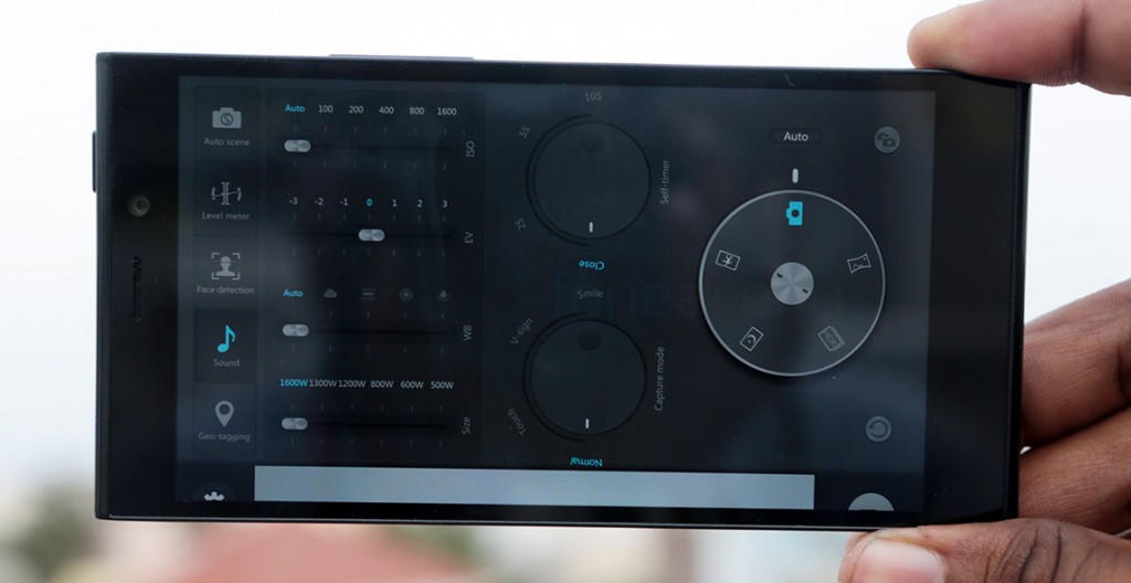
The operational UI, like the phone’s design, is minimal, but it does have a flashy interface to go along. A swipe to your left reveals a page of dials and sliders that let you manually set modes, change white balance presets and a lot more. There are many modes including HDR and Panorama being the special ones. We found the camera to work really well and take great photos. But before diving into the samples, here is the camera review, walking you through the interface and showing off all the samples –
httpv://www.youtube.com/watch?v=eTJpbx7zqMI
Daylight
Full Resolution – Sample 1 | Sample 2 | Sample 3 | Sample 4 | Sample 5
HDR
Full Resolution – Sample 1 | Sample 2 | Sample 3
Macro
Full Resolution – Sample 1 | Sample 2 | Sample 3 | Sample 4 | Sample 5 | Sample 6
Low Light
Full Resolution – Sample 1 | Sample 2 | Sample 3 | Sample 4
Video
httpv://www.youtube.com/watch?v=YQjsFN76Kxg
Thoughts on the camera performance –
- Daylight images are clean and have near perfect white balance, great performance overall
- HDR adds details in shadows and never seems over processed, a great implementation without artificially edge enhancing
- Macro shots produced great detail with or without HDR, and nice bokehs thanks to the f2.2 aperture and 4.88mm focal length
- Low light shots are best in the night mode, the images produced are very clear and not over processed
- Video is of great quality, the dynamic range is amazing and sound clarity is really good
- Overall great camera, one of the best in this segment
While the rear camera, although without the tons of features, is the one of the best we have seen and used, the front facing camera beat our expectations to a pulp. Believe it or not, the front facing camera is a 8 MP unit, with AF. It is easily one of the best we have seen so far, because it even ties with the N1 for the top spot, which is basically a back camera in the first place. Stunningly clear photos from the front facing unit, which can also record video in 720p. Narcissus would be proud.
Video is 1080p with stereo audio. It is very good in terms of quality but is disappointing that a Snapdragon 800 powered phone doesn’t have the capabilities for 4K or 60 fps video. While the camera performance is great, we longed for the features and tricks that other cameras boasted, like the Z1’s nifty oversampling mode, the HTC One’s ZOE, to name a few. Because this is really a quality piece of engineering here and it needs more computational tricks to attract the user to take more photos. Surely, a lot of power is at their disposal and it would be excellent if they enable 4K video or more camera modes with a software update.
Internals
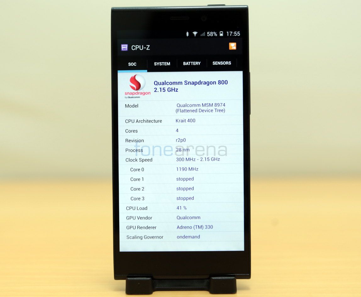
The phone comes in two variants – one with 16 GB internal storage and 2 GB of RAM, which we have, and the other with 32 GB of storage and 3 GB of RAM. There is a notable difference in price between the two variants, and the one with 16 GB of storage is cheaper. But that aside, everything else is similar, and both the variants are powered by the 2.2 GHz Snapdragon 800 processor, with the Adreno 330 GPU as the graphics unit. Performance wise, the phone is blazing fast. Apps open quickly, as you’d expect from a phone powered by the Snapdragon 800 chip and games are unmistakably fast, but you might run into some heating issues if you are playing for a long time. We checked out the device’s gaming performance on video, you can check it out here.
httpv://www.youtube.com/watch?v=ENtLpPvjZ6w
httpv://www.youtube.com/watch?v=uOovqg2ZxuY
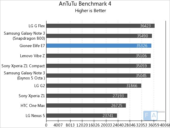
If that is not indicative enough of the performance, we also ran some synthetic benchmarks on the device, only to find it performing very similarly to other Snapdragon 800 phones, but the price factor is what Gionee has going for the Elife E7, which is simply the best in class, without a doubt.
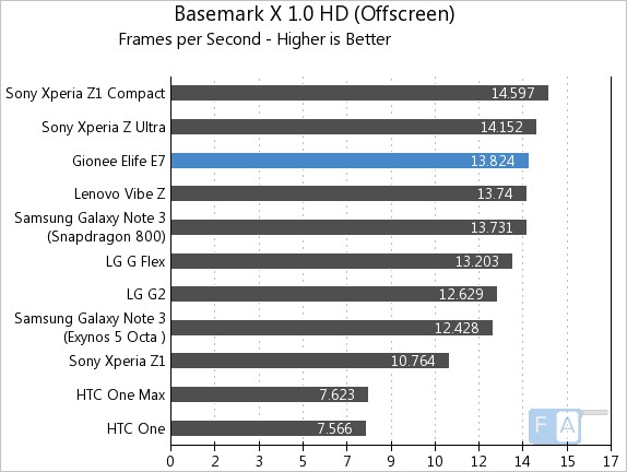
But when it comes to real world performance, like basic UI navigation, the Elife E7 is a different story. Due to heavy use of animations and the gaussian blur effect, the launcher takes a toll on the performance and drops a lot of frames in general usage. This is discouraging for a new user expecting super fast performance from the device. But once we changed the launcher, the device once again showed its true muscle by performing admirably well. We just wished Gionee could have done something about this.
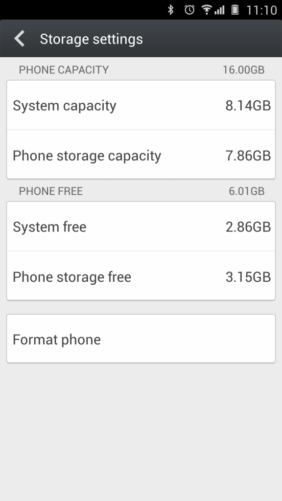
Coming to storage, the phone we have is the 16 GB variant, which comes with 8 GB each for the system and user storage respectively. You roughly get about 11 to 12 GB of free space for apps and user storage combined. But that is all you are getting, as the phone lacks a micro SD expansion slot, on both the variants. Heavy media users be warned.
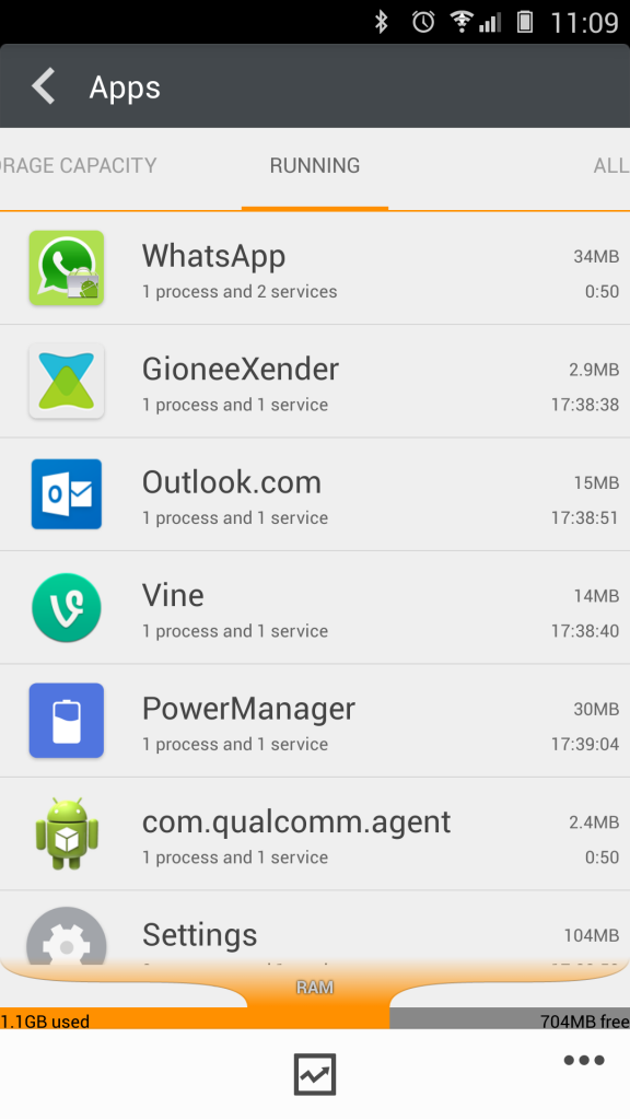
The 2 GB RAM on this phone is plenty enough for multi tasking, but on heavy usage, power users would tend to prefer the 3 GB version, as this one gets full unto 80 percent once many apps are running. There is 1849 MB of RAM available for the system, which is considerably lesser than most other phones with 2 GB of RAM, but realistically, we never found it to be a bottle neck for performance.
Additional hardware details to be noted are NFC and USB OTG in terms of connectivity, which are almost a standard on phones these days. The loudspeaker, located at the bottom of the phone is decently loud and is designed to be not muffled when kept facing up on a table, but its performance seems to be limited. It distorts easily when playing loud music, but is loud enough, without distortion for calls and other things. We would have liked it to be better. One last thing about connectivity is that the Gionee Elife E7 also supports Wi-Fi Direct, which is used in its own app called the Xender, which can send any file from your phone to another using the same app, over peer to peer Wi-Fi.
Battery life
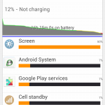
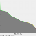
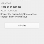
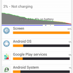
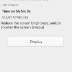
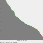
One of the main concerns for us, going into this review was battery life. The Elife E7 not only has a non removable back cover, but also a battery of significantly lower capacity for a device in this segment. It’s a 2500 mAH Li-Ion unit, which is less for a device with a bright 5.5 inch screen and top end specs, but surprisingly enough, it held its own in our testing. We could easily churn out a day’s worth of usage from the Elife E7 on medium to heavy usage, while it lasted for more than 24 hours on medium usage. We capture both the kinds of usage on these graphs below.
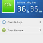
As you can see, we got a whopping 6 hours of display time on medium usage which included regular whatsapp and Twitter, lasted for more than a day of usage time, while with 3 and a half hours of display time, with around 12 percent to spare, we had 16 hours of usage, which is not bad at all. It was a surprise for us then, and even now, on how this relatively smaller battery unit is able to extract the amount of performance we witnessed. You even have the power saving modes that you can manually enable to extend it even further, all using the Power Manager app. We seldom used it, but we think it will be very handy if you plan to get more out of this battery.
Software
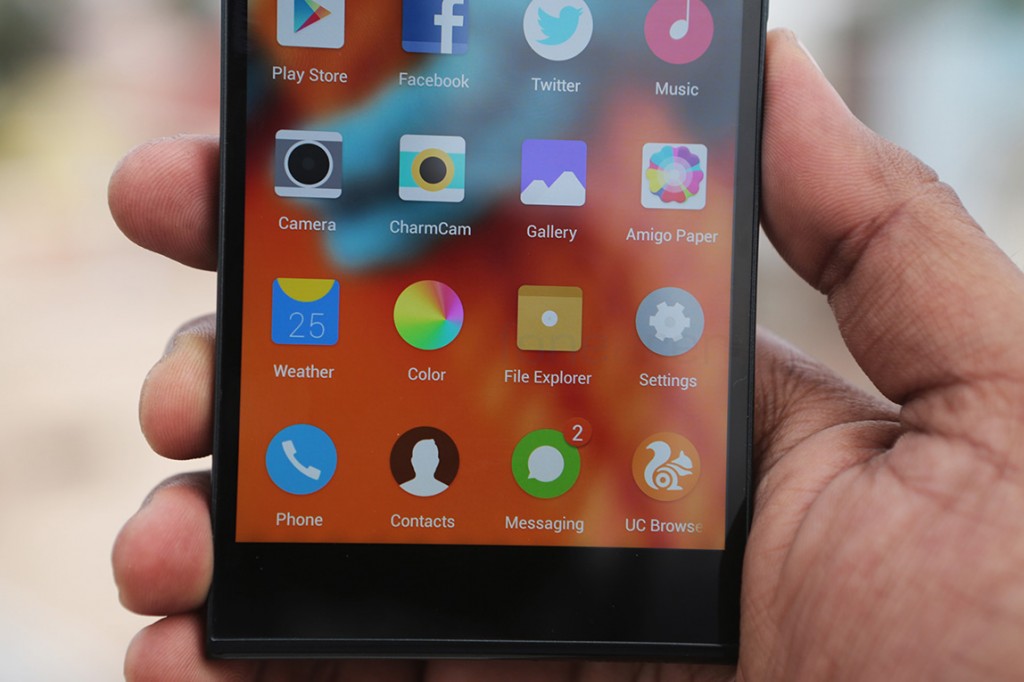
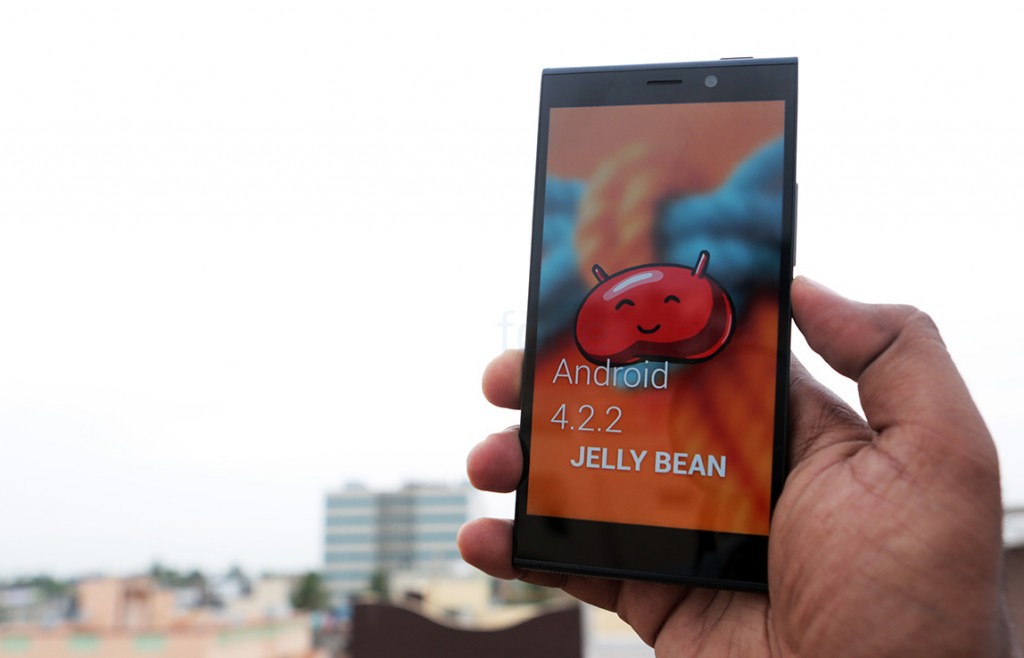
The Gionee Elife E7 runs on Android 4.2.2 Jellybean that is two versions behind the latest operating system update, Kitkat. Not only that, the UI is heavily skinned with almost everything that looked remotely like Android modified to look very similar to what most Chinese OEMs offer. Yes, one can draw so many parallels between the Lenovo UI or even the Oppo UI, with all of them sporting a white-ish colour scheme for list pages and a dark notification shade with big icons for quick settings. Even more unsettling is the fact that some skins totally do away with the app list. Lenovo, Gionee and Meizu have completely changed to a look that is familiar to iOS users rather than Android users, which is understandable for the market they are from, but it is weird for us who are used to the look of stock Android. But hey, at least we have customizable icon sets and themes to change the look of the device the way we want.
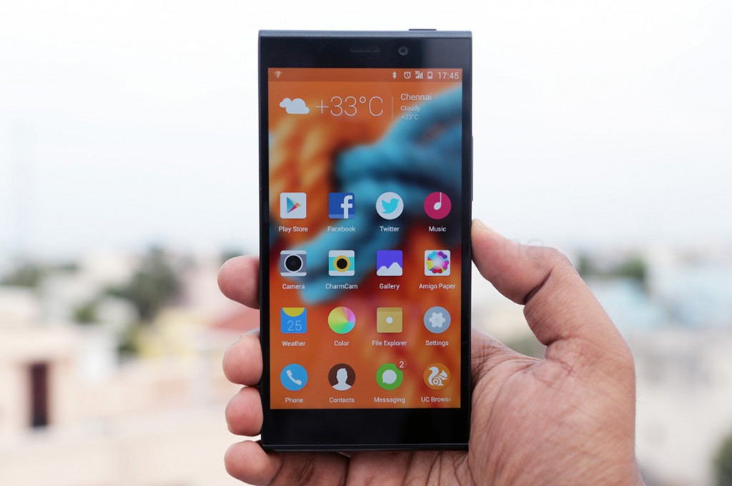
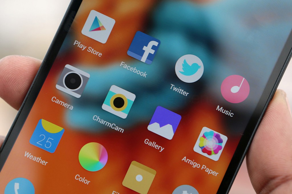
The launcher, called the “Navi launcher” includes a sliding lockscreen and Gaussian blurred wallpapers, with flat icons that can change with themes. The desktop blur can be turned off from the Navi Launcher’s settings, so it is mandatory to do that if you intend to use custom launchers. Apart from the homescreen-only approach, the UI is all about custom default apps that further familiarizes you with the new UI. Most have the overflow menu button on-screen, which is very similar to Windows Phone’s three dot menu.
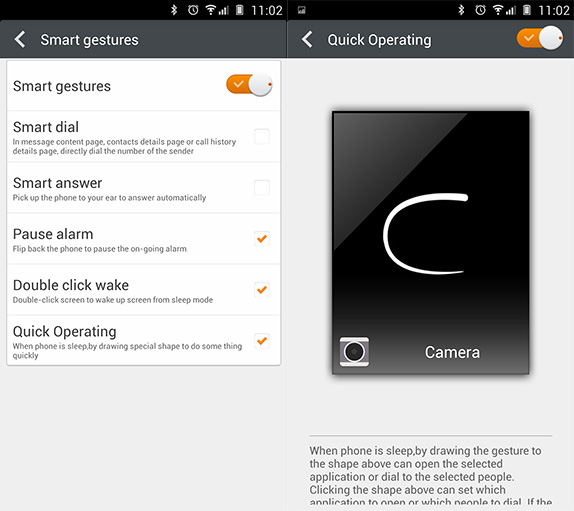
And then there are the smart gestures that use the proximity sensor and the gyroscope for reading various actions. There is double tap to wake and even a “Quick operating” gesture, which you can draw on a screen that’s turned off and it will take you directly to the app of that gesture. Pretty nifty, when you are using these on a regular basis, but a caveat is that only one quick operating gesture can be set. Again, these are very similar to what Oppo offers.
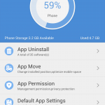
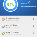
Most default apps were full featured and had beautiful design that resonated throughout the UI. Some examples of the really good ones are utilities like App manager, an app that lets you handle all your installed apps in a neater way than Android natively supports. Another one is the Phone Accelerate app that can quickly clean the processes and give you options for managing the boot sequence, the cache and all that. Finally, one other utility we love is Power manager, the one that we talked about in battery life. The power saving settings are akin to what you usually see on Windows laptops, with granular control over connectivity, power sipping components and even background processes to some extent. If you turn this one on after configuration, it is guaranteed that the battery life will extend, which is good value for being pre-installed. Of course, all these can be done using several third party apps, but pre-installation with the OS makes all the difference.
Media apps like Gallery, music and video work as expected, except the annoying little thing we found with the music player, which skips occasionally during play back. This was very evident during travel and the sound quality, even when DTS is turned on, is not so great. The Gallery and Video apps are, again, beautifully designed and very functional, and we also have all the Google apps pre-installed. Well, most of them at least, because Google+ was missing from this list. A lot of third party apps have also been pre-installed, like Yahoo Cricket, NQ Mobile Security, Game Zone, Saavn and a few games from Gameloft.
Overall, If we had to nit pick for issues on this phone, it would be software. The default UI and launcher get in the way of performance, which marginally puts off the user looking for a fast experience, but since this is Android, there is always choice of a different launcher, where things are smooth as butter. Another gripe is that we have no idea if the Elife E7 will be updated to the latest version of Android. Unlike other ROMs, the community-driven approach is missing and we aren’t sure if Gionee can deliver the updates in a swift way. Apart from these, it is very hard to not recommend this phone, which brings us to the conclusion.
Conclusion
The Gionee Elife E7 is the first time the Chinese manufacturer takes on the responsibility of delivering a flagship device. But a flagship device carries high expectations that every company aspires to deliver. In this case, has Gionee delivered? We would say, yes. Gionee has managed to craft the Elife E7 with enough charisma and muscle to satisfy the most demanding buyer. A few quirks exist though, like the lack of a micro SD card slot, a smaller battery that doesn’t look good on paper and nagging software issues that could derail the user experience, but a factor that completely supersedes these issues is the price. For Rs. 26,999 for the 16 GB/ 2GB RAM version, you get a sturdily built phone, a great display, epic cameras, great raw processor performance and above average battery life. We just wish Gionee works on the software part more, but that’s always a variable, right? The hardware is almost flawless here, especially for the price, and hence, best in class.
Pros
- Great build quality and display
- Amazing rear and front facing cameras
- Great performance
- Above average battery life
- Pricing
Cons
- No micro SD card slot
- Might be too tall or thick for people with small hands
- Custom UI is slightly laggy, has minor issues and no clear path for updates
- Power button is on the top

