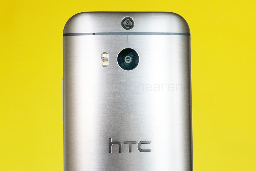
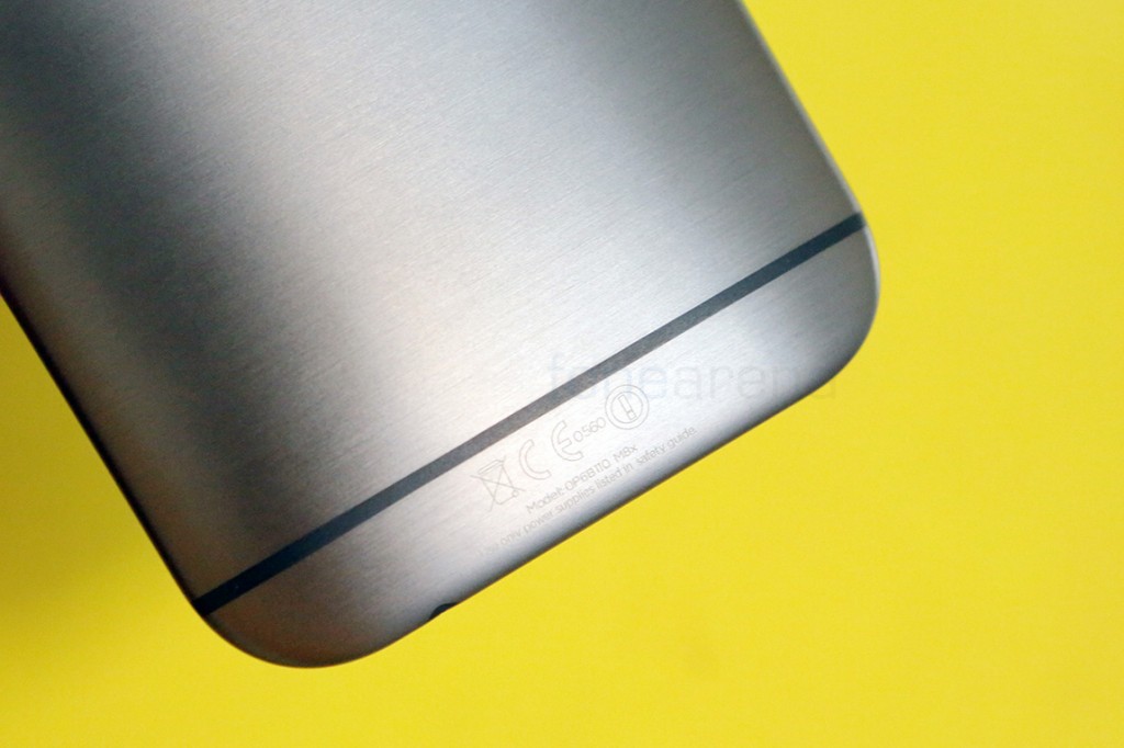
HTC’s design chief might be moving on to greener pastures, but he sure has left quite a legacy behind. After the original HTC One won accolades for its pleasing design and quality of build, the Taiwan manufacturer has one upped itself with the new HTC One M8. The design language might be almost exactly the same as its predecessor, but with minor changes in the build, and tweaks to the already good design, HTC has carved yet another well designed smartphone for the premium market. Lets take a hardware walkthrough of this device in photos to see how it looks in front of the camera.
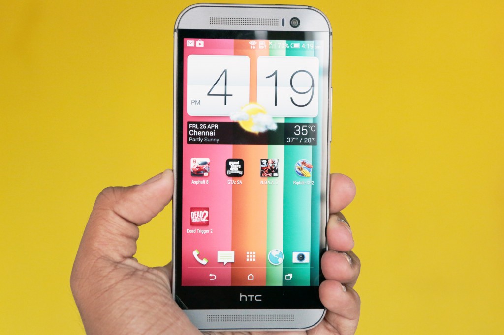
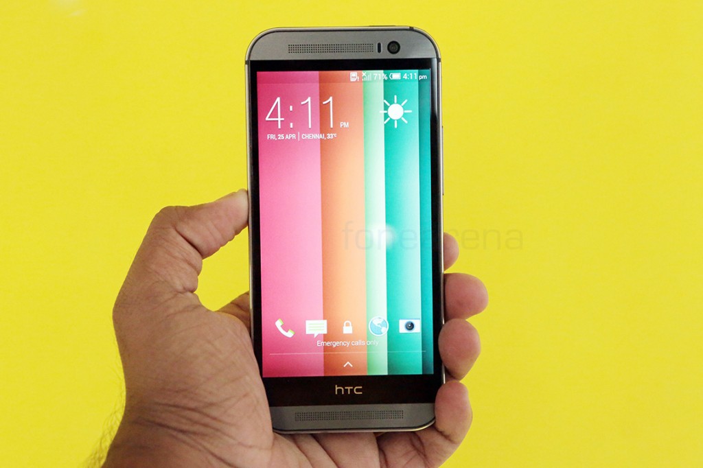
The One M8 has a narrow and long front face, thanks to the amount of space occupied by the stereo speakers they fondly call “Boomsound”. The familiar premium design lends credence to the flagship nature of this device.
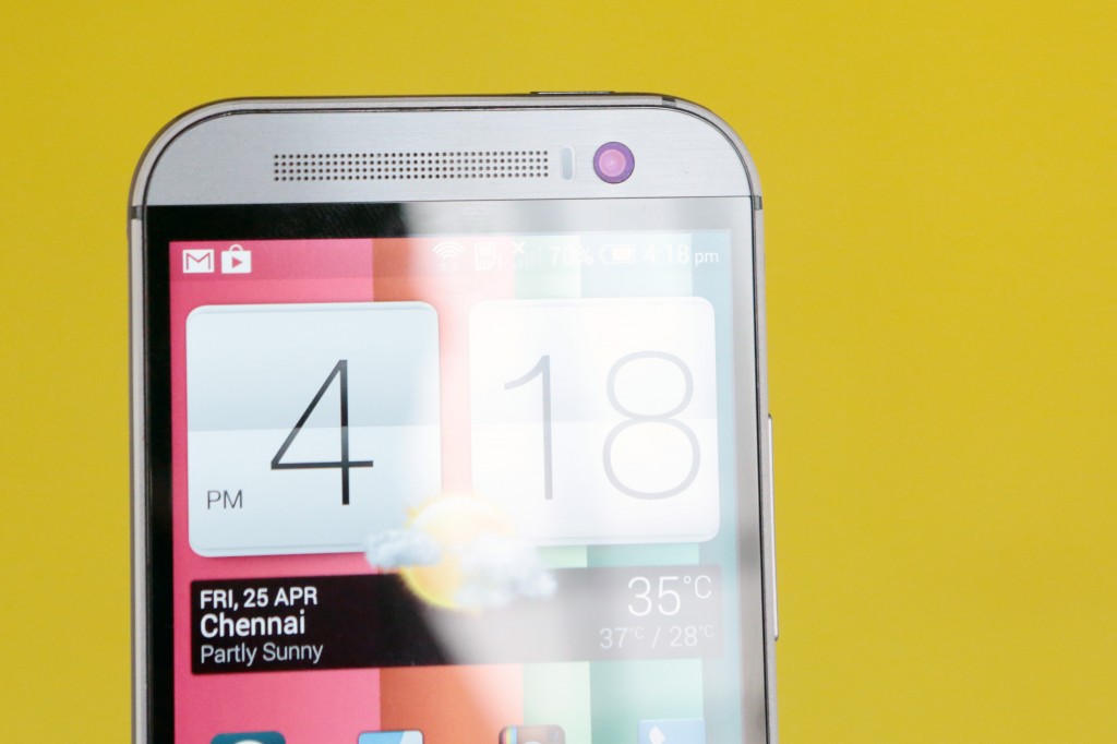
Above the new 5 inch full HD IPS display is the front facing camera that has a higher megapixel count than the phone’s main camera. This sits along side the sensors, the speaker grille and the notification LED that lays inside.
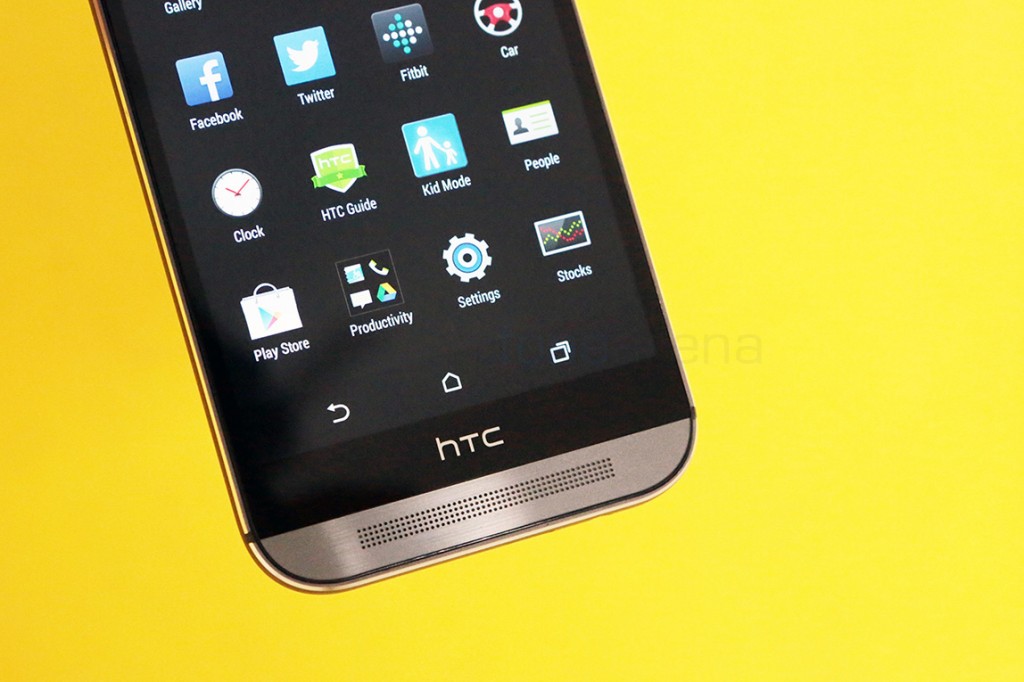
The new One M8 loses the capacitive shortcuts that were part of the older one, but still keeps enough bezel between it and the speakers. As you can see, the keys are overlaid on the screen in the UI.
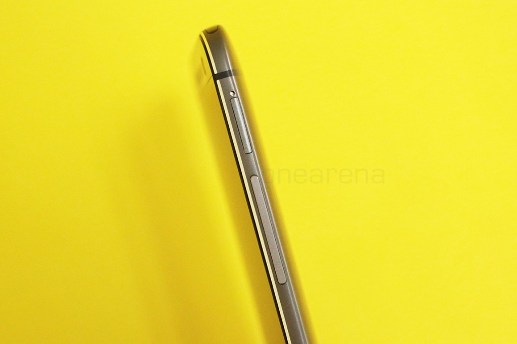
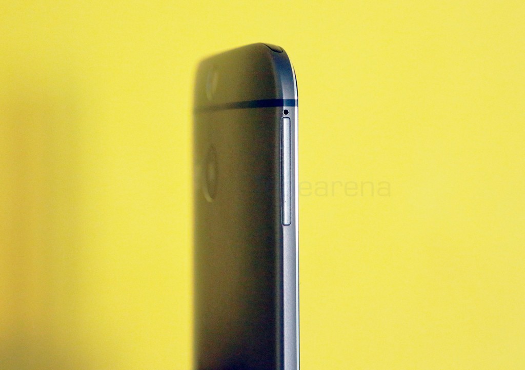
Moving to the right side of the phone, we have the nano SIM card slot and the volume rocker. The rocker is almost flush with the device, but has a nice tactile feel.
The left side has another slot, and this is for micro SD expansion, a long standing feature request for HTC’s flagships from users. Unfortunately this is also a pin-type assemble which requires the same pin as the one that they have provided for the SIM slot.
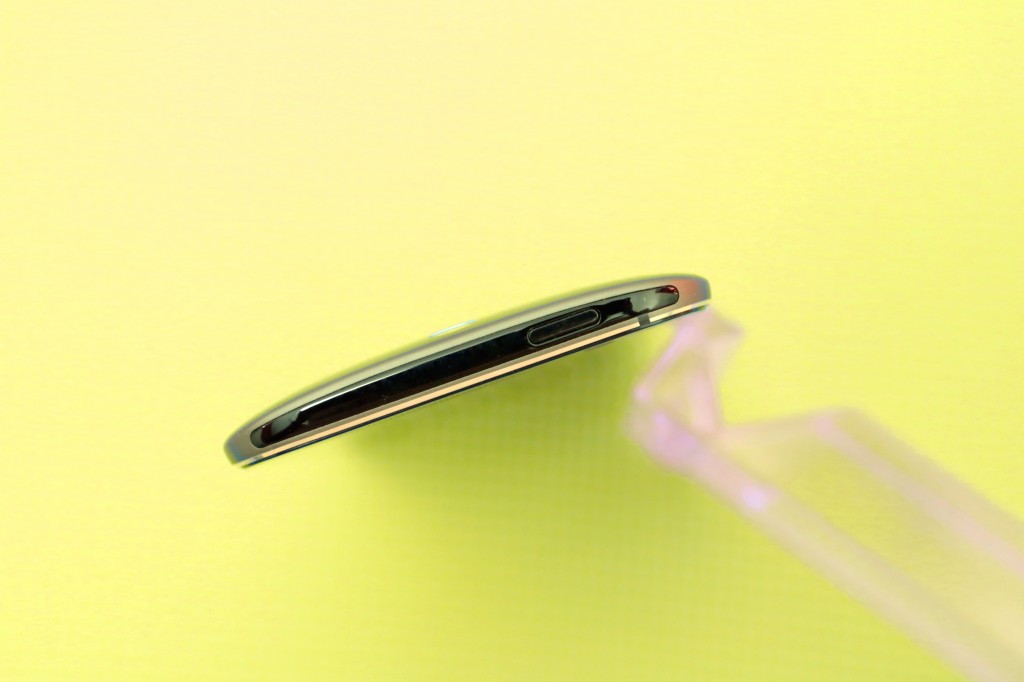
Moving over to the top, we have the rare plastic part of the device that wholly acts as a cover for the IR LED underneath and also houses the power lock switch, which moves from the left to the right, when compared with its predecessor.
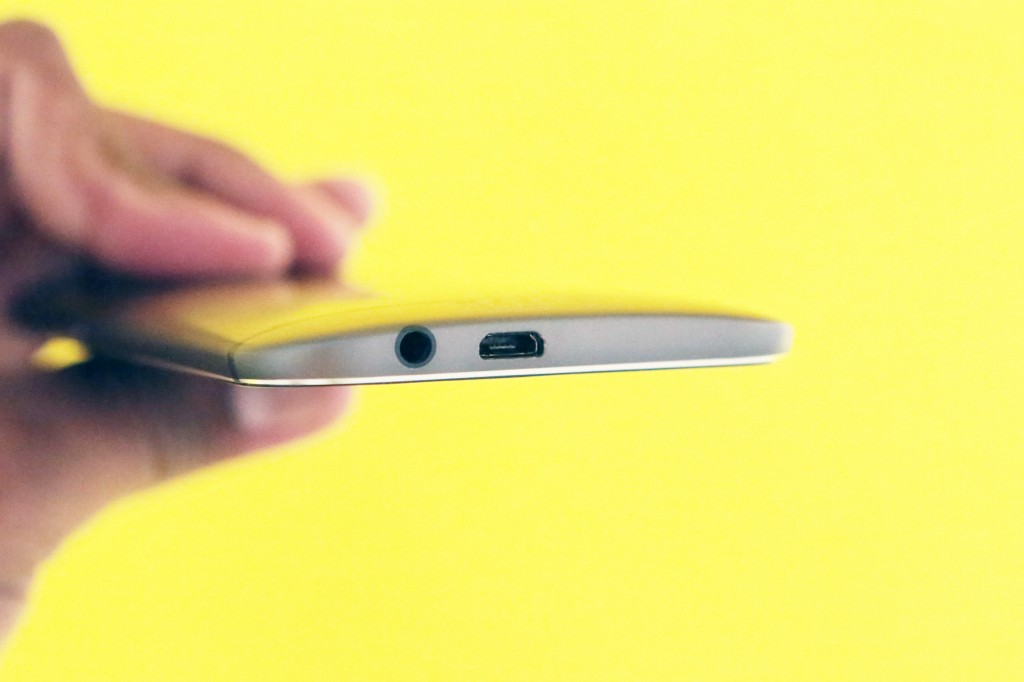
At the bottom we have the 3.5mm audio jack and the micro USB slot.
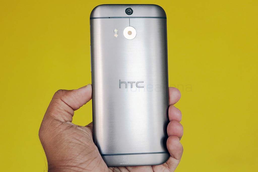 Back is where HTC struts its stuff, with a beautifully curved and machined aluminium body, with nice strips of dark plastic running through. The plastic parts, one on the top and the ones on the back help in enhancing the antenna reception. There is also a secondary mic nudged in between on the top strip here. The whole machined body is curved to nicely fit in your hands and almost looks like the new Mac Pro from any of its sides. The edges are hence thin and very smooth to touch.
On top of the back sits the Duo camera setup from HTC. The top camera unit is a low resolution camera unit solely used for detecting the depth map of the scene and the lower and bigger unit is the same 4 MP Ultrapixel unit as before. This time it loses OIS but the dual LED flash is now two-tone, just like the iPhone 5s which helps is capturing natural skin tones, using flash.
The back is non removable but packs a decently sized battery that will last you a day. In this above photo, you can see the machined lines on the Aluminium body. This looks even more appealing in person.
We will tell you more about the HTC One M8’s design, its build quality and the ergonomics part in the review, but we hope this preliminary look gives you an idea of how the One M8 looks in person. What do you think of the One M8’s design from these photos? Let us know in the comments section below.
Photo credits Siraj Hassan

