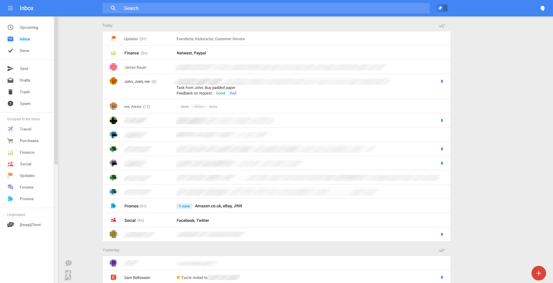
Google is about to give its email client Gmail a major makeover, as per fresh reports from Geek.com. Leaked images of the Gmail for web is getting a similar look to that of the mobile app.

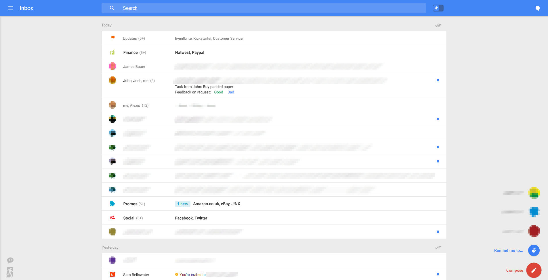
The new UI for web is getting a new slide-in menu on the left-hand side of the inbox which will have all the labels like inbox, sent,mail, trash, drafts, spams and so on. While on the right side of the screen, we can see a quick access menu at the bottom that will allow users to quickly start an email. This means it is replacing the tabs like Social, Promotion and Primary that were introduced last year.

Hangouts option at the top is seen in form of a chat bubble to enable easy conversations. The new Gmail layout will introduce a pin system that lets you prioritize the emails you see first based on importance.
Users will apparently be able to drag pinned emails to the top to keep them front and center at all times. This means, Google is shutting down the ‘Start’ system that has been there for a long time. Moving on, a red “+” icon in Gmail’s lower-right corner presents a new pop-up menu for composing new messages and adding new reminders into Gmail.
According to the report, it is not clear when the redesign will be available for users but there is a possibility that the company might announce it at the Google I/O conference in June.
Source: Geek.com
