Motorola, a Google owned company back then came out with a mission to educate consumers that affordability doesn’t mean creepy functionality. The first generation Moto G carried a price tag that attracted a lot of audience with its features stretching beyond what was on offer in the market and amazed its competition.
The 2013 edition of Moto G ticked more boxes than what consumers expected and for the first time users got more than what their money deserved. Today, Moto G has a successor with improved hardware specifications, and 10 months later has Motorola done it right? Well, we have set out to find out the answer.
Retail Package
When we got our retail package, we pretty much knew that the company wouldn’t include anything that’s beyond the essential accessories in the package. This is of course one of the ways to keep the costs down, but Motorola has been bit too conscious in its saving efforts.
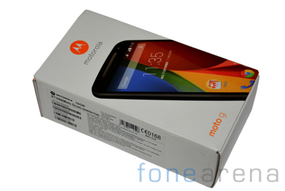
The 2014 edition of Motorola Moto G ships in a box that is very similar to what the previous model did. First up inside the box is the device itself and if you continue digging furthermore, you will find the A/C adapter, headsets and some leaflets.
It’s quite surprising that Motorola decided to scrap the microUSB cable from its package. Granted, that by now you would probably have a few lying around, but in case you don’t have one, then you don’t have an option other than buying it – because at the end of the day, without the USB cable, there’s no way you can transfer data between your phone and computer.
Video Review
httpv://www.youtube.com/watch?v=zxM7Vc-OwpI
Design
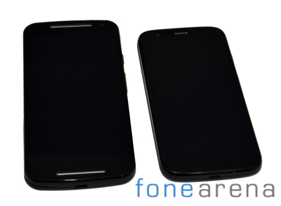
For starters, you are going to have hard time distinguishing between the previous generation Moto G and new Moto G – expect for the size, the design language remains largely similar. Heck, the naming scheme isn’t that different either.
Having said that the styling of the new Moto G is quite impressive, but we don’t think it’s going to be a show off element. Just like the original model, the 2014 edition also comes with clean and efficient structure, which is very simple.
The new Moto G sports two different kinds of plastic and we like the quality of it. Considering its price tag, its build is par for the course. If the same device would have hit the market two months ago, the overall structure could have gained a lot more appreciation, but since the introduction of Xiaomi Redmi 1S and Asus Zenfone 5 in the mid-range segment, the bars are now set very high.
We are not trying to take any credit away from new Motorola Moto G, because it’s certainly one of the well put together phones in the market right now.
If you are worried about getting your smartphone screen scratched, well it’s time for you to put it aside and live peacefully. The new Moto G comes with Corning Gorilla Glass 3, which is not only scratch proof, but also shutter resistant. And, you really don’t have to worry about the back as it can be very easily replaced.
Talking about replacing your back, it’s not as impressive as Moto Maker for Moto X, but nonetheless you still have some options with colored back panels.
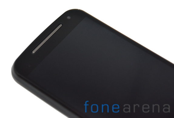
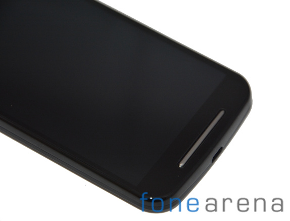
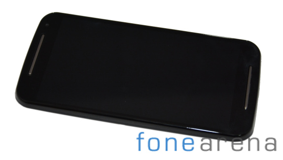
On the front of the new Moto G, you get an earpiece that also doubles up as a speaker, the front-facing camera, ambient light and proximity sensor. The presence of stereo speakers above and under the display is one of the significant addition from the previous edition.
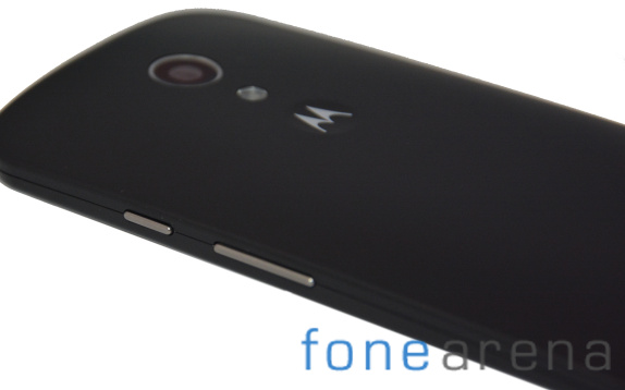
The controls are all integrated to the actual screen. The left side of the smartphone is completely bare just like its predecessor. On the right we see the power key and the volume rockers – the only two hardware controls on the phone.
The microUSB port is located at the bottom of the device and the good news is that it supports USB host, which means that consumers can attach peripherals like keyboards, USB sticks and even a mice.
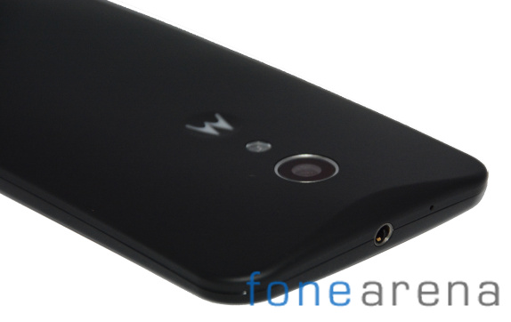
Moving to the top of the smartphone, we locate the 3.5mm audio jack placed bang in the middle and next to it is a noise cancelling microphone pinhole.
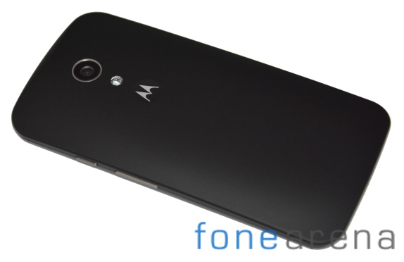
Back of the new Moto G houses the 8 megapixel sensor with the LED flash and the Motorola logo right below it. Opening the back panel is a bit difficult as you need to push your finger in the microUSB slot and pull it with considerable amount of force before it pops out. Underneath the cover, there are dual micro-SIM slots and the welcome addition – the SD card slot (supports up to 32GB).
The battery is non-removable and there’s no way you can access it.
Display
Motorola’s success with the original Moto G depended a lot on its 720p display, which was one of the finest in the crowded mid-range segment. The new model features a stretched out 5-inch panel with a pixel density of 294 ppi – which is not as sharp as the one on Moto G 2013 edition.
However, the impressive contrast levels and the color rendering more than makes up for the loss of pixel count. The viewing angles are far better with the text remaining legible even at extreme angles. We are happy to report that the front panel is not that reflective, which means that you will not have to find for a shelter to view it.
The white balance could have been a bit better, but considering its price tag, maybe asking for it would be just too much.
User Interface
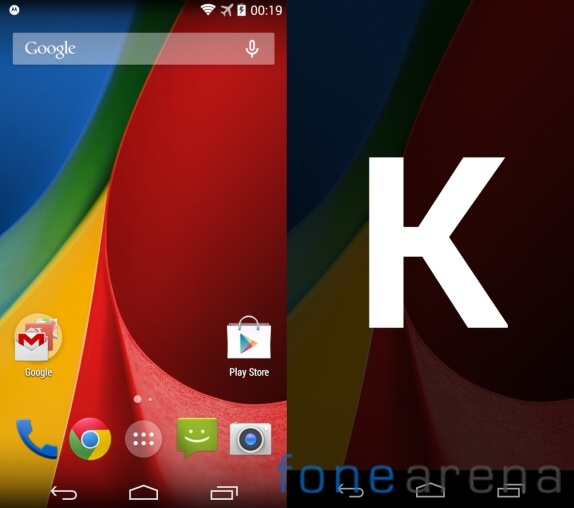
Motorola’s newest mid-range smartphone comes out of the box with Android 4.4.4 KitKat and guess what? It’s in line to get the latest Android OS – L whenever it becomes available. The user interface is nothing but stock Android and we are happy that the device doesn’t come with any customized UI on top.
The reason for liking stock Android is very simple – it is more fluid and has far less strain on the hardware.
Let’s talk from the moment we awake the smartphone, you are greeted with the lockscreen with a padlock button placed in the center. There are multiple unlock patters a user gets to choose from – simple slide, pattern, pin or password and face unlock. Lockscreen widgets are also available and you choose what to have from a wide range of options.
Android 4.4 KitKat is not all work and no play, thanks to the presence of Google’s Daydream. It’s a nice and entertaining screensaver concept.
A finger pull down from the top brings the notification center and a two-finger swipe down enables you to access quick settings. The homescreen has five panes and you can use them to fill it with shortcuts, folders or even widgets.
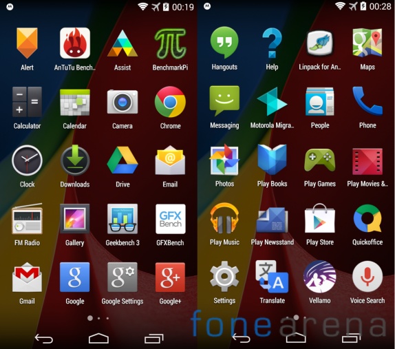
The new Moto G’s app drawer has four rows of icons and has two tabs – one for Apps and another for Widgets. The recent apps list can be accessed by pressing the multi-window key and we only wish that there was a close all apps option.
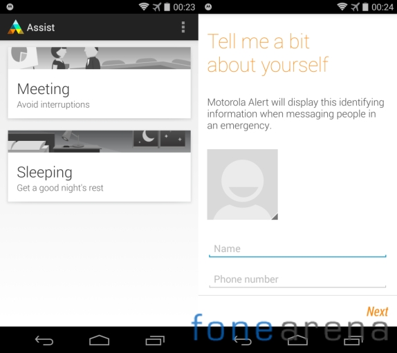
Motorola has included some of its own applications like the Assist app, Alert and Motorola Migrate. The assist application is basically the company’s own version of Do Not Disturb, while the alert app will display the identified information when messaging people in an emergency. Lastly, the Motorrola Migrate app as the name suggests will help you switch from an old smartphone.
As we said before, the stock Android doesn’t have much strain on the chipset and hence we didn’t find any lag during the day to day usage. It’s not slower than any of its competition and overall it offers great experience.
Performance
The new Moto G comes with a Snapdragon 400 chipset with quad-core 1.2GHz CPU, Adreno 305 GPU and 1GB of RAM – which is essentially the same hardware that was powering the previous generation Moto G smartphone.
The performance also depends on the software and other optimizations. So, let’s see if Motorola has managed to get the best out of the hardware on its 2014 Moto G edition.
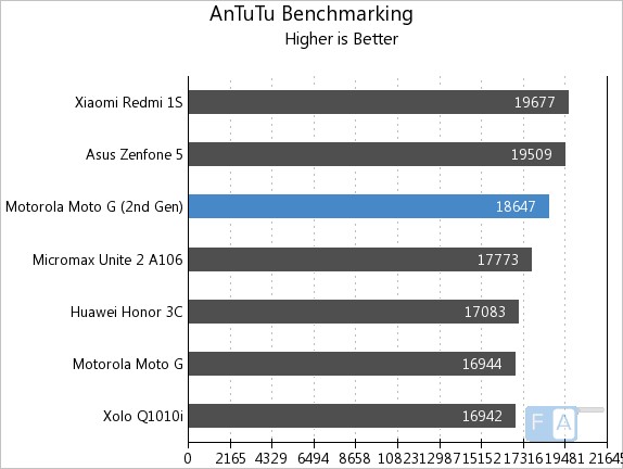
We decided to take the new Moto G for a spin in order to stack it up against its competition. First up was the AnTuTu test that gauges the overall performance of the device. The new Moto G managed to score about 2,000 more than that of its predecessor.
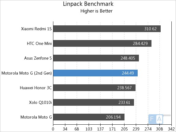
Next was the Linpack test, which is a multi-threaded oriented benchmark. The results reveal that the performance of the device is far superior that it’s previous model and the smartphone has the potential to hold its ground in the mid-range sector.
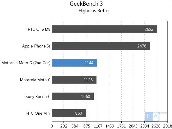
After sweating it out in Linpack, the next challenge for the new Motorola Moto G was the Geekbench 3. This test evaluates the cross platform performance of the CPU.
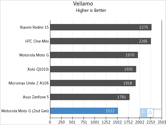
Last up was the browsing performance test with the Vellamo application. Surprisingly, the phone only manages to score 1,522 points – which is less than that of its predecessor.
Here is the gaming review
httpv://www.youtube.com/watch?v=1I4w9Y4Jq94
Camera
The all new Motorola Moto G comes with an 8 megapixel sensor, which is an upgrade over the 5 megapixel unit from the previous model. The camera doesn’t come with many of the bells and whistles that are found on many of the flagship offerings out there.
The user interface on the camera is very minimalistic and includes just two buttons – one for the video recording and other for the front-facing camera. All you need to do to capture an image is to just tap on the screen and tap-hold will enable you to shoot in burst mode.
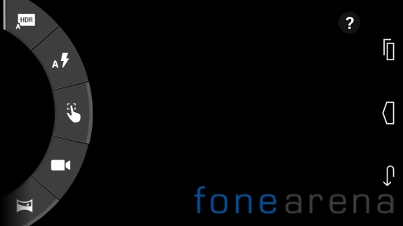
You can access the settings by swiping from the left of the screen to the right. It opens up a wheel with options such as HRD, flash, touch focus and panorama among other toggles.
The limited number of options means that you need to get used to the camera before you can shoot quality images. You should rely on the auto-mode for the focus in order to get a right shot and on such occasions the contrast ration tends to fall a bit.
You can shoot without the HDR enabled, but more often than not you usually end up with low contrast images without much detail. The good news, however is the colors are accurate and the noise is very less as compared the images shot with its competition.
If you shoot with HDR turned on, you get better quality images with the extended dynamic range and improved contrast ratio. With HDR on there are some drawbacks as the colors are overblown and the images tends to miss that natural element. Finally, it all boils down to the personal choice as to what type of images you prefer as both have their deficiencies.
Battery
The second-generation Motorola Moto G has 2,070mAh battery. Although, the capacity is not too much by today’s standards, the efficient chipset helps the battery last for an entire day. However, the efficiency is down when compared with the previous version, but we guess that’s more to do with the much bigger display.
New Moto G doesn’t disappoint us when we put its endurance numbers next to its competition as its battery provides enough juice to last longer than most of the other smartphones in the mid-range sector.
Conclusion
The first generation Motorola Moto G was called poor man’s Nexus, but can the new model live up to those expectations? Well, we don’t think the smartphone has enough to retain that title.
Don’t get us wrong, the device isn’t cheap and as a matter of fact for what it has on offer, it’s quite good. But, the likes of Xiaomi and Asus have set the bar quite high and we think new Moto G is just not there.
Why did Motorola decide not to change the internals is something that’s beyond us. The performance of the device is not any different from its predecessor and in fact it seems like a downgrade in some aspects like the browsing for example.
Performance apart, the upgrade in the display, camera and most importantly – memory is something, which Motorola has got it right.
The 2014 Moto G edition can no longer be considered as a smartphone that gives bang for the buck. May be, the likes of Xiaomi Redmi 1S and Asus Zenfone 5 have spoilt us, but the market is no longer in the same dimension as it was when Motorola first introduced the Moto G in India 10 months ago.
Considering the overall performance, the OS updates, the screen, the camera, the ability to expand memory and all other features – is it worth calling it an upgrade? Well, we really don’t think so.


