The Apple Watch is proving to be a resounding success from a sales perspective. It is believed that initial pre orders have already exceeded the number of Android Wear watches sold every year and all this is while most buyers haven’t even got their hands on the smart-watch yet. While the jury is out on the utility of smart-watches altogether, we spent some time with an Apple Watch in Beijing to see if it meets the expectations set by the hype around it.
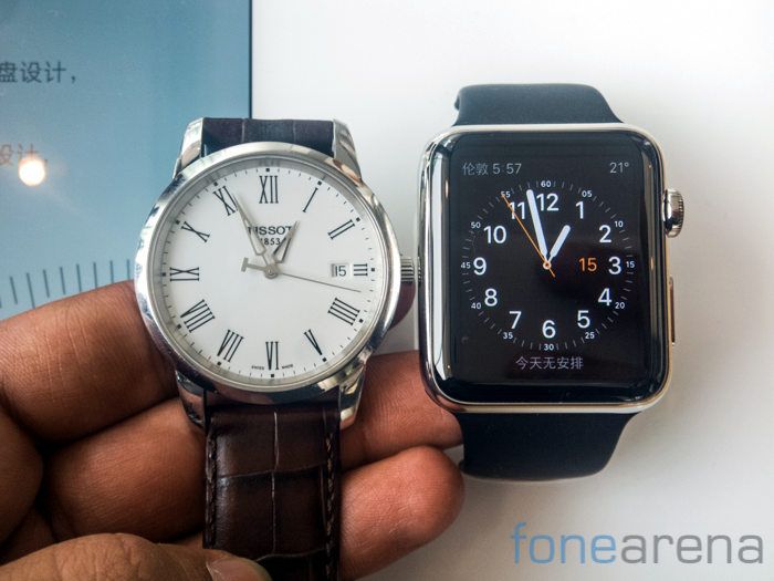
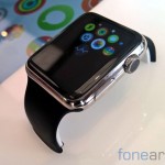
Our first glimpse of the Apple Watch left us a bit underwhelmed, the watch above is the 42mm variant with the analog watch on the left having a 38mm dial radius. Unfortunately, the biggest version of the Apple Watch still feels diminutive while the display seems just a bit too small for the highly complicated interface. More on this later. The difference in the size comes down to the fact that Apple measures the watch face top to bottom while the industry standard is to measure it diagonally. This means that the Apple Watch effectively comes to an equivalent of 35mm. Very very small. The 38mm version of the Apple Watch feels smaller still. The screen quality too isn’t very good. You can notice a bit of a gap between the glass and the display while the screen could’ve certainly been sharper.
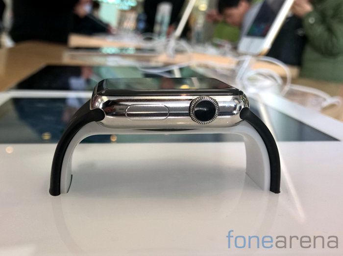
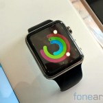
The Apple Watch uses a combination of a digital crown and a hardware button for all interface interaction and this can get quite complicated very quickly. Pressing the digital crown brings you to the app drawer while rotating the crown lets you zoom in. We found this counter intuitive as we feel that a wearable should enable quick navigation between apps and functions. The Apple Watch on the other hand requires you to head to the app drawer via the button on the crown. You will then have to scroll around the interface using the touchscreen following which you zoom into the app using the crown.
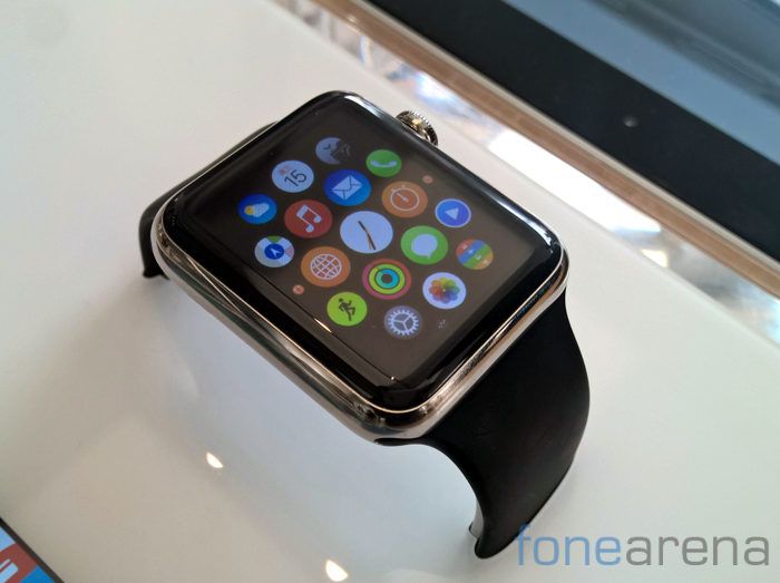
In terms of performance, the Apple Watch seemed fast enough for the most part but every now and then, it would slow down completely and require you to wait before you could scroll around the interface. While we expect that Apple will work towards resolving these issues in future updates, the software at the moment doesn’t really live up to the standards expected of the company.
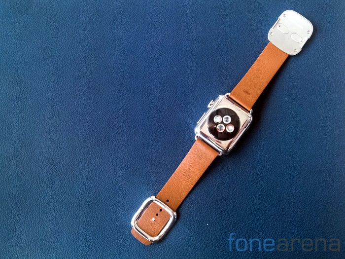
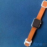
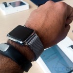
Over at the back you spot the heart rate sensor which involves infrared light as well as visible-light LEDs to provide accurate heart rate measurement during workouts. An additional use case is that the watch allows you to send your heartrate to a loved one though we’re really not sure why you’d want to do that. During the course of our time with the Apple Watch, we tried out the Stainless Steel Link Bracelet, the Milanese Loop and the Modern Buckle with a leather strap. Of the three, i’d say that the Stainless Steel Link Bracelet feels the best with the Milanese Loop being a bit too feminine for my tastes. The Modern Buckle however really disappoints because of the quality of leather used. We’d expect better from Apple and more so given the price point here.
An intimate device like the Apple Watch requires more than a brief amount of time with it. Our unit of the Apple Watch is already on its way towards us and you can expect a more in-depth review soon. Our quick impressions though? The attention to detail makes the Apple Watch a high end smartwatch like none other but the software and performance lets it down. The smart watch industry is still in a nascent stage and unlike most Apple products, the Apple Watch too is caught in this rift with it trying to do too much yet lacking a single compelling reason to use it.
