If the “Next big thing” ads weren’t clearer, Samsung has always wanted its Galaxy S to be an iPhone. Premium, desirable and something people aspire to buy. The Galaxy S series was aspirational indeed, and was often ahead of the iPhone in many departments, except for the ones related to “premium”. The metal-lovers we all are, kept complaining about “premium” for more than 3 years, so Samsung has now finally delivered a phone that can, not only tick a box in all departments, but also deliver.. the Galaxy S6. This review, however, is of its more aesthetically pleasing variant, the Galaxy S6 Edge, which is almost exactly the same as the S6, but the dual-curve edge screen will cost you substantially more. Let’s find out why and a lot more.
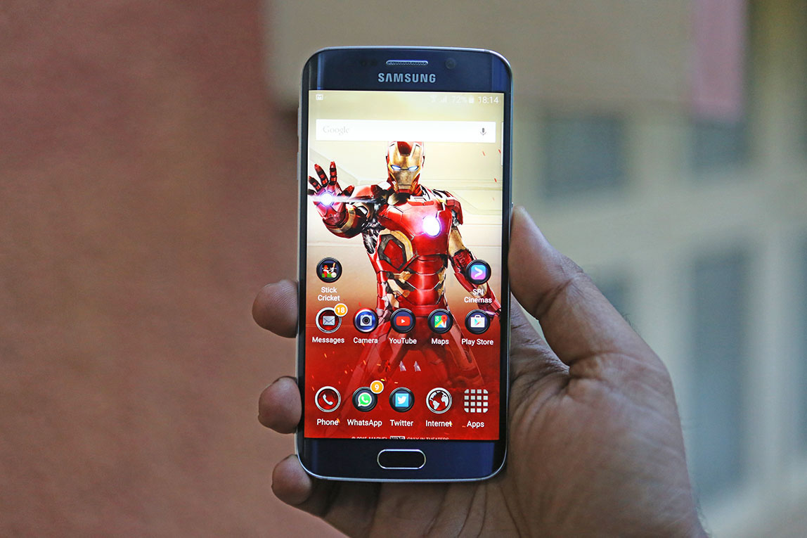
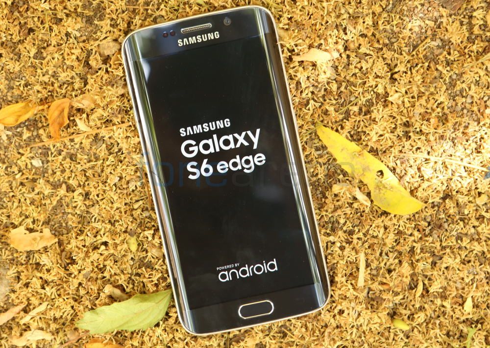
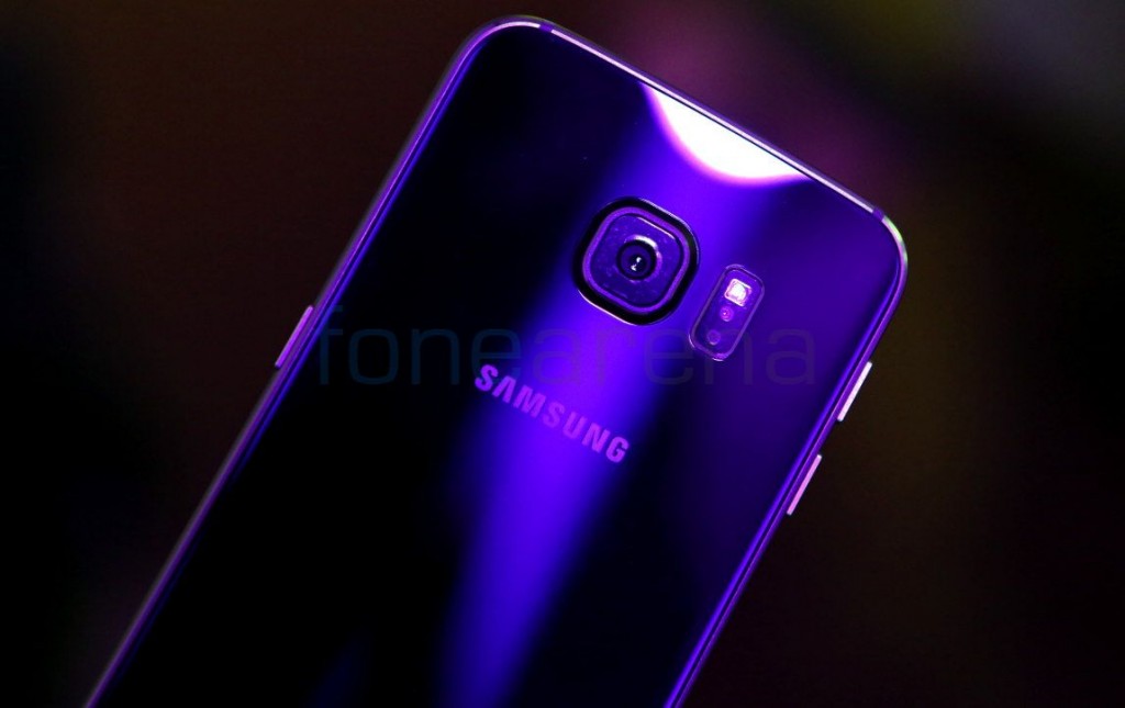
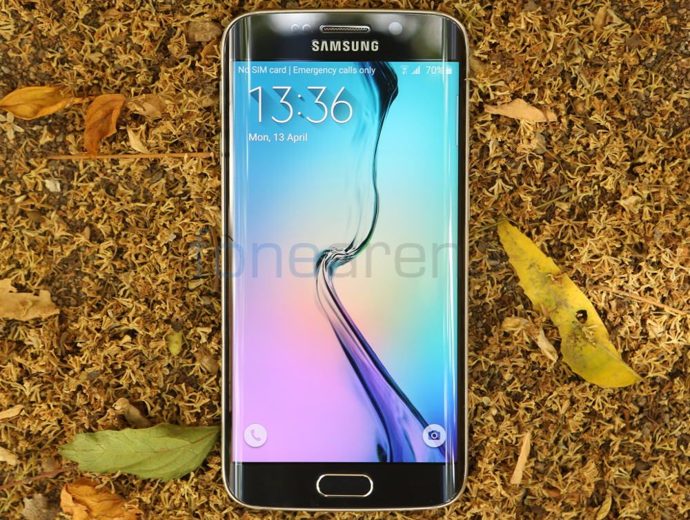
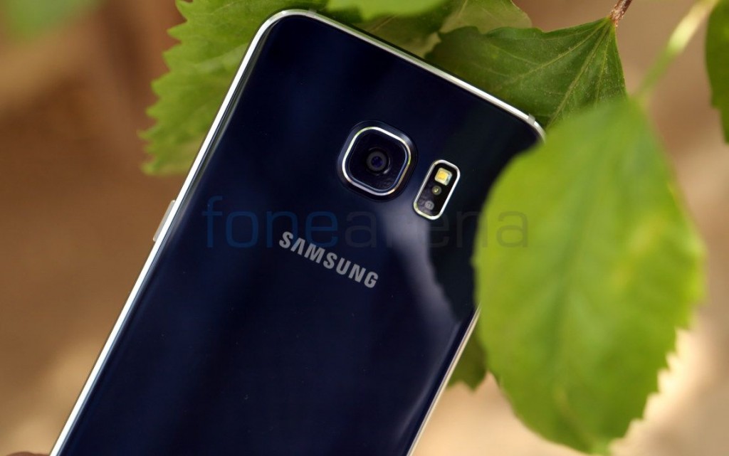
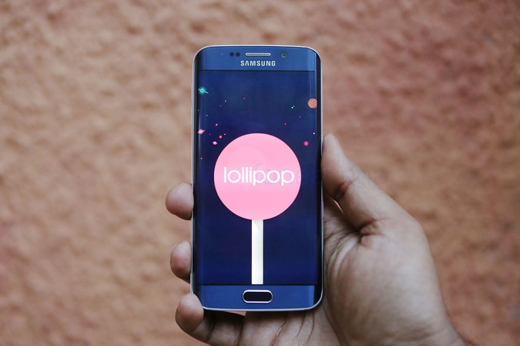
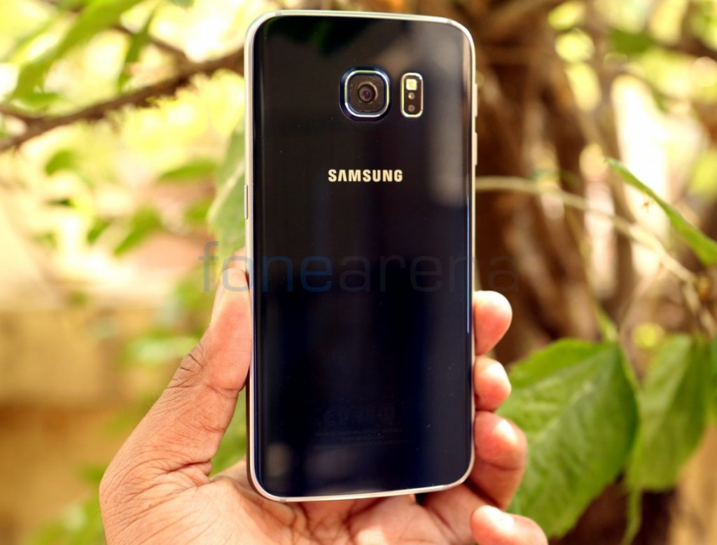
When Samsung released the Alpha, hopes of getting a metallic design for the flagship was real, but the Galaxy S6 Edge had surpassed our expectations, with a metal-and-glass design that massively ups the premium quotient. There is glass on both the sides of the smartphone now, a first for the Galaxy series. Not sure if the glass on our review unit is different but there are no signs of smudge or grease affecting the glass in any way similar to that of the demo units we were shown at launch events, which is great because we were really worried. Even the gloss in the sapphire black layer under the glass seems more understated than it was, at the events. This toning down has helped the S6 Edge achieve its sleek look.
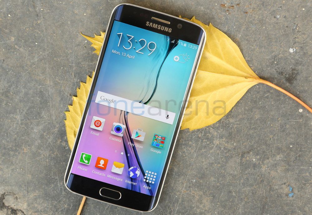
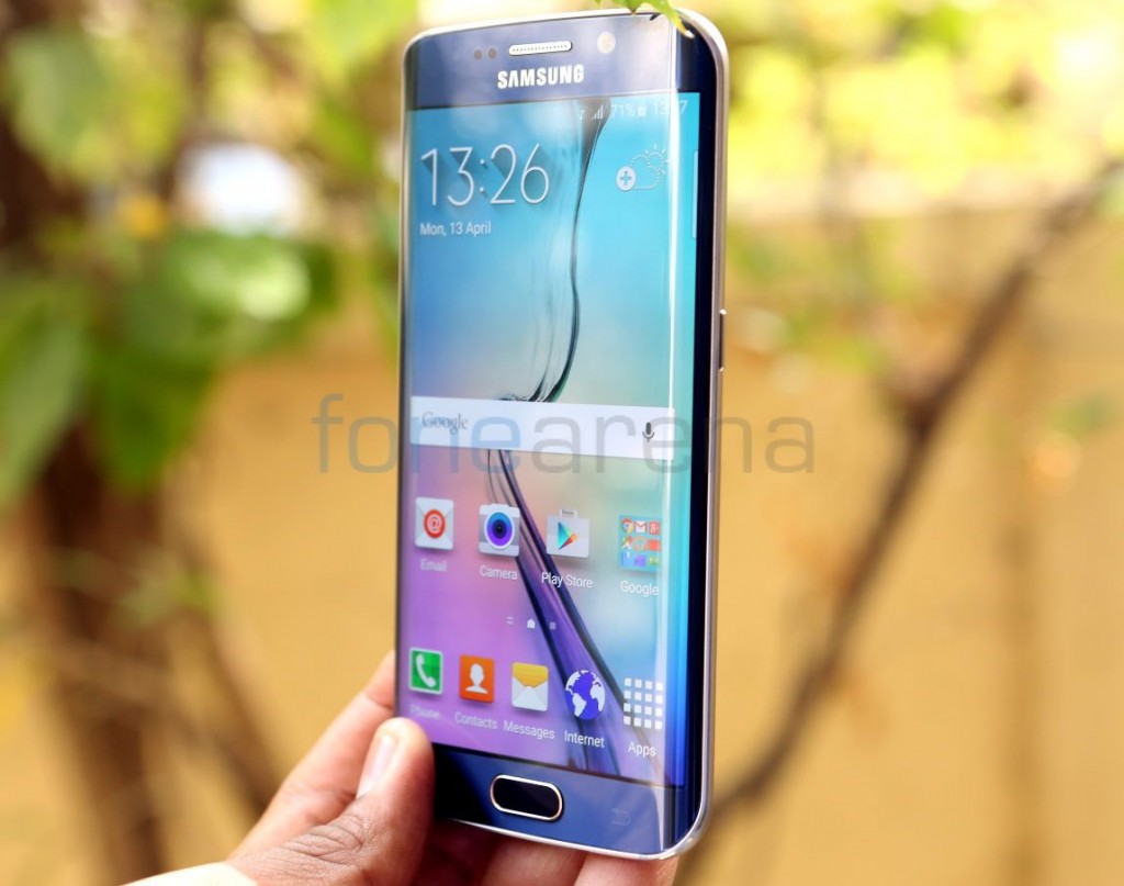
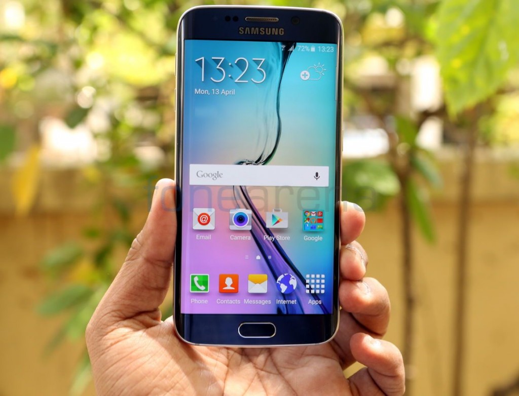
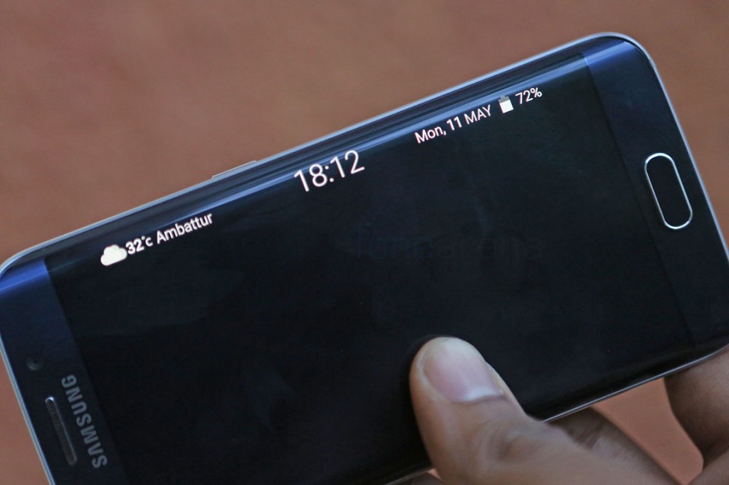
Mainly thanks to the nicely curved edge screen, this time doing its thing on both the sides unlike the weird-looking Note Edge, the S6 Edge looks near-futuristic and unlike any smartphone, ever. Even when the screen is off, the reflections swerve into the sides, giving it an extremely unique look. An achievement, considering the stale sameness of most other slabs, including Samsung’s earlier ones.
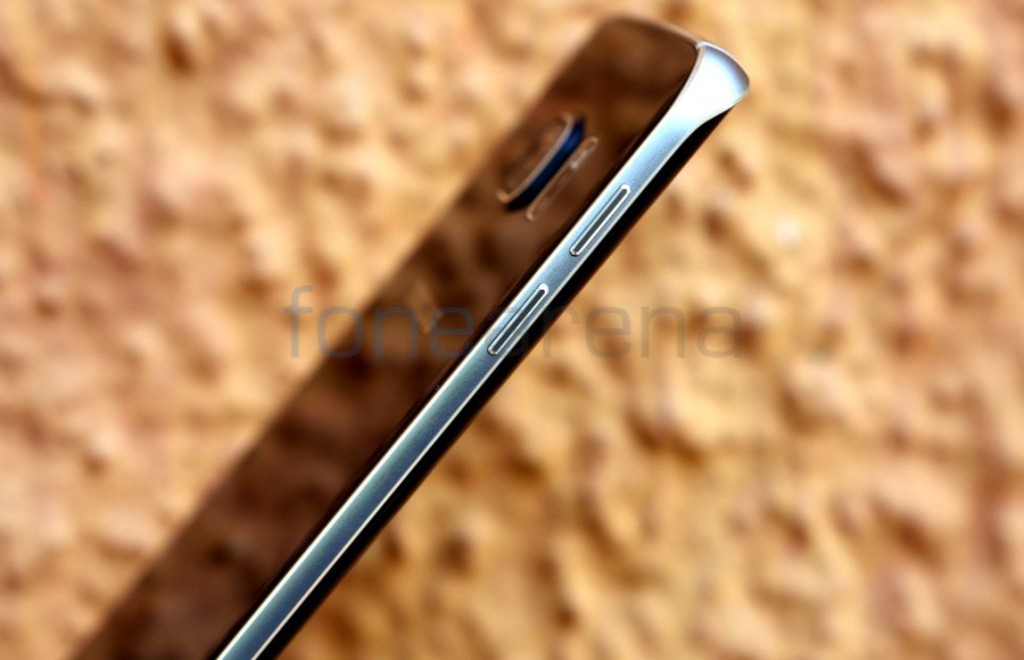
Again, unlike the Note Edge, the screen does not extend as much into the back, and leaves a thin strip of metal to separate it from the glass, well enough to accommodate narrow buttons for volume on the left side and power/lock on the right. These buttons are surprisingly responsive and clicky.
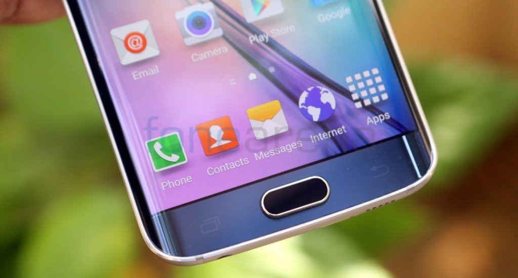
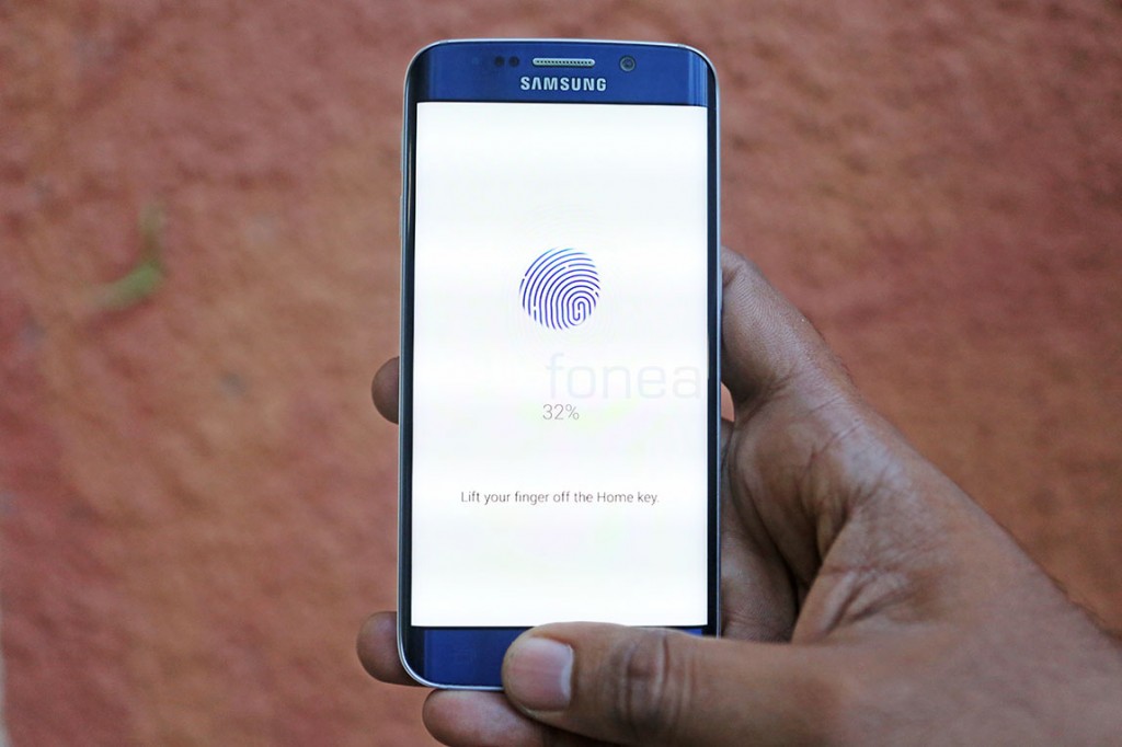
That applies to the new home button too, which also houses a brand new fingerprint sensor that brings functionality on par with the iPhone’s Touch ID. You don’t need to swipe your finger on it anymore, just a soft touch with your designated finger will do. It changes the experience in software too, but more on that later.
With the display curving along with the glass, the device, naturally, is narrower, which adds to the slick look. But here’s the catch. The thin metallic strip, which is thicker at the top and bottom, is too soft. There is not enough grip for you to confidently hold the device, like say, when you are walking. If you have a case of “occasional dry hands” like me, forget about not consciously holding the phone tight, which the thin strip of metal makes harder. The glass bits also seem pretty strong, which I realized after dropping the phone once, from a seated position. There was no damage, thankfully. The S6 edge is slightly thicker than the S6, at 7.0 mm vs 6.8mm, making sure there is enough space for the thin metal strip. Also thin is the bezel, which creates the edge-to-edge look of the display. The chamfered metal edges, only on the sides, are slightly raised to make sure your fingers find the display, more than the bezel.
The special gloss that shows off the sapphire black color at the front looks great when there is lot of light, but I couldn’t help but wonder how it would have looked without the gloss, a purely black futuristic slab. The attention to detail is also lacking, when it comes to arrangement of the various ports. It would seem like nitpicking, but small things make a lot of difference. Apple knows this too well.
Despite everything I said, the Galaxy S6 Edge is one of the best looking smartphones out there, right now. It may be slippery, but it looks amazing even when it falls. What looks even more amazing is the display. The 5.1″ Super AMOLED screen, at a QHD 2560×1440 resolution, is one of the best to view anything digital. This is the first high-resolution display that almost mimics the resolution of print. QHD resolution on a 5.1″ screen is as useless as the first retina display on the iPhone 4, everything just looks way better.
The signs of toning down the image were visible, even in the Note 4, but Samsung might have perfected it this time around. The colors are accurate and balanced, unlike the oversaturated brightness that was characteristic of every Galaxy S display ever. It is also considerably better than the Note 4’s display, which says a lot. With regards to experience, the edge screen enhances the display as well as meddles with it. It enhances by making media, especially pictures in various app UIs, flow out of the screen, but at the same time, meddles with the display in some viewing angles, where there is a tint on the edges, especially if there is primarily white content on the edge screen. However, the positives are overwhelming to consider this a major hindrance.
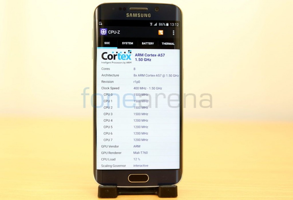
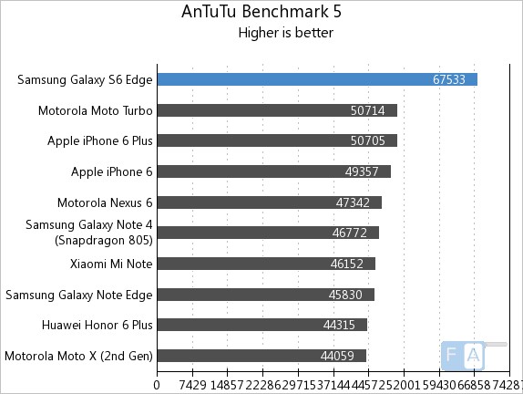
Also overwhelming is the performance of this device, which, after a subpar experience with the Note 4, was something I hoped Samsung would fix, and they have made it better than ever. The new Exynos 7420 Octa-core processor has a 2.1 GHz quad core A57 cluster and a 1.5 GHz quad core A53 cluster, both working heterogeneously, based on ARM’s big.LITTLE architecture. Technical mumbo-jumbo aside, the performance is crazy fast on the S6 Edge. QHD resolutions are no longer a task, if this particular chipset is concerned. It blazed through everything we threw at it, reminding us of the remarkable performance upgrades over the years. The 64-bit capable processor is running a 64-bit OS, so things are buttery smooth, which bodes well for Samsung, in terms of raw user experience. Apps, games and the UI, generally, is fast. The device is also equipped with 3 GB of DDR4 RAM, which is much faster than a DDR3 one, and it shows. Sometimes, when the device is heavy on load, the app drawer drops a few frames of animation to redraw content, but the content appears really fast, unlike previous models. This is due to the RAM filling up fast with high resolution assets, but it doesn’t feel slow thanks to the speed of execution.
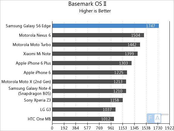
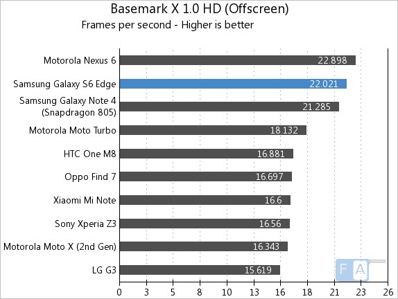
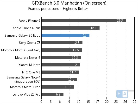
The execution speed was clearer when we ran benchmarks, comparing it against all the other flagships. Here are some examples –
The Mali-T760 MP8 GPU unit is not the best out there, as evidenced by the screenshot above, especially with the burden of running a Quad HD screen, but it surely holds its own. It is certainly better than the Note 4/Edge, which sported a under-clocked MP6 variant. In real, the gaming performance was quite good, here’s how it performs –
httpv://www.youtube.com/watch?v=kjgyilcsXrI
As you could see, everything was fast and alright except for the lack of USB OTG support for the controller and the random graphic glitches in Grand Theft Auto. Also, no, the device does not rapidly heat up when gaming. It gets warm, but not hot. The thermal readings in CPU Z usually hover around 60c when gaming or installing apps, but we found that the environment the device is in, matters a lot for overheating. When I took the device with me to a southern town that’s traditionally hotter (about 40c), the device started heating up for no reason. Using the camera made it so hot that I couldn’t use it anymore in landscape, because the area around the camera was extremely hot, and the battery too drained out rapidly. Doing the same in a much cooler environment had no effect on the phone.
But yes, the camera was something I used a lot, so much that it was the sole reason of overheating and battery drain. It’s that good. The 16 megapixel unit at the back is a Sony sensor on our unit, augmented by the optical image stabilization unit. There are reports that new batches have the Samsung ISOCELL sensor that was present on the Note 4 and, previously, the S5. While the sensor (IMX240) initially made its way to Note 4’s Snapdragon variant, we see it here paired with a faster f1.9 lens on the S6 edge. This sensor has the same pixel size (1.2 um) as the 20.7 megapixel IMX220, but the performance is tons better. Here are some camera samples –
Download the full resolution samples for closer inspection
The Galaxy S5 proved to be great with images, and so was the Note Edge, but the S6 is, surprisingly, a major improvement over these in many aspects. Most of those aspects don’t revolve around image quality, but in actual experience. A double tap on the home button takes you to the camera in an instant, from anywhere, even when the screen is off. This proved to be amazing for all those usually-missed moments. One of the best things about the iPhone is the reliable output and a fast yet stable performance, with quick and efficient access. The Galaxy S6 edge is the only Android smartphone that not only matches, but actually surpasses that experience. The interface is much cleaner, with important modes like the Pro mode, now available a swipe away. Exposure/AF lock is now possible with just a long press, making it easier get just the right exposure or focus we need.
Imaging performance in broad daylight is great, with tons of sharp detail, accurately balanced colours and great dynamic range, when live HDR is on. In low light, the imaging algorithm tends to overexpose the highlights by compensating for the shadows, which are just filled with uneven noise. But when the exposure is right, the image is cleaner than usual and output is pleasantly surprising. While low light performance is better than the iPhone, there are devices that do it better than the S6. The 16:9 pictures from the camera are often “wallpaper” material, my friends quipped, when I showed them the samples, which says a lot about the camera as well as the display. The edge screen creates that effect, I guess. With f1.9, the images benefit from a brighter scene in low light and a lot of bokeh at close-ups. With the pro mode, it is possible to manipulate the focus and exposure, to create images like these –
Other modes I frequently used were Panorama, video, and of course, the front facing camera. Let’s talk about the “selfie” camera first. The 5 megapixel unit at the front is equipped with a 90 degree wide angle lens and takes great selfies. The best thing about it is you can even have HDR enabled in the front facing unit, which is great for selfies with the sun behind you. With a “wide selfie” mode, you can pan around and stitch together a group selfie, which Samsung and Ellen made popular during the Oscars. About the video modes then, the rear facing unit can record optically stabilized 4K footage at 30 fps, Full HD with HDR and smart OIS, at 30 fps and without HDR, at 60 fps. There is also the slow-motion 120 fps mode at 720p, which is the only thing that falls behind, thanks to the iPhone’s 240 fps capability. The dual ISPs do great job of encoding and decoding all kinds of videos, but the sharpening could be a tad lesser in its algorithms, even in stills.
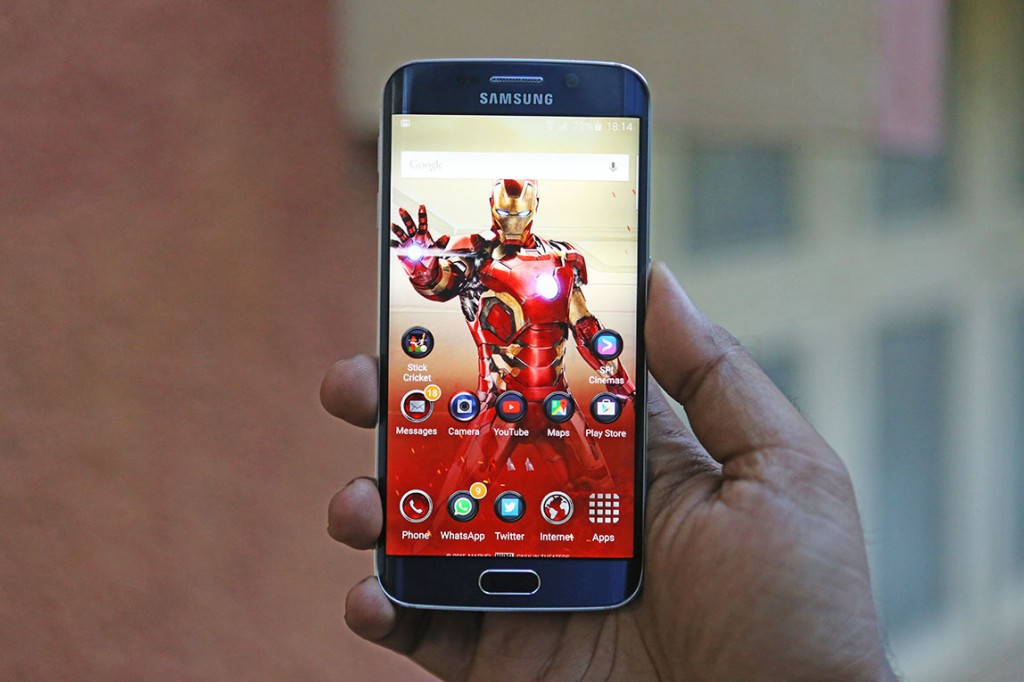
That brings us to the software aspect of the Galaxy S6 Edge. Running on the latest version of Android, Samsung’s newest UI refresh finally feels like a refresh. Adopting material design guidelines for its own default apps, Samsung has moved past duality concerns that plagued it before. Touchwiz used to occupy so much space on internal storage and on RAM, so Samsung has removed all the unnecessary apps, replaced them with shortcuts and cleaned up the footprint. Not only that, there is more to the customization aspect now, with themes, configurable grids and so on. Might have taken them so long, but all the major ROMs have themes now, which is great news for the consumer obsessed with visual customization. Touchwiz is now light enough to go along with the speed of the processor and not be a bottleneck, which, yet again, improves the overall user experience. Oh, and did you know Touchwiz now has parallax effects on its homescreen?
The bigger question in software though, is, how useful is the edge screen? We had seen how the Note Edge’s features were mostly lost on us, with it infringing on screen real estate to display awkward notifications that weren’t accessible in landscape once swiped away. Thankfully, those features are near-absent on the S6 Edge. With edges on both sides, Samsung has almost done away with that idea, saving it for the times only when the screen is off. By doing a double-swipe on the edge screen, you can bring the information stream up, which lets you quickly glance at all the panels, just like on the Note Edge. People edge lets you add favorite contacts into color coded bubbles, which not only gives you quick access, but also shows you a glowing animation of color on the edge screen when the respective contact calls. Unfortunately, this is a feature that works only when the phone is face down. Even with Gorilla Glass 4 on both sides, who would keep the phone down like that without a case? Personally, a case defeats the point of this phone, so I ended up not using this feature at all.
But the one thing I ended up using a lot was the Fingerprint sensor. Unlike the s5 or the Note 4, the “swipe” action is not needed anymore and the whole sensor now sits right under the best home button Samsung has ever produced. Press and hold the tactile home button with your configured finger to take you to the homescreen in a matter of seconds. The speed of recognition, we tested, was as fast as the iPhone’s Touch ID. The fingerprint sensor can now be used for various things like authorizing NFC payments using Samsung smart pay, authorizing passwords for third party apps and so on. Biometric authentication is the next step in identity management, and Samsung finally has a solution that can match the iPhone. We found it to have errors, of course, it doesn’t detect it 100% of the time, but it almost always works, which is great.
Moving on, in terms of storage, the 32 GB variant we got has about 23 GB of free space, which is good enough for the most of us, but it would be unfair not to mention the missing micro SD card slot. A Samsung flagship without a micro SD expansion slot or a removable battery is a reality we have to come to terms with. With changes to design and build, this was inevitable, but we were hoping to see a slot anyway, like how they had managed for the Alpha series, with hybrid slots. May be the dual SIM variant will be able to house a micro SD slot, but if you are looking to use the same micro SD card you had used in previous flagships, you are out of luck. It’s not a major problem, to be honest, but people who expected it to be there would be disappointed. Connectivity wise, the device is equipped everything one would expect from a flagship, including LTE support for Indian bands, which is almost mainstream now, at least in devices. One small thing they have rolled back, is the micro USB port, which is now only a bog standard 2.0 instead of the much faster 3.0 port that was present on the S5. You can check our product page for more details.
The battery, a 2600 mAH unit, needs charging everyday, much like most other flagships out there. Thankfully, quick charge 2.0 with its designated charger and in-built wireless charging make it easier to charge the device when the battery runs out. Generally, on a normal work day, I got a day’s worth of medium to heavy use, but when traveling, the battery kept draining, which made me regret myself for forgetting to take the quick charge 2.0 enabled charger. However, the power saver modes helped a lot, and great standby performance made sure that I didn’t lose charge before reaching for the charger. One wouldn’t need to worry about the S6 Edge’s battery life much, as things have been made a lot easier now. With the Exynos 7420 being power efficient in standby, a day’s worth of use is a guarantee for most.
Conclusion
What usually seems like a botched-up job, is now the common underlying theme for Samsung’s latest flagship device, user experience. The Korean manufacturer has finally done a lot of things right, thereby bringing the Galaxy S range to aspirational levels of an iPhone. The design, the build quality, the display, the camera and the overall performance, all come together for a harmonious user experience, which dwarfs minor issues like overheating in higher operating temperatures. The Edge screen, on the other hand, doesn’t add much value in terms of experience, but is aesthetically superior than the S6. It’s a matter of choice in the end, but if you want one of the best looking and best performing Android smartphones ever, get the Edge, else get the S6, which will look normal, be less slippery and lighter on your bank account. And if you’re shopping for a flagship alternative to the iPhone, the S6 and the S6 Edge are right at the top of our recommendation list.

