It’s been almost 12 months since Xolo announced its new UI, which was dubbed as Hive. With its own user interface, the Indian manufacturer gave a lot of freedom to its consumers with the ROM offering a wide range of customization.

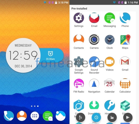
Today, thanks to our insider, we get to know more about the enhanced version of the Hive UI. Our source has sent us two screenshots of the Hive UI 1.5 that will debut on the first device from Xolo’s new online only sub brand – Black.
For starters, the Hive UI 1.5 will be based on Android 5.0 Lollipop and as you can see in the screenshots, the UI will come with material design. Furthermore, it sports a flat look and the user interface features vibrant colors. All in all, the upcoming version of the custom layer seems to be more graceful and elegant as compared to the current form.
Just like Hive 1.0, the new iteration is expected to offer a wide range of theme options. And, if our source is to be trusted, you’ll have about 17 unique themes available for download on day one of the official release.
Xolo seems to have taken the philosophy of customization very seriously. With Hive UI 1.5, users will have the ability to replace the app icons and have a user interface that matches their taste. The company is also said to be planning to hire designers to create some exclusive digital art work for its Hive consumers.
Unfortunately, this is all we know, but we really like the direction in which Xolo and its software team is moving. The first device with Hive UI 1.5 will be officially announced by the end of this month. So, it’s not going to be a long wait before we get to play with the Xolo’s new version of Hive UI or its new device.
A Special thanks to our insider!
