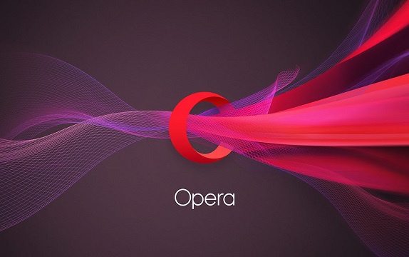
Opera has undergone a major overhaul with a new logo and brand identity. The company has redesigned and modernized the logo that still keeps the letter ‘O’.

The letter ‘O’ is still in red color bur is now three-dimensional that symbolizes the gateway that leads users to more. Opera Software may have started out as a browser vendor 20 years ago, but it now offers a far wider range of products and it wants its new brand to reflect that. The company said that it is now more of an internet company providing great experiences online and in order to reflect that it has dropped the “Software” from the logo and will now be simply called as ‘Opera’.
“Today, we’re revealing the new identity and updated icon for our flagship product Opera Mini on the iOS platform. Over the next few months, we’ll be rolling out the new brand across the Opera family, including our entire product portfolio.”
said Opera in a statement.
httpv://www.youtube.com/watch?v=KvJJk5Z-iZE
Opera said that the new logo and branding will start with Opera for Android, Opera Mini for Android and Opera for PC. Following this, the company will bring the update to data management apps Opera Max and Opera Coast for iOS.
