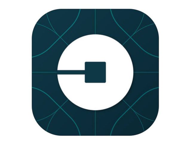
Uber has announced that it is getting a makeover. The popular ride hailing service is adorning a new logo and branding. Uber started as a way to hail private black cars and had a red magnet as a logo at the time. However, with its new logo, Uber says it wants to better represent the company it is now.

The company is doing away with the flat black ‘U’ logo as the new logo now has a black square inside a white circle which it is referring to as “bit” . Uber wants to focus on this “bit” and eventually expand its portfolio. Uber, which currently operates in 400 cities across 65 countries, has claimed that their logo is connected to bits and atoms. “This updated design reflects where we’ve been, and where we’re headed. The Uber you know isn’t changing, our brand is just catching up to who we already were”, explained Uber.

“The team has spent months researching architecture, textiles, scenery, art, fashion, people and more to come up with authentic identities for the countries where Uber operates”, said Uber. The overhaul and logo revamp comes at a time when Uber is valued at $62.5 billion
