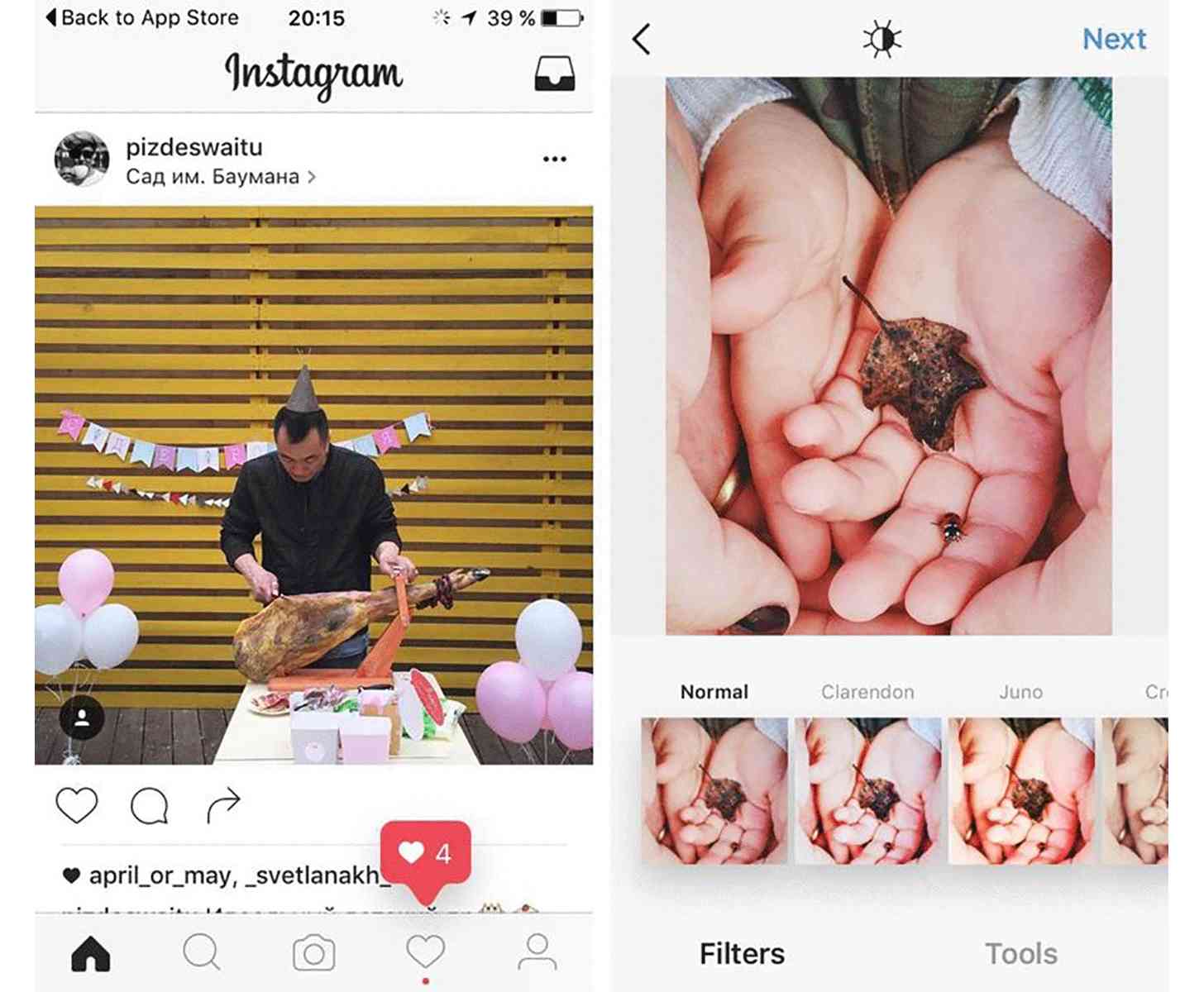
It looks like Instagram is planning to change the design for its mobile apps. According to a some screenshots, the popular photo sharing app is testing a new black and white design.
Instagram is testing the new design with a small group of users. As per the images, the app is leaning towards a monochromatic design instead of the usual blue and colorful theme. The icons located at the bottom of the interface have also been changed, now appearing thinner and flatter. The first major change in the icons is probably the one for the in-app camera in the middle. Instead of a white circle inside a box and the signature blue, the new icon is a thin outline of an actual camera. The activity button on the bottom bar has also been changed to a simple heart rather than a heart in a bubble. Moreover, the profile button on the bottom is now an icon of a person instead of their photo.
Instagram confirmed the design change, saying, “We often test new experiences with a small percentage of the global community. This is a design test only.” It is not clear at the moment whether Instagram will roll out the revamped UI and design to all users.
