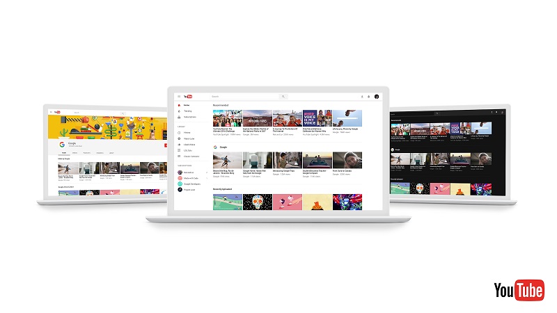
YouTube has unveiled a new look for its desktop client that boasts of several Material Design features. The company has now started rolling out preview of the revamped site for its users. People can now opt-in to check out the new look.
YouTube claims the refreshed desktop design is clean and fresh as it no longer has visuals that can disturbs the browsing or watching experience. The idea, according to YouTube, is to bring the desktop viewing experience closer to its mobile counterpart that focuses more on displaying content up front. In this updated look, YouTube for desktop gets a dark theme turns your background dark throughout your entire YouTube experience. YouTube says it has been developed to cut down on glare and offer a more detailed video viewing experience. Users can toggle on or off the dark theme from the site at any point of time.
Next up, the site design is built on a new, faster framework named Polymer, which enables quicker feature development. Other tweaks include smaller channel icons while the YouTube logo and the search bar in the upper left have also become smaller.
In order to check out YouTube’s latest look, you can opt-in to preview the new design at youtube.com/new. You can return to the current design by selecting “Restore classic YouTube” from the Account Menu.
