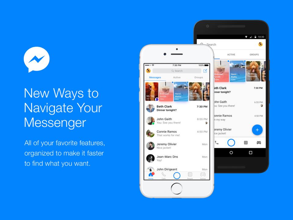
Facebook Messenger has redesigned its home screen to make navigation easy. The redesigned home screen is more organized and focuses more on messaging.
The revamped home screen now shows three tabs for Messages, Active, and Groups. The bottom bar features tabs to your Home screen, make Calls, take photos with the Camera button, search for People and play Games. It will soon feature a Discover tab after it starts rolling out. Messenger is also making things easier for its users in case they miss anything with a new red dot, which will be used as a visual clue. Messenger Day is also present between below the three tabs.
David Marcus, Head of Messenger wrote in a blog post,
These changes are designed to make Messenger simpler for you – to help you get to your contacts quickly, jump into your conversations where you left off, start new chats, and stay up to date.
The revamped Facebook Messenger update will start rolling out globally for Android and iOS users.
