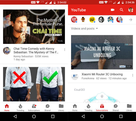
YouTube for Android has received an update that brings a refreshed UI and a new bottom navigation bar. The main aim to shift the navigation bar to the bottom is to make it easier for users to reach the tabs with your thumb.
The update separates “Account” and “Library” to make it simpler to find what you are looking for. Your playlists, watch history, uploads category will now fall into Library section while the Account section will comprise of Account and Settings functions.The navigation bars are visible on all pages so you can quickly navigate to one of the main navigation tabs.
- The app remembers where you left off on each tab. For example, if you scroll down through the Home feed, then go to your Subscriptions tab, and then return to Home, you can easily pick up where you left off. The new navigation feature is already available on iOS and is slowly rolling out to Android.
