Just after a week after the release of Chrome 62, Google has rolled out the Chrome beta 63 with new changes and additions. It is giving the finishing touches for Chrome Home U.I, a brand new flags page, new options for web apps and more.
Google Chrome’s bottom address bar design called the ‘Chrome Home’ has been in the development for quite some. It was first spotted almost a year ago; later it became a full revamp of Chrome’s interface in March and then a new design called ‘Modern U.I’ for Chrome Home with the rounded address bar and other elements appeared a while ago in August. This ‘Modern U.I’ was shipped with Chrome 62 last week but wasn’t enabled by default, and the original Chrome Home isn’t enabled for all.
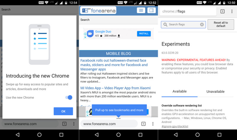
Now the Chrome beta 63 is showing signs that indicate that the Chrome Home is nearly completed and ready for a broad rollout. In the beta 63, there is a new flag that says “You’re using the new Chrome” message at the top of the overflow menu which on tapping open a pop-up describing the new features and there is a slider to disable the new interface as well. There’s another new flag that says ‘Chrome Opt-out Snackbar’ which prompts users to take the survey the first they opt-out of the new Chrome Home by disabling the new interface from the slider mentioned above.
Chrome has always had Flags that lets you experiment with features that in the development stage and the flags count slowly increased making the section cluttered and difficult to navigate. Now with the beta 63, the new Flag section interface looks much cleaner, and all the options are sorted between available and unavailable.
Another biggest change is the Minimal U.I for web apps. When you add a site or web app to your home screen, Chrome checks the site’s manifest file to see how the site wants to be displayed. Up until now, the web apps had three layouts, one that opens the browser, one that opens as a web app with the status bar but no browser-like interface, and finally the ‘fullscreen’ to make the web app full screen.
With the new beta update, Google has added a new option called the ‘Minimal UI’ this makes the web app look like a Chrome Custom Tab which lets you access the current URL which is ideal for the news site. Lastly, beta 63 also has sitewide audio muting feature that enables you to completely mute audio for individual sites. But for now, users can temporarily mute individual tabs, and it currently shows permission prompts as pop-ups, instead of banners at the bottom of the screen.
Google will roll out the stable version of the beta 63 in the coming days, but you can get the beta version from Google Play Store.
