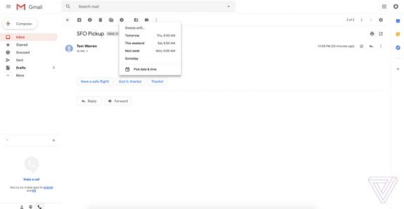
Just yesterday there were reports that Gmail is being revamped with new web U.I, smart replies and more. Today we are having the first look at the updated Gmail and how it looks once it is rolled out. The new design is said to bring it closer to the company’s tweaks for Gmail on mobile devices.
The new version of Gmail includes some subtle elements of Google’s Material Design and a number of new features that were originally introduced in Google’s Inbox. Google is implementing the smart replies for Gmail web much like the Gmail for mobile which provides suggestions to reply to emails quickly. It is also bringing the new snooze feature that lets you temporarily remove emails from your inbox. Snooze and Smart Reply are both currently part of Google’s Inbox app for Gmail, and now both features are finally making their way to Gmail for the web.

The new Gmail brings three different layouts to choose from; default interface will show you what kind of attachment is included in an email, including things like images, slides, documents or spreadsheets, right from your inbox. Next interface comfortably removes these icons and instead shows the familiar paperclip to signify an attachment. The ‘Compact’ is similar to ‘Comfortable’ but decreases the vertical whitespace.
The new Gmail also features a new sidebar, where it displays the options for using Google’s calendar, Keep note-taking app, or tasks side-by-side with your email messages. Since the new redesign of Gmail for the web is a close resemblance to Inbox, so it is unclear where this leaves Google’s Inbox project. With Google’s I/O coming up in the next few weeks, we can expect the redesign to be introduced at the event.
