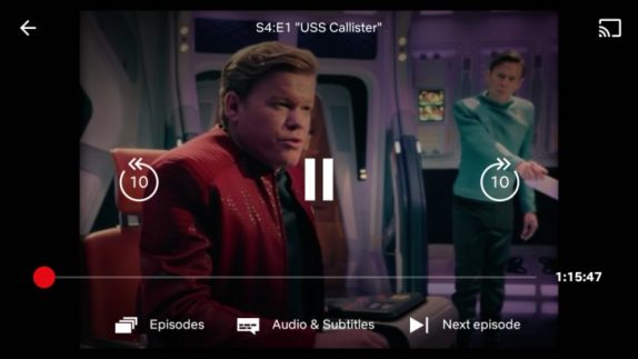
Netflix for Android finally brings the much-needed update with redesigned U.I with larger controls, forward video, next episode button, and more. This redesigned U.I is long overdue as the player felt a little underwhelming as opposed to great content it carries.

It also brings a new forward and back 10-second buttons which makes it easy to jump to the exact point. Much like YouTube, you can double tap on the left or right side of the screen while watching to instantly go forward or back. The update also brings bigger controls like play/pause, with labels to quickly select Episodes or turn on Audio & Subtitles. Most importantly, it gets a new“Next Episode” button to get to the next one even faster.
This new update fixes almost everything, the play/pause buttons are now centered instead of leaving them at the left corner. Though the forward and backward doesn’t rack up to +20, +30, it still is something that is better than nothing. The episodes’ and ‘Audio & Subtitles’ buttons have been moved to the bottom with the caption.
If you are a Netflix user, you can download or update the app from Play Store Hope the Netflix iOS app will get the new UI soon.
