The entry level smartphone segment is littered with devices from both recognized brands and a growing group of indigenous manufacturers. Micromax in particular has taken this market by storm and introduces devices at a breakneck pace.
When Sony announced the Xperia E Dual, we were quite interested in seeing if Sony could disrupt the market with a great product and solid after sales backing. We’ve just spent a few days with the handset and our experience has been rather interesting. Read on to find out more!
Box Contents
Here’s a quick unboxing video for you to see what is included in the retail package of the Sony Xperia E Dual.
httpv://youtu.be/o4oC_5m4ofQ
The contents include :
- Xperia E Dual
- Micro USB Cable
- Charger
- Earphones
Hardware & Design
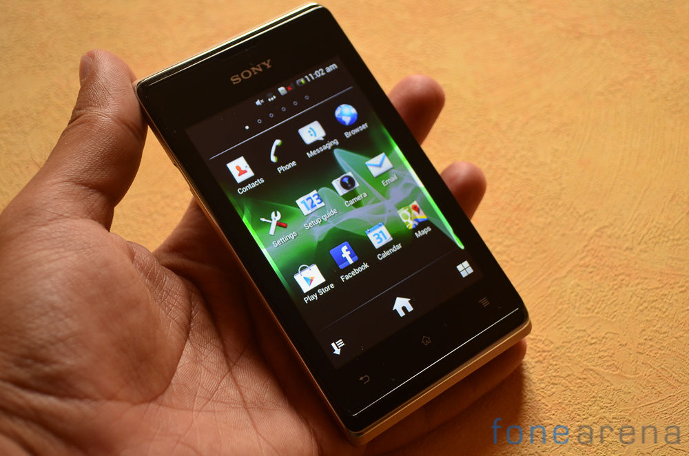
The Xperia E Dual is an entry level device but doesn’t skimp out on the quality of materials. Sony has used quality plastics all around which will stand long term use with ease. The design leans towards being generic but it does have elements that highlight the work put in towards it.
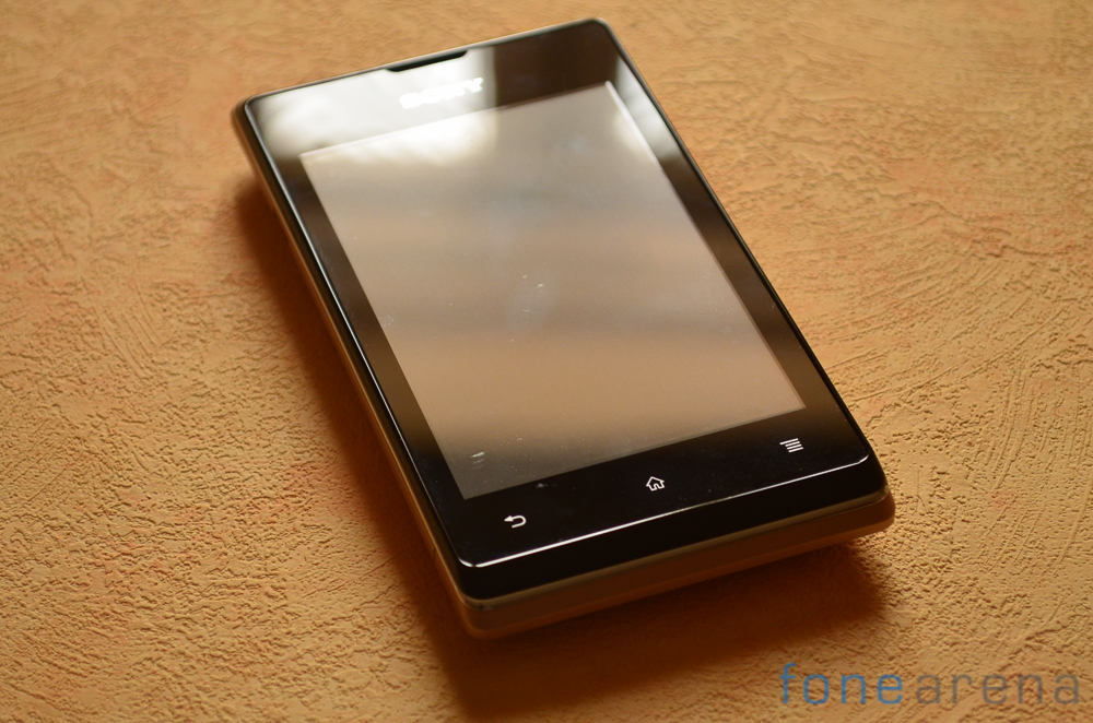
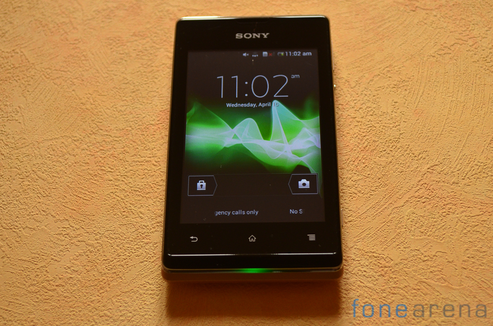
The front of the phone has a 3.5 inch HVGA display. Below it are capacitive buttons that unfortunately do not light up. The buttons however are responsive enough and register feedback even at the lightest touch.
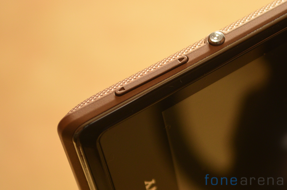
Towards the right side of the phone you can find the volume rocker, power key and camera key. The keys provide good enough feedback and are very easy to access.
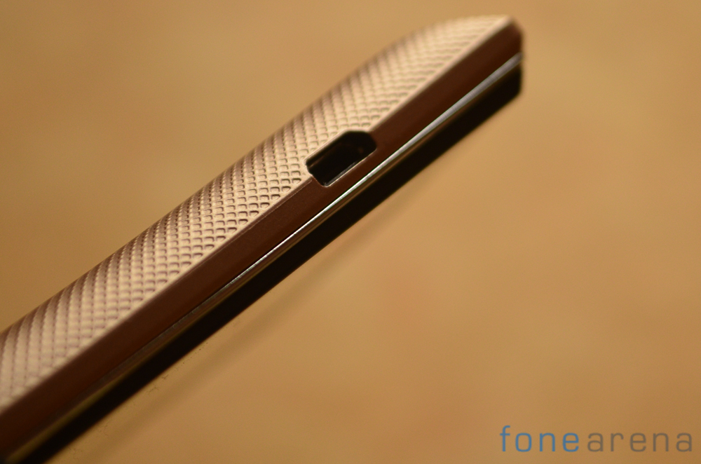
The left side lacks any buttons except for a lone micro USB port meant for charging and syncing data with your computer. Towards the top is the 3.5mm jack to use with headphones.
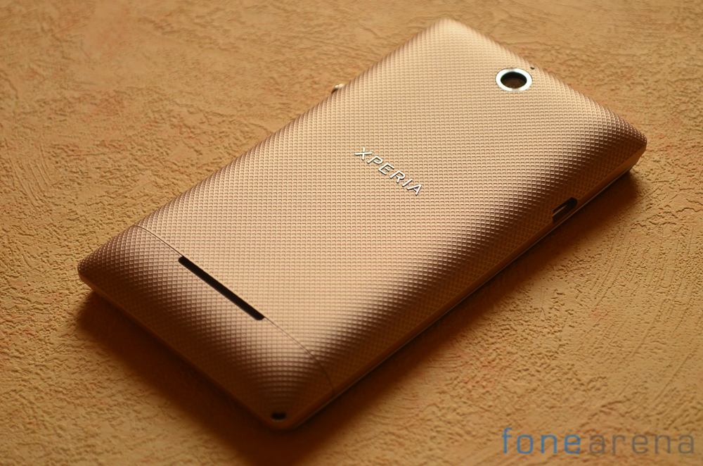
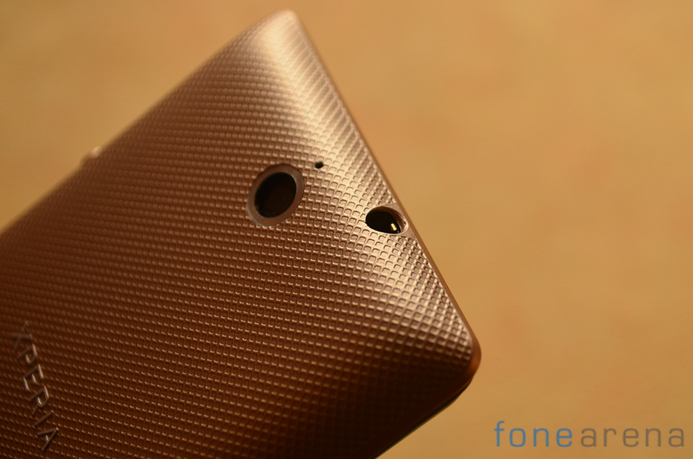
Sony has used an interesting texture on the back of the phone. The weave like pattern and the grippy material used results in a device that won’t easily slip from your hand. The plastic back easily opens up to give you access to the SIM card, micro SD slots and the removable battery.
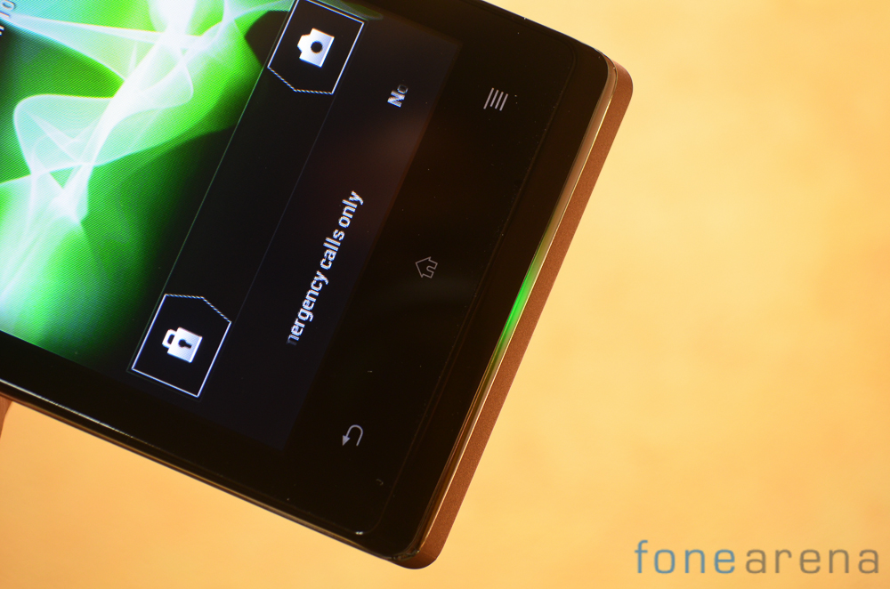
A very cool addition that sets the Xperia E apart from the competition is the led embedded in the lower half of the phone. The display & light take up the hue that is set in the phone theme. It is possible to further control this RGB led via third party apps available in the Play store which offers a whole lot of possibilities.
Software
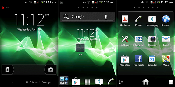
The Xperia E has a UI that is reminiscent to every other Sony Xperia device that you might have used in the past few years. The skin is not too resource intensive and brings some cool additions to the OS. As the UI layer is very similar to what we’ve seen previously, we’ll just touch upon some of the more interesting aspects.
The lockscreen offers quick access to the camera and allows you to switch profiles with a simple swipe. Coming to the homescreen, if you’ve seen a Sony Xperia phone you’ll be right at home over here. A couple of widgets for weather information, music player and quick access toggles are included. The app launcher allows you to rearrange applications in alphabetical order or a custom sort.
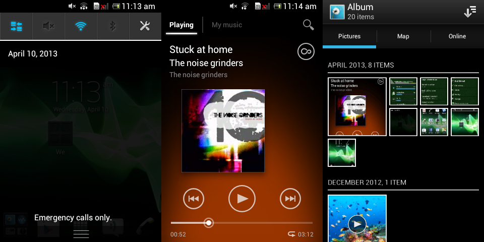
Sony’s customizations extend to the pull down notification bar where you can find quick access toggle for vital functions. The Xperia E Dual also gets the same music player and photo gallery app that we love from the flagship models. The music player has a very Windows Phone like vibe and gets all the basics right. The photo gallery allows you to sort images by month and additionally, it can overlay them on a map which lets you see where exactly you took the photos provided you have geo tagging switched on. It is also possible to pull in your image feeds from a range of online services.
Performance
When we talk about budget devices like the Xperia E, benchmark scores aren’t the most important thing that we look as real life usability is what is more important. To its credit, the phone remains fast and fluid in all but the most demanding usage scenarios. The interface is well optimized and we couldn’t spot any perceptible amount of lag. Popular games like Temple Run work just fine. The phone is powered by a 1 GHz Qualcomm Snapdragon MSM7227A paired with the Adrena 200 GPU and 512MB of RAM. The limited amount of RAM may affect the multitasking potential of the phone depending on your usage pattern. We’ve included a few popular benchmark scores below if that interests you and you can check out our separate Sony Xperia E Dual benchmarks page for the complete range of scores.
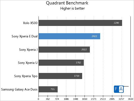
Quadrant has become a de-facto benchmark for Android devices so we’ve included it above. The phone scores well above other devices from the same stable which are placed above the Xperia E in pricing. The Intel Atom powered Xolo X500 performs much better in the Quadrant benchmark.
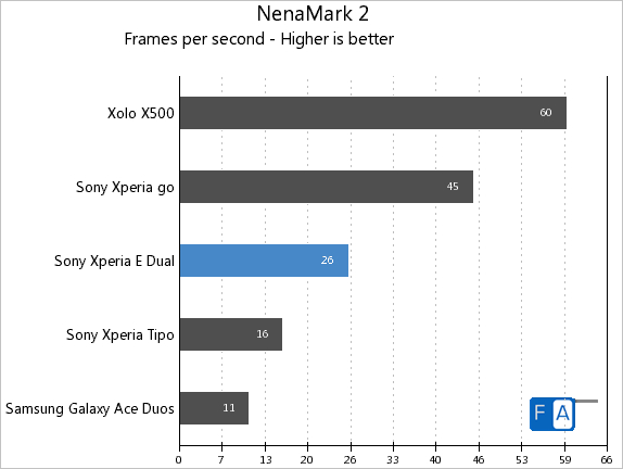
The Xperia E is handily outpaced by the Xperia Go and the Xolo X500 due to the rather anemic Adreno 200 GPU in the phone. It is sufficient to play popular games like Temple Run but you might face issues with more graphically intensive apps and games.
Display
The screen on the Xperia E Dual has a resolution of 480 x 320. Stretched over 3.5 inches it offers 160ppi which is hardly something worth writing home about. The display is fairly bright but visibility under sunlight suffers.
The screen is vibrant enough to make watching video clips possible if not enjoyable. The screen itself is adequately responsive.
Camera
Over at the back of the phone you can spot the camera module of the phone. The phone lacks an LED flash which is a curious omission. A front facing camera is also missing.
The camera with a resolution of 3.1MP is clearly one area where Sony has really scaled back. Maximum resolution for video recording is VGA which again is quite disappointing. The camera performance here is possibly one of the worst we have seen in a long time.

The camera struggles to get a focus lock on close up objects. As displayed in both the shots, white balance is totally off as well.
Photos shot even in bright light are incredibly low on details. Noise levels too tend to be on the higher side. We really cannot recommend that you use this camera to record anything of importance. It might suffice for the occasional snapshot but that’s about it. Low light performance images are unusable for the most part.
Battery Life & Connectivity
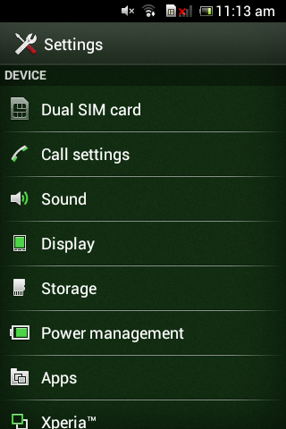
The Xperia E Dual as the name suggests is a dual SIM phone and accepts two mini SIM cards. The slots are located under the battery and can be accessed by removing the rear cover. A Dual SIM section is provided under settings to allow you to configure it to your liking.
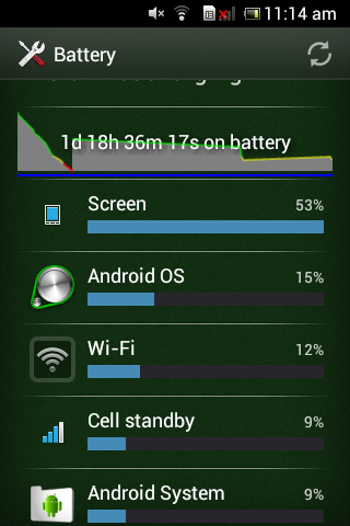
The battery is a 1530 mAh unit. We were positively surprised by the battery life we could squeeze out of the handset. With moderate usage, it is possible to get a day of usage.
With the phone connected to a WiFI network and a fair amount of usage. We managed to get almost 2 days of standby before the phone gave us the first low battery warning. It is possible to further extend battery life via the Power Management settings pre configured by Sony.
Conclusion
The Xperia E Dual is not the best handset that you can get in the budget segment but it is a solid offering nonetheless. Good build quality, long battery life and a reliable software build means that if the essentials are what you care for then this could be the handset of choice for you. Those who desire a higher level of performance or a great camera may want to look elsewhere. The Xperia E Dual is available for Rs. 10,990.
Pros
- Good build quality
- Decent battery life
- Innovative notification LED
Cons
- Poor camera
- Middling performance
- No front facing camera

