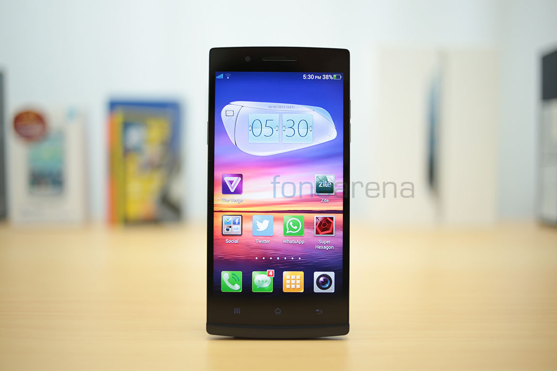
Oppo, a little known brand in the world of smartphones is actually an up and coming player in the consumer electronics world, based in China. Started very recently in 2004, the company has dabbled with Blu Ray players, LCD TVs and various other consumer electronics products and had taken up to smartphones with the launch of the Oppo Finder last year, once the world’s thinnest smartphone and now, the Oppo Find 5. The Oppo Find 5 is, by all means, a flagship product. With great design, build and hardware specifications backing the device, Oppo has the audacity to make it one of the best Android hardware on the planet, but has it? Lets find out.
Video Review
httpv://www.youtube.com/watch?v=QVSps35zQmQ
Box Contents –
Right from the beginning, Oppo has vowed to impress us, and that starts with the box itself. Built like a premium jewel box, it definitely wowed us. Have a look at the our unboxing post for more details.
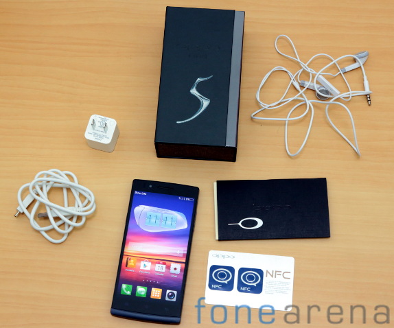
You get the phone, the SIM ejector tool accompanied by user manuals in a slick compartment, a stereo headset with mic, a micro USB cable and a compatible power plug inside the box. Additionally, you get configurable NFC smart tags for personalized functions in a single tap.
Design, Build and Ergonomics
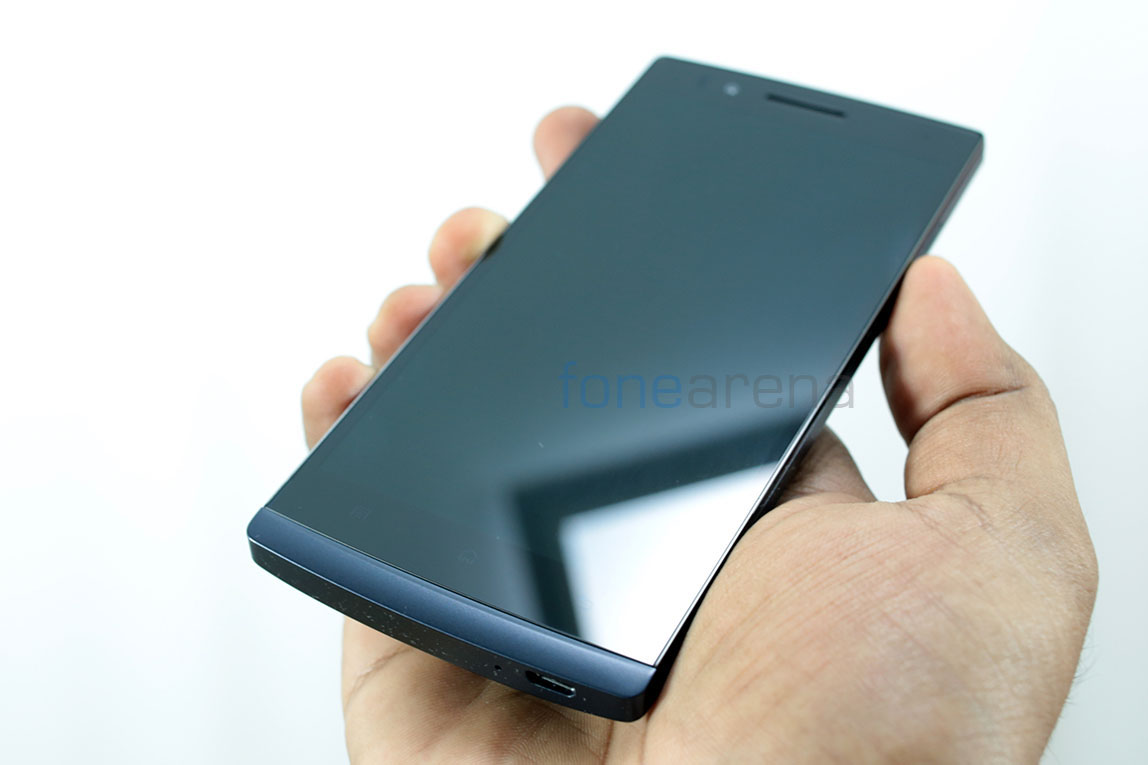
A simple way to describe the design of the Oppo Find 5 in two words would be “Stealthy dark”. We have the midnight black edition and it is an absolute looker. The device is not exactly black though, it has a very dark blue tone to it, much like the midnight indigo sky.
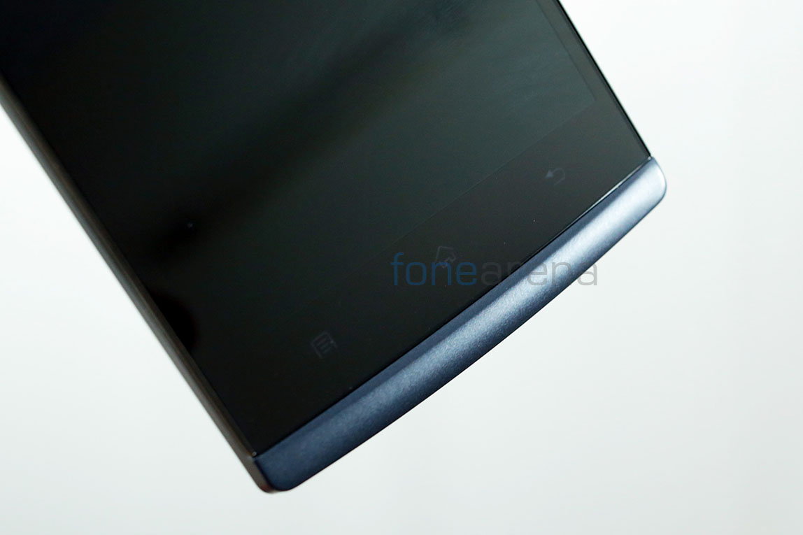
Slightly curved corners and a stern flat front reminds us a lot of the Sony Xperia S, with a similar “chin” slightly protruding at the bottom of the phone.
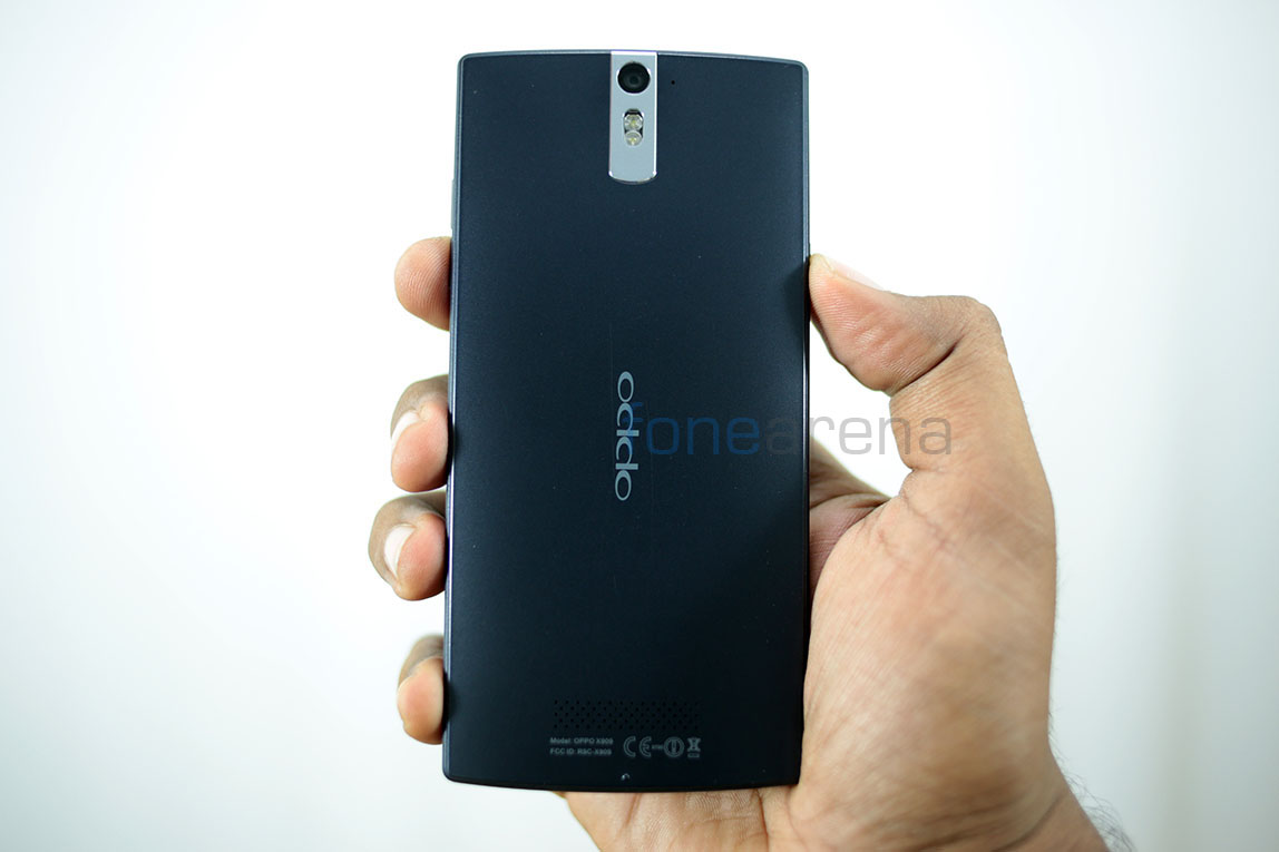
The back is slightly curved to fit nicely with the hands, with a beveled outline meant to give it an unique look. The whole “invisible” design makes it look really slick, especially when the display is turned off. This slick device is fit to be used by a ninja.. or perhaps Sam Fisher, because it is definitely an awesome looking device any spy would lust after. The stainless steel strip around the camera on the back adds a certain “executive” look to the device, with its plain flat presentation.
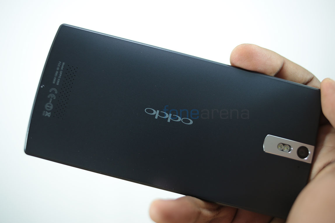
Majorly built of high grade dense plastic, the build quality of the Oppo Find 5 is unparalleled by any other plastic based smartphone on this planet. That includes the highly praised Nokia polycarbonate and others too. While aluminium based devices are of a different breed, the Oppo Find 5 redefines how plastic based smartphones can be, and it is of excellent build.
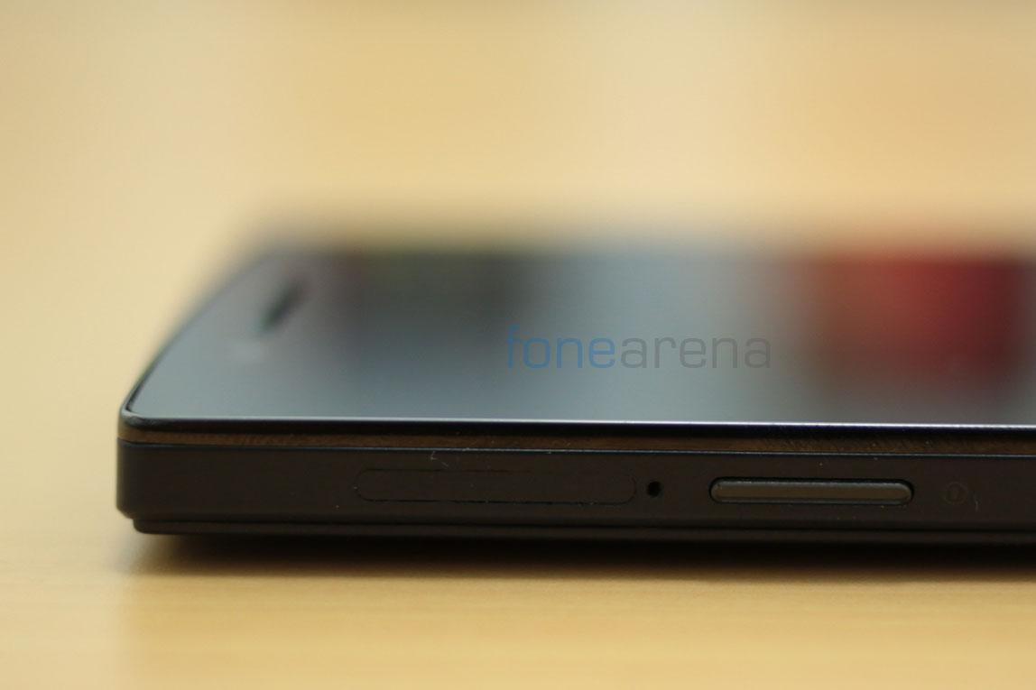
The glass on the front is surrounded by a thin raised strip of aluminium, painted in black. While it may prove to be a minor hindrance while taking calls, it is otherwise a good decision, for the sake of the glass. Even the buttons on the sides are of very high quality, like the ones you usually see on a high end Blu Ray player. I guess that’s where Oppo took their design cues from. Made from a single piece of dense plastic, the body is solid and has no moving parts.
Being a 5 inch device, the ergonomics are bit on the negative side. While the extremely thin bezels make it super narrow and easier to hold in one hands, the overall height of the device makes it hard to fit into denim pockets, mainly the front sided ones. Most of the times, especially while riding on a bike, I consciously adjusted the device so that it would be sideways and not straight, which would have meant the device jutting out of my pockets. And no, front shirt pockets are a no go. Also, thankfully there are no controls on the top of the device.
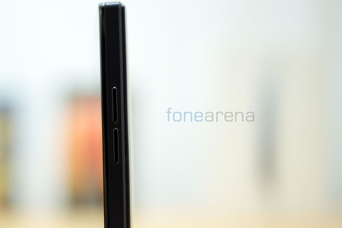
Coming to the dimensions, the device is just 8.9mm thick and weighs 165g. Due to the smaller surface area, the weight actually becomes noticeable. While it is not a dealbreaker in any way, the device reminds you now and then that it is built like a tank and you wouldn’t wanna break someone’s head with it. Advantage of the weight is of course the extremely reassuring build quality, a good compromise we guess. Overall, the Oppo Find 5 is a slick stealth tank in terms of design, build and ergonomics. Lets move on to the hardware walkthrough then.
Hardware Walkthrough
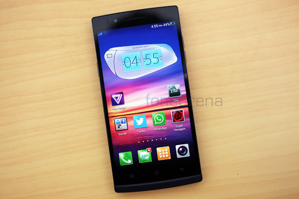
The front is dominated by the 5 inch full HD IPS display with the glass covering it. The display has an ultra thin bezel with almost an edge to edge perception.
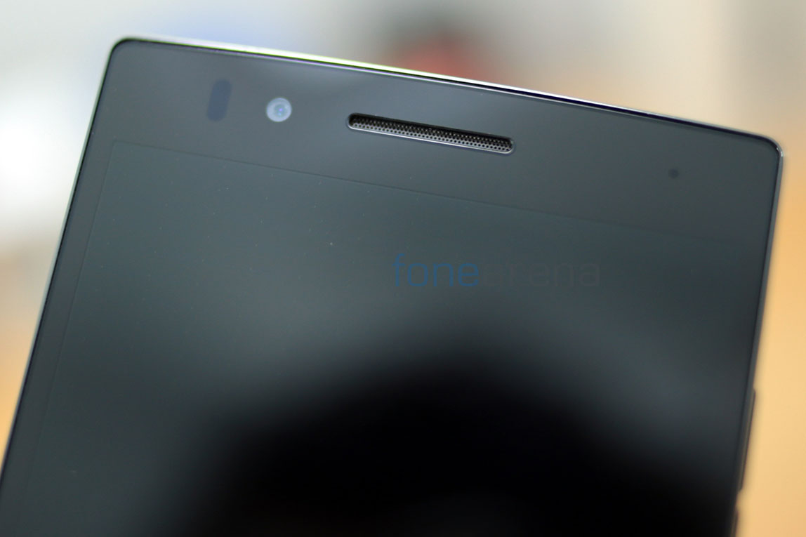
Above the display you have the 1.9 MP front facing camera, the ear piece and the usual pair of sensors. Additionally you have a notification LED too, which is the small dot on the right.
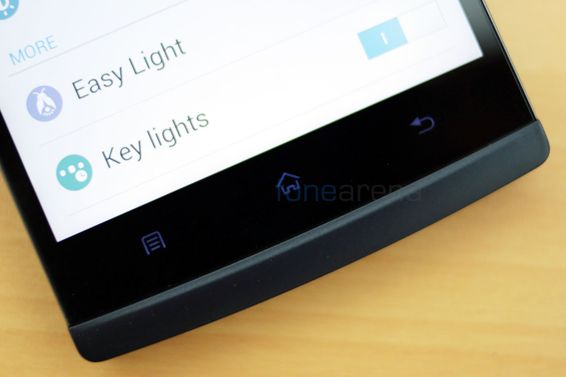
Below the display resides the three capacitive Android shortcuts that light up along with the display. One major inconvenience with the capacitive shortcuts is that they are very close to the display. So close that most of the times I was pressing the home key instead of the space bar on the keyboard. It was annoying at first and then I learned to be careful and thank goodness for Android’s multitasking prowess, most of the stuff I wrote in a message were still there after every mistake.
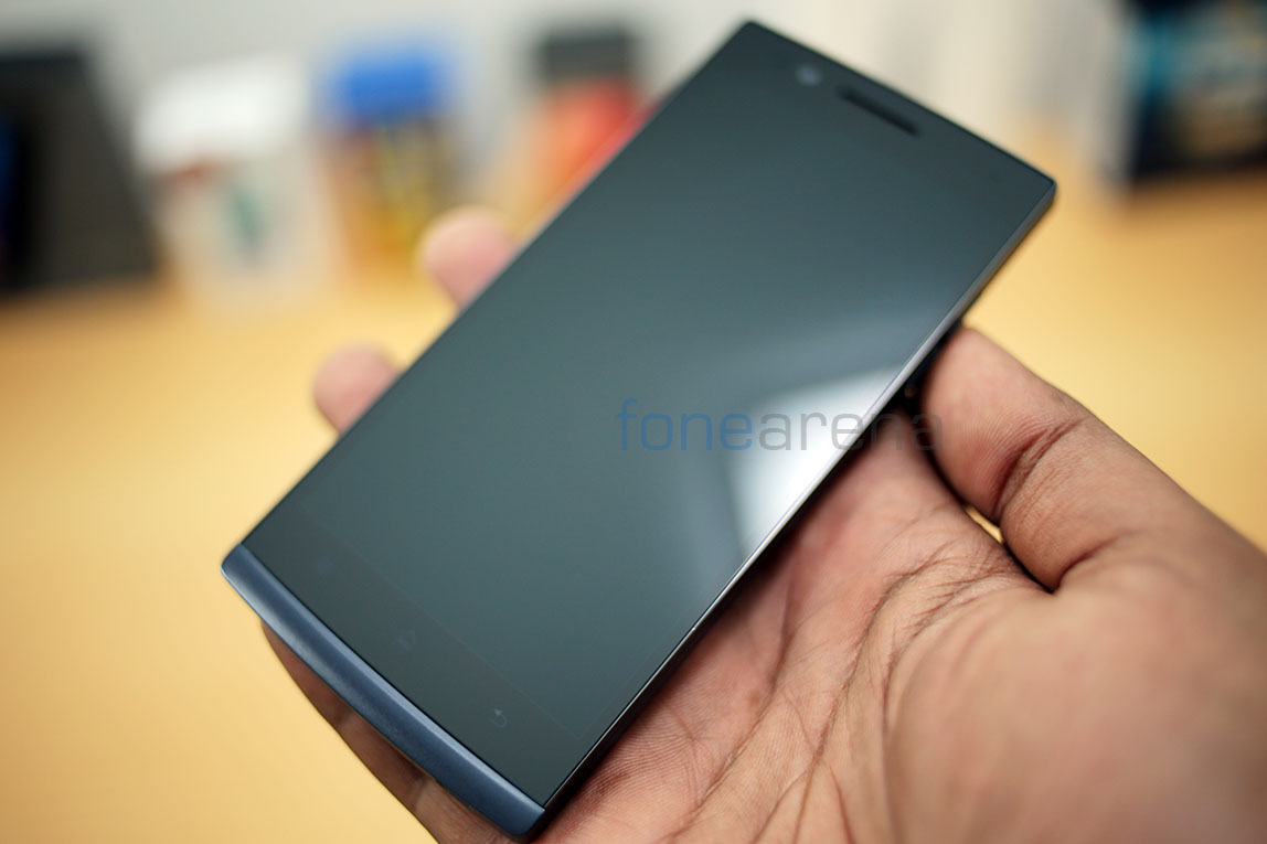
The display, the components and the capacitive buttons all are engulfed by a single piece glass that runs edge to edge till the bottom chin part, which in turn is a continuing part of the back. As we saw earlier, there is also the extremely thin aluminium strip runs around the glass on three sides, with a very slightly raised rim protecting the glass.
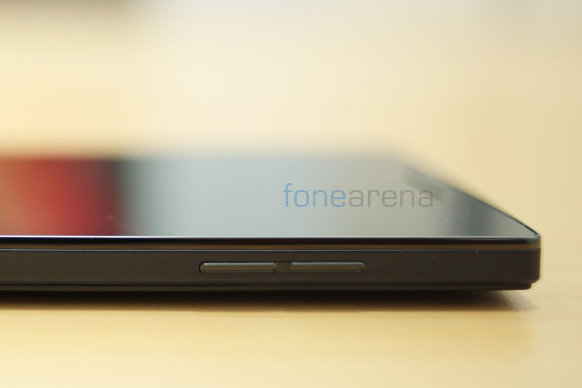
On the right side of the phone, you have the volume rocker, which have a bit of a shallow key press and also work as unlock keys, hence eliminating the dependence on the power key which is placed on the left side of the phone.
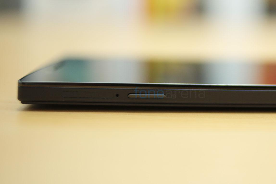
Interesting to note that Oppo has made the button placement comfortable for left handed users than the right handed ones. While it was disorienting at first, I slowly got used to it, mainly thanks to the accidental presses of the volume rocker waking the screen.
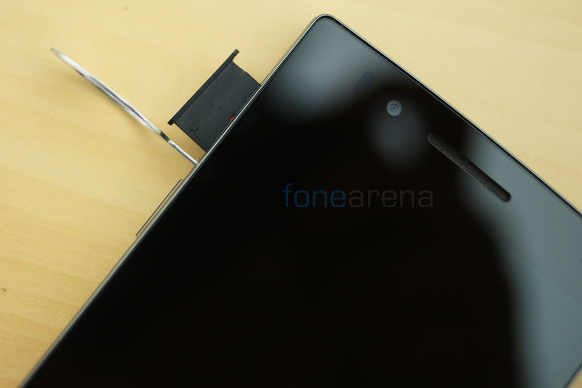
Also on the left is the slot with a micro SIM tray which opens with a pin(given in the box).
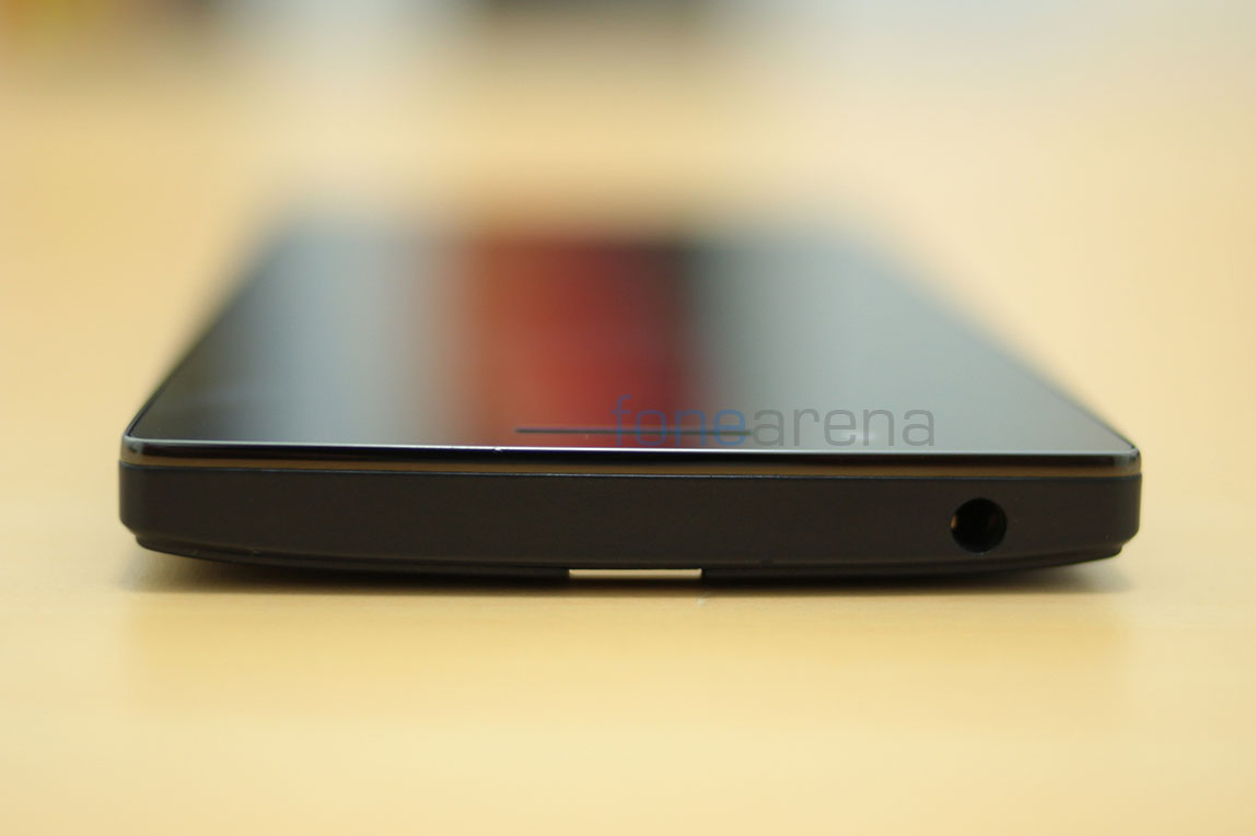
Over at the top you have the 3.5 mm audio jack placed leftwards off center.
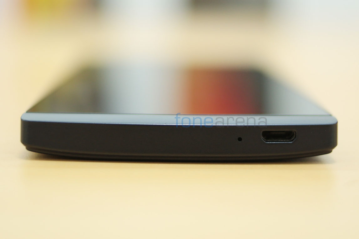
Over at the bottom you have the micro USB port for PC connectivity and right besides it is the primary microphone for voice calls.
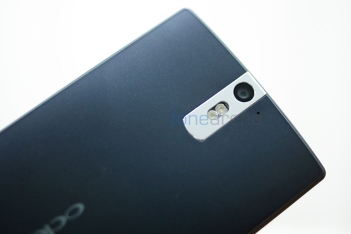
At the back of the phone is the 13 megapixel camera unit with dual LED flash housed in a stainless steel camera strip. Even the camera strip is nicely beveled and is scratch resistant. Accompanying the camera is the secondary microphone for stereo audio recording in video. Down below, you have the amazing loudspeaker that has Dolby-enabled hardware for crisp and loud audio output. More on that later.
So that’s it for the hardware walkthrough, lets jump into the juicy details then.
Display

Initially when we witnessed the Oppo Find 5 at the Mobile World Congress, there was one thing that completely stood out and that was the display. It’s no different now, and it’s easily one of the best displays we have seen on the market. Spanning 5 inches in the diagonal and sporting a crazy 1920×1080 resolution, the IPS LCD panel has all the ingredients for terrific performance. The display is closely bonded to the glass, in fact one of the closest bonding we have seen and that makes it look like the display is floating on the surface of the glass. Oppo calls this OGS(One Glass Solution) technology. The technology, which we feel is one of the outstanding features of the display, is explained in a brief animation promo here –
httpv://www.youtube.com/watch?v=qg3v5Ph0vbI
One of the very few displays in which the colours stayed unwashed at every viewing angle. So, yes, the display has amazing viewing angles.
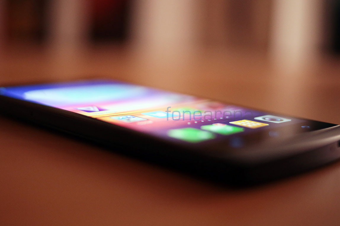
The brightness, the colour reproduction, the pixel density(443 ppi) and the overall performance, led us to believe that this was one of the best we had seen on a smartphone. Colours are nice and punchy, whites are perfect, contrast is excellent and the ambient backlight control is perfect, need we say more? However, the bane of all smartphone displays is bright sunlight, and much like other excellent displays such as the HTC One and the Galaxy S4, this one too fails to keep up with sun. But at auto brightness, it does try its best in boosting up the brightess and manages to stay pretty readable. Again, this is easily one of the best displays we have seen on a smartphone, and kudos to Oppo for that.
Camera
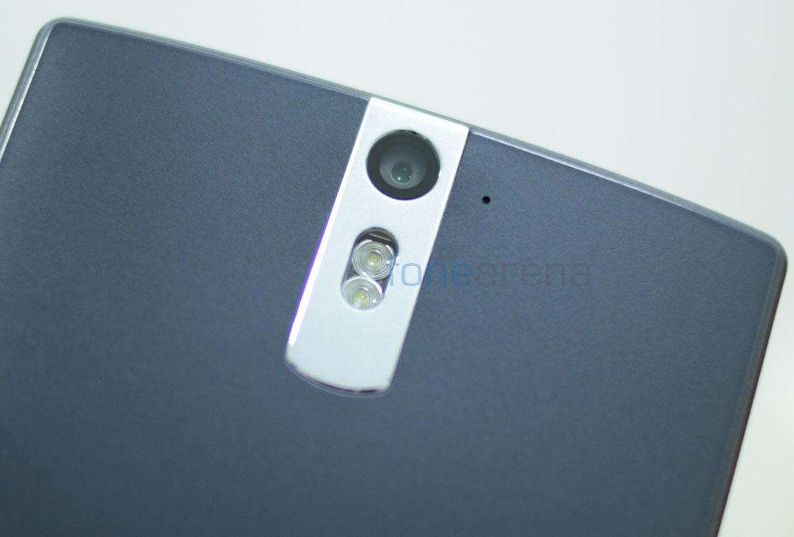
The camera unit on the Oppo Find 5 is a Sony-made Exmor RS 1/3.06″ 13.13 Megapixel stacked CMOS sensor coupled with a clear and fast F2.2 aperture lens. First off, we need to understand what a stacked CMOS technically means –
The stacked structure of the Exmor RS sensor “layers the pixel section, containing formations of back-illuminated pixels over the chip affixed with mounted circuits for signal processing, in place of conventional supporting substrates used for back-illuminated CMOS image sensors.”
Basically, instead of placing the pixels on a substrate, they are directly affixed over the DSP while a traditional back-illuminated sensor has both the pixels and the DSP over a supporting substrate thereby reducing the amount of light falling on the sensor. Coupled with an unconventional RGBW on-chip encoding, the stacked CMOS sensor outputs great images in most lighting conditions. Thanks to the RGBW arrangement, the additional white pixel in every RGB cluster helps in increasing the brightness on the photo, hence vastly improving the low light performance, but also adding white noise to extremely low light pictures with uneven light distribution. We also found out from Oppo that the lens unit uses a 4 layer coating with a blue glass filter, for improving the clarity.
Technical jargon aside, what everything above means to you, the end user, is that the camera takes great pictures, and we have a lot of samples to prove that.
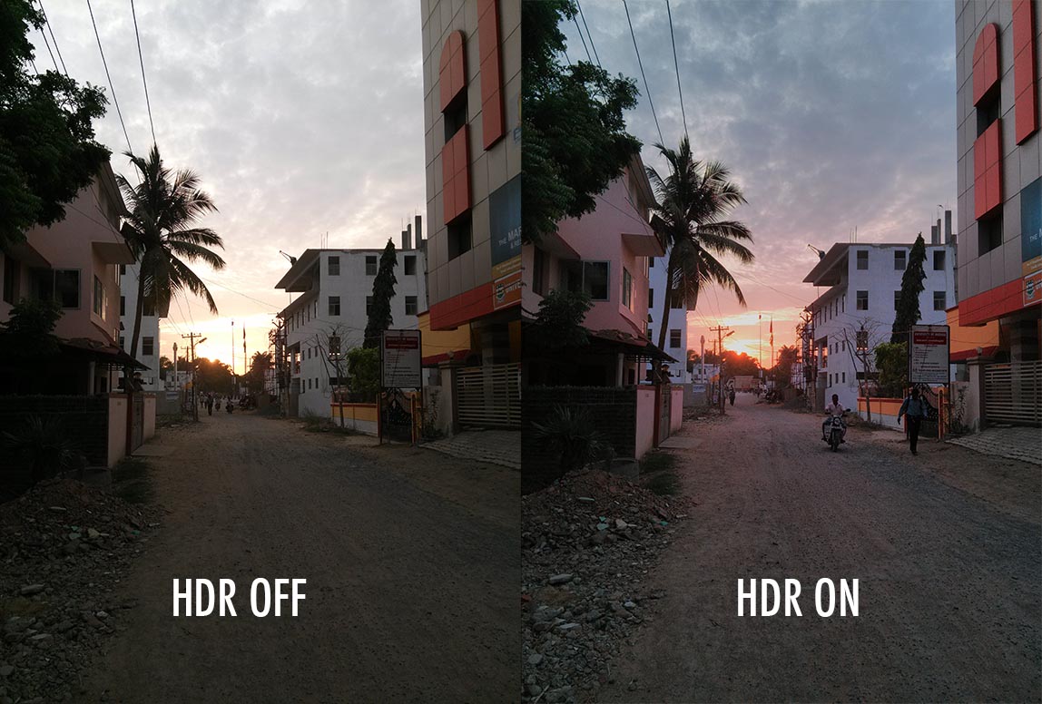
Image quality excelled in most lighting conditions with only the extreme low light conditions with uneven lighting giving it a challenge, as mentioned above. Even pitch dark conditions were reasonably handled well by the Oppo Find 5. The most interesting feature of this camera though, is the HDR mode. The “High Dynamic Range” mode in the camera lets you take quick burst of differently exposed pictures and merges them immediately to give you a picture that has light in shadows as well as the highlights with a damn good leveled out saturated image. Here are some camera samples of the HDR mode mostly in similar conditions and places as the images above, and a relative comparison of one image just so you see the brilliant difference.
Note: Some HDR samples have been resized due to file size limit on WordPress
This is one of the few phones in which there is a tangible difference between the normal and the HDR photo. However, we did notice a higher amount of noise and saturation in all the HDR photos, which made them look artificial sometimes. Nevertheless, I would suggest use the HDR mode, which takes photos almost instantly and you won’t even notice much shake or movement, which is really impressive! The Oppo Find 5 takes full HD 1080p video at 30 fps, with modes for 720p, normal 480p at the same 30 fps frame rate and surprisingly, a slow motion 480p video mode which records videos at 120 fps. Before we delve into the details, here are three video samples – Normal, HDR and Slow motion footage.
Normal –
httpv://www.youtube.com/watch?v=0GL0UVsml2U
HDR –
httpv://www.youtube.com/watch?v=hPLSt9t87bA
120 fps 480p High Speed video sample –
httpv://www.youtube.com/watch?v=7s2LLoaTICc
While the video quality in full HD is generally good, it is nothing spectacular like the photos. Perhaps the still camera raised our expectations too much. Another pitfall in video recording is that the camera, in low light conditions, drops the frame rate to compensate for the exposure, which is good in some, but in more ways not. Especially with video, we feel that frame rate should be given more priority than exposure. The slow motion footage, which recorded in 480p at 120 fps, is of predictably low quality but makes up for it in its value and thanks to the crop factor, the shake is compensated rather very well. The slow motion footage we recorded, with added music, might look a bit dramatic even. In that way, the novel mode works out in favour of the users. In terms of HDR video, the frame rates and the bit rates are lower due to multiplication on frames ever second, which was a bit disappointing.
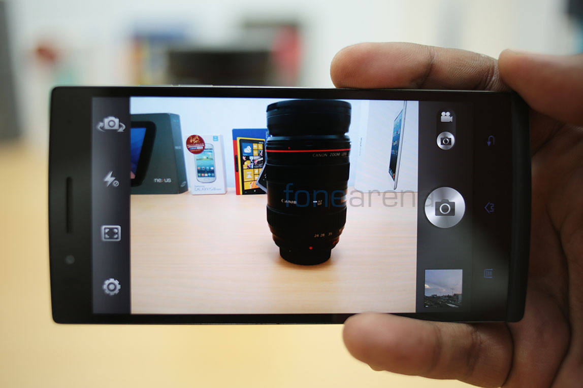
The camera UI was simple and beautiful to use. The shutter button on long press goes into burst mode, and even the volume rocker can be used as a hardware shutter button. As expected there are quick shortcuts for most wanted functions and modes. As mentioned above, there are modes for Panorama and HDR in stills, and various frame rate modes in video. Along with HDR video, these are some of the many options you get in the UI. You can even turn the audio off if needed. Here are some screenshots of the camera UI –
Talking of audio.. With two microphones at its command, the audio is recorded in stereo with the AAC codec at 48 KHz. Weirdly enough, we noted that the audio recording starts off with a high pitched hiss and then quickly corrects into a quieter and a cleaner audio. We think it might be the work of the noise cancellation feedback algorithm that is supposed to start before the video, but instead starts once you press the shutter key. A minor annoyance that might be fixed in the software soon.
There is a 1.9 megapixel front facing camera, and it is awesome. Rejoice, Skypers and selfie-junkies! Even the front facing camera can take awesome HDR images, and is of very high quality. With a wide angle lens to support the sensor, the front facing camera is similar to what you would see in recent HTC FFCs that are equally really good! So, overall, the stills camera is really awesome, we’d wager that it is on par with the Samsung Galaxy S4, which co-incidentally sports the same sensor + lens module. Lets move on to the internals then.
Internals
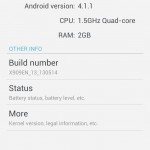
The Qualcomm Snapdragon S4 Pro APQ8064 might be already considered outdated owing to the growing number of devices that already support the newer Snapdragon 600, like the HTC One for example. But, the S4 Pro is still powerful and is definitely the second fastest Snapdragon chipset available in the market now. While the processor, in terms of raw power, is no slouch, we did feel that the 1080p display might be dragging the GPU down. Similar to the Xperia Z, we did find some lag here and there, but overall experience was butter smooth. It has a 1.5 GHz Quad Core Krait CPU under the hood with the Adreno 320 GPU powering the graphics. Here are some synthetic tests we did earlier, which might answer your doubts regarding the performance –
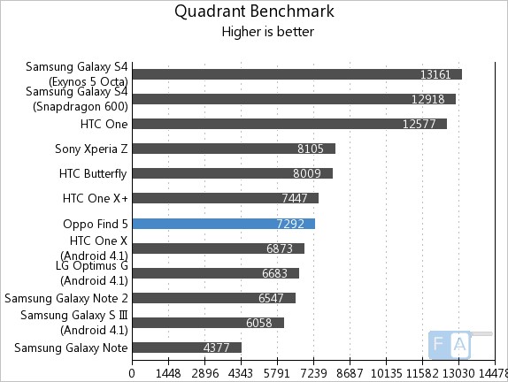
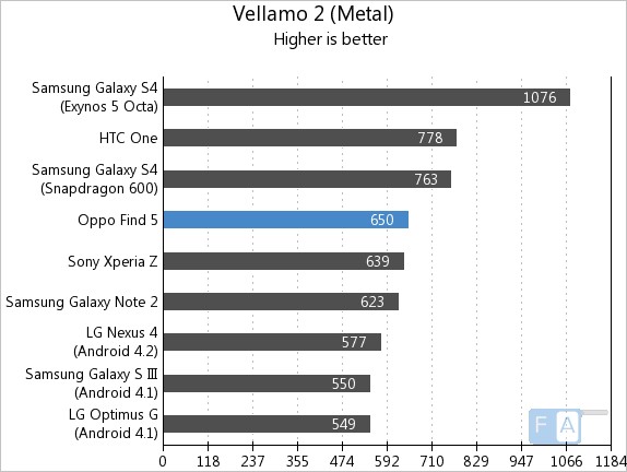
More benchmarks here. And hey, if you had been wanting to know how games work on the Oppo Find 5, here you go –
httpv://www.youtube.com/watch?v=XsjmPCCg6Bk
As you might have noticed in the video, yes, it does heat up while doing graphically intensive stuff like gaming. In fact, anything that involves either the GPU or the 3G modem, it promptly heats up. Also, the phone becomes way too hot if used while charging over 3G. May be we were pushing it too hard, but we do it for all the phones we test anyway, and the fact that this overheats is probably a concern for us.
In terms of memory, it has 2 GB of RAM, out of which 1.87 GB is usable, with the rest allocated for the GPU we assume. On a fresh boot, we had about 600 MB of RAM occupied and it gradually rose to 1.2 – 1.3 GB while using 5 – 7 apps at a time. We never ran out of RAM of course, but we did see some slow downs when it reached more than 1.5 GB but thanks to a quick “End all” button in the multi tasking menu, we were able to get back to normal rather soon. The device comes in two ROM variants, 16 and 32 GB, and ours being the costlier mid night black edition, it came with 32 GB of internal storage out of which 1.97 GB was dedicated to app storage and 25.23 GB was dedicated to rest of the storage needs, which included app data too.
There is no expandable storage on this device, but we doubt that will be a problem. The ROM storage can be accessed from a PC or a Mac using the mass storage mode or the player-friendly MTP mode.
Connectivity and Call quality
Usual suspects like BT 4.0 and WiFi 802.11ac with wireless display are a part of the APQ8064 chip, but additionally Oppo has made available a hexaband 3G HSPA modem, which performs well, in our tests. We never lost connectivity or dropped calls, and 3G data performed admirably well, with top notch speeds as one would expect. As we mentioned earlier, the heating issue while tethering over 3G was a slight annoyance we were reminded of, every time we try it. It has a NFC chip built-in, and is used for BT file transfers as well as for writing tags.
Call quality was good overall, except for the experience which was slightly hindered by the raised aluminium frame around the display that manages to be slightly painful for the ears. Callers had no problems hearing from our side, and the headset’s microphone worked really well too. The loudspeaker on this phone is really loud and great for conferences if needed. Talking of the loudspeaker..
Music and Loudspeaker
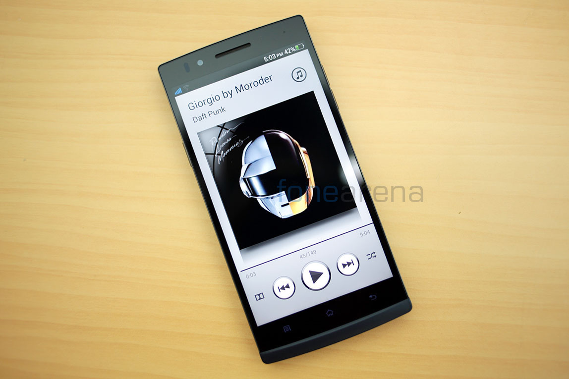
The music features of this device are definitely worth a separate mention. The Oppo Find 5 is one of the first devices in this world to be powered by Dolby Stereo as well as Dirac HD, both being great audio technologies. While Dolby is usually completely software based, the Oppo Find 5 has it in its hardware too, while Dirac HD takes it to entirely another level. The default music player bundled with the OS comes with options for toggling the audio effects to “no effects” “Dolby Mobile” or “Dirac HD”. Lets talk about Dolby first.
Dolby Mobile technology basically is a software based audio processing algorithm that widens the sound across all the frequencies and gives out a punchy bass. It is also enforced in encoding, not just decoding. For example, all the videos recorded/decoded on the Find 5 are Dolby enabled, and the most impressive thing is, it directly takes advantage of the Find 5’s loudspeaker.
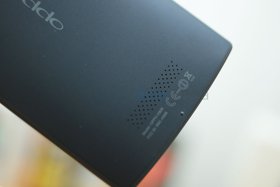
When the Dolby effects are turned on, the loudspeaker on the Find 5 comes to life with amazing quality and punchy sounds. Easily one of the best loudspeakers there is, and lines it right up with the HTC One’s Boomsound speakers enhanced with a similar Beats Audio technology. However, there was no Dirac HD mode for the loudspeaker, which brings us to Dirac HD itself.
Basically, Dirac HD is tailored proprietary audio processing. It is not just software, but software tailored for specific hardware and that’s where it shines. By mapping out the acoustics of the corresponding hardware, Dirac provides a special chip tailored to the loudspeaker or the earphones, thereby maximizing the optimal output. The Dirac HD sound makes music sound as original as possible with little amplification and a streamlined clear sound output. From the Dirac website –
What are the benefits of Dirac HD Sound?
In short, the main benefit of Dirac HD Sound is that it improves the loudspeaker characteristics, yielding a better sound in terms of:
– Improved staging (localization of sound events)
– Better clarity and intelligibility in music and voices
– A deeper and tighter bass
– Reduced listening fatigue
We can attest to all the above advantages, they are definitely real. This tailored optimization technique has been taken advantage of by Oppo, by employing the chip inside the phone, which in turn is tailored for the in-box headset. Yes, the white headset inside the box is optimized for Dirac HD, and let me tell you this, this gave the best quality music I have heard in my whole lifetime. I am no audiophile, but Dirac HD would immensely please them for sure. If you are looking for the best audio experience on a smartphone, the Oppo Find 5 is the phone to get, period.
Software
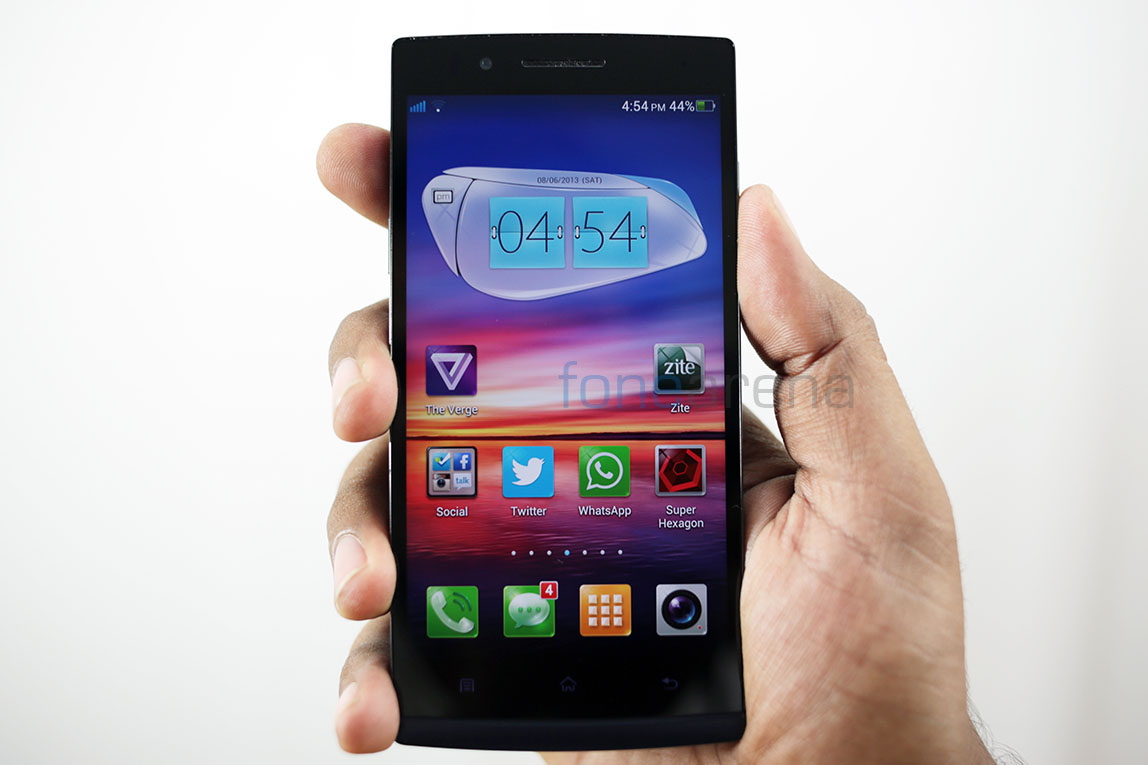
While the above 3000 and odd words sum up one of the greatest Android hardware of all time, lets get down to the software side of things. Running on Android 4.1.1, it is a good version behind the latest update, but Oppo has made sure you don’t notice them, because the UI doesn’t look anything like Android. With bold and big colourful icons, all based on a rounded square with a stationary dock makes it look somewhat similar to MIUI in the application list. But the homescreen and its special widgets are the ones that look sci-fi futuristic and completely out-of-place. We weren’t a big fan of the icons or the whole launcher itself, but it does provide some nice utilitarian features.
You can uninstall an app from the application menu just like how you do on iOS – long press and press the X. Wallpapers, widgets and screen arrangement plus organizing was made easy with just a long press. The persistent dock meant we had access to main functions on both the screens, reminding us of the Samsung Touchwiz UI. While we despised the look of the homescreen and the icons overall, the other parts of the OS were absolutely pleasing and splendid. With a light white plus dark gray theme applied to every bit of Android imaginable, it had a flat design that boded well with the awesome display. Add great fonts to that and you have got an user interface that is both beautiful as well as functional.
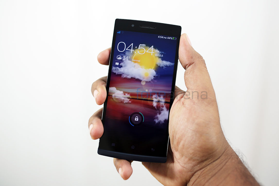
Talking of functional lets talk about the default apps and the modified interface. The lockscreen is a neatly designed screen with main information like date/time being static and call/message notifications being dynamic, with the status bar visible in a transparent layer. There are three styles to the lockscreen and the three vary in functionality and animation.
The “glass board” is bare bones and offers no shortcuts or extra information, but is a cool animation nevertheless. The “slipper unlock” has options to quickly mute the phone, but the overall best lock screen style under settings is the “weather unlock”. It has cool animations for weather, you can double tap on the clock to mute/unmute the phone, you can launch the camera straight from the lock screen using the shortcut and overall we found it the most functional.
Onto the notifications center now, it has quick toggles for almost anything imaginable. You can also re-arrange or edit it to you tastes. The best and most used notification toggle for us has been the one-click hotspot. Extremely useful. The multiasking menu is a nice little popup with rounded screens of all the running apps and a single “clear RAM” button. Swiping up closes the app and swiping down “pins” the app to the multi tasking screen, which never closes even if you press the clear button. At a time, only three thumbnails are visible, with others revealed in a swipe to the left.
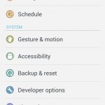
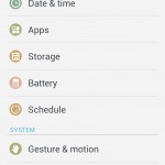
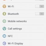
The settings menu is considered the most important aspect of any Android phone and the Oppo find 5 shines in this respect. Sporting a pivoted design, the settings are nicely segregated in columns with very interesting features. The pivot “General” has all the connectivity settings, for BT, WiFi, Wireless Display, NFC and mobile networks and its supplements. Additionally you get the usual Android settings for apps, storage, battery till about phone. Only thing added here is the gesture and motion settings which offers options for “Easy answer” which lets you answer calls without having to use the touchscreen. You just need to place the phone on the ear to answer. And then there is the ubiquitous “Double tap to go up” which enables iOS like list to top management. You can also schedule power cycles using set timings, which won’t affect the alarm clock.
The “Sound” pivot offers various control over the audio of the device, which is pretty normal, while the “Display” pivot directly offers options to change the launcher and set it as default, and even allows you to change the lockscreen as mentioned earlier. There are also settings for the notification LED and the key lights. Talking of notifications, this is one of the very few phones that allows you to control the notifications of each app, from a centrally located system setting, much like iOS. Also present under the same “Personal” pivot are the accounts, security settings, and granular control over data saving letting you add trusted apps. There is also a blocking mode in terms of “Blacklist” and “Permissions”. Overall, this settings apps is easily the most functional we have seen on a phone.
Apps
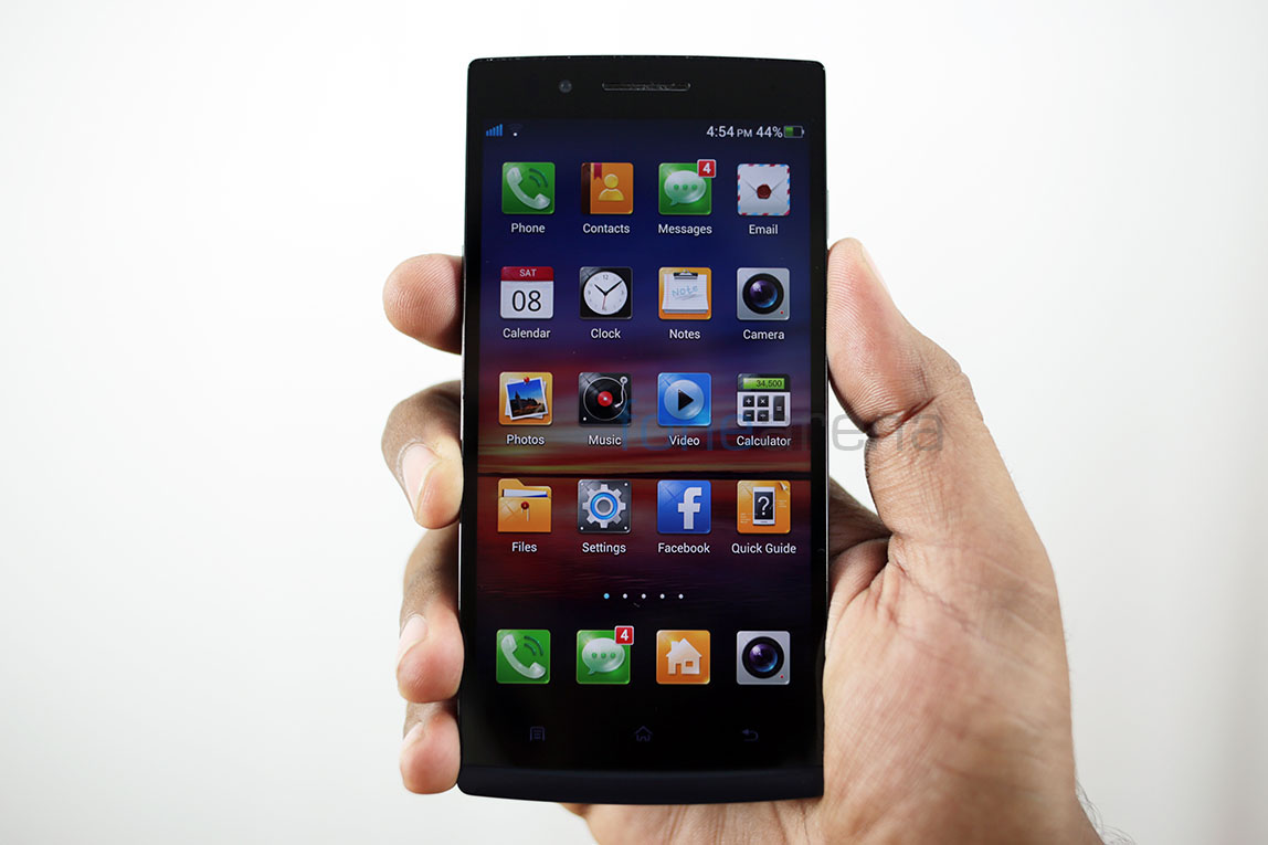
The Oppo Find 5 comes with most of the Google Apps pre-installed, but it’s the default apps that are good enough to be a differentiating experience. The dialer app is modified to correspond with the theme but its Achilles heel is that it can never stay truly in the running state, even if pinned. It always refreshes, and for a very important app such as the dialer, it’s a shame, but it’s choc-a-bloc with all the features you would expect. The messages app notifies each and every message over a pop-up which might be slightly intrusive at times. The file manager app is very neat with nicely segregated file types and quick access to FTP and DLNA. One of the best designed file manager apps in our opinion.
The gallery too, is neatly arranged in folders and offers a great experience, much better than the stock app. The videos app is barebones and offers playback of most video formats, with the video player having the option to pop out and overlay itself on a small thumbnail, much like the Samsung Pop-up play feature. The default music player app plays all the files perfectly well, with the aforementioned audio effects like Dirac HD and Dolby Stereo. Check out the screenshots for a better understanding.
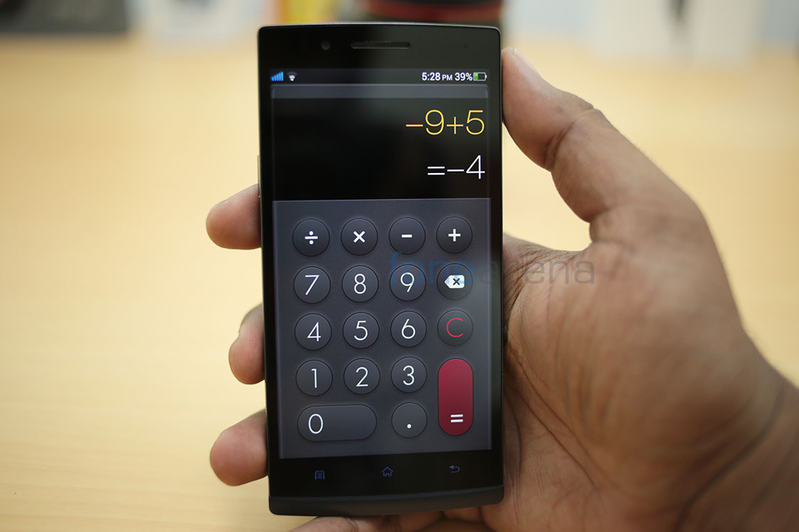
Not impressed enough by the calculator?, there is also a hastily built weather app, and interestingly, the Oppo forums app, which grants you access to the Oppo forums. It was amazing to note that the community was vibrant and the latest updates were actually made from consumer feedback. There is also a beta firmware in the works for interested forum members.
Battery Life
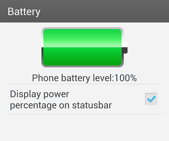
Sporting a 2500 mAH Li-ion battery, the Oppo Find 5 performs decently well under normal conditions but buckles under stressful ones. The battery life under normal use definitely ensures a day of usage and we assure you that, from our month long testing and regular usage as a main phone. The only thing that irks us is the battery app inside the settings menu, which is completely useless and can tell you only the percentage left and an option to display percentage on the status bar. The most annoying thing for our battery tests, we felt. But thankfully, there are a lot of third party solutions which helped us through.
Overall, the battery life was decent, but nothing extra-ordinary in our month long time with the device.
Conclusion
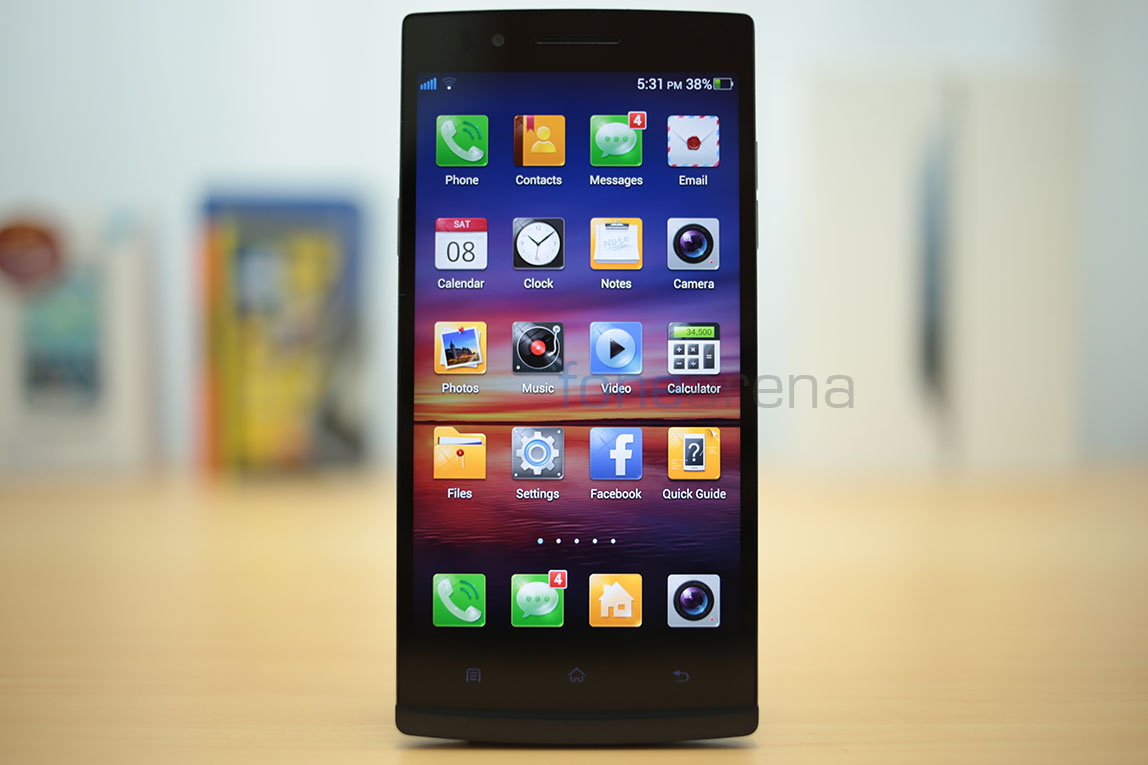
The Oppo Find 5 is a really awesome device. It has a great display, a brilliant stills camera with HDR, amazing design and build quality, excellent loudspeakers and music performance, and most of all, beautiful and functional software. However, we did feel that the custom skin was slightly overdone with respect to icons and widgets, the video camera was a bit underwhelming when compared to stills, the battery life was only decent and nothing spectacular for a 2500 mAH capacity, the phone heats up at times and might be a bit big/heavy and bulky for some.
Ultimately, at a price of just 499$ for the 16 GB version of the device, the pros easily outweigh the cons and definitely makes it one of the best Android hardware available on the market.
Pros
- One of the best displays ever
- Brilliant design and build quality
- Amazing stills camera with a top notch HDR mode
- Excellent music performance and quality loudspeakers
- Beautiful and functional custom skin
Cons
- Video recording a bit underwhelming
- Phone heats up at times
- Overdone icons and widgets
- Battery life not extra ordinary for a higher capacity
- Device might be bulky and too big for some


