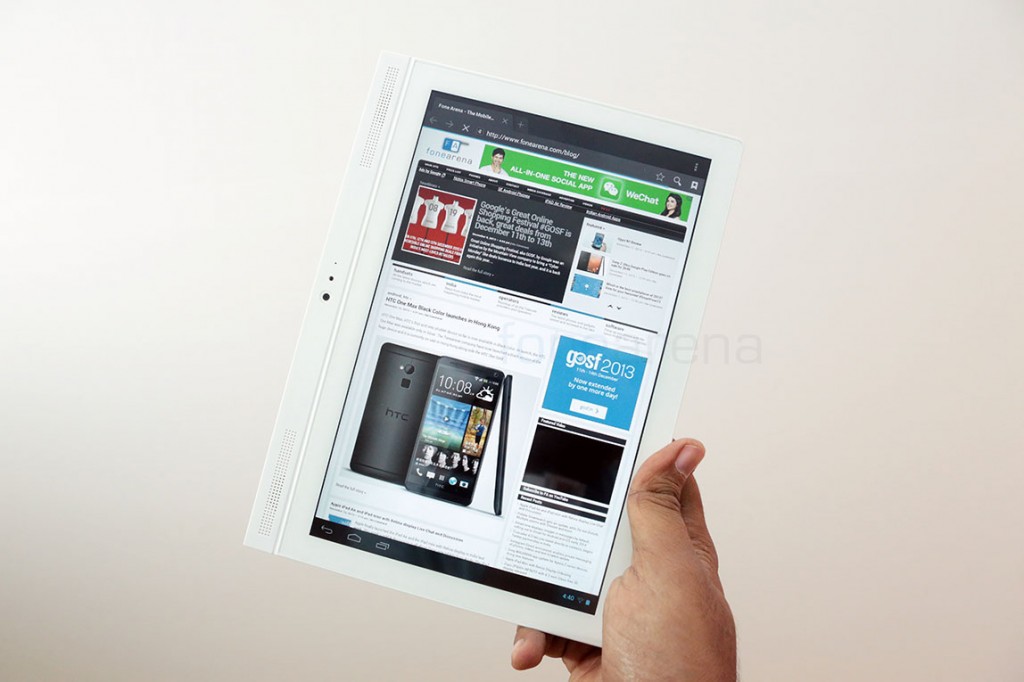
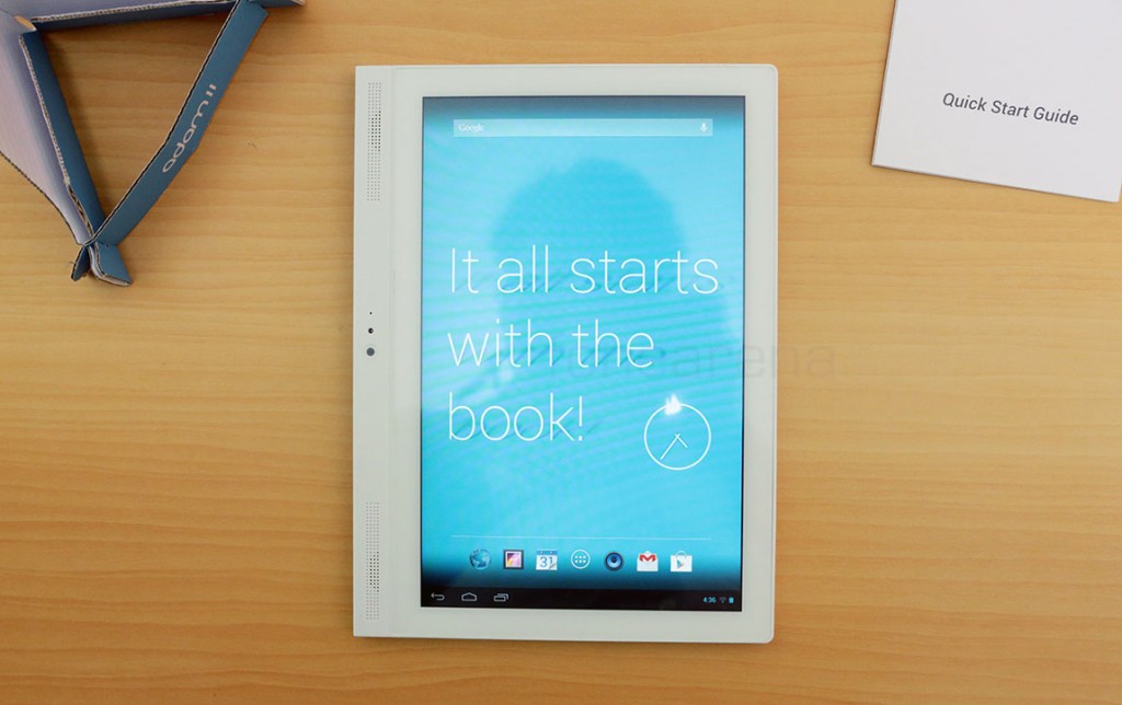
We had just unboxed the Notion Ink Adam II, a sequel of the ill-fated original Notion Ink Adam, and found it to be rather surprisingly good in terms of design and build quality. It is a really neat device, and with a price tag of just Rs. 16,999 for the base WiFi version and 18,999 for the 3G version, it is a compelling product in this category. With a textbook like form factor, the Notion Ink Adam II hopes to offer users a natural reading experience, or at least a cheap and affordable 10 inch device. We will be letting you know our complete opinions on this device in our full in-depth review but before that, lets take a photo walkthrough of the Adam II’s uniquely designed and build hardware.
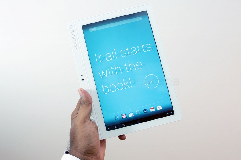
“It all starts with the book” says the default wall paper. We see what Notion Ink’s going for here, with regards to the design philosophy and we like, despite us wanting a smaller form factor of this.
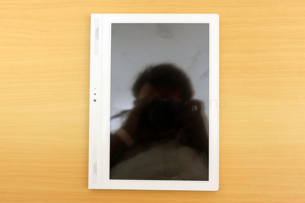
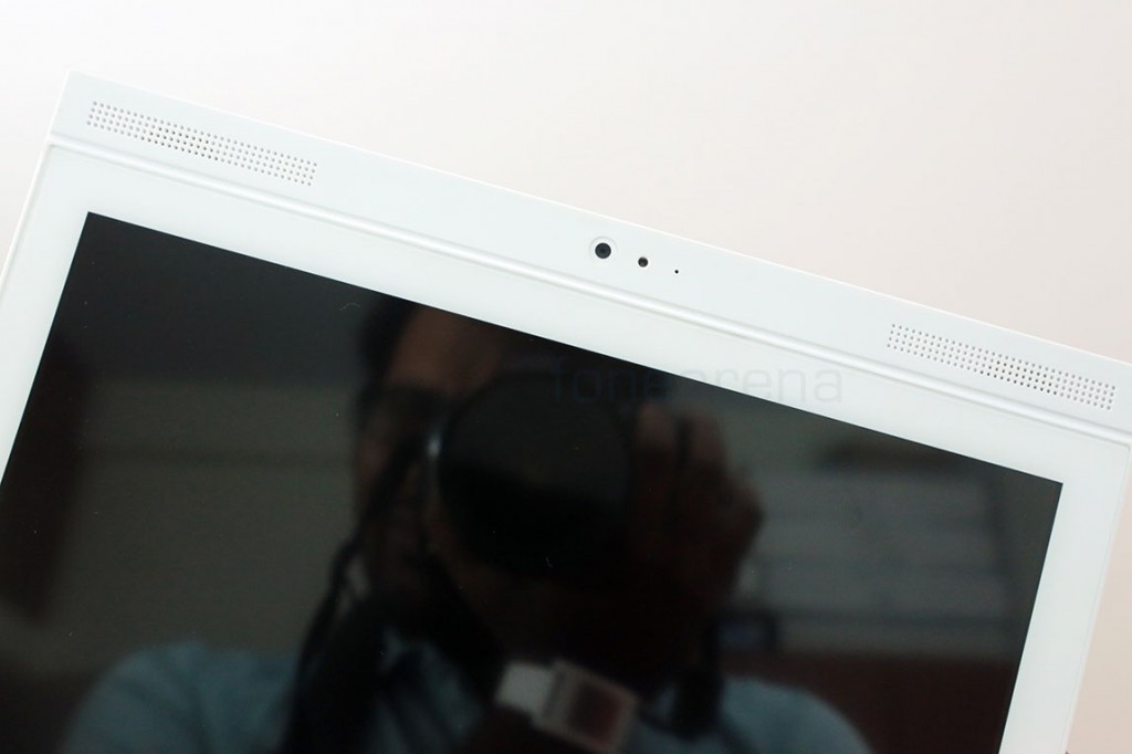
The tablet, meant to be held in portrait, has a large bezel on the left, which packs stereo speakers. the 3.2 MP front facing camera and a microphone, primarily used for video calls. The display is a 10.1 inch IPS LCD panel with a 1280×800 resolution and is covered by the Asahi Dragontrail glass. It is highly reflective and a finger print magnet too.
When held in landscape, these components make more sense, or rather feel familiar. As you can notice, the tablet is fully white, making it coherent and minimalistic in design. We really like the grilled speakers and its symmetric placement. Considering this is a tablet meant to be held in portrait, lets go by that orientation for the hardware walk through.
The right side(or the bottom, in landscape) is empty but there are a lot of connectivity options at the bottom(or left, in landscape).
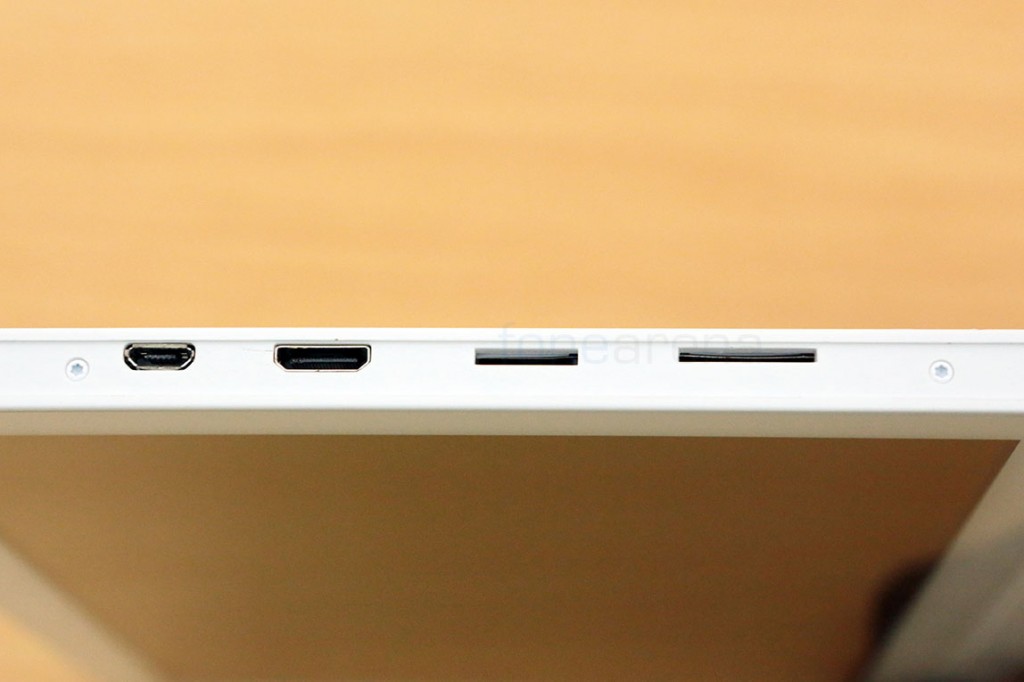
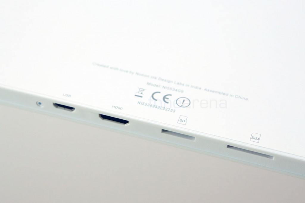
You have the (from left to right) micro USB slot with OTG support, mini HDMI port for display out, a micro SD card slot for adding upto 32 GB of memory and finally, a SIM slot for data connectivity. You can also notice the screws right here on the side, may be it’s easy to open the tablet.
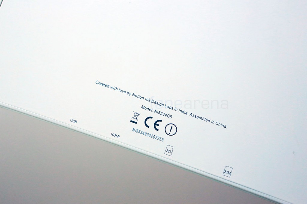
The ports are neatly labeled in a thin font, which makes it easier to find and use.
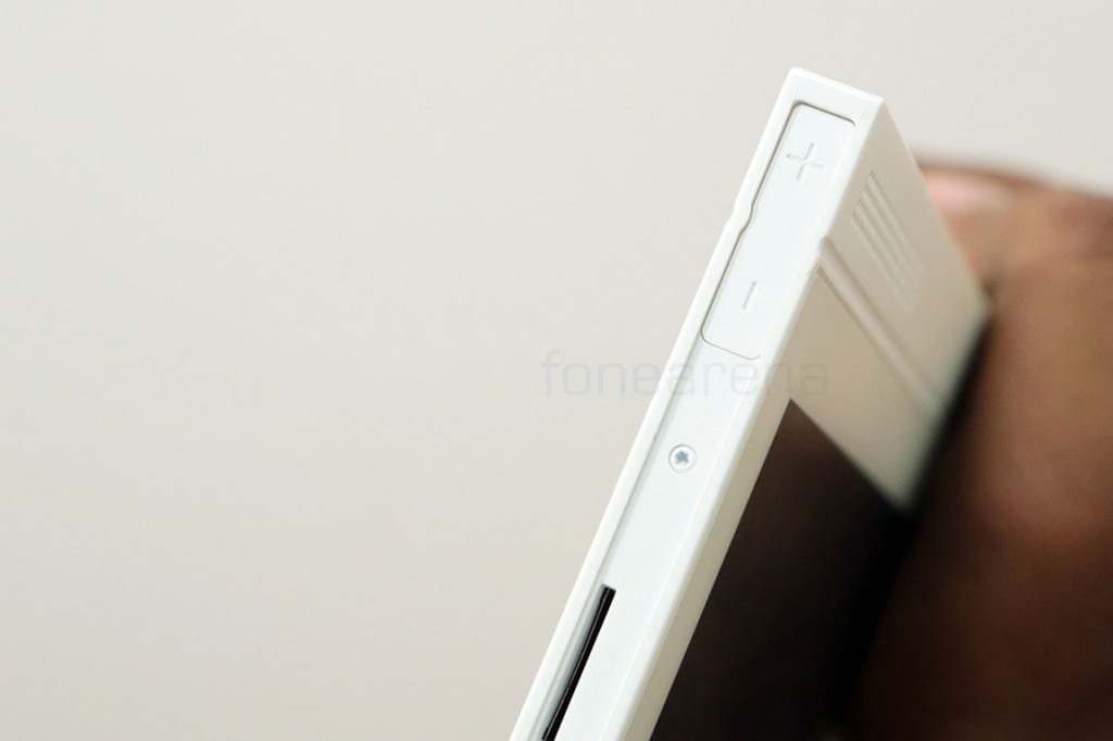
You also have the volume rocker sitting at the edge of the same side(left, in landscape and bottom, in portrait).
You can also notice that this tabled is “Created with love by Notion Ink Design labs in India, Assembled in China”. Yes, the company is based out of Bangalore and is responsible for the conception and design of this product, while it is assembled in China, much like most of the electronic products these days.
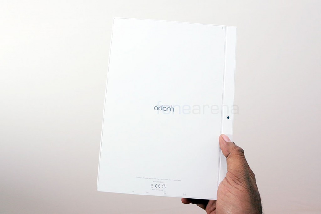
The back, which is flat and minimalistic, sports the Notion Ink Adam logo and also the secondary rear camera on the right. The metallic build is marvelous and is just a sight to behold. It looks way better than how it looks in the photos.
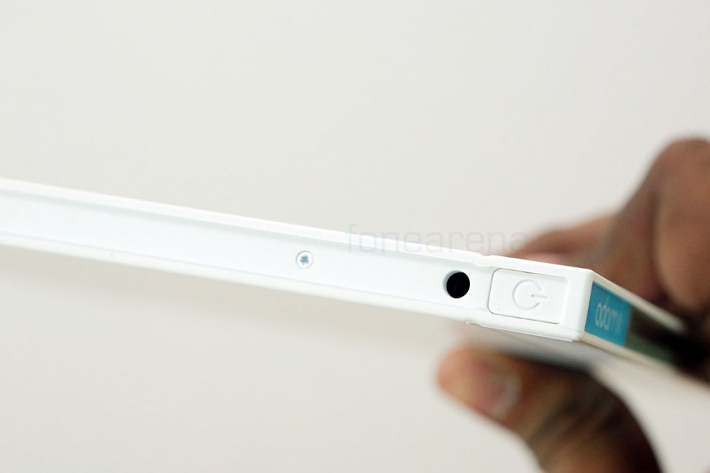
Over at the top, we have the power/lock switch and the 3.5mm audio jack.
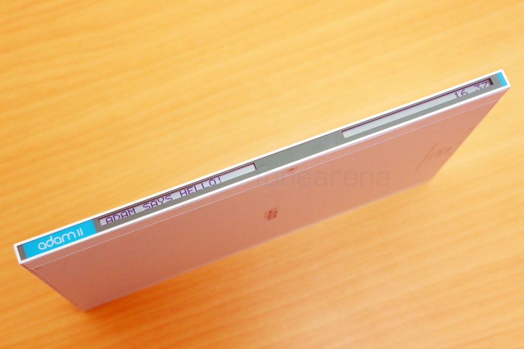
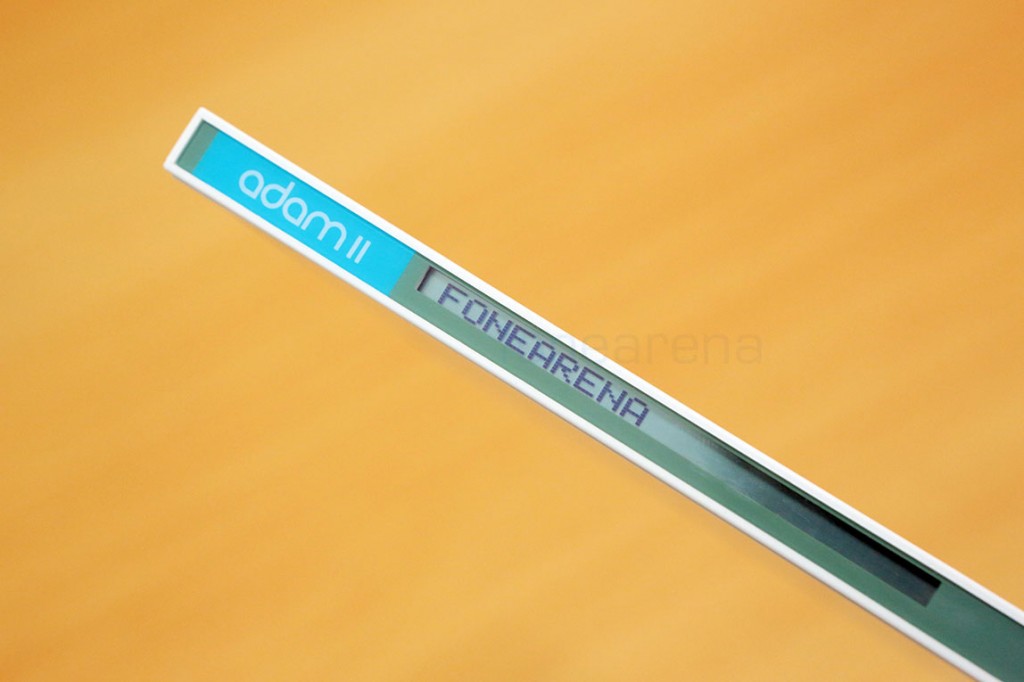
Over at the left, we have the spine of the device which also sports a two-part LCD screen. This is always on, even when the device is turned off, and acts like a text book’s label. You can configure the message it says on the left and it displays the time on the right. Of course, this works great for at-a-glance information, hence notifications can be configured to be displayed here. A nice little touch, but works great if you just want to see if you have any notifications without turning on the screen, and put the tablet aside.
As mentioned earlier, you can configure a custom message from inside the settings to make it show what ever you want.
In the end, the Notion Ink Adam II is a completely re-designed product and is a fresh start. It doesn’t have an e-ink display, nor it has any wonky build quality or lofty promises of a custom UI, but it’s just a cheap 10 inch tablet that wants you to take it seriously, like a text book. Hving played around with the device just for a couple of days, we are honestly overwhelmed by the design and the build quality. Coming from an Indian company, it feels original with a unique form factor, unlike other companies that just follow the crowd. We will be letting you know if this device is worth the money in our full review, but until then, let us know if you have any questions, in the comments section below.
