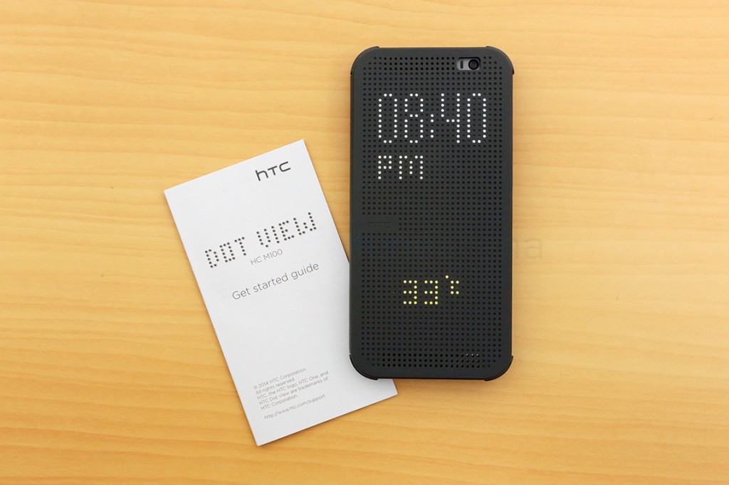
Accessories have always been key part of the buying experience, especially since the advent of the predominantly touch screen phones. It’s almost a necessity that one cover up their pricey phone to prevent damage. Companies took advantage of this and offered unique solutions as cases to differentiate themselves, like for example Samsung’s “Flip cover” or later, the S-View cover, had a magnetic flap that was attached to the whole back cover and also had a window to display at a glance information. While that was mimicked by LG for its own flagship device using the Quick Window cover, the other flagship maker, HTC, has taken a different route this time. The One M8, unlike the M7, is smoother and more slippery, mandating a requirement for a case this time, and HTC has one, called the Dot View case. Sporting a dotted front made of silicon and a more grippy plastic back, the One M8 also gains a new “Dot view” mode that makes at-a-glance interaction really interesting. Find out how it works, in our video here –
httpv://www.youtube.com/watch?v=Fg2GeU4XHTA
Read the HTC One M8 Review here
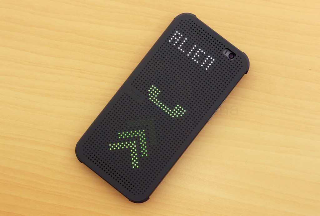
As you saw from the video above, the One M8 Dot View case is really useful when it comes to at-a-glance information or even acting on critical notifications, like calls.
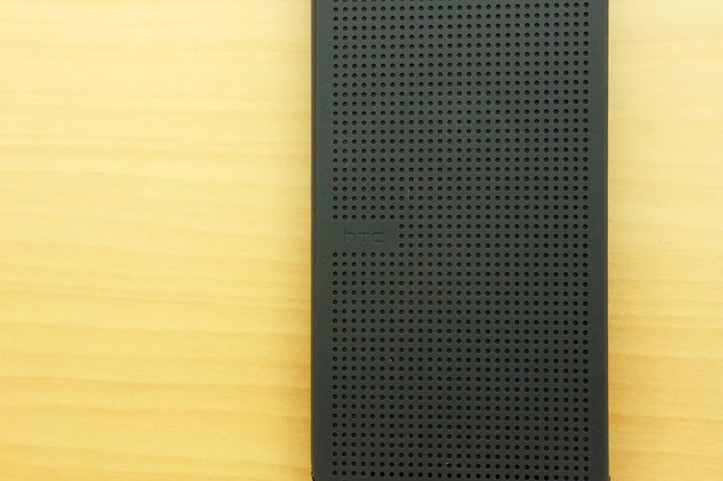
The way it works is very simple, there is no electronic display on the case or something, it’s just holes. The silicon front is smooth to touch and has low power magnets that act as a lockscreen switch too. It enables the phone to wake up when the case opens, and when closed, it goes into a different display mode. With blocky letter and basic images, the Dot View display illuminates only the necessary pixels for showing at a glance information. Those blocky pixels are shown off through the holes on the front, making it look like a vintage dotmatrix print. Best thing is, thanks to the sensitivity of the case, the notifications will be actionable, and you can even activate the voice command gesture by just a swipe down.
Executing a double tap gesture will wake up the phone to display the time and the weather information, and directly opening the case will take you to the homescreen. Here, you will lose the functionality of the lockscreen but you do get more, in a presentable way.
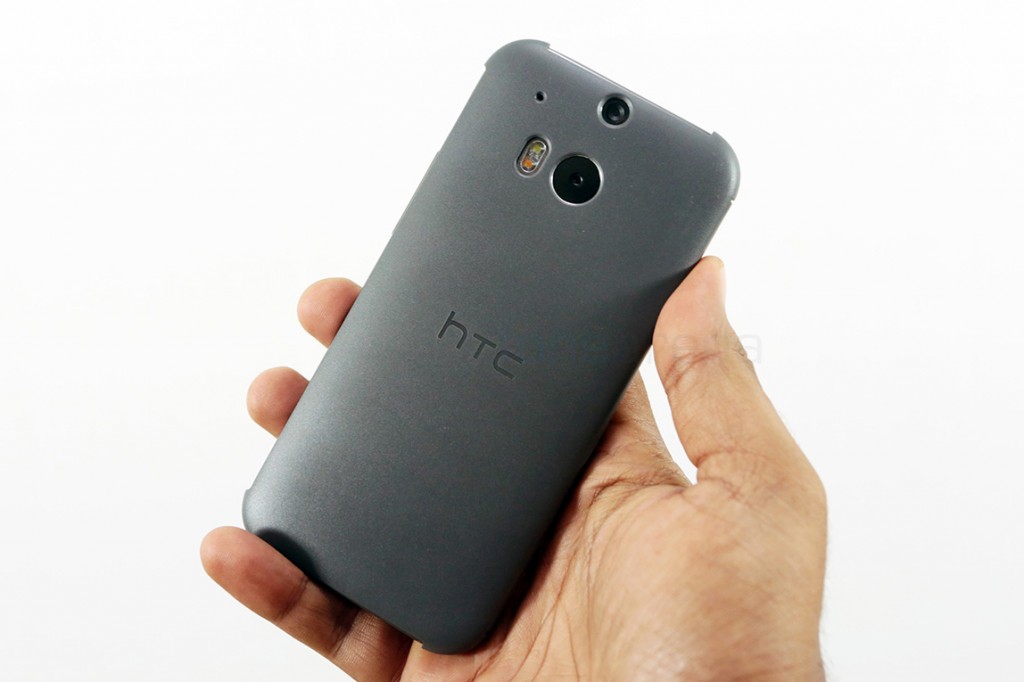
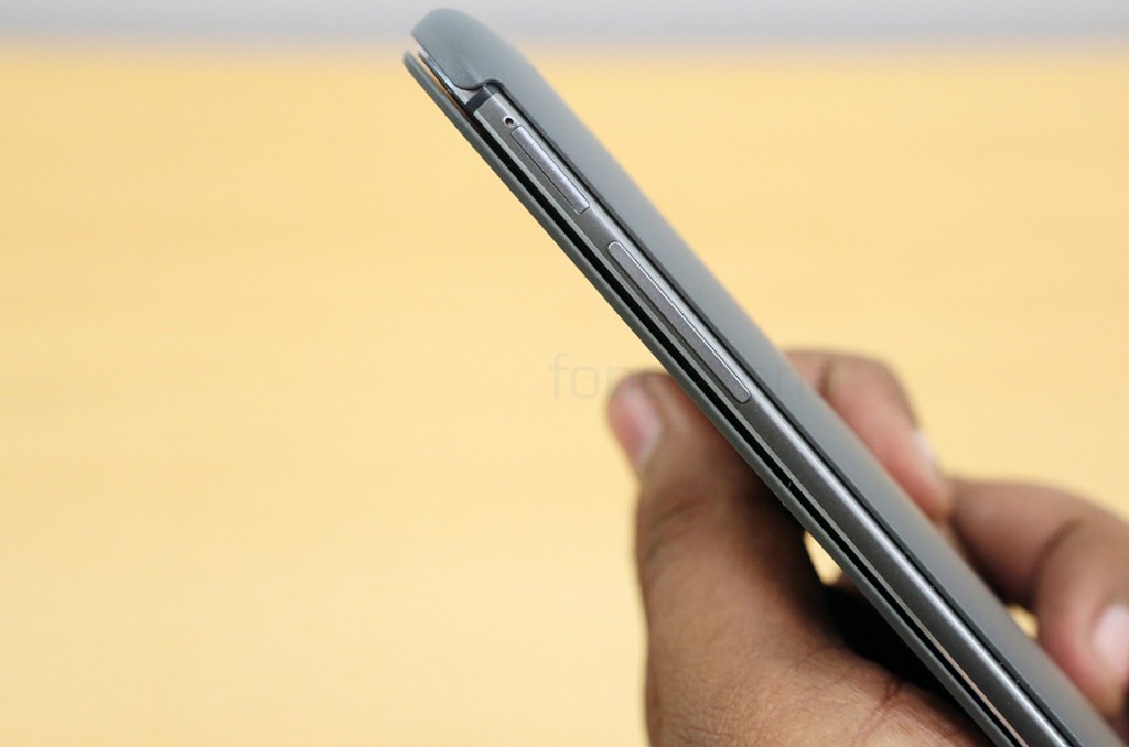
The back, as mentioned earlier, is made of plastic and boasts a matte finish. This offers way more grip and sufficient protection from scratches to the metal body. Since this is made by HTC and for the One M8, it obviously fits like a glove.
The case adds a bit of thickness to the phone and all the glamours of the One M8’s design flourishes are concealed within, which might beat the actual purpose of getting the device, but the cover is a really decent compromise, in our opinion, especially considering the slippery, the metal body ensured. Anyway, that’s all we have on the HTC One M8 Dot View case. Let us know what you think in the comments section below!

