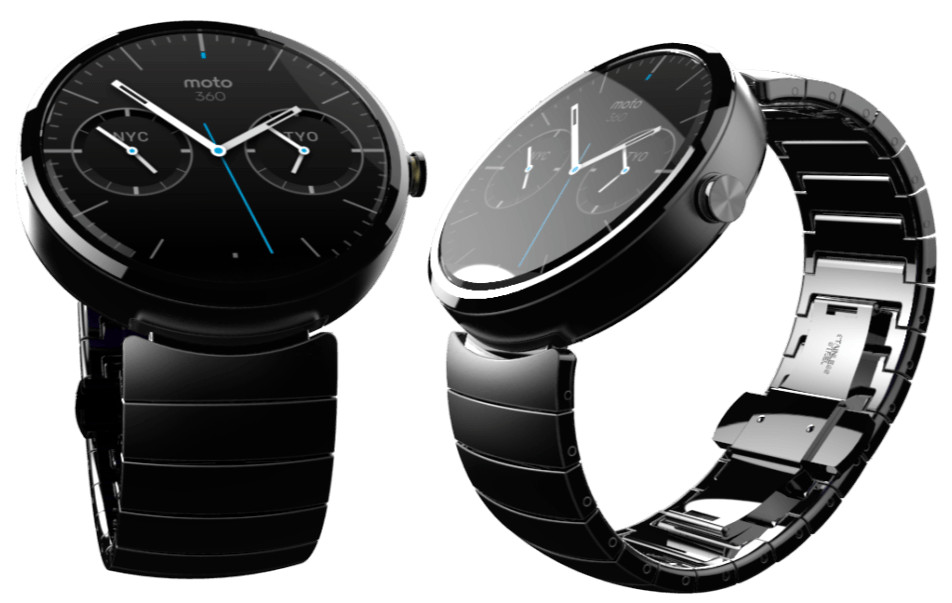
Motorola is all set to bring its very first smart watch with Android Wear OS, in a few days. Moto 360 watch will be sold in ‘a selection of styles’. Motorola invited designers to create different looks for the new watch. Winner of the contest will get a Moto360 watch. Moto received nearly 1300 entries that were judged by the team that created Moto 360. Amongst the many entries received, here are Motorola’s top 10 picks. Which of these designs would you want to see adorn your wrist? Share your comments at the end of the post.
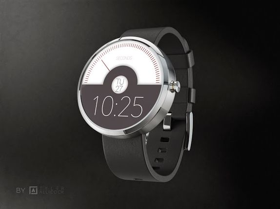
This one is one of the simplest of them all. Designed by Tyler Allicock. An Analog seconds counter, date in the middle and digital minutes and hours at the bottom.
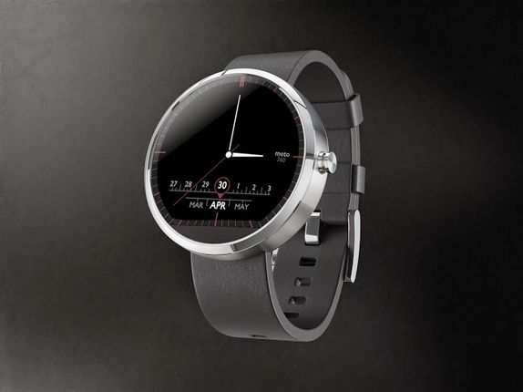
Designed by Pawel Hanusowski – This Moto360 design is dominated by Analog watch. Radio like readout for the Month and Date accompanied by some red accents.
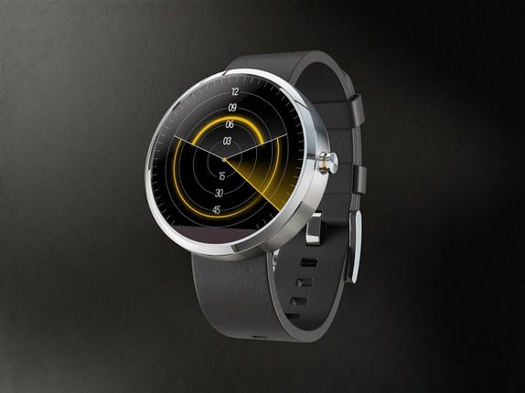
Created by Jason Wang this design is a clever mix of Analog and digital watch design. The face bears a passing resemblance to an old radar, but only in aesthetic, as functionally it’s very distinct. The smaller arc on top represents the hour, and the larger arc below represents the minute. As arcs, they can be read easily at a glance from any angle. A second hand sweeps over them. Perhaps a not as easy to read ?
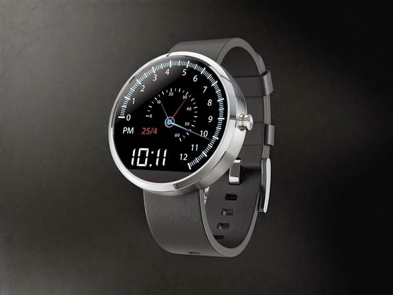
A lot happening on the screen here . Paul Stringer who designed the watch face has described it as – A car speedometer style watch face with the Hours on the outside and Minutes and Seconds on the inside. When the Second hand gets to the end it flys back to the beginning (very much like a tachometer). The Minute and Hour hands also do this when they reach the end of their respective gauges. It also includes the AM/PM Indicator, Time in a digital format and then date.
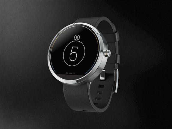
A very interesting design by Aramis Negron. This Moto360 face is simple, new and easy to read. Designer has based his design on an idea that each widget should have the entire canvas to portray its information.
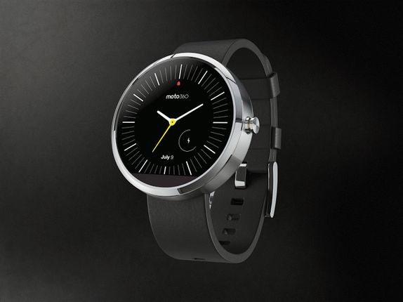
Designed by Dave McCarthy -A clean and easily readable face. Keeping it feeling truly like a watch, the only things on it are the time, date, and a battery indicator.
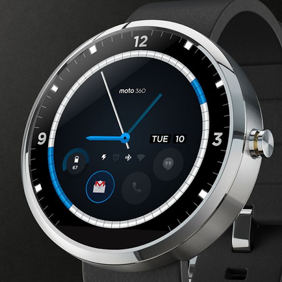
Designed by David Pascual. This design displays calendar events, allows for user defined notification widgets, and provides status information for basic watch functions. One of the most creative and informative, yet not cluttered design.
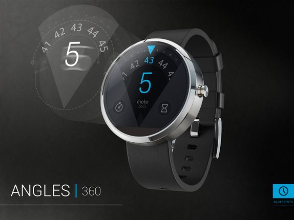
Jose Azua calls his design ‘ANGLES’. As seen here, the watch displays hour and time in an unusual design for a round interface. There is a fraction dedicated to shortcuts eg. stop watch.
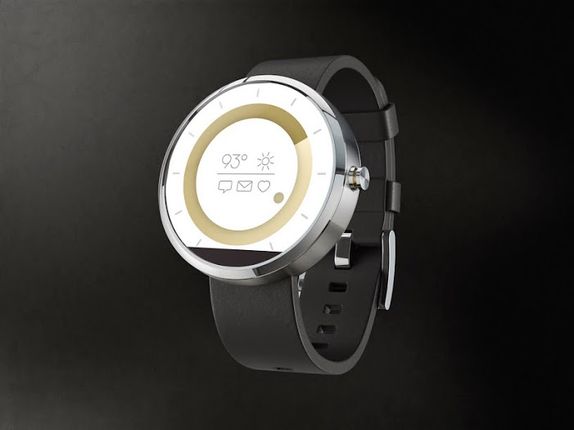
Designed by Will Rodriguez. This disc design concept takes a modern approach to showing the time. Minutes are shown through the larger disc in the background. The hour is shown through the foreground disc. It also displays notification icons for sms, email and health alerts as well as a basic weather widget. A rather simpler and basic design for a smartwatch.
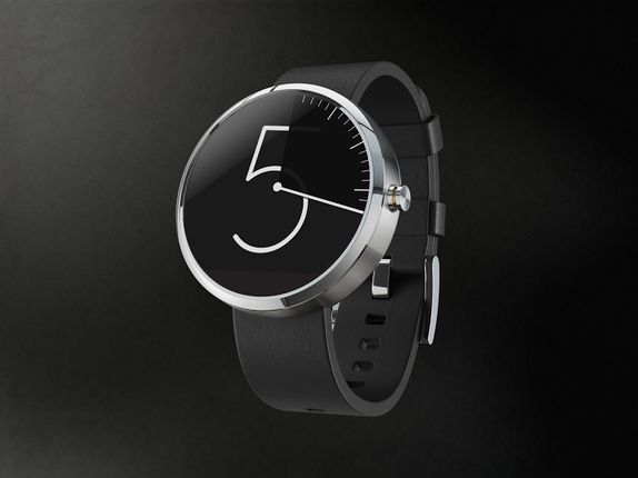
A very creative time counter. But is that all this watch face can offer? Layton Diament designer describes it as ‘my “Vanishing Hour” watch face concept. As the minute hand makes its way around, the hour is dimmed while revealing the minute marks’. Motorola will announce winner of the best design on June 24th.
