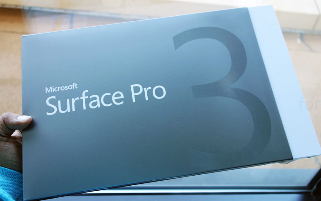
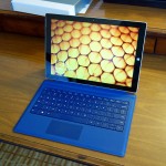
Microsoft announced the Surface Pro 3, the latest iteration of its own hybrid efforts under the “Surface Pro” moniker, at an event in New York last month. Panos Panay, the guy heading the Surface group, kept referencing the Macbook Air as the Surface Pro 3’s competitor and got the audience intrigued, including us, watching the live webcast from afar. But we have now got the chance to try one out in person, as the device has started shipping in the US and Canada, with units available even without pre-order. So, what are our first impressions like? Check out our unboxing and setup video where we detail everything –
httpv://www.youtube.com/watch?v=yUc95M6Z8zs
Related: Microsoft will give you 650$ in exchange for an Apple Macbook Air
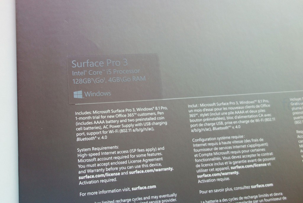
What you saw above was the unboxing of the Surface Pro 3 as a standalone device. The version we bought was the 128 GB Core i5 model that retails for 999$, but without a Touch or a Type Cover keyboard.
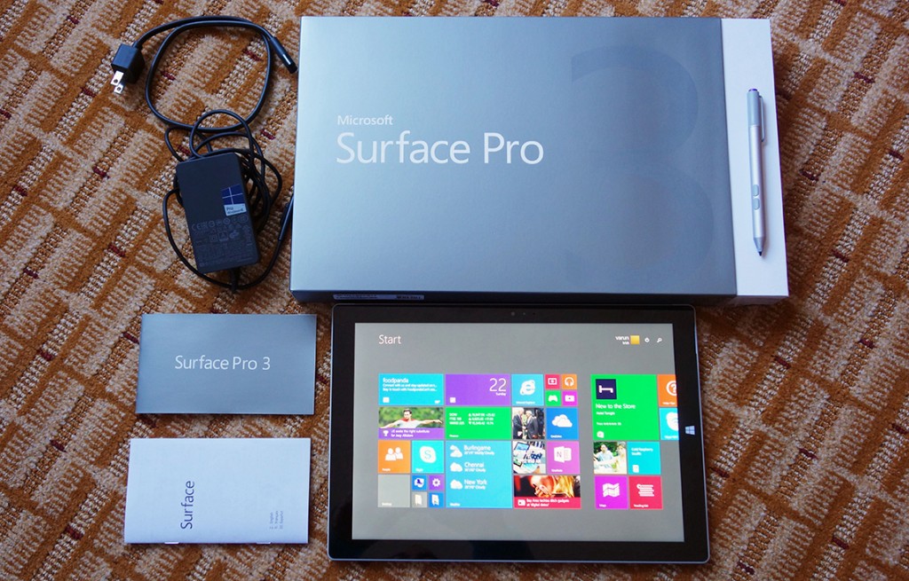
The box contents were, as expected, minimal, as the device is mostly an Ultrabook rather than a tablet, and not many accessories are needed, except for the Type Cover which you have to buy separately.
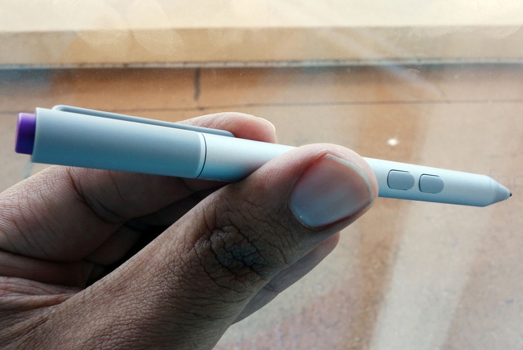
But you do get a pen, this time being the N-Trig model, with two buttons and a AAAA battery to power it. Yes, Microsoft have gone for an active stylus this time, rather than a Wacom digitizer and a passive stylus like before. This pen has 256 pressure points, down from more than a thousand on the last model.
The pen looks and feels high quality, with metal flourishes and even a dedicated button that can activate One Note in a click. This was demonstrated at the Microsoft event, and it works over Bluetooth. You also get a thinner adapter this time, but with the same extra USB port for charging your other devices simultaneously.
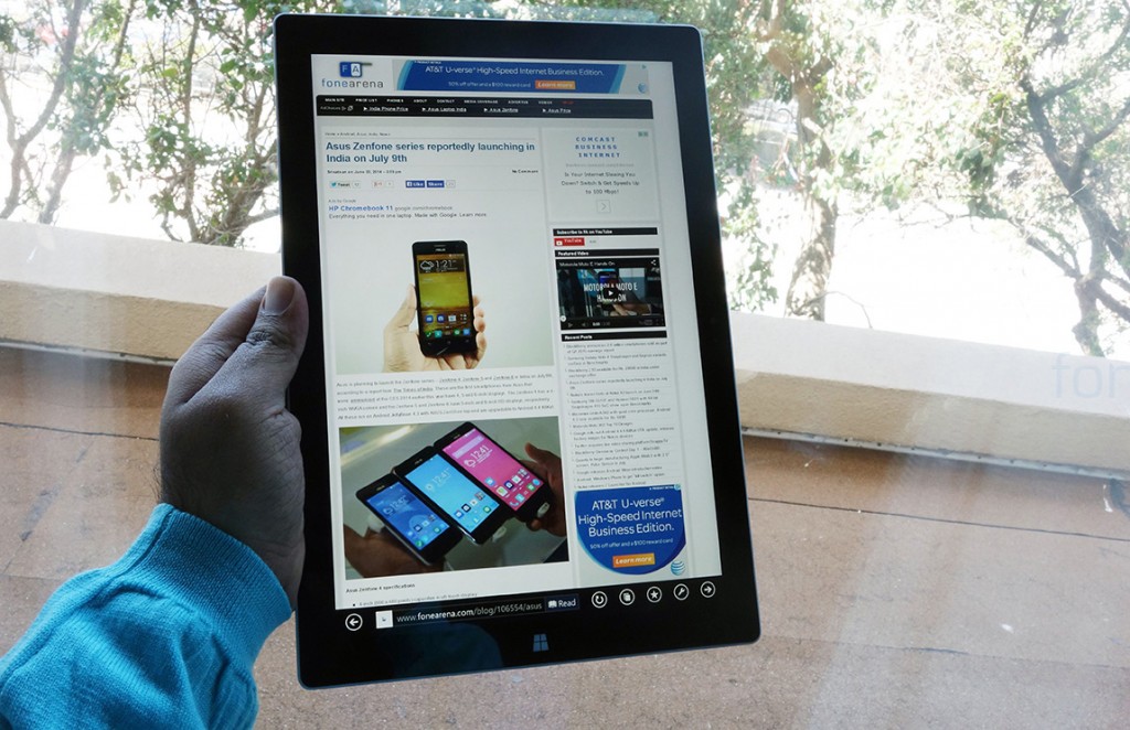
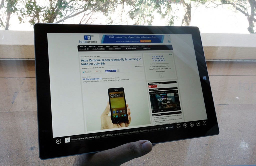
Here’s the Surface Pro 3 in action, but in portrait, just to show you how the new 3:2 aspect ratio works out. And here it is in landscape –
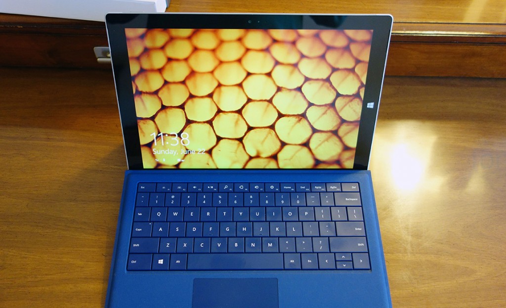
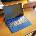
As you can see, the Surface Pro 3 does handle both the orientations better than before, and it is also very light, especially when taking into account what’s inside. The screen is a 12 inch 2160×1440 LCD touchscreen which looks great and offers good pixel density.
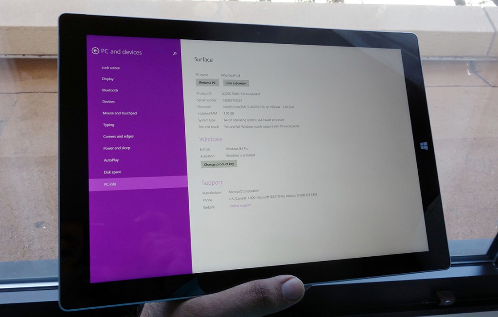
This is where one realizes the power this device packs. It’s got a Intel Core i5 processor inside, with 4 GB of RAM and 12 GB of storage and still manages to be only 9.1mm thin.
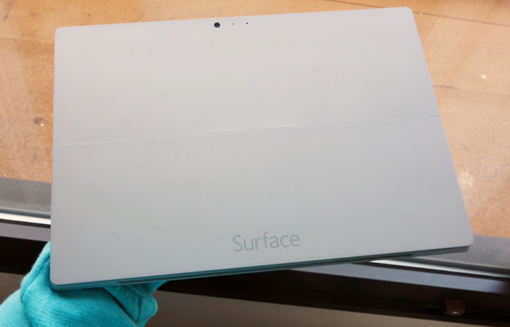
The Surface Pro 3 comes in this silver-like colour, following the Surface 2. This is a good direction as the colour as well as the treatment to the Magnesium alloy has rid the Surface Pro 3 of the finger print and scuffs problem the previous two generations had, and that is definitely a good thing, we’d say. Some more shots of the gorgeous looking hardware here –
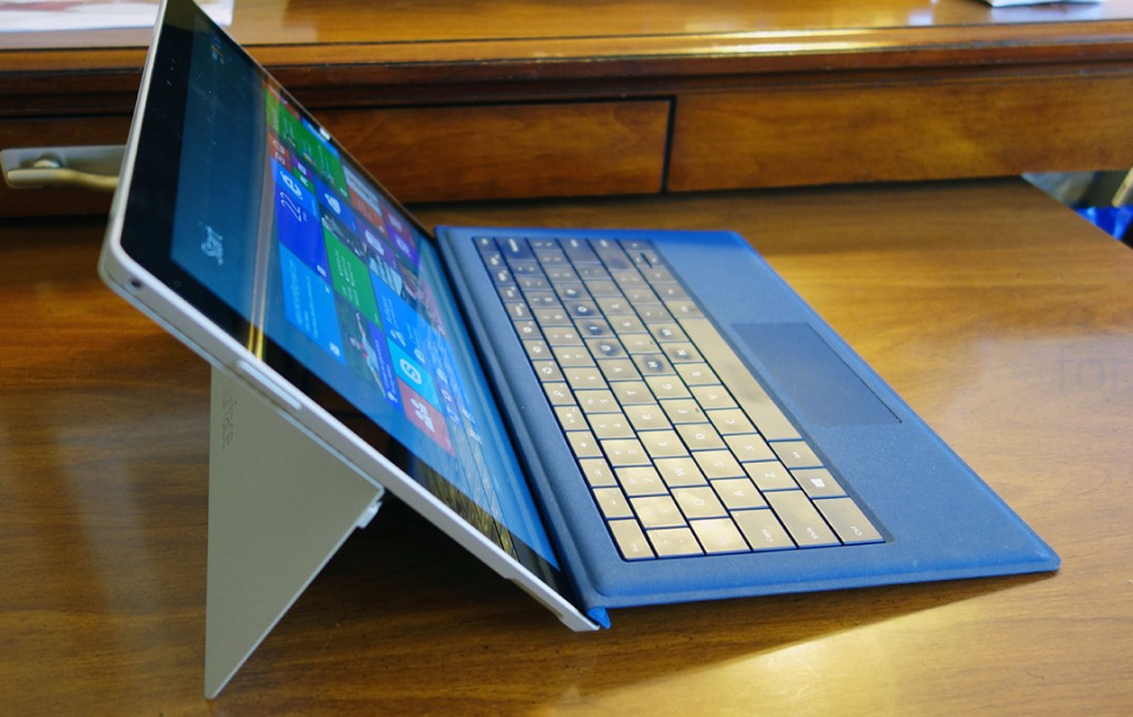
One of the biggest changes when it comes to the Surface Pro 3’s design is the kick stand, but there is one main thing that the kickstand proves useful for, which is called “lapability”, a word coined by Panos. But lapability goes to waste without an important ingredient, the type cover keyboard –
httpv://www.youtube.com/watch?v=8s_1FE5NcbM
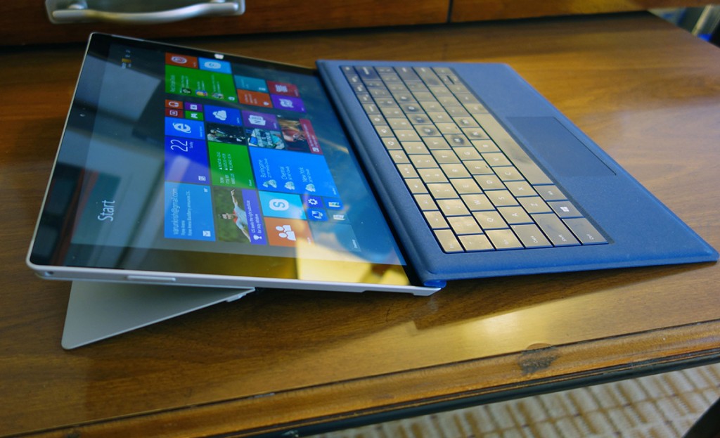
The newly improved Type cover has a larger and a smoother trackpad now, but it also has an important usability upgrade thanks to the magnetic attachment. This magnet that sits on the top of the type cover sticks to the front bezel of the tablet, which makes it sturdier on the lap, and hence makes it more “lapable”, turning into the hybrid we desire.
With no space left in the bottom bezel for a start button, Microsoft has moved it to the right, which makes sense, but when using as a tablet, it might be redundant. Though hardware keys are always more reliable than software keys which can get stuck in limbo anytime.
Now back to the kickstand, which you can see in action above. This time, Microsoft has opted for a high-friction assembly that can bend upto 160 degrees, making the Surface Pro 3 much better for all kinds of people. For example, tall people no longer need to worry about the angle of the screen when the Pro 3 is on their laps, and it also allows better typing on the tablet when in the full stretched out mode.
Without the keyboard, this position might be suitable for tablet usage on the lap. The Kickstand is also surprisingly sturdy and easy to use, and is a big big improvement over its predecessors.
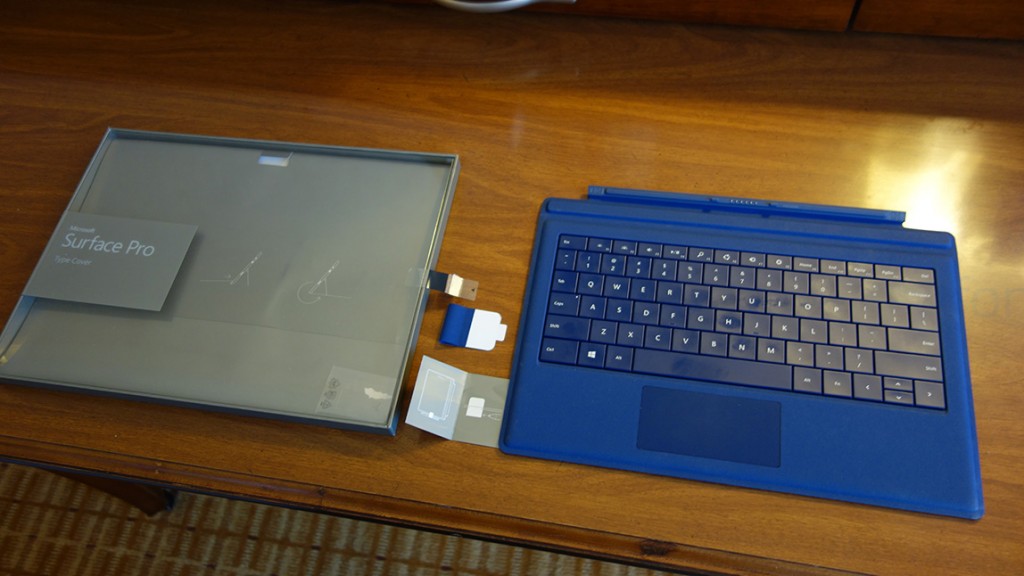
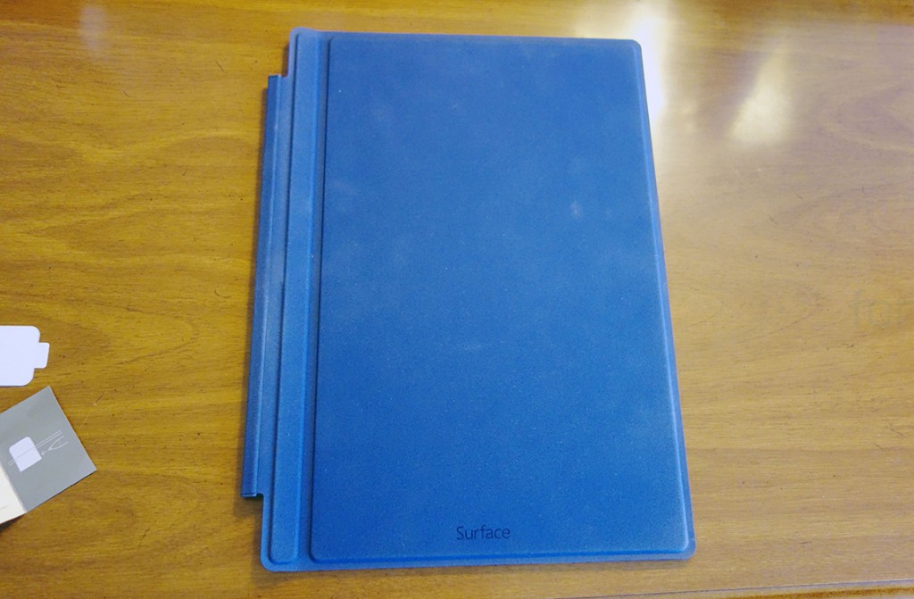
This is the type cover from the front, which looks like the cover of a book. Notice the logo here on the front, which, in portrait, is the reason why it looks like a book, and also because of the form factor of course. All these aside, we are quite enjoying the Surface Pro 3 right now, and we will be letting you know more in the coming days and weeks, but until then, here are more photos of the device and its type cover, which is such a necessity burdened as a separate accessory.
So, what do you think about the Surface Pro 3? Let us know in the comments section below.
Bharadwaj contributed to this report
