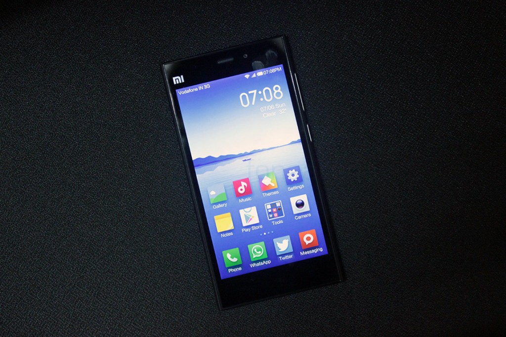
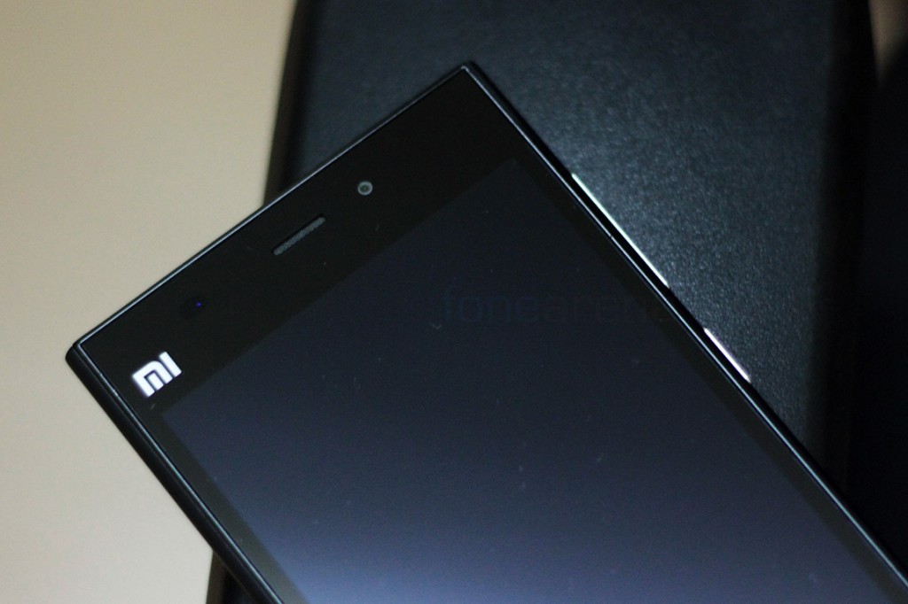
The Xiaomi Mi3 we reviewed yesterday, has been officially priced in India for Rs. 14,999. The phone comes with a 5 inch 1080p screen and a minimalistic design and build wraps around the display to bring forth a solid device. While we discussed about its design, build and ergonomics in our review, we find it apt that the device receive a separate photo walkthrough without too much of text coming in the way. So, here you go, a separate photo gallery for the Xiaomi Mi3, which, in case you are planning to get one, could be helpful.
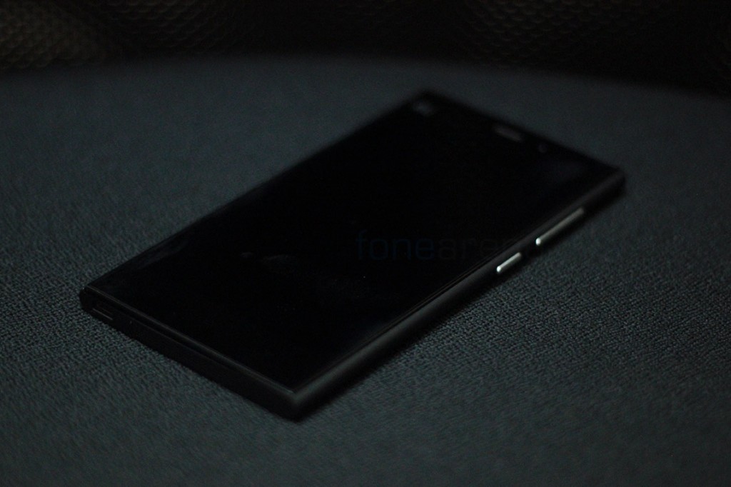
The black variant looks dark and stealthy which is a good thing. However, it does look like a Nokia N9 without the curved back.
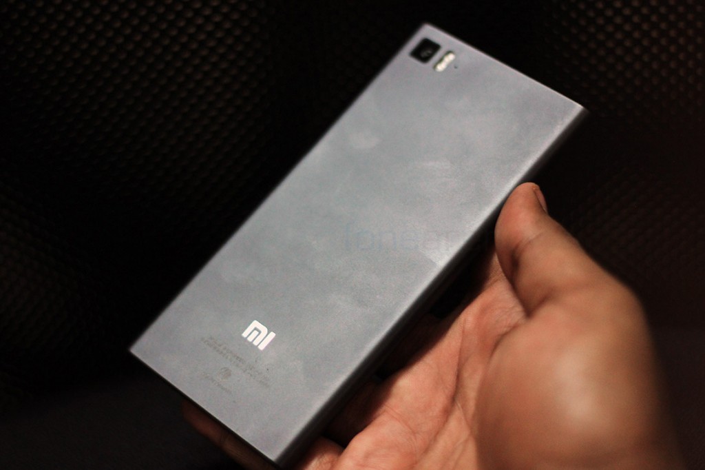
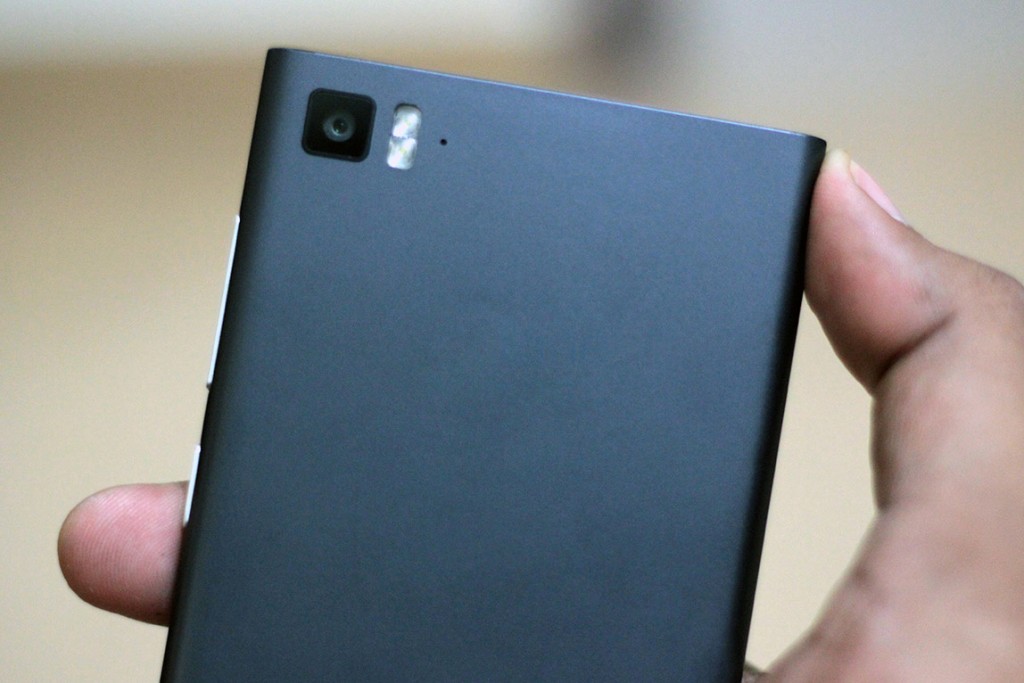
The body is a single piece of matte plastic that tends to gather a lot of fingerprints and smudges over the period of use.
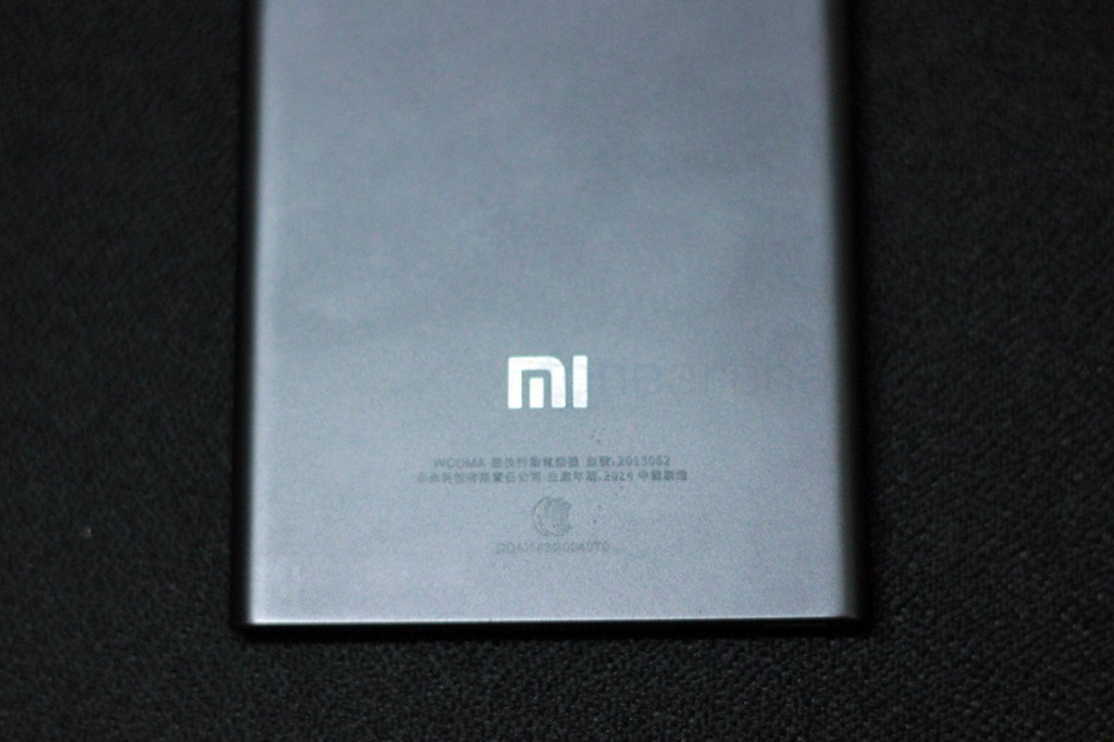
The Mi logo is made visible on the front as well as the back, and it’s flashy, with a gloss that reminds us of the Apple logos on the back of iPhones.
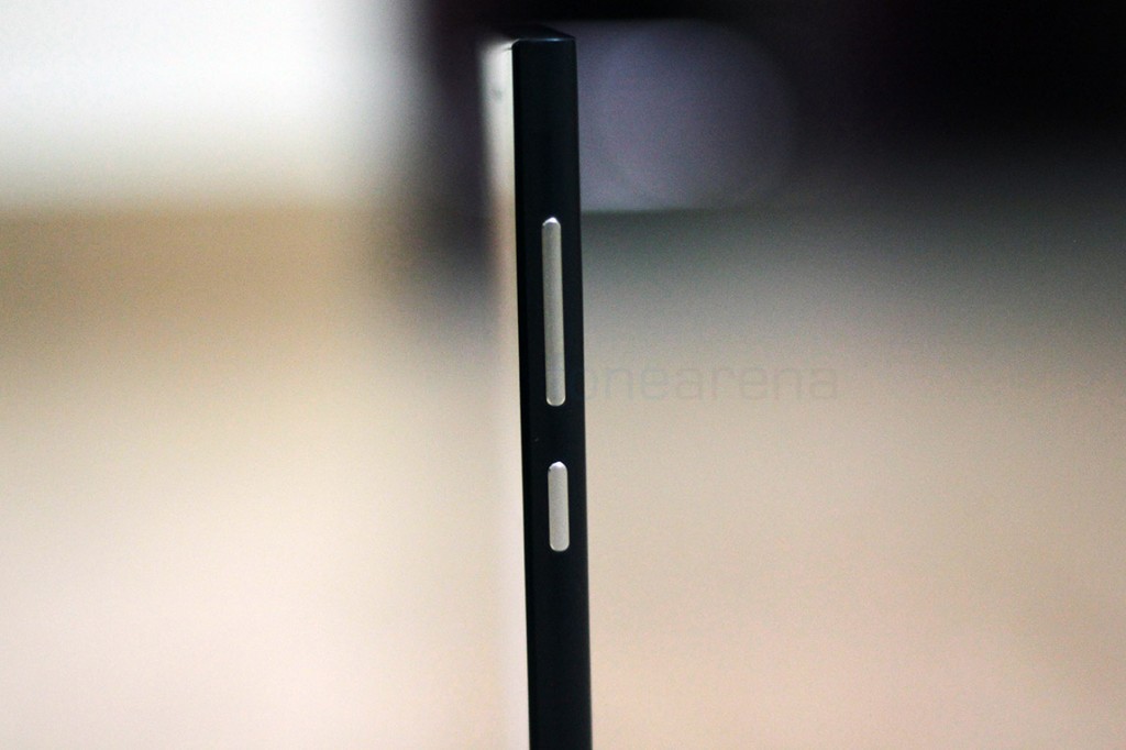
If the design wasn’t enough, even the buttons are styled to look like the N9.
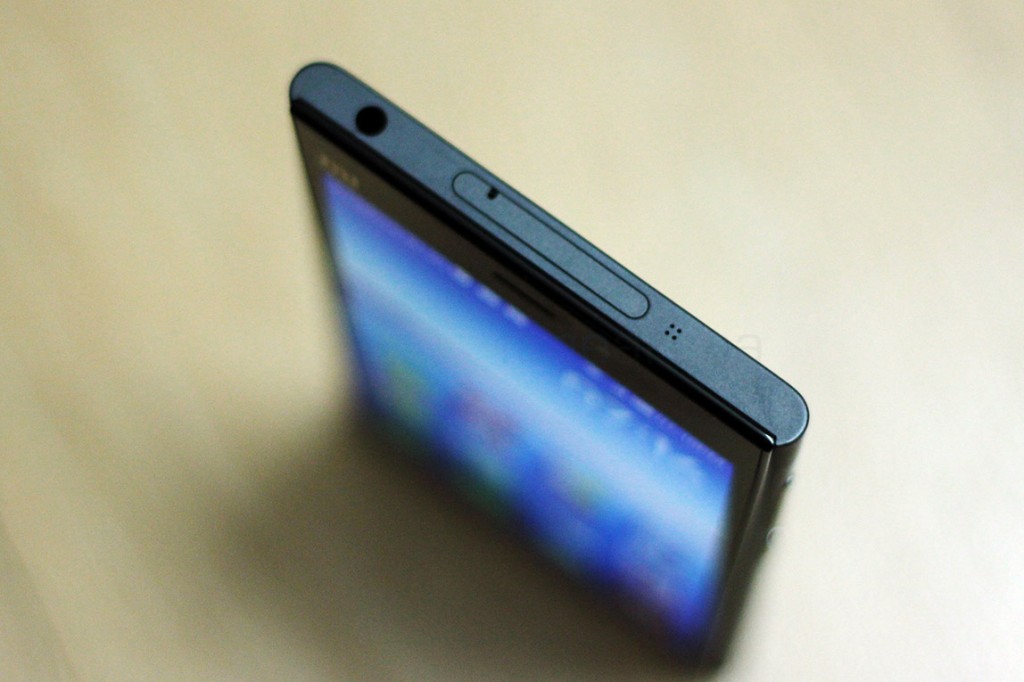
The attention to detail is very interesting on the Mi3, as it has perfectly machined doors, laser etched holes, making it a very well made product.
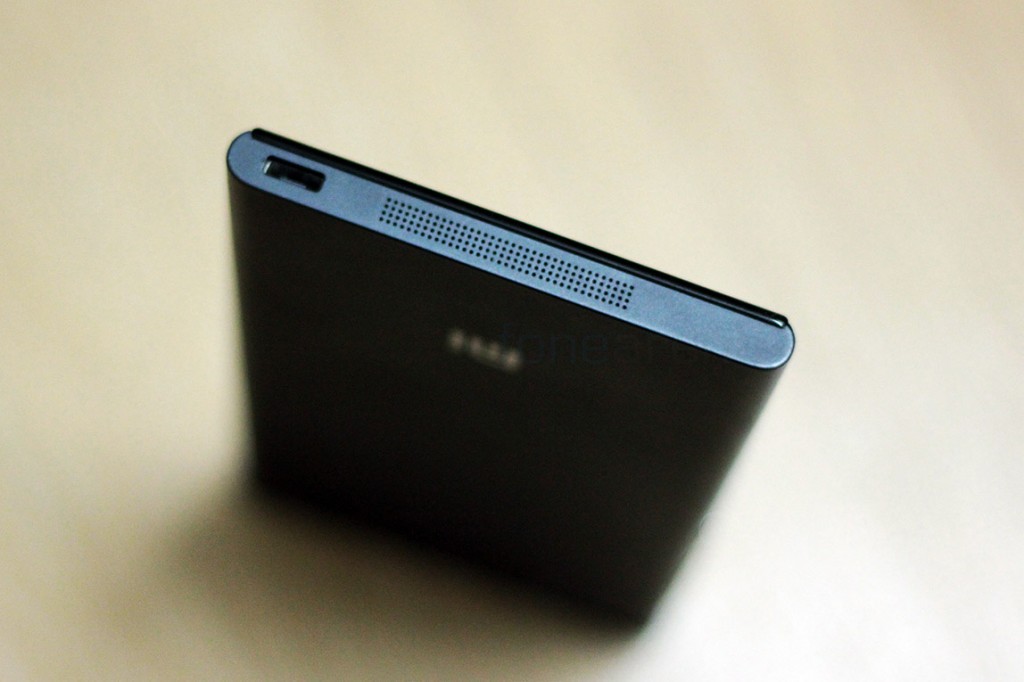
Here we see the attention to detail again with laser drilled holes for the speaker and the metal re-inforced micro USB slot.
The camera unit occupies an iPhone-like position here, but worry not it does not get scratched that easily.
This picture brings out the frame that protects the display at the front. This is the only glossy part apart from the otherwise matte phone. And this brings us to the end of the photo gallery, which should have provided you with more information, besides our review, we hop. What do you think of the design of the Xiaomi Mi3? Does it meet your expectations? Let us know in the comments section below.

