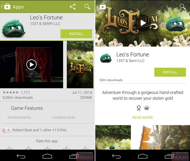
Google Play Store will reportedly get a revamped UI along with the recently announced Material Design, according to a report from Android Police. The design language announced at the Google I/O developer conference is expected to gradually land on popular Google platforms.


According to the leaked screenshots provided by Android Police, the Google Play Store looks more cleaner and simple UI. The new Play Store has more white space and larger header images as compared to the current Play Store. These images are mostly in the background and are similar to album art images. Also, more focus has been added on bringing the content forefront. Reviews section for apps has become more colorful with the addition of color review bars. It must be noted that these images are for Play Store for both tablet and smartphone.
Finally, the Material Design also adds the Roboto font that can be seen used in the revamped UI of the Play Store in these images.The report states that as these images are pre -release leaks, they are subject to change. There is no official word from Google regarding the UI update for the Play Store.
Source: Android Police
