Samsung’s Galaxy Tab S 10.5 is the Korean giant’s latest tablet for the enterprise, plain and simple. While it is very much the bigger brother of the Tab S 8.4 we just detailed, the form factor alone dictates a different destiny. Priced to match the iPad Air in the US, the Tab S 10.5 launched here, soon after the global launch, is unsurprisingly the higher end mobile version, priced at Rs. 44,800. Yes, a 10.5″ tablet that can make calls and even send SMS, but it will naturally be used for data, mostly. Tablets as a whole are mostly geared towards consumption, but companies have been trying to go at it from a productivity angle too, like the Surface and numerous other OEM based tablets. Samsung’s take on the Tab S 10.5 is based on the same idea, with a good amount of preinstalled enterprise focused apps. Armed with a Super AMOLED screen, the Tab S 10.5 aims to satisfy the office goer, and our first impressions video might help explain that cause a bit more, watch –
httpv://www.youtube.com/watch?v=dvaOvJWbggo
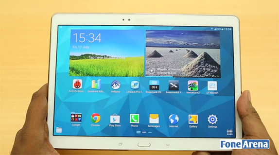
As you saw from our video above, the screen is the most prominent feature of the tablet, and that is clear with Samsung’s marketing messages as well. The 10.5″ 16:10 2560×1600 Super AMOLED screen might not be as sharp as the 8.4″ one with the same resolution but it’s still one of the sharpest >10″ screens out there.
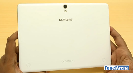
The tablet follows the same design language as the Galaxy S5 with a perforated soft plastic-back that feels like a better material than the glossy plastics the company used to use. Design language aside, it was surprising to see that the tablet maintained the same thickness as its 8.4 counterpart, at 6.6mm while it weighs almost the same as the iPad Air. That’s an overall engineering achievement we’d say, especially when the tablet is packing a 7,900 mAH battery. On the inside, the 10.5 has the same Exynos octa processor as the 8.4, and practically everything except the battery and the form factor is the same between the two.
Check out the Tab S 10.5 benchmarks here
Software wise, it was good to note that Samsung has not gone through with its Magazine UX decision, predictably due to the backlash from Google, but Touchwiz has still undergone considerable changes. For a tablet, the phone UI never makes sense, so Samsung has moved around quite an amount of UI elements to the corners so that they are easily accessible. As mentioned earlier, Samsung has also made an effort to showcase productivity, so there are some pre-installed apps like Webex, remote desktop and so on, which will make it easier for office go-ers to use it at work. The company has its own book case accessory and a Bluetooth keyboard too, which it hopes people will take advantage of. With that said, we do have a lot more to say about this device in detail, but we’re holding out until the review, but if you have any questions, do let us know in the comments section below. There will be more.


