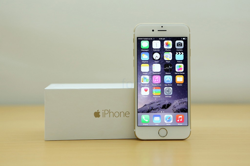
For the first time ever in the history of iPhones, Apple had forgone its “one size fits all” policy and released two different screen sizes for its flagship device. The iPhone 6 is the moderately sized variant, while 6 Plus is the Apple phablet we’ve been waiting for. We’ve got both the phones with us right now, so naturally, the first order of business is to unbox them. First up is the smaller iPhone 6 with its 4.7″ display, a new thinner design and souped up internals, finally giving us more screen real estate, and also playing catch up with the rest of the world. Watch the unboxing video and check past the break for our first impressions of Apple’s latest flagship –
httpv://www.youtube.com/watch?v=uIp_OvylXdM
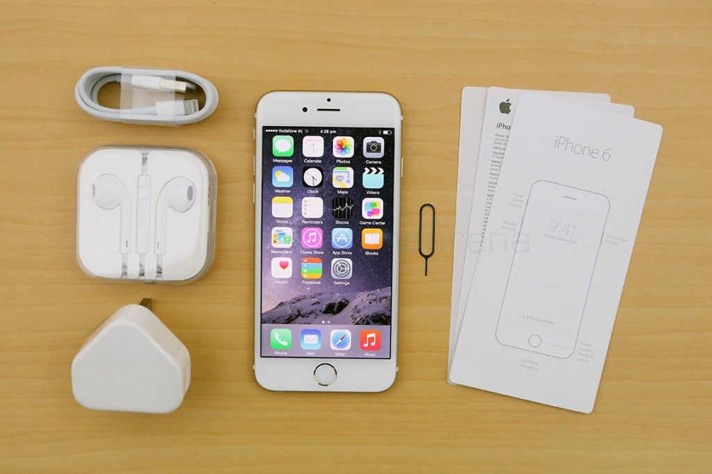
The box contents were the usual Apple accessories you get with any iPhone purchase –
It’s interesting to note that, while the factory unlocked variants, like the one above, come with a SIM ejector tool, the carrier versions don’t.
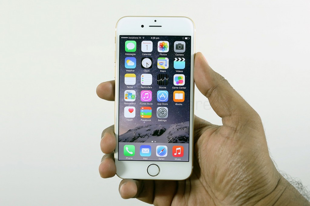
And this is the new iPhone 6, which immediately feels larger, with its 4.7″ screen size demanding larger dimensions overall. Personally, I had always wanted a bigger iPhone, and it is so awesome that Apple has finally delivered. The 4.7″ screen size is perfect, it feels like the apt size these days, especially if you find the 6 Plus too daunting for your hands. The design is also completely new, with it gaining materials similar to the iPad mini, the Air and, to an extent, even the latest iPod Touch. The colour, champagne gold, in this case, comes through to the front, around the phone as well as the home button. But of course, it’s most prominent..
..on the back side of the phone. The aluminium has a smooth matte finish, just like the iPhone 5s but the design forces it to curve to the front, where it merges nicely with the curved 2.25D glass. There are two plastic bands running through the phone’s back and they kinda look out of place, the black bands on the space grey version looked a lot better. May be it’s the colour, or may be it’s the fact that the bands sit on the curves, but something seems off in our opinion.
The new iPhones are slimmer than before, but they are so thin that the camera module sticks out. As you can see from the photo above, besides the protruding camera unit, one other annoyance is the smooth curved sides. It always feels like the iPhone might slip out of my hands anytime and that’s not a good thing. I was always conscious about holding it right, because, let’s face it, that’s what Apple expects you to do. A case is definitely necessary if you want to save your high profile investment from falls. Sure, it might not break even when you drop it from shoulder-height when standing, but you can never know. But these concerns aside, the iPhone 6 is actually a delight to use.
A subtle design change like the curved glass makes swiping a pleasure, especially if you are used to edge gestures for going back one level. I highly suggest you use that because hitting the back button at the top left might not be so easy anymore. On the software side, iOS 8 has brought in a lot of much needed additions like custom actions, extensibility features and more. Read our iOS 8 review, to get a complete idea of what the new update is all about.
All said, there is a lot more to talk about and it’s apparent that we have only started to scratch the surface(not to be taken literally, we like beautifully designed phones). Check back for our complete review soon.


