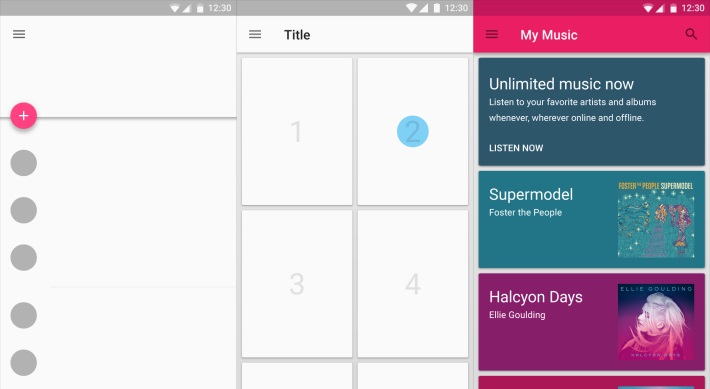
Google has updated Material Design developer guidelines with several new sections and additions to some existing content. These guidelines makes it easier for app developers to tailor their apps to fit the design of the latest version of Android.

The new guideline includes:-
- Data tables
- Units and measurements
- Floating Action Button has been moved into its own section, adding new details about behavior and transitions
- App structure
- Component sticker sheet for Adobe After Effects
- Data truncation and redaction
- Writing guidelines for Settings
Additional significant content updates include:
- Typography adds further guidance on style and line height for dense and tall languages
- Cards includes more specs for laying out actions and content
- Dialogs contains additional layout guidance
- Tabs adds guidance around label content and more complete sizing specs
- Scrolling techniques adds guidance for overlapping content
More details about the guidelines are present here
