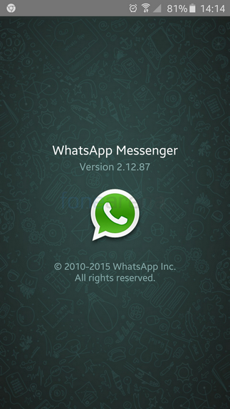
WhatsApp recently made the new Material Design update for its app live on the Play Store. Now it has introduced a new Beta version of the app – v2.12.87 that goes another step ahead and replaces any remaining Holo aspects of the UI with Material Design elements. It brings about a few other changes as well.
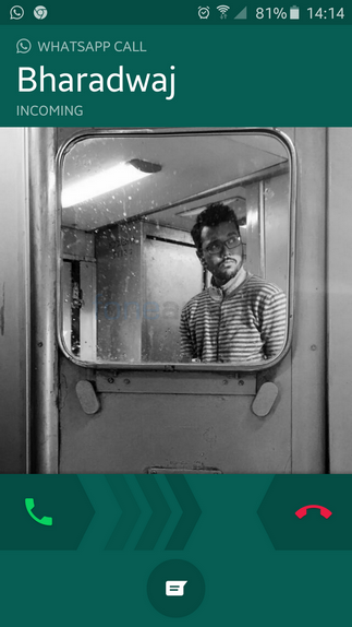
The Whatsapp calling screen has also been changed to a Material Design one now. The change makes the calling screen look cleaner and easier to work with. The caller’s name is now larger, the background is now a teal green color instead of black like it was before and you also get animated arrows from the call answer/reject buttons. Below that you also get the reject with a message button.
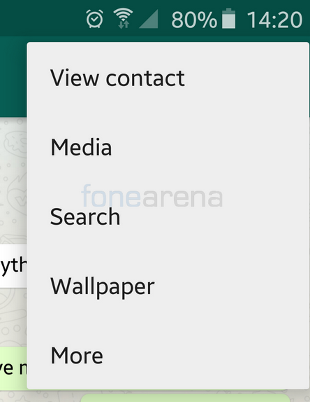
The chat background has also been updated. While it still looks very similar to the old one, it is now updated with a brighter more cleaner looking image. The icons from the extra options menu are gone and now only text appears there. The Whatsapp calling shortcut is still located near the attachment shortcut and that is something we would like to be changed in a future update as it is often pressed accidentally when trying to attach something. Perhaps a confirmation of the call you wish to place would be nice or else moving the shortcut to the top left or placing it along with the other extra options.
There are a few other changes in the UI that you really have to look at carefully in order to notice. But these changes do make your Whatsapp experience more cleaner, smoother and more enjoyable on the whole. If you wish to download this Beta version of Whatsapp, you can do so at the source link below.


