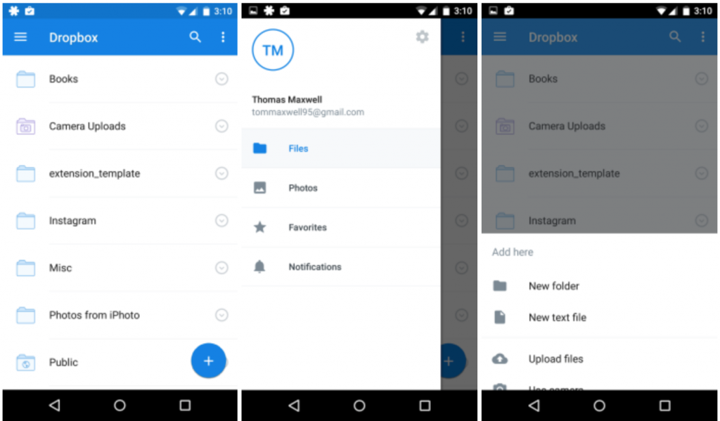
Dropbox has been adapting Google’s Material Design UI elements into its application over the last few releases. The beta releases since v2.6 have progressively introduced the design language. Today, the company has bumped up the application to version 3.0 and is rolling out the updated design to all users.

The fresh update brings with it a new UI scheme that fits right in line with the Material Design language guidelines laid down by Google. Users will find colored status bars, a hamburger navigation menu and a floating action button. A flat UI color scheme rounds off the upgrades to the application, there is no new functionality here. That said, All of the changes work in tandem to make the application interface much cleaner and easier to navigate. The update is going live on the Play Store and should hit your phone over the next few days.
[Via – 9to5Google]
