Facebook Notes has received a makeover as a blogging platform. The latest update allows users to post longer pieces of articles that differentiates from a standard Facebook status update thereby making them look like a blog.

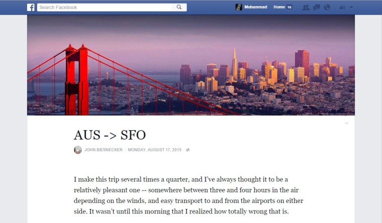
The revamped ‘Notes’, features a more friendly design, wider posts, large cover images and better, clearer fonts. These additions makes the Notes look like a blog. Use of large images at the top and the entire UI gives Notes a ‘Medium’ like look. The new version of Notes gets rid of the sidebar with ads and other suggestions. Facebook had originally launched Notes in 2006 but it got overshadowed by constant updates to the social network and hence never picked up. Notes had received a major update in 2010 and a makeover was much due. The new design was first spotted by Facebook user John Biesenecker.
“We’re testing an update to Notes to make it easier for people to create and read longer-form stories on Facebook,” said a Facebook spokesperson. The Notes update is currently being tested on limited number of users. Facebook’s 1.4 billion users is a huge audience for bloggers and with an enhanced Notes feature, the social network is a great platform to get more and more readers. Facebook recently launched Instant articles, that allows a number of publishers including The New York Times, National Geographic, BuzzFeed etc. to post their articles directly to the social networks iOS app.
