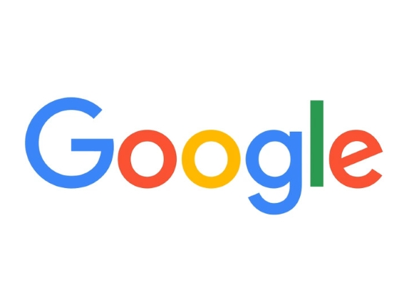

Last month, Google as company got restructured under a new parent company called Alphablet and Sundar Pichai was promoted from SVP Products to Google CEO. Now, the firm has brought one more change and it is the all new Google logo.
On Tuesday, Google unveiled the new design saying that it is the “brand identity that aims to make Google more accessible and useful to our users—wherever they may encounter it.”
[HTML1]
The new logo is set in a custom, geometric sans-serif typeface, but it still retains distinct multi-color sequence. It is still simple, and has more flat look in-line with Material design philosophy.
The Google logo has always had a simple, friendly, and approachable style. We wanted to retain these qualities by combining the mathematical purity of geometric forms with the childlike simplicity of schoolbook letter printing. Our new logotype is set in a custom, geometric sans-serif typeface and maintains the multi-colored playfulness and rotated ‘e’ of our previous mark—a reminder that we’ll always be a bit unconventional.
Company has also changed the design of compact version of the Google logo. It now has been replaced from little blue “g” icon to new four-colour capital “G” icon.
Just to tell you that Google had slightly tweaked the logo earlier this year in April as well, but that was just the alignment issue that firm had corrected. Now, with this iteration it is the sixth time Google had redesigned its logo since its inception in 1998.
httpv://www.youtube.com/watch?v=olFEpeMwgHk
