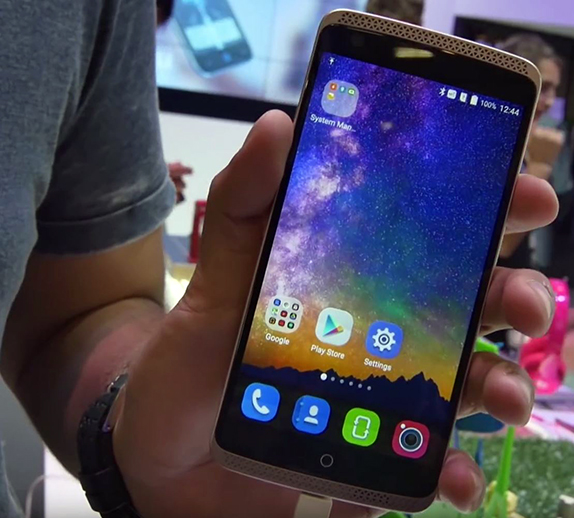

During IFA 2015 in Berlin, we were able to get our hands on the much praised ZTE Axon Elite. We took a closer look at the handset that is mainly focused at improved imaging and audio quality.
The ZTE Axon Elite has quite an unusual design. It looks like an iPhone has been inserted into a speaker case primarily due to an all black front and a circular home button. The screen on the device is a 5.5″ 1080p IPS panel and while it isn’t winning the pixel race with the likes of Sony’s 4K Z5 Premium or even Samsung’s Galaxy flagships and LG’s G4, it still is quite a dense display and we didn’t find it short on sharpness. The display was also quite vibrant and had good contrast. In fact, the screen is less reflective compared to most other high end devices we have seen recently as well which should directly improve its sunlight legibility. How exactly it performs under sunlight is something we’ll be able to comment on better after we review it.
The front facing camera seemed quite good in our short experience with it. The brightness was good and the noise levels were kept to a minimum even though we tried it indoors. The 8 Megapixel resolution also manages to capture quite a lot of details. The stereo speaker did sound loud however, it was a bit hard to judge it accurately considering the noisy environment. Out of the dual speaker setup, the one at the top doubles as the earpiece when calling. The setup allows for a good acoustic experience in both portrait as well as landscape modes. The device does support high quality audio through the headphone jack.
There are three capacitive keys below the display – the home button in the centre along with a multi-tasking and return key on either side. Just like on the OnePlus 2, these keys are programmable and the user can choose their function based on their preferred layout. The power/lock key on the right and the volume rocker key on the left are well raised above the body and provide good feedback when pressed.
The design gets more weird when you turn the phone over to check the back. The major portion of the back has a soft touch matte finish metal while the top and bottom portions have a faux leather finish with faux stitching as well. We aren’t the biggest fans of this setup as it tries too hard to look premium. Either one of the two would’ve been good enough rather than a mix of both.
The rear camera unit comprises of a dual lens system with a 13 Megapixel primary camera long with a secondary 2 Megapixel camera for depth sensing. There is a dual LED flash unit to accompany the camera as well. We weren’t able to try out the depth sensing feature properly but the images that we took seemed quite good in terms of image quality, sharpness and the details captured. Again this will be something that we look forward to trying out in depth during our review. Till then we can say that this device seems quite capable of doing well and we are interested to see what it can do.
There is a fingerprint sensor below the camera unit which seemed to be more sensitive and easier to use than most fingerprint sensors on yesteryear smartphones. We would’ve preferred a fingerprint sensor on the front or even on the side like Sony have done but they have still implemented it quite well.
The device is powered by a Snapdragon 810 processor and has 3GB of RAM which put together gave quite a snappy performance and we didn’t observe any overheating or lag. The 3000 mAH battery should be good enough to last a whole day with proper optimization from ZTE especially considering that it has a 1080p panel. But even if it dies, you’d be delighted to know that there is Qualcomm Quick Charge 2.0 that will allow the device to charge 60% in 30 minutes.

