Flipkart has launched a mobile website called as Flipkart Lite. The website is a toned down version of the desktop website and its mobile app.


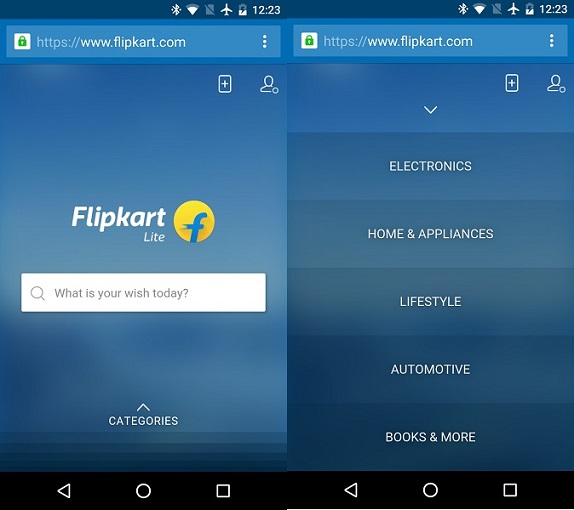
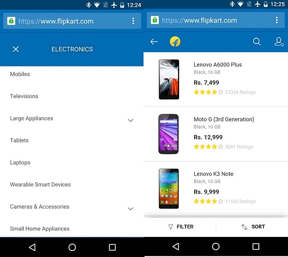
The Facebook Lite mobile website continues to adorn the blue color tone from the desktop and app. The UI is simple and and offers all the content up front with fewer navigation steps. As soon as you open the site you will see the Flipkart Lite logo on the homescreen along with a search bar at the center that lets you find items you are looking for. At the bottom of the home screen is a button for Categories and swiping it up shows you all the categories like Electronics, home appliances, Lifestyle and so on. Similar to the desktop and mobile app, users can filter or sort the products based on various factors.


The mobile website is fast and feels responsive. There is a tab on the right hand corner on the home page and tapping on it adds Flipkart Lite to you mobile’s home screen just like any other app. The latest move comes from Facebook after it was reported to be adopting the app only model like Myntra. In August, the company decided to put the decision to go app-only on hold.
httpv://www.youtube.com/watch?v=MxTaDhwJDLg&feature=youtu.be
