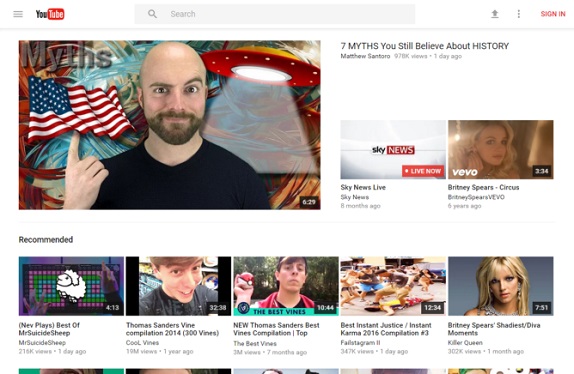
Google is testing a new Material Design makeover for YouTube on the Web. The refreshed UI is being currently tested on small group of users.
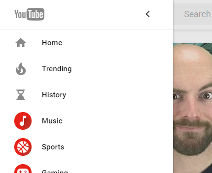
The YouTube home page has a new toolbar that sports a search box. There is an upload icon and an overflow menu with options to change the language and country, access help, turn on/off restricted mode, send feedback and restore the “classic” interface. A hamburger menu is present on the left that slides out with links to Home, Trending, History, and other categories.

The channel icons have been refreshed to round and now come with subscriber count and subscriber button. Similar to the mobile revamp that happened last week, the web version is getting larger video previews and an overall flatter look. The overall UI is cleaner and the video player interface is the same but the info and buttons below are reorganized.
