While the Moto G and E series of phones helped the company break into the mass market, it was the Moto X that cemented the company’s foothold in the upper end of the market. The handset encompassed everything that users loved about the Nexus series of phones and delivered added goodies like Moto Maker derived customisation on top. While the Lenovo acquisition led to the demise of the latter, the Moto Z points to a brand new direction for the company’s flagship device. Here’s the FoneArena review of the Moto Z, one of the most interesting devices to be launched in 2016.
Moto Z specifications
- 5.5-inch (2560 x 1440 pixels) Quad HD AMOLED Corning Gorilla Glass display, 535ppi
- 2.2GHz quad-core Qualcomm Snapdragon 820 processor with Adreno 530 GPU
- 4GB LPDDR4 RAM, 64GB internal memory, expandable memory up to 2TB with microSD
- Android 6.0.1 (Marshmallow)
- Dual SIM
- 13MP rear cameras with dual-tone LED flash, OIS, Laser Autofocus, 1.12um pixel, f/1.8 aperture
- 5MP front-facing camera, f/2.2 aperture, Wide-Angle lens
- Fingerprint sensor
- Dimensions: 153.3 × 75.3 × 5.19mm; Weight: 136g
- Moto Mods connector, Water repellent nano-coating, USB-C port for headphones, charging and data
- Front-ported loud speaker, 4-Mics
- 4G LTE (Cat 9), WiFi 802.11 ac (2.4 GHz + 5 GHz) with MIMO, NFC
- 2600mAh battery with Turbo charging
Design
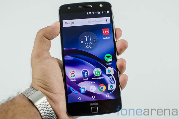
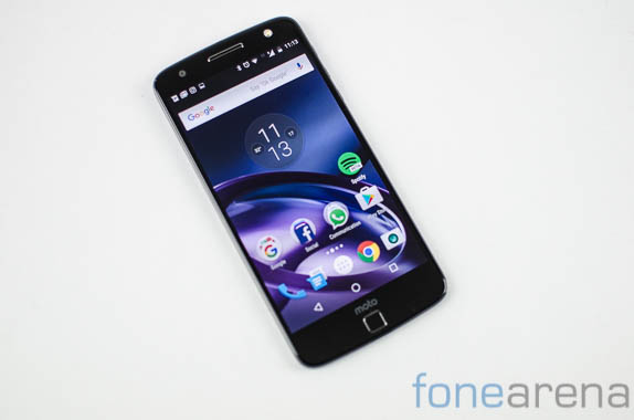
The Moto Z is the company’s flagship device and it shows. The combination of glass and metal melds together seamlessly. The overall design language of the phone remains very similar to that seen even on Moto’s entry level devices but certainly doesn’t take away from the fact that this is a premium device.

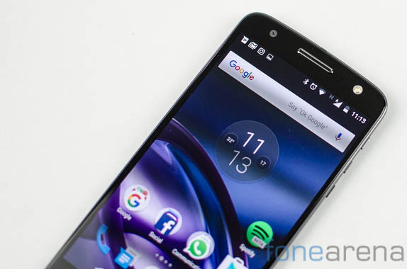
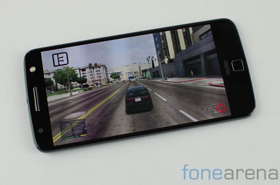
The front of the Moto Z sports the 5.5 inch Quad HD AMOLED display. Up at the top is a 5MP front facing camera alongside interestingly an LED flash placed at the opposite corner. The top earpiece also doubles up as a speaker allowing for crisp and clear audio playback. A feature that we don’t particularly like is the fingerprint scanner placed at the bottom. Where most competitors either place this at the rear or use the button as a home key too, the fingerprint scanner on the Moto Z serves a single purpose. On screen controls for back, home and menu show up near the bottom of the screen but more often than not, we ended up reaching out for the fingerprint reader to go to the home screen. That said, the scanner is sensitive enough and quickly drops you into the device as you tap on it.

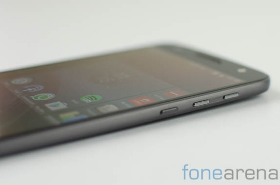
Along the right edge, you’ll find the volume rocker and power button. The edges curve around softly with the buttons placed towards the top. That said, we found them to be rather small and on occasion it can be a bit hard to reach out to them. The tactile feedback on the other hand is perfectly good. The power button has a rough finish on the top making it easy to identify it amongst similarly sized buttons.
There’s a hybrid SIM slot placed along the top edge of the phone. Users can choose between dual SIM mode or replace the second SIM for a microSD card slot. A noise cancellation mic is also placed up top. For better or worse, Moto has eschewed the headphone jack on the phone and you’ll be using the USB Type C port along the bottom edge. If you still wish to use regular analog headphones, fret not as Moto has bundled in a USB Type C to 3.5mm audio converter in the box. With 2 of the top smartphone manufacturers dropping the audio jack and Samsung rumored to the same, it seems we’ll all have to accept the looming reality of the dongle life.

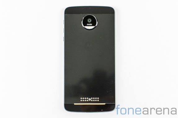
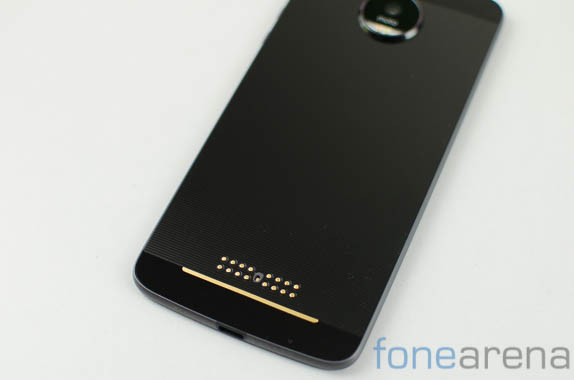
Flip the phone over and you can observe some incredible design flourishes like the metallic back which is interspersed with parallel lines of matte and glossy finish. Despite being constructed out of a relatively polished material, this part of the device is mostly fingerprint resistant but can pick up scratches if you’re not careful. The camera module sits proud from the phone with the lower half relegated to the dual LED flash and Laser Autofocus unit. Lying along the absolute lower edge however is the most interesting part of all. 16 gold pin connectors lie parallel to each other in an 8 x 8 configuration allowing for the very intriguing Moto Mods ecosystem to take effect which we’ll talk about that in another article.

The Moto Z measures 153.3 × 75.3 × 5.19mm and weighs just 136 grams. That slim shell however makes it just a tad bit uncomfortable to hold, a problem which is solved by using the included faux-wood style shell which add just a bit of thickness but make the ergonomics way better. The style shell also levels the handset with the camera island itself. Really though, the Moto Z is a gorgeous device.
Software
Like previous Moto devices, the phone runs almost vanilla Android with just subtle enhancements all around. We’ve always appreciated Moto’s UI enhancements and the Z is no exception to this despite Lenovo’s take over of Motorola.
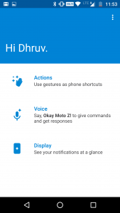
On the face of it, the experience of using the Moto Z is akin to working with a Nexus device. The interface is absolutely clean and for all practical purposes there are no extra apps preinstalled on the device. What genuinely pushes the interface forward though are Moto’s proprietary enhancements on the display, gestures and voice front. Let’s start with the first.

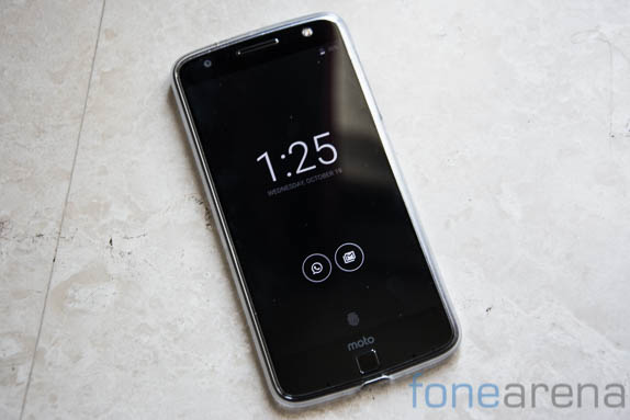
The moment you get a notification or place your hand over the screen, the screen lights up and shows the time and an icon representing the app that has a notification. You can now touch this icon to reveal further info about the notification all without having to switch the screen on. The entire experience is extremely handy once you get used to it and is visually appealing to boot.
Moto Voice is one of the other additions that essentially pulls up Google Now but allows you to dedicate a special, personalised command to it. This works as well as you’d expect from Google Now and we really had no issues in talking to Google’s assistant despite a warning from the app that we were in a room with a high amount of echo.
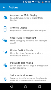
There’s additional gestures too like the ability to flip to silence or twist the phone twice to launch the camera. These features are nice to have but have been replicated by other manufacturers to a degree and don’t quite stand out like the convenience of Moto Display.
Performance
With a Snapdragon 820 processor onboard, you wouldn’t really expect the Moto Z to struggle with tasks and you’d be right. Alongside the 4GB of RAM, 64GB of storage and the vanilla build of Android, the Moto Z almost flies through whatever task you throw at it. We’ve yet to come across a single scenario where there is any visible slow down in processing or general UI frame rate. A top of the line processor stuck into an extremely slim body does have the unfortunate repercussion of heating issues though. Long periods of camera use, intensive apps, high graphic games all rapidly heats up the phone and often approaches an uncomfortable degree. Nonetheless, performance remains top notch without anything to complain about. Really, you can throw any app or game at the Moto Z and it will deliver the goods with aplomb. Now coming to synthetic benchmarks, we’ve included a few key benchmarks that should help you get a better of comparative performance. Do keep in mind though that real work performance can be wildly different and much more indicative of how the phone performs.

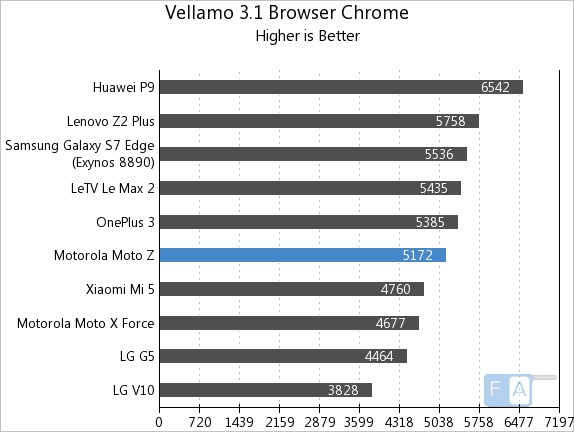
In the Vellamo 3.1 Browser benchmark, the phone scores 5172 points which is a bit lower than the competition but still enough to place it right in the middle of our test bench.
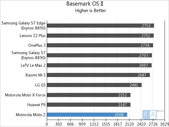
In the Basemark OS II benchmark, the phone scores 2068 points placing it in the bottom half of our test bench.
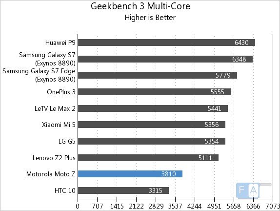
Similarly in Geekbench 3 Multi Core, the phone ranks a bit low with a score of 3810 points.
And finally in Geekbench 3 Single – Core benchmark, the Moto Z scored 1474 points. As we mentioned earlier, benchmark performance is a mere indication but does not reflect the full scope of a device’s performance. We found the Moto Z to be an excellent performer in every day use.
Display
The Moto Z has a 5.5 inch Quad HD AMOLED display to offer. Due to the nature of the AMOLED panel, the screen displays deep blacks, vibrant colors and excellent viewing angles. We were surprised to see how bright the display goes as it easily bested the Delhi and Chennai sun, allowing us to view it outdoors. This could be attributed to a feature that overdrives the screen to over 500nits where the regular maximum brightness is 370 nits.
Being an AMOLED panel, it can selectively display things like notifications without activating the entire display panel. This further helps with the battery life too as the entire display doesn’t need to be powered on. We observed excellent viewing angles with practically no color shift even when we viewed from the corner. Our only complaint with the Moto Z’s screen would be that the colors tend to veer towards slightly exagerated vividness even in the standard profile and don’t go as flat as we’d have preferred.
Camera
Let’s be frank, the camera module on the Moto Z is good but it’s not going to blow your mind. The phone sits in a category where it is competing with the best of the best and with that in mind, the images from the 13MP sensor tend to be just a bit underwhelming. On a hardware front, the sensor is backed up by a lens with an f/1.8 aperture which should theoretically allow in more light but the pixel size remains the same at 1.12 um and in a way explains why the sensor loses out to the competition that offers a larger pixel size at similar resolutions.
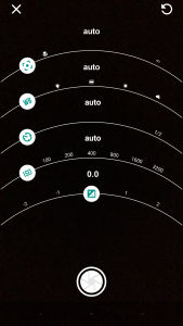
The camera app itself offers a ‘Pro’ mode in additional to regular shooting options. In this mode, users gain control over the shutter speed, ISO as well as manual focussing capabilities. The interface interestingly is nigh identical to what Nokia pioneered on it’s Lumia series of phones. In the regular mode, you can switch regularly accessed features like the HDR mode via a single tap. It’s not the most feature packed app and there doesn’t seem to be any way to enable RAW capture either. For not let’s move on to the image quality on offer.

Generally speaking, the images aren’t bad at all with noise levels well in check. Unfortunately the shots often took on a warmer hue than the real situation highlighting some trouble with identifying the right white balance. In low light, there’s a fair bit of digital noise reduction noticeable in the dark areas. Like most smartphone cameras, the phone performs well enough as long as there’s decent lighting conditions. The company has worked with Hasselblad to come up with a mod that promises to deliver class leading performance, we’ll be reviewing that separately.
The 5MP front facing camera is accompanied by an LED flash as we mentioned earlier on and it acts like a fill flash too when you’re shooting into the light. Even in less than ideal light, the front facing camera captures a decent amount of detail and produces sharp images with mostly accurate colors.
Connectivity & Battery Life
The Moto Z supports Cat 9 4G LTE, WiFi 802.11ac with MIMO as well as NFC. From a network perspective, this makes the phone future proof for the time being. We also noted the presence of a hybrid SIM slot that allows for a Dual SIM configuration or the choice to expand the 64GB of built in storage via a microSD card. The phone charges and transfers ALL data over USB Type C and as talked about earlier, lacks a 3.5mm audio jack too. We see why Moto had to ditch the hardware because of a lack of space in the slim shell but we’re not entirely of the opinion that this is in the consumer’s best interest. Sure, you can connect a dongle to use your analog headphones but they don’t allow you to simultaneously charge you phone which is a situation that we found ourselves in just a couple of days back.

Battery life on the Moto Z is pretty much what we expected. Being the slimmest device on the market means that Moto couldn’t squeeze in much more than the 2,600mAh battery onboard. This proves to be woefully inadequate for the top of the line processor, Quad HD display and a full range of sensors. We regularly had to charge up the battery by the middle of the day and with active use, there is no way that the phone can last a full day without one of the additional battery mods attached to it. The charger provided in the box is of the 15 watt variety and allows you to quickly top off the handset but we’d highly recommend that you invest in a battery mod should you chose to buy the phone.
Conclusion
The Moto Z is quite simply, one of the best devices that the company has made. Not only is it a gorgeous phone in it’s own way, it also paves the path for a new brand of modular phones and keeps the legacy of Motorola alive at Lenovo.
In extended user, our biggest complaint was the battery life and that too only with active use. The hardware looks and feels great and the surprisingly useful software enhancements are more than welcome. Priced at Rs. 39,999, the Moto Z is a fairly sensibly priced flagship device that has more than a few tricks up it’s sleeve to hold its own.
Pros
- Gorgeous hardware
- Excellent display
- Vanilla Android with some very useful tweaks added in
Cons
- Battery life is less than stellar
- Camera could be slightly better
- Audio over Type C will take getting used to
