Following straight in the steps of the Xiaomi Mi Max, it is now the turn of yet another gigantic phone cum tablet to launch in India. Announced a couple of months back, the Zenfone 3 Ultra is now available in the country and we’re been using it for a few days now. Is this the perfect phone that doubles up as a tablet or really just a small tablet with a phone component inside? Read on our review of the Zenfone 3 Ultra to find out.
Asus Zenfone 3 Ultra specifications
- 6.8-inch (1920 x 1080 pixels) display with 95% NTSC color gamut
- Octa Core Snapdragon 652 processor (Quad 1.8GHz ARM Cortex A72 + Quad 1.2GHz A53 CPUs) with Adreno 510 GPU
- 3GB / 4GB RAM, 32GB / 64GB / 128GB internal storage, expandable memory with microSD
- Android 6.0 (Marshmallow) with Zen UI
- 23MP rear camera with dual-tone LED Flash, Sony IMX318 sensor, f/2.0 aperture, 4-axis OIS, 3-axis EIS, Laser AF
- 8MP front-facing camera, f/2.0 aperture, 85-degree wide-viewing angle
- Hybrid Dual SIM (micro+nano/microSD)
- Fingerprint sensor
- Dimensions: 186.4 x 93.9 x 6.8 mm; Weight: 233g
- 4G LTE, WiFi 802.11 a/b/g/n/ac (2.4/5 GHz), Bluetooth 4.2, GPS, USB 3.0 Type-C
- Dual Five-magnet stereo speakers, NXP smart amplifier, Hi-Res Audio (HRA)
- 4600mAh battery with Qualcomm Quick Charge 3.0
Design
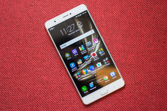
Asus has adopted a homogenous design on the entire Zenfone 3 range of phones and this is very evident in the approach towards the Zenfone 3 Ultra as well. Now before moving on to specific design features, we should probably talk about ergonomics. At 186.4 x 93.9 x 6.8 mm, the Ultra is without a doubt a gigantic device which is to be expected given the massive 6.8 inch display housed in that frame. Despite software tweaks and efforts by Asus to make the Zenfone 3 Ultra usable in a single hand, it is most comfortable only when using both hands especially with the marginally slippery brushed metal elements on the side and rear. For the most part you’ll have to set aside anything else you’re holding before digging out the Zenfone 3 Ultra.
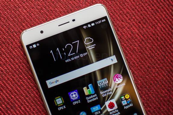
The front of the Zenfone 3 Ultra is mostly composed of the large 6.8 inch Full HD IPS display. Narrow bezels run on either side of the screen while above it lies the 8MP front facing camera. Below the display is a central hardware home key flanked on either side by capacitive keys that correspond to back and multitasking. Both these keys are backlit of course. The central home key also houses the fingerprint scanner that proved to be quick at scanning and dropping us into the user interface.
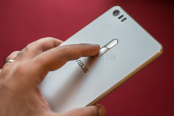
The right hand side is where you’ll spot the centrally placed power button as well as two nano SIM card slots above it. One of these is a hybrid slot allowing you to expand the built-in 64GB of storage using a microSD card. You’ll observe that there’s no volume rocker here and that’s because it has been placed over at the rear of the handset. This shouldn’t be much of a surprise for those of you who’ve used previous Zenfone series devices. On a phone of this size, reaching the rear volume rocker is a definite stretch and it is far from convenient. We managed to drop the phone a couple of times while trying to adjust the volume due to the sheer size of the device.
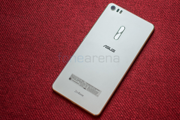 The back of the phone eschews the spun metal and glass design of the regular Zenfone 3 and adopts the brushed metal finish from the Deluxe. While the spun metal and glass is certainly more visually striking, we feel that Asus has done a good job by adopting the brushed aluminum which is much more scratch and scuff resistant. The 3.5mm audio jack is placed at the top while the bottom of the phone sports the USB Type C connector.
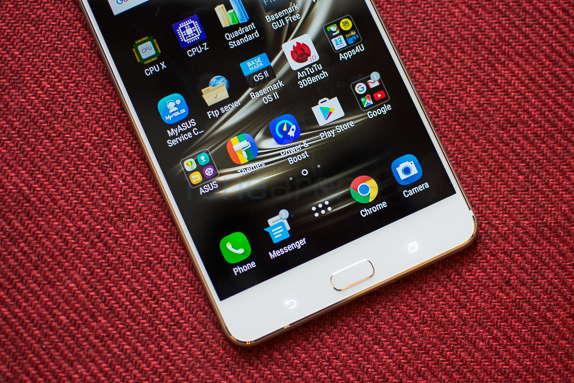
Overall, the Zenfone 3 Ultra is more or less a gigantic take on the Zenfone 3 Deluxe. The expanded dimensions obviously have a negative effect on dimensions but if you are in the market for a large screen phone like this, you’ll simply have to live with the limitations till edgeless displays like that from the Mi Mix become commonplace.
Software
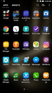
The Zenfone 3 Ultra runs Android 6.0.1 with ZenUI on top. Time and time again we’ve commented on the sheer amount of bloat on the ROM and unfortunately, once again Asus has continued its tradition of installing close to 24 applications on their phone. This includes redundant apps like multiple browsers, game shortcuts and some marginally interesting ones like the Laser Ruler.
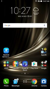
Moving on to the interface itself, it is quite the same as we’ve come to expect from Zen UI. The phone keeps the three level hierarchy where in dropping in from the lockscreen takes you to the homescreen and you can further access an app drawer from here. The lockscreen itself allows for multiple customisable shortcuts that can help you quickly get into your favorite apps.
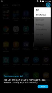
In typical Asus fashion, the homescreen is very customizable and you can add themes, icon packs and more to completely tweak the interface. Dive into the app drawer and once again you can sort out apps using a number of ways. The software can also place these apps into smart folders which sorts them out on the basis of functionality. Despite the large amount of bloat, the phone remains smooth for most parts of UI navigation. There’s a fair few interesting additions but the heavy-handed pre bundling on the hardware is something we could have gone without.
Performance
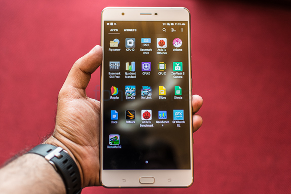
Internally, the Zenfone 3 Ultra is powered by a Snapdragon 652 processor and 3GB of RAM. For a phone priced at Rs. 50,000, these are pretty low end specs. We agree with Asus that specifications aren’t the be all and end all but if users are investing flagship grade money on a phone, they expect flagship grade hardware that gives them their money’s worth. We found performance to be satisfactory while browsing through menus and more. Heavy multitasking is managed fairly well though you might face issues with large and graphically heavy games. On a day-to-day basis, there was little to complain from a performance perspective. Graphically intensive games on the other hand exhibited a few dropped frames and occasional slow downs. We’ve included some benchmarks below to give you a better idea of comparative performance.
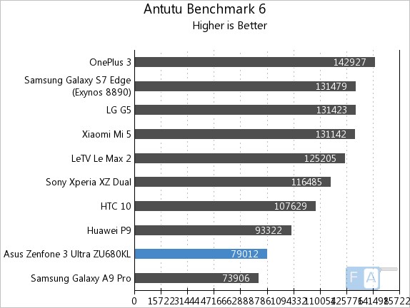
On AnTuTu 6, the Zenfone Ultra scores 79012 points placing it towards the bottom rung of the ladder. This is mostly because a lot of the competition is using higher end processor like the Snapdragon 820 here.
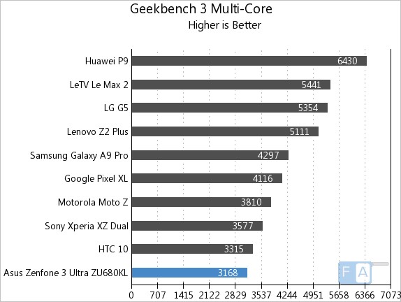
On the Geekbench 3 Multicore benchmark, the phone scores 3168 points and is placed right at the bottom of our test bench.
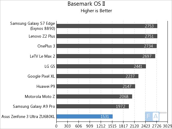
Similarly on Basemark OS II, the Zenfone 3 Ultra scores just 1531 points. Like always, we insist that benchmark scores are only indicative and don’t always reveal the true picture behind performance. This is equally true on Zenfone 3 Ultra where you might be discouraged by the poor scores.
Display
Face it, if you are buying a phone with a 6.8 inch display, the screen is definitely a priority for you. And resolution related concerns apart, it does not disappoint. The Full HD panel covers 95% of the NTSC gamut. The color rendition is spot on and brightness levels are good enough to view outdoors even on a sunny day.
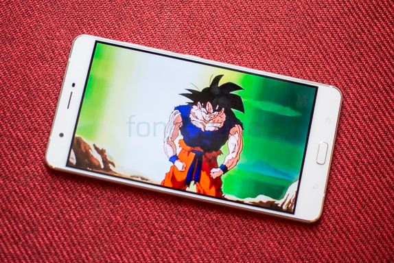
That said, the phone is begging for an upgrade to a Quad HD panel. The large, bright display looks good but it isn’t hard to notice soft edges around app icons and text. Given the media centric approach of the handset, it seems like a major faux pass by Asus.
Camera
Straight up, the camera on the Zenfone 3 Ultra is quite disappointing. Given the camera hardware pedigree though we’d err towards this being a software issue rather than hardware. There’s a 23MP rear camera with dual-tone LED Flash, a Sony IMX318 sensor and f/2.0 aperture. To step it up a notch, the phone even includes 4-axis OIS, 3-axis EIS, and Laser AF. All this means that the camera should ideally be capable of some stellar photography which is unfortunately not the case here.

The camera has a tendency to wash out all colors and sharpness levels tend to be lacking too. In fact we observed that despite having 4 axis stabilisation, images often turned out to be blurry.
What is evident is that the camera lacks dynamic range. The images tend to have overblown highlights with the skies appearing particularly washed out and details missing in the shadow region. Low light images are rather poor despite the dedicated shooting modes built into the phone. We’re honesty quite surprised by the poor camera capabilities and can only hope that this is a software issue that’ll get resolved with updates.
Connectivity / Battery Life / Multimedia
The Zenfone 3 Ultra is well equipped in terms of connectivity options. From 4G LTE, WiFi 802.11 a/b/g/n/ac (2.4/5 GHz), and Bluetooth 4.2 to the requisite GPS support, the phone has it all nailed down. Charging is done over USB 3.0 Type-C and interestingly, the phone is amongst the first to support video out as well. Unfortunately we couldn’t test this out since we were unable to find compatible cables but it does lend further credence to the multimedia credentials of the phone. Built in storage on the phone is 64GB and of this around 52GB is available free. There’s dual SIM card slots onboard and the second slot doubles up as a microSD card slot as well. We reiterate our previous stance that we are really not in favor of hybrid SIM slots since you have to choose between hardware capabilities. Beyond the microSD card slot, the phone can also augment built in storage using a USB OTG drive.
With the massive 4600 mAh battery, standby times on the Zenfone 3 Ultra are superlative. We could easily get two days of use from the handset and often even on the third day there was enough charge in it to get us through half the day. The large battery quickly became one of our favorite things about the handset.
With dual Five-magnet stereo speakers, a NXP smart amplifier and Hi-Res Audio support, the Zenfone 3 Ultra ticks all the checkmarks for high quality audio output. Let’s talk about those speakers first. The Ultra goes loud, REALLY loud. There’s hardly any stereo separation since both the speakers are at the bottom but you won’t complain about volume. There’s just a hint of bass but that would be expecting a little too much from a smartphone speaker and we were happy to see that audio did not crack even at high volume levels. Coming to headphones output, the phone performs well enough. The noise floor is slightly high so on sensitive headphones you’ll be able to hear a bit of hiss but for the most part audio performance is satisfactory.
Conclusion
Calling the Zenfone 3 Ultra, a phone, is a bit of a stretch. For that matter it transcends even the phablet category and is approaching small tablet standards. Marginally smaller than a Nexus 7, it really puts media consumption and battery life first. On those fronts, the phone excels with a very good screen though points could be deducted for it not being a Quad HD panel. The exemplary battery life further aids its claim of being a content consumption device.
Unfortunately everything else falls apart as ergonomically the handset is way too big to be convenient as a phone. The camera too proved to be very disappointing. Overall though, with all these caveats it is hard to make a case for the Zenfone 3 Ultra at a price point touching Rs. 50,000. Should you really want a very large smartphone, the Xiaomi Mi Max is good enough to satisfy your curiosity at a much more palatable price point.
Pros
- Good screen
- Battery Life
- Display out over Type C
Cons
- Too large to be comfortable
- Poor camera
- Price

