
Last year’s Moto Z Play was widely considered as one of the best devices in the company’s line up. A perfect balance between performance and stellar battery life, the phone also served as a showcase for the Moto Mod ecosystem at a lower price point. With the Moto Z2 Play, the company has the same goals in mind with refinements on most fronts. Let’s take a closer look.
Moto Z2 Play specifications
- 5.5-inch (1920 x 1080 pixels) Full HD Super AMOLED display with Corning Gorilla Glass 3 protection
- 2.2GHz Octa-Core Snapdragon 626 processor with Adreno 506 GPU
- 4GB LPDDR3 RAM, 64GB storage, expandable memory up to 2TB with microSD
- Android 7.1.1 (Nougat)
- Dual SIM
- 12MP rear camera with dual-tone LED flash, Dual-Pixel Autofocus, Laser Auto focus, f/1.7 aperture, 4K video recording
- 5MP front-facing camera with f/2.2 aperture, dual-tone LED flash
- Water repellent nano-coating
- Fingerprint sensor
- 3.5mm audio jack, FM Radio
- Dimensions: 156.2 x 76.2 x 5.99mm; Weight: 145g
- 4G VoLTE, WiFi 802.11a/b/g/n (2.4 GHz + 5 GHz), Bluetooth 4.2 LE, GPS, NFC, USB 3.1 Type-C
- 3000mAh battery with Turbo charging
Design
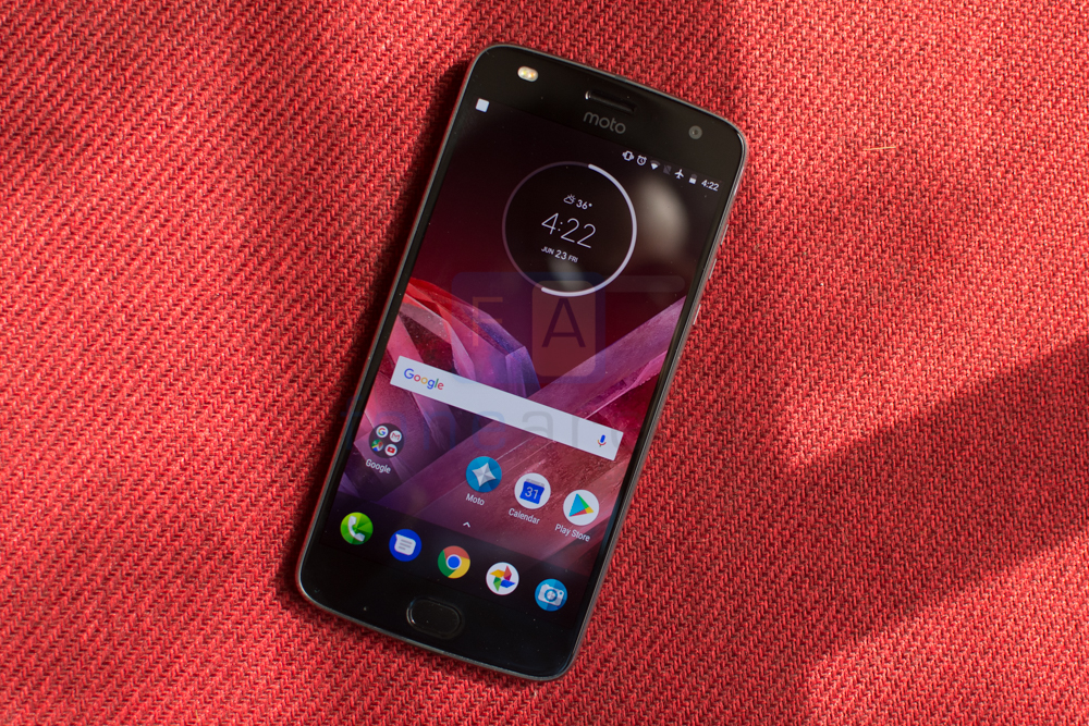
There’s a certain homogeneity to Moto’s designs across the board. The front of the phone isn’t all that different from the phone that it replaces and in fact looks right in place with the entire Moto Z line up.


The center is of course dominated by the 5.5 inch Full HD Super AMOLED screen with a Corning Gorilla Glass 3 layer above it. While the world moves towards bezel free displays, the Z2 Play unfortunately sports substantial bezels along the sides. The large screen and fairly large bezels both contribute to making the phone rather wide and this makes it difficult to handle if you have small hands. Both at the top and the bottom too there’s a significant lip area. There have been improvements here though.
The top of the phone appears a bit crowded with the Moto logo below the earpiece. On the right is a 5MP front facing camera while the left side has a dual tone LED flash. More on this in the camera section. Below the screen you’ll find the fingerprint sensor as well as a microphone. Compared to the last generation Moto Z Play, the fingerprint sensor is now larger. The shape too has changed to oval from the square sensor. The reason for this is more than aesthetics. The sensor now doubles up as a gesture area and you can toggle between this and the onscreen multitasking, back button. A short learning curve aside, we found the gestures to be very intuitive and felt ourselves trying to perform the same on other phones too.
The entire construction of the device is glass and aluminium. The bezels along the side have a very slight silver chamfer that merges into a nicely curved space grey soft touch rim. The right side has segregated volume keys while below it is a ridged power button. While all the buttons have excellent give, we observed that the volume buttons were on the smaller side and placed too close together. It can be a bit difficult to effectively press the up or down button though we’re really nitpicking here.
The left side of the phone is bereft of buttons while at the top you’ll spot the Dual Nano SIM and microSD card slot. it is certainly good to see that the company has opted for a dedicated microSD card slot instead of going for a Hybrid SIM slot. Next to it you’ll find a microphone port. The bottom edge has a USB Type C connector in addition to the 3.5mm audio jack.
Flip the phone over and there’s a lot more changes. Where the first generation Moto Z Play employed a glass back, Moto has gone for a matte finish metal back. As smartphone manufacturers work hard to hide away the antenna lines, Moto has embraced them and integrated them into the design. They run all the way along the edges and widen up a bit at the top and bottom. This effect looks great and certainly adds to the visual appeal of the phone.
There’s a very prominent camera bump towards the top and sticks out quite a bit. Given how slim the phone is at just 5.99mm, the bump appears even larger. Still, it never really snagged in our pocket so it probably shouldn’t prove to be a problem. In fact Motorola maintains that the large bump helps the phone sit at an angle and prevents the camera module from sitting flat on the desk which could potentially scratch it.
Along the bottom edge is the 16 pin contact strip for Mods. The pins are critical to enabling the Mod ecosystem and there’s no getting around them. Though they look quite good to us in a steampunk-ish way, we can see why many might not. All in all though, the Moto Z2 Play seems to have improved the design on most fronts.
Software
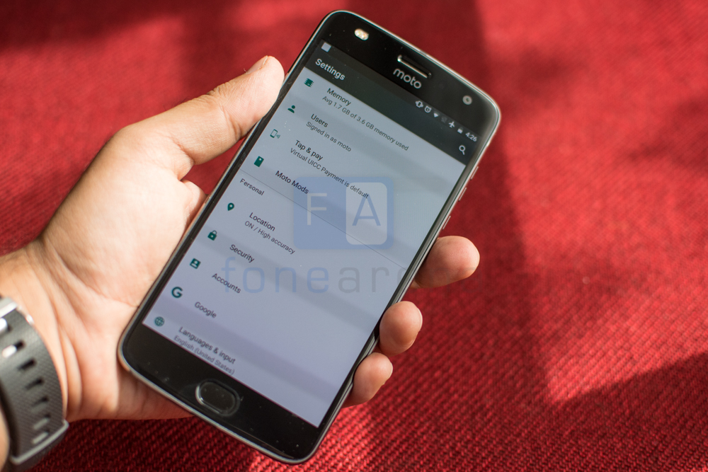
Android 7.1.1 Nougat powers the show here and is almost stock for the most part. Motorola prefers a hands off approach with the software onboard their phones and this approach works remarkably well.
The entire interface paradigm is remarkably similar to stock Android. The homescreen has a shortcut for Google Now and the camera app at the opposite corners. Swiping up simply drops you into the launcher itself. The homescreen sports a fixed shortcut bar along the bottom edge while above it as always lie the app shortcuts as well as space for widgets. Swiping up from the bottom will give you access to the entire list of apps.
As we mentioned earlier, there are additions to the interface and these are mostly integrated into a single Moto app. This app further subdivides them between Moto Actions, Moto Display and Moto Voice. Actions lets you use gestures to perform actions like performing a chopping motion to turn on the flashlight or perhaps a quick twist to turn on the camera. This is also where you can disable the onscreen buttons and switch over to the gesture based navigation on the fingerprint reader. Moto Display on the other hand enables an ambient mode on the screen that is activated using the proximity sensor. It allows you to view basic notifications, a clock and battery. Unlike implementations on other smartphones, the display panel does not stay switched on all the time which seems like a missed opportunity since the onboard AMOLED panel could easily facilitate this.
Finally we have Moto Voice which lets you perform basic tasks like reading out messages, weather info and more. With Google Assistant onboard though this is redundant and we can’t really encourage anyone to opt for this over Google’s much superior implementation.
Performance
The Moto Z2 Play is powered by a Snapdragon 626 chipset paired with 4GB of LPDDR3 RAM. Now this might not seem like a particularly powerful chipset and certainly, not much of an improvement over the device that it replaces. In combination with the clean build of Android though, the Z2 Play shines and delivers a perfectly good experience. For everyday use, the phone is perfectly adequate and gets the work done. The RAM is sufficient for day-to-day multitasking and we really grew to love how efficiently everything works. It was the rare occasion where we felt the need for more power. Only high-end 3D games proved to be a slight challenge for the phone where there were occasional frame rate drops.
Camera
On paper, the 12MP camera module paired with an f/1.7 lens should be quite the performer. Unfortunately results weren’t quite as good as we expected.
There’s a distinct lack of dynamic range in the images. Shot in bright sunlight, you can see that the white door exhibits blown out highlights. At the same time, the darker sections behind the structure have lost most details.
We found focussing speeds to be plenty fast thanks to the laser AF module however optical image stabilisation was sorely missed. In even slightly low lit conditions like restaurant, the phone would inevitably capture blurry shots. No matter how still we stood, more often than not, images would have a modicum of blur which is just not acceptable in a device of its calibre.
Display
The 5.5 inch Full HD Super AMOLED comes with a Gorilla Glass 3 layer on top for scratch protection. The display is bright and vibrant and we found it to hold up well even under bright sunlight.
It is possible to adjust the screen temperature settings to suit your preference. The default is a touch too dull though it errs towards natural looking, meanwhile the vibrant setting will appeal to those who prefer oversaturated tones. The screen was well visible even from odd angles. There was a bit of color shift but only when viewing the screen from an extreme angle.
Connectivity & Battery Life
Connectivity options on the Moto Z2 Play include 4G VoLTE, WiFi 802.11a/b/g/n (2.4 GHz + 5 GHz), Bluetooth 4.2 LE, GPS, NFC as well as USB 3.1 over the Type C standard. The phone is a dual SIM device and has a dedicated slot for the microSD card expansion too. Additionally, there’s a built-in FM Radio in case you still prefer to listening to good old analog programming.
Now coming to battery life, this time around Motorola has dropped the capacity to reduce the thickness of the phone. This has had an obvious effect on battery life. Where the original Moto Z Play could last a day and a half with ease, the Z2 Play certainly needs to be topped off at night. That said, in combination with the frugal processor and 3,000 mAh battery, it still packs enough juice to get through a full day. We managed over 5 hours of screen on time despite heavy use on the Moto Z2 Play which we found to be satisfactory but your mileage may vary depending on your use.
Conclusion
There’s really no doubt that the Moto Z2 Play is a great phone. While the specifications might not be cutting edge, the phone still manages to deliver fast performance, a clean build of Android and the promise of fast updates. Add to that the satisfactory battery life and the Moto Z2 Play certainly looks quite appealing.
The Moto Z2 Play is priced at Rs. 27,999 which places it within spitting distance of the Huawei Honor 8 Pro as well as the OnePlus 5 which aren’t much priced much higher. Both the phones deliver much superior specifications and camera capabilities. Given the price bump compared to the first gen Moto Z Play, the Moto Z2 Play is no longer quite the value for money deal. We still feel that it is an excellent phone but it could very well do a slight price drop to make it all the more appealing.
