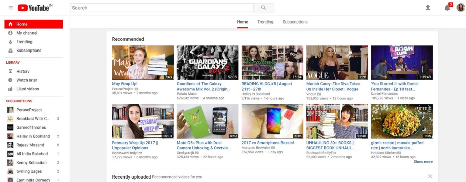
YouTube has rolled out a major overhaul and new features for its mobile and desktop app. The move comes from Google owned video sharing site to offer a more consistent look across desktop and mobile.
Firstly, YouTube has got a new logo and now the play icon is placed next to the YouTube name. Prior to the update, the “Tube” part was inside the play button in red. The logo is now much sleeker and the play button icon is also bright red. Up next, YouTube has updated its mobile app with a refreshed clean design that makes the header white that puts more focus on the content lead. The navigation tabs have been moved to the bottom of the app so they are closer to your thumbs. A new Library and Account tabs has been added that give you easy access to what you are looking for.
Earlier this year, YouTube introduced a gesture that allows you to double tap on the left or right side of a video to fast forward or rewind 10 seconds. Now in coming months, YouTube is testing a new feature that lets you jump between videos by simply swiping to left to watch a previous video or swipe right to watch the next one. Users can now speed up and slow down the playback of a video on mobile, a feature that was already available on the desktop.
YouTube will now support vertical videos with no black bars on the sides. YouTube player will change shape to match the video format you are watching. Along with the mobile app, YouTube has rolled out Material Design for UI that also includes the Dark Theme, which turns the background dark.
