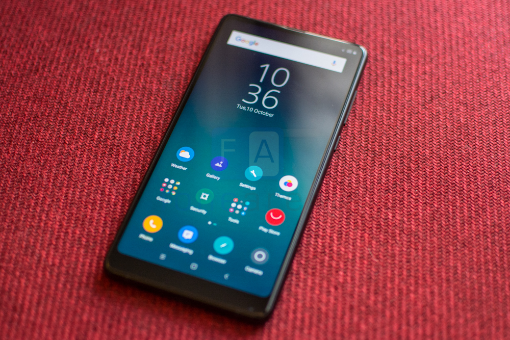
When the Mi MIX launched, a bezel-less smartphone was essentially a pipe dream. Sure, Sharp had announced a number of them over the years but a product that remained stuck in Japan doesn’t really count, does it? So, when out of the blue, Xiaomi of all brands introduced a modern, uncompromised smartphone that simply broke all design conventions, it quickly became the talk of the town.
In the year that has followed, bezel less and 18:9 are terms that almost every major smartphone manufacturer has latched on to. Now that the gimmick isn’t new or unique, the Mi MIX 2 has to stand up on its own merits. We’ve spent a bit of time with the new hardware. Not nearly enough to write a review but enough for us to pen down some initial thoughts. Let’s talk about the Mi MIX 2.
Xiaomi Mi MIX 2 specifications
- 5.99-inch (2160 × 1080 pixels) Full HD+ 18:9 display with 1500:1 contrast ratio, DCI-P3 color gamut
- 2.45GHz Octa-Core Snapdragon 835 64-bit 10nm Mobile Platform with Adreno 540 GPU
- 6GB LPDDR4x RAM with 128GB (UFS 2.1) storage
- Android 7.1 (Nougat) with MIUI 9
- Dual SIM (nano + nano)
- 12MP rear camera with Sony IMX386 sensor, 1.25μm pixel size, f/2.0 aperture, dual-tone LED flash, 4-axis OIS, 4K video recording
- 5MP front-facing camera with facial recognition, 1080p video recording
- Fingerprint sensor
- Dimensions: 151.8x 75.5 ×7.7 mm; Weight: 185g
- 4G LTE, WiFi 802.11ac dual-band (2×2 MU-MIMO ), Bluetooth 5.0, GPS/GLONASS/Beidou, NFC, USB Type-C
- 3400mAh (typical) / 3300mAh (minimum) battery with Qualcomm Quick Charge 3.0 fast charging
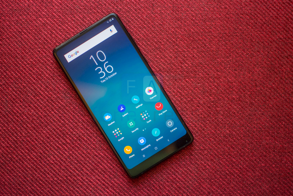
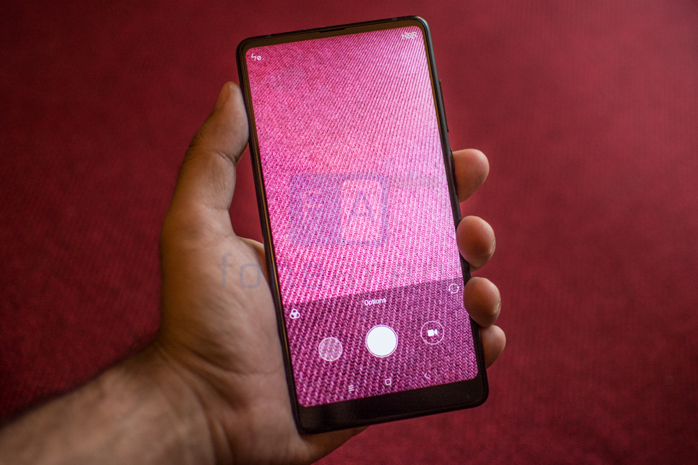
The company hasn’t been sitting on its laurels. One look at the MIX 2 affirms that much. The original MIX was a gigantic device that employed a 6.4-inch screen with a strange 17:9 aspect ratio. This time around though the hardware has been significantly shrunk down. The display is now a 5.99 inch unit with an 18:9 aspect ratio. You’ll notice that this closely aligns with the panel on the LG V30 or the new Google Pixel 2 XL. It is still an LCD unit but one of the finest on the market. Sunlight readability is absolutely fantastic and it goes pretty bright too.
The screen resolution might sound a bit low at 1080 x 2160 pixels which in simpler terms is a bit more than Full HD to account for the wider frame but is absolutely sufficient for on-screen use. Color representation is accurate and you can always dive into the settings to adjust the temperature. Xiaomi isn’t advertising the MIX 2 as Daydream compatible and if it did, you’d notice that the experience wouldn’t as immersive as some of the other flagship devices due to the drop-in resolution. But I digress, this is still a fine display and it is still amazing to see the almost zero bezels along the sides despite the feature having been mimicked by most.
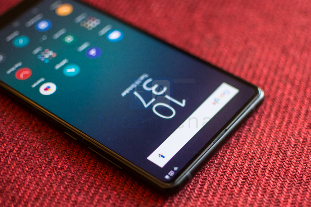
While last year’s Mix used a very cool piezo electric speaker in the earpiece that unfortunately performed rather poorly, the Mix 2 nixes that feature in lieu for a rather standard one. Well not quite, the speaker is placed behind the screen and the audio is quite literally being piped up through a slit above the screen but the end result is vastly superior to the piezo electric version.
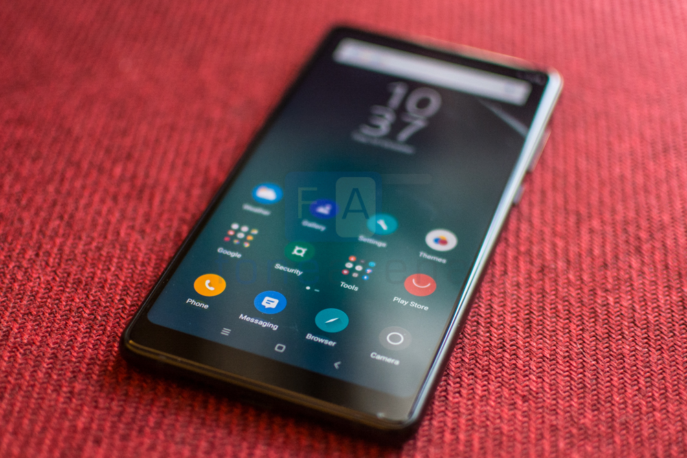
There is of course the lower lip that houses the 5MP front facing camera and the notification LED. The bottom bezel is about 12% thinner than the original Mix and is certainly no eye-sore. Placing the camera here does mean that it almost stares up your nose when you activate it. The phone helpfully suggests flipping the phone around to take a better picture and even turns the interface around. This however doesn’t work in a whole lot of 3rd party apps and results in some very awkward selfies. The camera placement comes with the territory as a design compromise that had to be made to reduce bezels on three sides. What would you rather have? The lip as chosen by Xiaomi or a notch that eats into the screen a la iPhone X? Personally, the Pixel 2’s implementation that adds functionality to the balanced chin by including stereo speakers sounds like a good trade off.
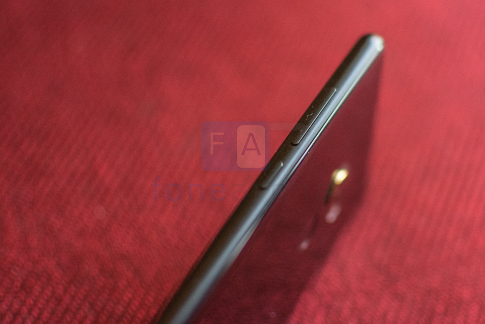
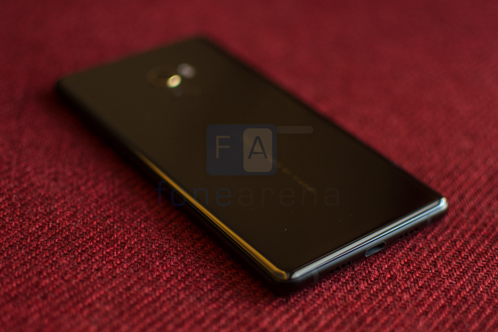
Moving on, there’s a certain refinement to the hardware. The edges are rounded off and sit comfortable in the palm. The volume rocker and power buttons are within easy reach on the right hand side while the left sports the dual SIM card slots. On the network communications side, there’s world wide LTE support now so you can take your phone with you almost anywhere. Some compromises have been made though and standard Xiaomi features like the IR Blaster and 3.5 mm audio jack are nowhere to be found. You’ve got a USB Type C connector at the bottom that doubles up as an audio jack. There’s Quick Charge 3.0 support for topping off the 3400 mAh battery.
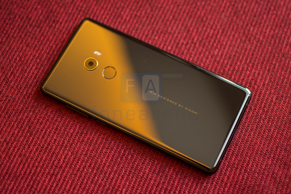
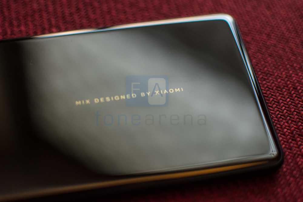
The back panel is made of ceramic and gently curves into the aluminum frame that forms the central part of the phone. If you like taking selfies with your phone’s rear camera, you’re going to love the Mi Mix 2. The ceramic back is extremely glossy to the point of acting like a mirror. But hey, it does look great and particularly nice in the hand. We suspect a lot of you will be using a case with the phone though given how slippery it is. The Mix 2 would slide down half the length of the couch whenever the vibration motor kicked in. Talking more about the design, the company’s gone for an understated upmarket luxury brand like look for the back of the Mix series. There’s 18 carat gold accent work around the camera module and a “Mix designed by Xiaomi” tagline etched into the device. Beyond that the design is fairly common place with a 12MP camera module and dual LED flash.
Since this is Xiaomi’s flagship phone, it has the standard spec list for 2017 devices including the requisite Snapdragon 835 chipset and 6GB of RAM. It has 128GB of storage, but the 256GB configuration might not make it to India. This is screaming fast hardware and as expected, there were no slowdowns anywhere at all. It’ll do anything you throw at it and then some more. Now to be fair, this is something you’d expect from a flagship phone and all of the competition is equally adept at getting things done. We’ll leave the benchmarks for when we wrap up our review but simply put, performance is beyond satisfactory and not something you’ll have to think twice about.
In a time when almost all OEMs are scaling back on the customizations done to their Android build, the Mi Mix 2 is proudly running MIUI 9. There have been optimizations on all fronts but by and large this is the MIUI that you love or hate. In our opinion, MIUI is an acquired taste. It takes an iOS style approaching to the app drawer by placing all app icons on the home screen itself. In addition, there’s features like Quick Ball Shortcuts, Second Space and Dual Apps that bring added utility to your usage experience. Most of the MIUI9 changes are under the hood but performance is generally snappy.
Inexplicably, Xiaomi has still not built-in features like actionable notifications and inline replies that are a part of Nougat. Maybe with MIUI 10 and Oreo? One can always hope. Coming from the clean experience offered by the OnePlus 5, Pixel XL and the Xperia XZ1, going back to MIUI seems like a step back and is one aspect of the phone that really needs a visual overhaul. There’s the argument that the consistent UI/UX design across the Redmi and Mi portfolio of phones makes it easier for users to switch but a radically different device like the Mix 2 deserves more than a rehashed design that is getting long in the tooth.
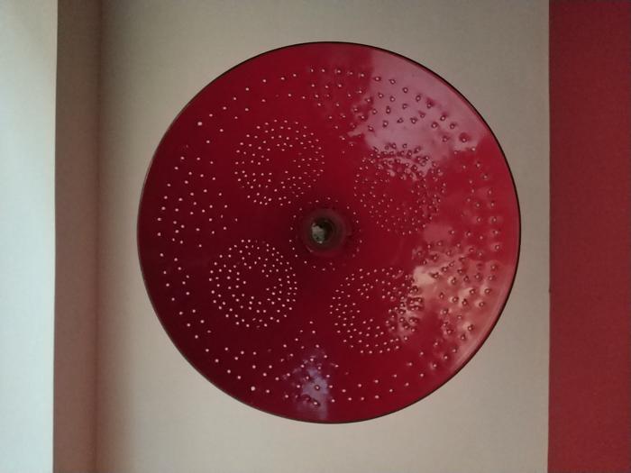
You’d have noticed by now that the Mix 2 doesn’t have a dual camera array like most of its competition. Nope, it also does not pull off the computational photography wizardry like the Pixel 2 XL either. The camera experience on the Mix 2 is in all honesty pretty barebones. The 1/2.9” sensor used is the same as the primary camera on the Mi 6 and is capable of capturing 12MP stills in addition to 4K video at 30FPS. There’s 4 axis optical image stabilization too that should help with low light photography.
From what we’ve seen so far, the camera does a good job but nothing exemplary. It is certainly not going to give the Galaxy S8 or the latest iPhone a run for it’s money but look at more likely competition like the OnePlus 5 and it manages to hold its own. Sure, the Mix 2 loses out on the telephoto lens and subsequently Portrait mode and prospective buyers are going to have to decide whether that’s a tradeoff they are willing to make in exchange for a much futuristic design. Images have sufficient detail and sharpness and the phone does a good job at metering for white balance.
Shots skew towards realism and so might appear a bit dull and muted compared to similar shots from other devices. Low light imaging is nothing special and while it’ll make do if you have nothing on hand, the splotchy noise reduction and high ISO levels make the shots less than appealing.
Despite the fact that it’s not the only bezel-less smartphone on the planet, the Mix 2 leaves a good first impression and if this is the way forward for Xiaomi, color us excited. We expect some long-term Xiaomi fans to complain about missing features like the IR Blaster and headphone jack, but clearly the company has made the hard choice of innovating with design and pushing the barrier forward.
While we understand the compromise of placing the front camera along the bottom edge, we feel that the rear camera on Mi Mix 2 doesn’t quite match up to what competitors are pulling off. The software interface too is starting to feel a bit antiquated. That said, these are all but a few minor niggles. For the most part the Mi MIX 2 comes well equipped to give a tough fight to much more expensive competition. The Mi MIX 2 is priced at Rs. 35,999 and goes on sale on exclusively on Flipkart and Mi.com from October 17th.


