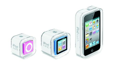
Spot poll: Who doesn’t like some new gear, especially when the new pieces of bling sport the bitten fruit logo ‘round the back? This week, A Byte of Apple takes a long hard look (see our Exclusive Photo gallery as well) at the 2010 lineup of iPods – the nano, the touch and the shuffle – and this what we came back with. If you’ve been putting off the decision to pick one of these babies up, this should seal the deal for you!
2010 Apple iPod nano
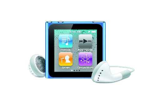
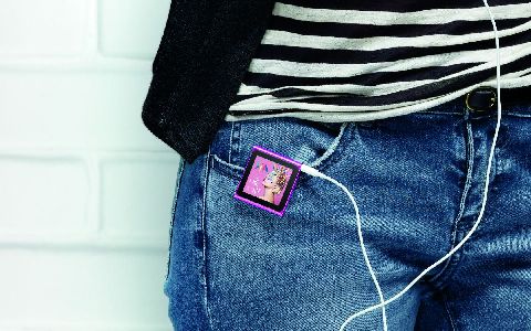
Given how the iPod nano is prone to radical design changes – over the years, it’s been a rectangle, then a square, then a thinner rectangle – I’d expected Apple to pull something spectacular out of the bag this time as well. But nothing would have prepared one for the massive transformation the nano underwent in this ground-up redesign. For a start, it is square again, and has lost some serious weight – the new nano measures approximately 1.5 inches square, and 0.35 inch deep, which includes the spring-loaded metal clip borrowed from the iPod Shuffle. It’s ridiculously small, bordering on the ‘where did I keep it’ small. The size reduction has meant that the nano loses Apple’s signature and iconic Click Wheel, and the only buttons you get are the volume control buttons and the sleep/wake buttons – the nano comes with no playback buttons.
Fortunately, you wont have to contend with the fidgety-earphone-control mechanism that Apple had launched with the previous generation shuffle, since the new nano sports a brand new 1.54-inch multitouch 240 x 240 pixels LCD display. The touch response on the nano is supremely responsive and fluid, and uses similar icon metaphors from the bigger iPod touch/iPhone family. To use the device, you have to press the Sleep/Wake button to activate the display and then tap around to change the track, just as you would with an iPhone or iPod touch. Or you could use the shake-to-shuffle feature to select a new random track to playback.
It’s one thing starting this thing up, and quite another using it, at least initially. Since they’ve used the same icon scheme as the bigger touch, you almost have to hunt for a way to get back to the home screen the first time. There is no home button, remember? Neither is there the familiar on-screen breadcrumb system to find your way back. The solution, as it turns out, is rather simple – you need to swipe left or hold your finger on the screen a little longer than usual to return to the main menu. I’ve used iPods a long while, and since this navigation paradigm didn’t come naturally and inituitively to me the first time, I was a tad surprised. These babies are supposed to be legendarily easy to operate, after all.
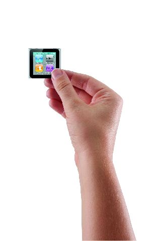
Once you get used to using the device, the interface is instantly familiar, and the closest I can describe it is a watered down version of the iOS platform that you find on iPhones etc. Four icons a page, four home screens and you can arrange them in your order of preference. The screen is smaller than the previous gen, but it is bright enough to use outdoors as well. The touch interface makes scrolling through long playlists a breeze, and you can hold your finger down and see letters of the alphabet flashing till you reach the letter you need. You can’t pinch to zoom in on photos though, but you can double-tap. There a neat trick as well – you can rotate the nano’s entire interface, 90 degrees at a time, by using two fingers and twisting clockwise. Perfect for when the nano’s clipped onto a band or a sleeve and you want to view it ‘right side up’. And if you plan to couple the nano with a wristband and wear it like a watch, Apple thoughtfully added a full-screen watch function that lets you use the nano as a watch! I can tell you, this watch is going to catch on! The pause-live-radio feature is present again, as is Nike + iPod Sports Kit connectivity, though you have to buy the adapter. If you don’t want to spend the extra cash, the nano has a pedometer and stopwatch/timer built in as well. Just keep in mind that if you plan to use this a lot for the gym or on walks, the nano isn’t operatable by feel, you actually need to glance directly at the screen to operate it. If you need to be able to control your music taking your eyes of what you’re doing, you’ll just need to invest in some type of headphone remote control – Apple’s remote headphones work as an alternative, or you could consider the shuffle (more on this later).
Now while the shape and user interface are the highlight of the new nano, it hasn’t come without its share of feature cuts. There’s no back-facing camera to record video, and it doesn’t play back videos anymore, which does make sense given how tiny the screen is. You can load photos onto the device, but even there, the screen size makes it only good for personal consumption, not sharing with friends and family. Support for basic Click-Wheel games is also gone, they were nifty so the loss is felt. And despite it having a multi-touch display, it is really underused in the nano’s user interface – maybe pinch-to-zoom wouldn’t have been a bad idea? And while we’re at it, some more nano apps maybe?
Verdict? The touch refresh to the nano gives it a new lease of life, and it’s hard not to be impressed by the build quality, multi-touch and overall good looks. On the features front, the lines that separated the iPods from one another just got even more firmly redrawn. Perhaps it’s best to think of this nano as a version 1 of a new range of devices from Apple, there clearly is a fair bit of disconnect from the previous gen to clearly establish lineage.
Apple iPod Nano 2010
Rating: 8/10
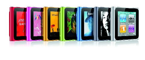
Price: Rs. 10,700 (8GB) and Rs. 12,700 (16GB) in silver, graphite, blue, green, orange and pink
URL: http://bit.ly/bJ1MXE
2010 iPod touch
There’s a lot written about the iPod touch, so lets run through the basics. It’s Apple’s phone disabled-iPhone, without the phone and GPS features – no voice calls (cellular), no SMS, and no wireless data service. It’s really then down to how little the iPod touch loses from the current gen iPhone that we can use as the basis to judge the device.
For starters, losing the extra weight of the phone and GPS radios allowed Apple to make this baby thin. How thin? Let’s put this in perspective – two iPod touch units, back-to-back, come close to the thickness of the already thin iPhone 4. It’s almost too thin for regular adult hands, and you always get the feeling that you’ll either drop it, or snap it in two. Don’t worry about the latter, it’s made of sterner stuff. The uber-petite structure comes at a cost – the taper to the back is much sharper than the previous gen, which means that it takes a little bit of getting used to to plugging in the dock cable or operating the volume or sleep/wake buttons.
Like the iPhone 4, the 2010 iPod touch has a high-definition 960 x 640 retina display which, like the one in the iPhone 4, packs in 326 ppi (pixels per inch). Icons and text look cleaner, and graphics are nothing short of awesome. How awesome? You only have to go back to a one-generation old 2009 iPod touch to appreciate the difference – the 2009 model ships with only 25% the number of pixels of the 2010 spec, so the jump is dramatic, and it blows the previous gen’s display clear out of the water. Put it side by side with the iPhone 4 and you will notice the two displays are not the same – the iPhone’s display is better for off-angle viewing, but only just.
Also brand new to the 2010 iPod touch is the camera (finally!) – two actually. One is a front-facing VGA camera that sits atop the display, and there’s a 720p HD video camera capable of capturing 0.7 megapixel stills around the back. Translated, the rear camera can record HD (720p) video at 1280×720 but in still mode, resolution of the images drops to 960×720 pixels. This camera isn’t the 5MP shooter that graces the back of the iPhone 4 – it’s fixed focused (no autofocus, so tap-to-focus only alters the exposure and white balance levels), there’s no LED flash but the touch does ship with a built-in microphone, so voice notes/VOIP calls/recording and video recording (with audio) are made possible. The camera round the back is clearly a compromise solution keeping the thinness in mind – compare the video recording capabilities of the iPhone 4 and iPod touch, you will notice that while the iPod touch’s video is pretty good, it is a little more grainy and washed out than the iPhone 4’s. No sense in comparing the still shots, but the touch is perfectly okay to take the occasional FaceBook worthy snapshot.
But it’s not for the video recording that the touch cameras have assumed importance. What the cameras allow you to do is to use the iPod touch as a FaceTime device, allowing you to video-chat with anyone on an iPhone4 or a Mac, assuming both of you are over a Wi-Fi network. Because the touch doesn’t have a phone number attached to it like the iPhone 4 does, Apple works with a unique identifier, which, by default, is the e-mail account attached to iTunes for using FaceTime on your touch. You can choose to attach any other email address, especially if you have more than one FaceTime capable device. The application itself works effortlessly on the device, and I can sense the iPod touch will be used more in the “see what I can see” scenarios rather than the “can you see me” scenarios. The portable form factor and the dual cameras really lend themselves well to showing folks on the other side of the FaceTime connection just how glorious the view from your hotel room really is… you get the picture. Apple certainly didn’t invent the concept of video calling, but FaceTime may just become the standard – only time will tell.
Under the hood, the 4G iPod touch has Apple’s A4 processor, the same kind of chip that can be found in the iPhone 4 and the iPad, and performance is snappy as well. Apps load fast, and games are quite the experience, with faster loading times and absolutely no lag. Aside from that you’ve got WiFi ( with 802.11-n support as well), Bluetooth 2.1 + EDR, and Nike + support built in. No GPS – it uses Wi-Fi location data only to determine its coordinates, so you can use the maps or geotagged images with some amount of location awareness. There’s a gyroscope in there as well, so games and apps can take advantage of the gyroscope’s ability to discern roll, yaw, and pitch, giving you far greater control while gaming. While we’re at gaming, the touch also comes with the Game Center app preinstalled, which basically acts as a leaderboard that collects and displays your game progress versus your friends. It’s Apple’s way of making gaming more social, and we’ll post more feedback on it in the future.
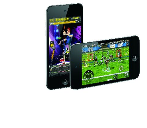 Notice how I haven’t spoken a word about the music capabilities of the touch? Just goes to show how important apps, games and data consumption are to the touch, as compared to the music-only siblings. That said, it does everything the previous gen did, and does it well. It packs its punches as a portable video camera, mobile browsing, mobile gaming device, VoIP device, mini tablet, and before we forget, an iPod as well. It is truly without a peer in its segment, and the easiest and cheapest way to buy into the iOS platform without worrying about a carrier lock. I’d gladly have traded the extreme thinness for a 3.2 MP autofocus camera around the back, and a beefier battery, but then, you cant win ‘em all, can you?
Apple iPod Touch 2010
Rating: 8/10
Price: Rs. 15,400 (8GB), Rs. 19,900 (32GB), Rs. 25,900 (64GB)
URL: http://bit.ly/cGawS1
If anything, with the 2010 iPod shuffle, Apple’s gone back to the form factor that made the second gen so popular, skipping entirely the bubblegum pack design it had chosen for the third gen. Buttons are back, and back for good – playback buttons adorn the front face of the device, while the headphone jack, the power switch, the battery indicator, the playback mode (shuffle/serial) control, and the VoiceOver button are bunched together on the top edge of the device. There’s the trademark clip, but using it is a little complex – the previous track button is way too prone to get pressed when you use the clip. Happens every time. Charging your shuffle happens via a 4-inch USB adapter cable that connects between the iPod’s headphone output and your computer, which also allows you to use the shuffle in disk mode a.k.a a glorified thumb drive.
Features wise, the shuffle has all that last year’s shuffle had, with the inclusion of VoiceOver, playlists, audiobooks, and podcasts, but even though this feature list is impressive for its size, it lacks some basics that that are a must at this price point – higher capacities, FM radio, a basic screen even. There’re are a ton of options out there that give you this and more, so if you’re looking for your MP3 player to give you the best bang for your buck, this aint it.
Apple iPod Shuffle 2010
Rating: 7/10
Price: Rs. 3,200 (2GB) in silver, blue, green, orange and pink
URL: http://bit.ly/aoA2hK
(all images are courtesy Apple)

