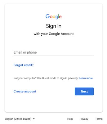
Google recently announced a new look for the Google sign-in screen, but then again due to some unforeseen delays it pushed the launch. However, it is finally rolling out the new design this week including some minor changes. This new design takes advantage of the new Material Theme styling.

Going forward, when you sign in to your G Suite account, you may notice the screen looks slightly different with some of the changes include tweaks to the Google logo and center alignment of all items on the screen. This change is a part of the Google’s efforts to update the G Suite applications in-line with its other products. However, the outline around the text field when entering your email address/phone number and password. This change will appear in the coming months.
As said, the new change centers the Google logo and other times on the screen to give it a more modern appearance. The sign-in screen will continue to use the current field, but with bolded text for the upcoming launch. However, the outline around the text field will be arriving in the coming months.

