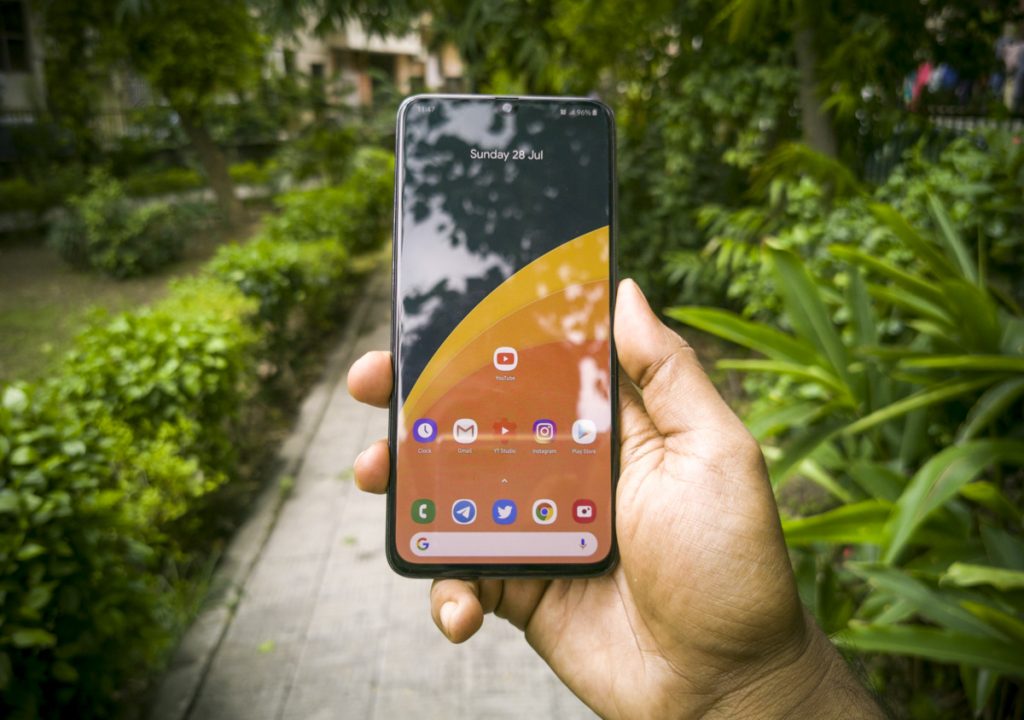
 If there’s one thing I can never forget in my long term experience with the Samsung Galaxy A70, it is One UI. Gone are the days of Touchwiz and the annoying bleep-bloop sounds. Also gone are the days of Samsung’s illogically priced mid-range phones. In 2019, a renewed focus on the Indian market has brought the world’s no.1 smartphone maker back into attention, with them belting out smartphones at a pace faster than T20 matches. There are multiple M series smartphones and several A series smartphones, apart from the flagship S and Note series. In this review, we are going to take a look at the A series smartphone that is purpose built for “Maximum Media”. The Samsung Galaxy A70, powered by a Snapdragon 675, is a great phone for media consumption and a generally great experience, especially in the long run. There are a lot of good things to talk about, like the great display, the almost full-screen design and of course, One UI, but of course, like every other phone, there are a few missteps as well. We shall discuss everything in detail, in this long term review of the Samsung Galaxy A70.
Unboxing
To be honest, I was quite excited to use a Samsung phone after a long time. This was mainly because of One UI, which is a beautifully designed custom skin upgrade to the Samsung Experience UI that preceded it. More on that later, but first let’s talk about what you get in the box.
Unlike in the M series boxes, you get a TPU case and a headset as well. Since there is Dolby ATMOS on this device, it does make sense to bundle a good pair of earphones along with the box. That said, Samsung’s idea for the Galaxy A70 is pretty clear, the stunning massive display and bundled earphones makes you want to consume media on this phone.
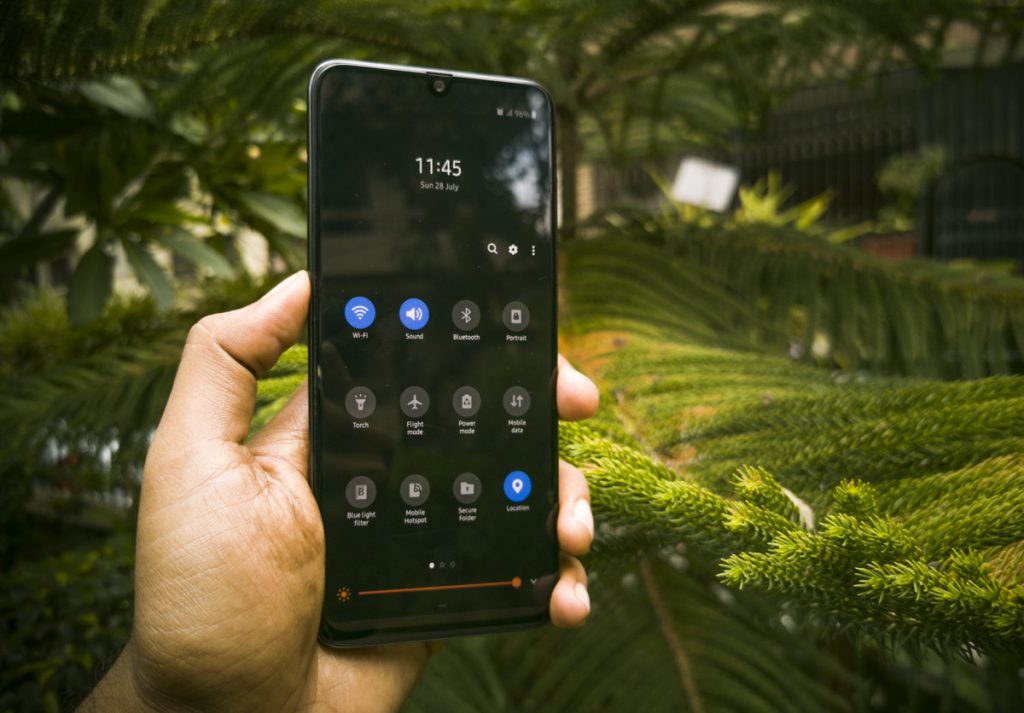
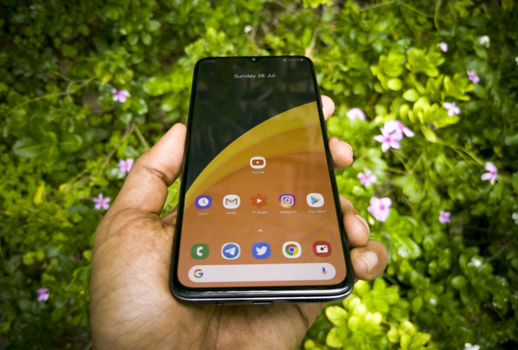
Yes, let’s about One UI first because, on a phone like the Galaxy A70, the OS is the centerpiece, everything comes next. Since this was the first time I experienced One UI in its full glory (I didn’t use the S series or the Note series) I just couldn’t believe what I was seeing. Disbelief, because it is such a far cry from the bloop-bleep cartoon-ish nonsense Touchwiz was. The design, not just in terms of aesthetics but in terms of usability, is light years ahead of, dare I say, almost all custom skins on top of Android. I have used almost every custom skin out there and I can comfortably say, One UI is the most thoughtful and equally fun-to-use UI in the world of Android. I have been using it for more than a month, so let me explain.
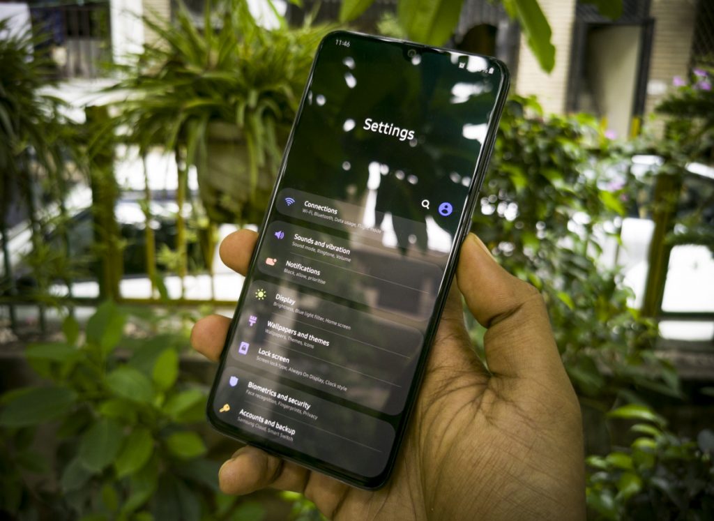 The permanent one-handed mode is a revelation on large screen phones. The UI items are designed in a way that everything comes to you rather than you trying awkwardly to go to them, especially on massive screens which is the norm on Android phones these days. This is visible everywhere in the UI, including in the top-down drawer, in the default apps like dialer, SMS, notes, calculator. See, there is a clear design language rule here and it is extremely helpful. Everything tends to be reachable, like tabs, actions buttons, even list items. A big usability upgrade for large phones so the Galaxy A70 definitely becomes a delight to use, despite the seemingly tough maneuverability.
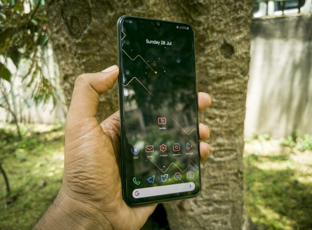 Dark Mode. Let’s be real, Samsung is not new to dark mode, they had it on their first ever S series smartphone but they just didn’t call it that. In the middle though, the company lost direction and dark mode went away along with that but now it is back and it looks glorious on the One UI. It’s just so good in every way because it is tailor made for the AMOLED screens which lights its pixels selectively without the use of a backlight hence massively improving battery life. Everyone’s doing dark mode these days, but in my opinion, One UI has the best dark mode. Samsung is the king of OLED screens so it is no surprise that every little detail is taken care of.
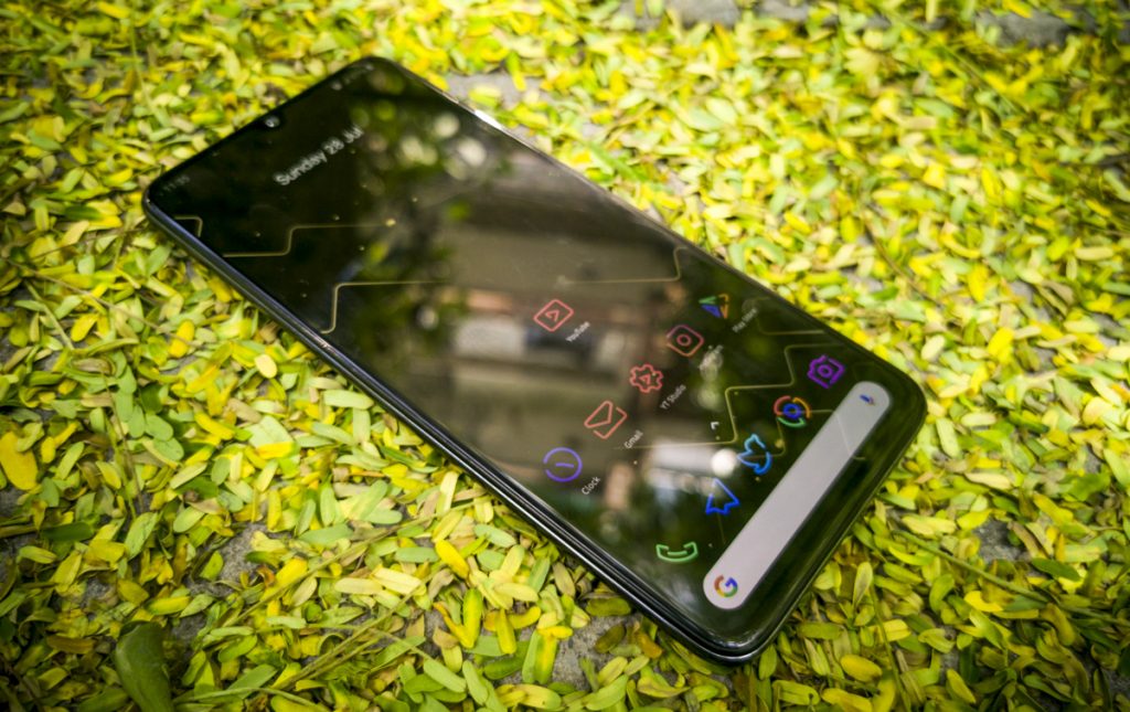 Optimization. This is one of the most important things for me when it comes to the UI. It cannot lag. This is why Oxygen OS or Stock Android is preferred by many, they don’t lag. Responsiveness and consistent 60 fps framerate is of paramount importance to not just delight the user, but let the user get stuff done without any delay. The Galaxy A70, aided by the Snapdragon 675 processor makes One UI seem like putting knife through butter. There are three components that dominate our UI interactions – Traversing the UI with mostly apps and the homescreen plus settings, switching between apps and using the keyboard. If the system fails to perform these basic tasks with consistency, then it is a sign of poor optimization but I am happy to report that after a long time, the Galaxy A70 is the first Samsung mid range device I have used that is amazingly well optimized. Even the keyboard, it’s possibly the best one I have used after the iPhone. Nope, not even GBoard can come close. And finally, the animations. This plus the icons form the aesthetic elements of the UI. Even though I am not a big fan of the icons (I use linebit custom icons instead), the animations are so delightful and fluid that interaction becomes an exciting experience. One UI has nailed it. To recap, amazingly usable one handed UI, the best dark mode, well optimized performance and keyboard and finally, those damn fluid animations make One UI the best custom skin in the Android world right now. Kudos to Samsung for doing it right this time. Sure, there is a lot of cleaning up to do and new features to introduce but what a beginning and what a delight.
It’s super big. Yes, it’s a 6.7 inch full HD+ Super AMOLED panel and it looks downright stunning. We all know how good Samsung is, at making OLED panels. This is no different. The display on the Galaxy A70 offers the best experience for anyone looking at getting a large vibrant screen to consume media. Most of the time, that’s what I did on this screen. Watched a lot of videos and took a lot of photos just to see them on the screen.
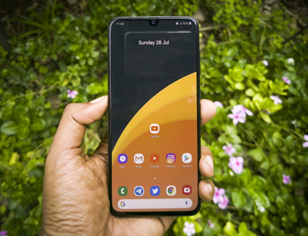 While it is a trend to belt out phones with insane screen-to-body ratios on all kinds of price points, there is always that pesky chin space which distracts from the immersive viewing experience. With an Infinity U notch and possibly the smallest chin in the mid range, the Galaxy A70 offers maximum immersion, which combined with this amazing display, makes the display just perfect for visual content.
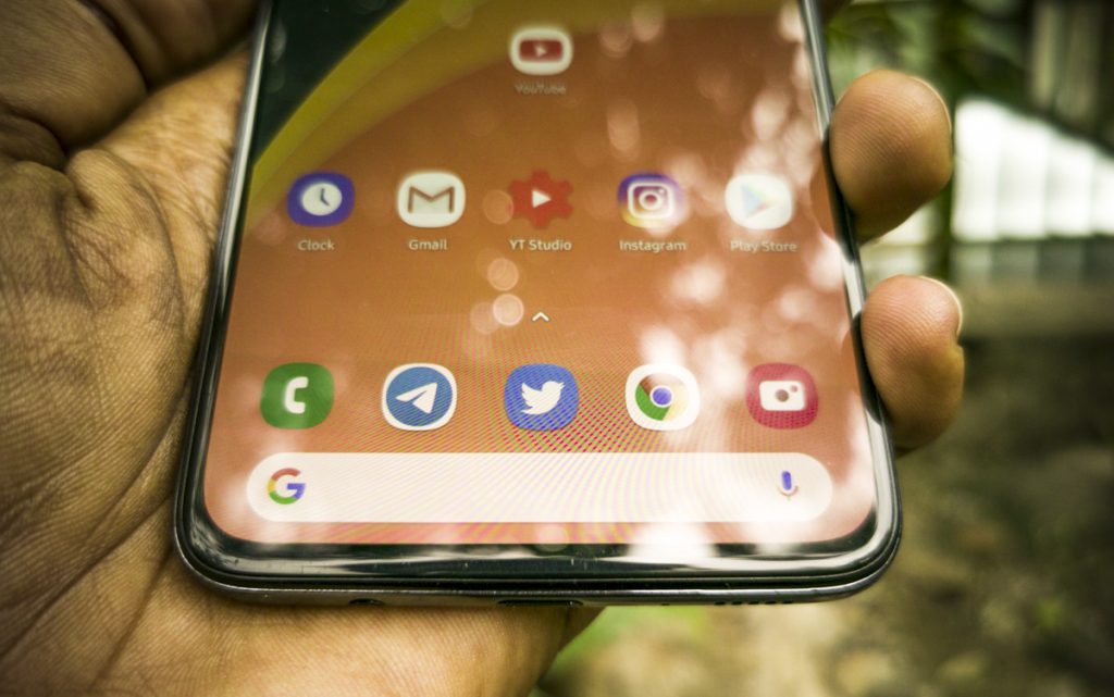 In my testing, I found the outdoor visibility to be fantastic. The colors were great, the contrast is unquestionably good and the use of a smooth coating on top of the glass ensures that your swipes are really natural. Overall experience regarding the display was great except for one little mistake. Sometimes when in the lockscreen, the display refuses to change from a lesser color bit mode, which it uses for the always-on display, to the full color bit mode, which is the entirety of the time you are in the UI. This mistake alone makes the display a bit weird at certain times, like it introduces gradients in your wallpaper where none exist otherwise. That aside, it is a great display which is very well suited for media.
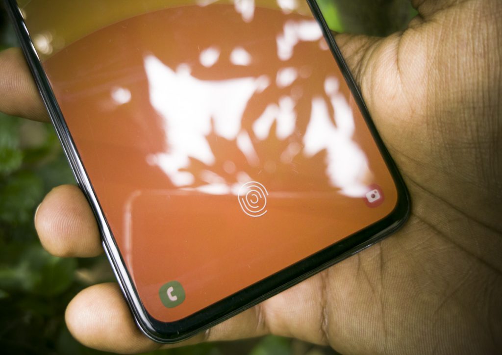 In-display fingerprint scanner
I’ll just say it. The Chinese have better optical fingerprint scanners than Samsung. This is the truth. What you get on the Galaxy A70 is similar to 2nd generation in-display fingerprint scanner that, let’s say, takes time to verify whether it’s you or someone else. Capacitive scanners are possibly ten times faster and ultrasonics are possibly five times faster. Meanwhile, optical fingerprint scanners are getting way better, they are literally on the 7th generation, on phones like the Redmi K20 Pro, OPPO Reno or the OnePlus 7 Pro, or even on mid range devices like the Realme X. So, there is no excuse for Samsung here.
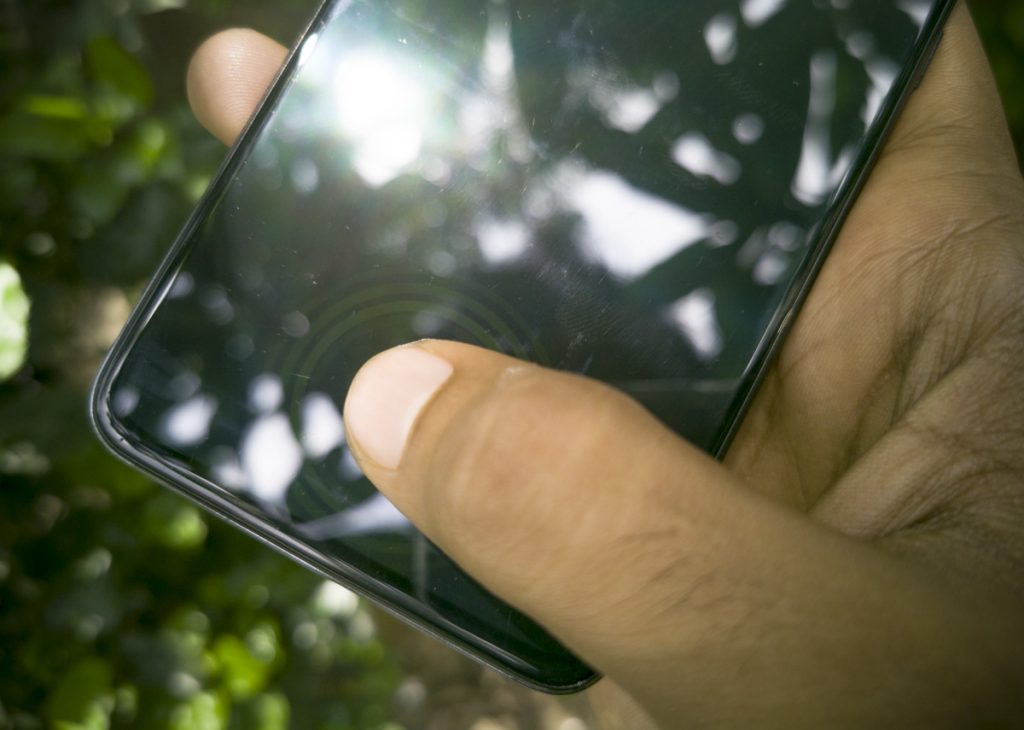 The in-display fingerprint scanner works, it’s not as bad that it won’t let you in, you just have to wait or use the much less secure face recognition algorithms. I’d suggest you compromise with the speed and use the fingerprint scanner. Sorry Samsung, this needs to get better. I hoped it would get better with software updates but so far this hasn’t proved to be true. To the readers I would say, just lower your expectations and you’ll be just fine.
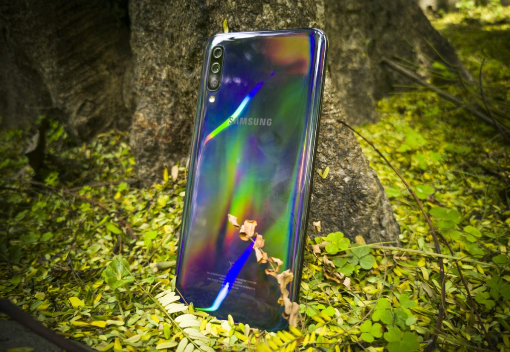
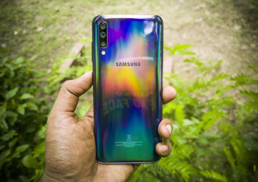
With glass backs and fancy gradients becoming the norm, Samsung has been trying to adapt its devices to the new design language that seems to attract everyone, yet the good old DNA has been retained enough to make the Galaxy A70 look flashy and understated at the same time.
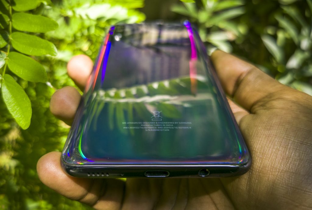
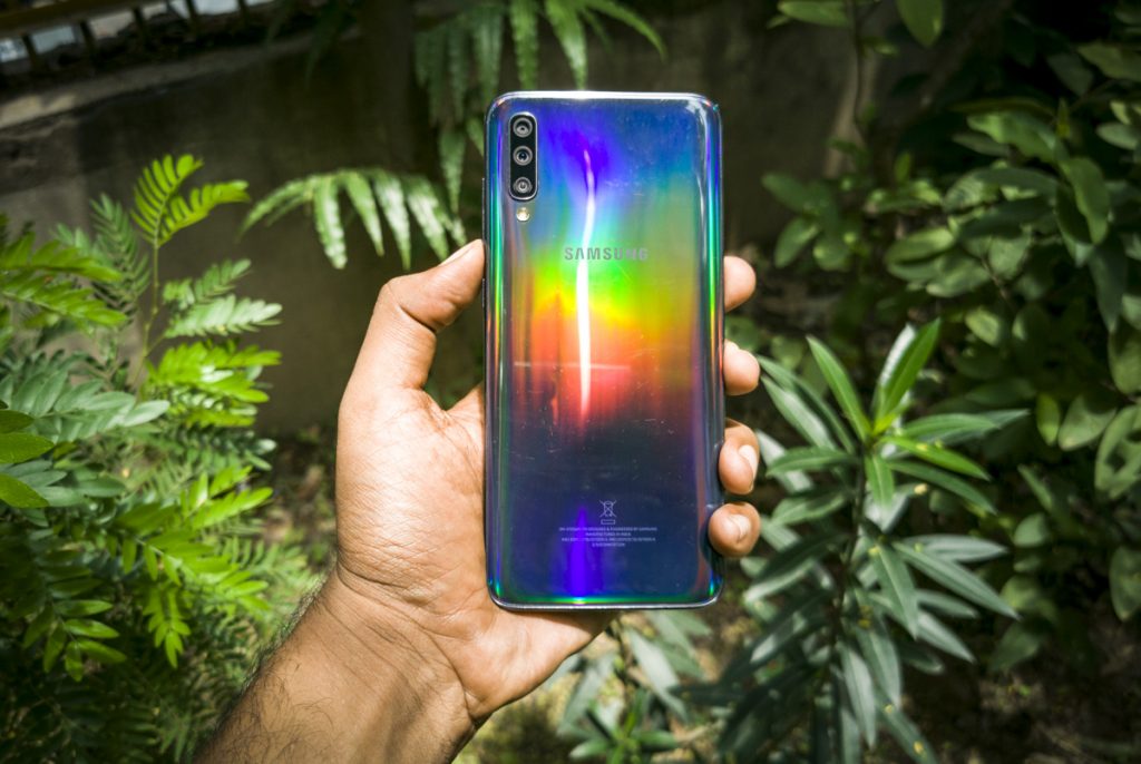 There is a multi-colour reflective layer on the back of the device which is very noticeable in bright light but normally, the device which is fully in grey looks like a normal Samsung phone that executives like to carry. Personally, I would have preferred something in glass, since that’s reserved for the S series, the A70 has to put up with a plastic back that unfortunately tends to get worn down faster if you don’t use a case. Thankfully, there is one inside the box unlike in the M series so if you are buying this phone, use the case.
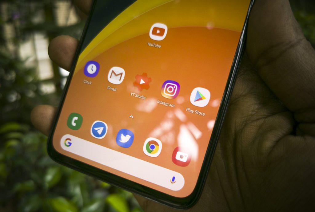 That doesn’t stop Samsung from using top quality glass on the front though. It is sturdy, slightly curved at the edges and thanks to a coating on top, it is one of the smoothest glasses I have used in this price range. It is an understatement as to how much it improves the user experience, especially with an optimized processor and a smooth and fluid UI. Swipes and other fullscreen gestures are effortless on this glass and you will feel the difference if you are coming from anything below the Galaxy A70’s price range. Also, even if the phone is quite large, the weight distribution is balanced and provides a good in-hand experience with a very thin profile. The back is curved to fit our hands better but again, use a case, because it will get slippery because of the glossy finish. Overall, the A70 is very nicely built with a reflective layer adding some glam to an otherwise very executive-looking phone.
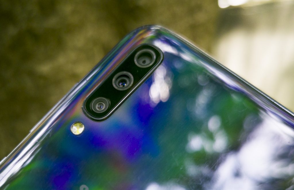
Samsung has been the only smartphone maker that has concentrated and delivered on the wide angle camera at almost every price point possible. In fact it is one of the only companies that offers a wide angle option instead of just a depth sensor. Here, on the Galaxy A70, there are three cameras at the back. The main sensor is a 32 MP sensor with a f1.7 lens and the secondary camera is a super wide angle 132 degree 8MP sensor with f2.2 aperture. The third camera is a 5MP f2.2 depth sensor. Before we take a look at the samples from the rear camera, I just want to say that Samsung is also one of the only companies right now to NOT offer a night mode in its camera UI. Let’s a take a look at the samples now.
The perspectives that the wide angle camera offers is really attractive for me, personally, especially when I am in the mountains. It just is a perfect place to capture a lot of the scene. But at the same time, Samsung has chosen to focus on the dynamic range a lot and has completely fudged up the details. In every image, if you can see in the full resolution, you will find the details to be too soft. There is over-sharpening to bring up the abysmal amount of detail the sensor captures. I was really disappointed as a pixel peeper to see the glaring lack of detail however if you’re of the casual type of photographer who posts only on Instagram, the images would be more than enough to pass off as a quality photo.
Another set of images, the same story. Detail in the grass, in the trees, in the mountains, is smudged beyond saving. Even in the 32MP high resolution mode, I found the detail to be lacking. May be Samsung has consciously kept the compression high to save some space, but on a 128 GB device this is definitely not needed. The 12 MP output was better than the 32 MP mode. But all said, the true tone HDR works really well in keeping the dynamic range in control. Highlight details are great and there is good enough detail in the shadows but just don’t expect finer detail from this 32 MP unit.
Macro pictures are the only pictures with detail from this camera. Here, like most cameras, you get some really good detail and vibrant colors. With f1.7 the bokeh is also very natural.
The best feature of the Galaxy A70 camera is the 480 fps super slo mo mode and the amazingly steady EIS on the wide angle camera. In terms of video recording, the Galaxy A70 shines and makes up for the main camera’s sub-optimal stills performance. Here are some video samples to show case the awesome video features.
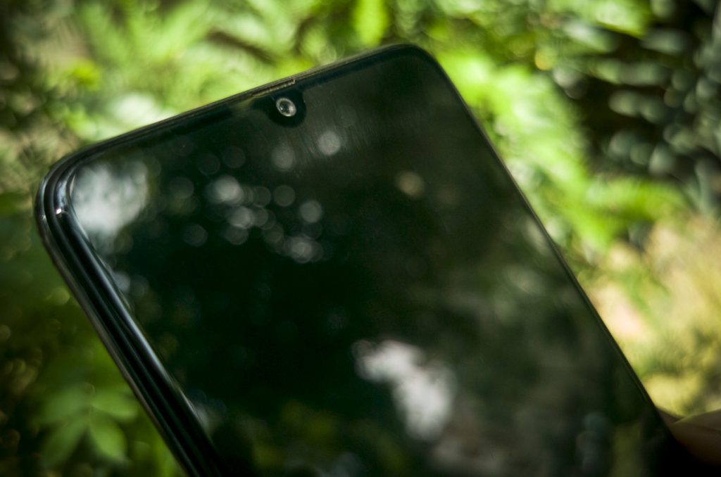 Another good thing about the camera setup is that the front facing camera gets a 32 MP unit as well. This, in my opinion, works out better than the rear facing 32 MP unit, and by that I mean the sensor is naturally more suitable for selfies than landscapes as there is not much detail to resolve. Here are some samples.
Performance and Battery life
 This is where things get really interesting on the Galaxy A70. The Snapdragon 675, which seems like an one-off mistake by Samsung which regularly sticks to Exynos processors on its phones, FLIES on the device. There is literally no lag or stutter to be found and as mentioned earlier, it might be due to One UI optimization or 675 itself being powerful enough to handle everything with ease. It also helps that the device has 6 GB of RAM and 128 GB of fast storage to help with the smoothness and fluidity of everything. The phone also refuses to die, with a large 4,400 mAH battery powering the phone for two days easily. At desperate times when there was no power in the mountains, a quick 25W fast charger given in the box, helped charge the phone to a 50% in 30 mins or so and that lasted for much longer to get me through the night and even a part of the next day. Such is the ease at which the Galaxy A70 will put your mind to. Never have to worry about using the camera or watching videos, which I promise you will do a lot on this phone.
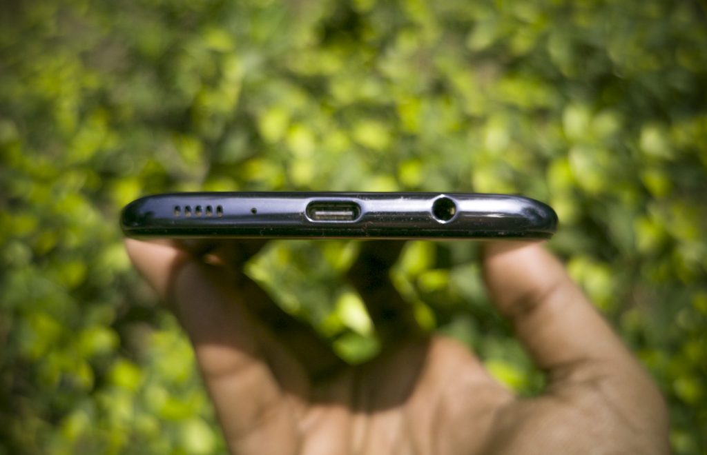 When it comes to sound, I found the loudspeaker to be a low-volume tinny mono speaker that could have been a lot better considering this is a media focused phone. However, there is a 3.5mm jack, which when connected with a quality headphone will sound incredible thanks to Dolby ATMOS. It is certainly recommended that you use headphones or earphones to experience multi media on this device rather than depend on the loudspeaker.
Conclusion
 In the end, it’s all about the media. It rules our lives. We consume it in infinitely many forms everyday, on many platforms. We call it movies, videos, YouTube, social media etc. Whichever way you see it, by the end of the day, you are consuming media. So, if your life revolves around this, the Samsung Galaxy A70 would be a great option. Its fantastic large screen ensures that you are immersed in you media, no matter where you are. Powered by the Snapdragon 675, the A70’s One UI will delight you with smooth performance and neat touches like making a 6.7 inch display easy to use, will make your life easier. If you’re willing to put up with a below average set of cameras that shoots awful stills but awesome slow mo video and incredible wide angle footage plus if you are willing to not mind the slow fingerprint sensor, the Galaxy A70 is the Maximum Media smartphone you’ve been waiting for. Samsung’s tradition continues with creating one of the best displays for watching content and that alone will convince a lot of people like me to keep using this device for a long time, as I have done over the month.
- Great Super AMOLED display
- Small chin, nice design
- Smooth and fluid performance
- One UI ease of use
- Great super slow mo and stabilized video recording
- Ample storage and RAM
Cons
- Below average stills camera
- Slow in-display fingerprint scanner
- Materials are not that premium
In today’s market, the competition is from devices like the Redmi K20 Pro, OnePlus 7, Zenfone 6Z and so on. While most of you might think about 675 as a processor that is not worth the price, given the positioning of this device as a multimedia phone, it hardly matters in my opinion. Also, if you want a more secure Android experience and a refined One UI and Samsung-only features like Pay and so on, this is the only device you can get in the premium mid range segment. The Samsung Galaxy A70 is priced at Rs. 28990 and is available from Flipkart, Samsung e-Shop and offline stores.

