Google Play Store is home to numerous apps and has over two billion monthly active users. In an attempt to improve the overall user experience, the search engine giant has rolled out a complete visual redesign for all the users after testing it recenetly.
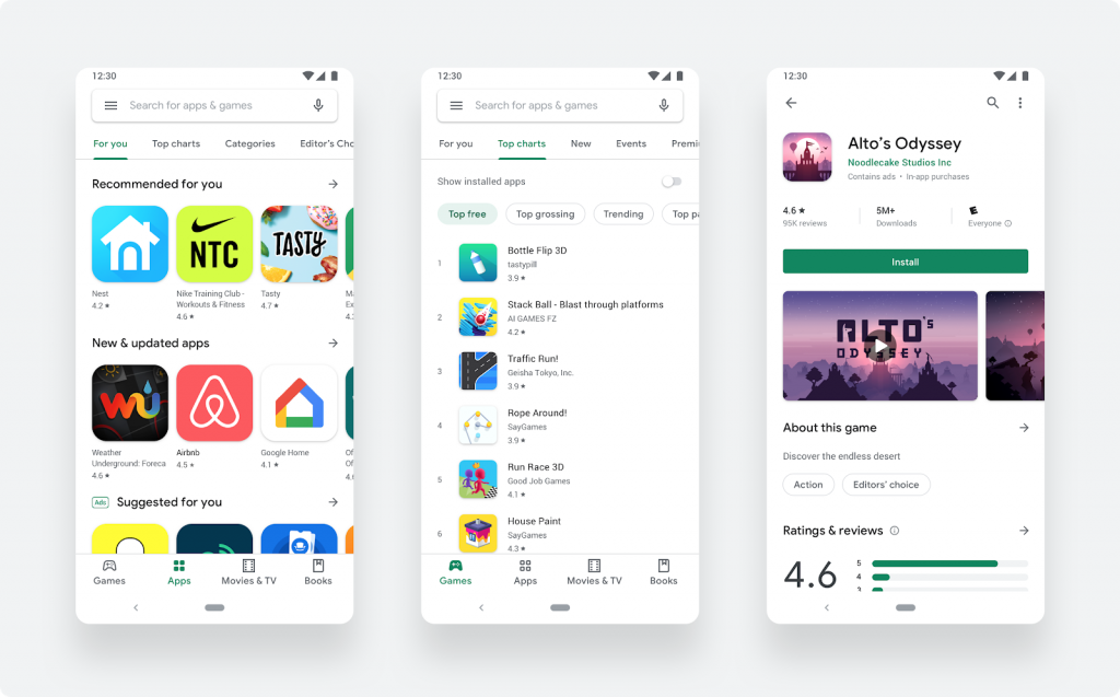
As per the company claims, this update delivers a cleaner, more premium store that improves app discovery and accessibility. Furthermore, the company has also updated a new navigation bar at the bottom of the Play Store on mobile devices and new left navigation on tablets and Chrome OS.
The new update now provides two distinct destinations for games and apps. Once users find the right app or game, the updated store listing page layout surfaces richer app information at the top of each page as well as a more prominent call-to-action button. This in turn makes it easier for users to see the important details and make a decision to install your app.
Also, the company has made a change in the icon system with a uniform shape, helping content to stand out more over UI.
