Google Photos is coming with a new update that redesigns many important elements in its UI. Google is getting rid of the hamburger menu, moving the search bar from the top to the bottom bar, added a button for the Library and more.

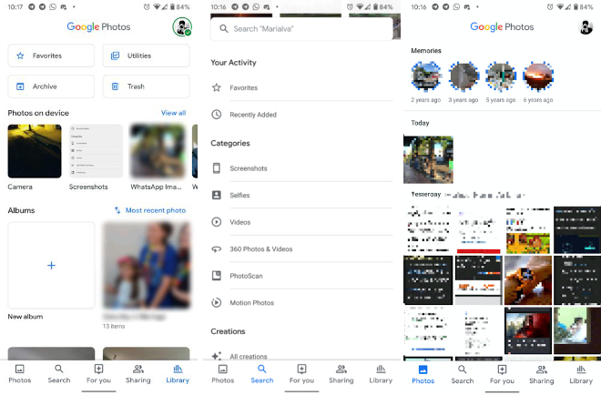
With the new update, one of the first changes that we noticed is that the search bar has been removed from the top, replaced by a ‘Google Photos’ header along with a button to switch accounts on its right. The ‘Memories’ section can be seen right below the header along with the most recent photos below that.
Coming to changes in the bottom bar, earlier there were icons for ‘Photos’, ‘Albums’, ‘For you’ and ‘Sharing’. Now with the search bar removed, the bottom bar has 5 icons now which are ‘Photos’, ‘Search’, ‘For you’, ‘Sharing’ and ‘Library’. Clicking on search tab, we can see a few more options compared to the earlier UI, with the ability to search categories like Screenshots, Selfies and more. A useful feature in the Search tab is ‘Recently added’ that shows all the photos that were uploaded recently to the user’s library.
A tab that was removed from the bottom bar is the ‘Albums’ tab. It’s been moved to a new tab in the bottom bar called ‘Library’. In the Library tab, there are 4 buttons in the top named ‘Favorites’, ‘Archive’,’Utilities’, ‘Trash’. Utilities seem to contain some of the features that were present in the hamburger menu like “Free up space” and “Manage your library” and the on-device photos are presented in a carousel of folders below these 4 buttons.
The update appears to be a server-side switch so far, so we have to wait for Google to push it to users. In the meantime, users can make sure that they have the latest version of the Photos app from the Play Store or the App Store.
