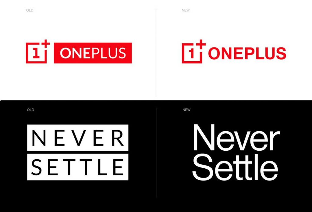
OnePlus has unveiled its refreshed visual identity, including an updated logo, which is the most significant change to the OnePlus brand since the company was founded in December 2013. The company said that it aims to make the OnePlus brand more easily identifiable and versatile.
The logo introduces a new curvilinear “1” which the company says is easier to read while adjusting the weight of the logotype for better overall balance. The “+” in the surrounding box has also been enlarged and is now more prominent, in a nod to the OnePlus community, which has played a key role in the company’s ongoing success, adds OnePlus.

The visual identity is accompanied by a fresh color palette which centers on OnePlus’s iconic red, followed by an updated secondary palette of cyan, green, magenta, indigo, and yellow. A new font also improves legibility and is easier on the eyes, according to OnePlus.

“A joint team of OnePlus in-house creatives and an external agency collaborated over nearly seven months to bring the refreshed brand identity to life,” said the company. “The goal was to unify all interaction with OnePlus, not just communications, but also the experience of using OnePlus’ products and services across all touchpoints,” it added.
Commenting on the new change, Mats Hakansson, global creative director of OnePlus, said:
OnePlus is not changing who we are, but reinforcing what we stand for — the true spirit of Never Settle. We always design for our users. We feel that these changes maintain the iconic elements of our brand that are beloved by our staff and our community while injecting both excitement and balance into our visual identity.
No detail is too small. By starting from thousands of user data points, the team arrived at a new holistic visual language inspired by OnePlus’ burdenless philosophy. OnePlus has grown a lot from an idea to a major smartphone player. Introducing a fresh new look is just one example of how we continue to bring our ‘Never Settle’ mantra to life.
