One thing Symbian has never had a lack of is excellent theme designers. Ever since the S60 2nd Edition days, you would simply have to hit up a small search on the internet to find hundreds upon hundreds of theme overhauls to help you personalize your device and always keep it feeling fresh. If fresh is what you’re aching for, then we’ve got just the thing for you.
IND190, one of my top theme makers right now, has apparently caught wind of the new overhauled Symbian interface that was promised to come to Symbian during the Nokia MWC Event. With fresh icons, a smaller status bar and a more appropriate bottom bar, it should bring a refreshing wind to Symbian and help it stay competitive so that Nokia could sell those remaining 150 Million Symbian phones as they planned.
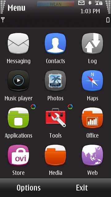
Well, not to make us wait for this overhaul, which by measuring Nokia’s time delay between first glimpse and actual availability, isn’t likely to come before 2012, IND190 has decided to create a theme with customized icons that look dauntingly similar to the new Symbian interface. Of course he couldn’t change the status bar sizes, but he did his best to emulate the icons and background look: enter the Classic Series.
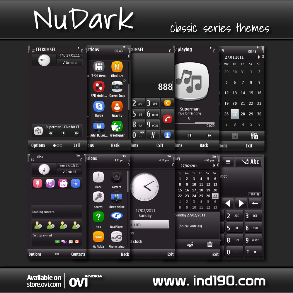
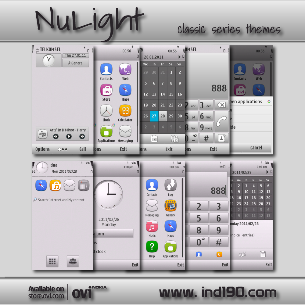
The Series includes 2 themes: NuDark with a dark background that would be a good match for devices with OLED displays as darker colors consume less battery power, and NuLight with a much whiter background that looks very much like the screenshot that was showcased by Nokia. Both themes come with either default icons or the new icon pack, and are available for S^3, S^1, S60 3rd Edition. There are also several wallpapers to go with both versions.
If you’re interested in getting a refreshed look on your device, you can head over to IND190’s Classic Series page to download any version of this theme.


