Google Maps is supposedly testing a new UI change within the app, bringing a dedicated Car Mode interface that would replace the existing in-car navigation UI. The new UI incorporates elements from Android Auto’s current Google Maps app like its buttons and home screen.
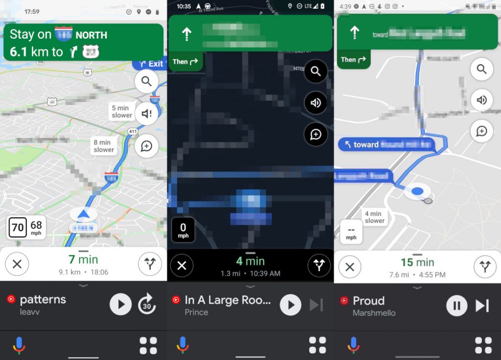
While the main maps screen and navigation remains unchanged, including the music controls shortcut at the bottom, what has changed is the bottom app bar. There are two buttons now, the left microphone button will activate the Google Assistant while the right menu button will show a new screen.
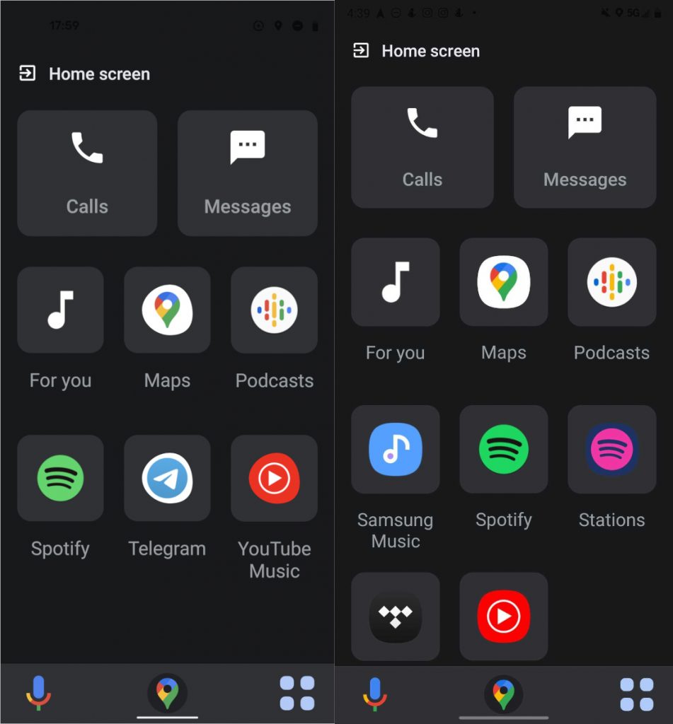
This screen is where we can see the resemblance to the Android Auto UI. There are big buttons with most of the essentials apps in your smartphone such as calls, messages, other messaging apps, podcasts and even a dedicated button for YouTube Music.
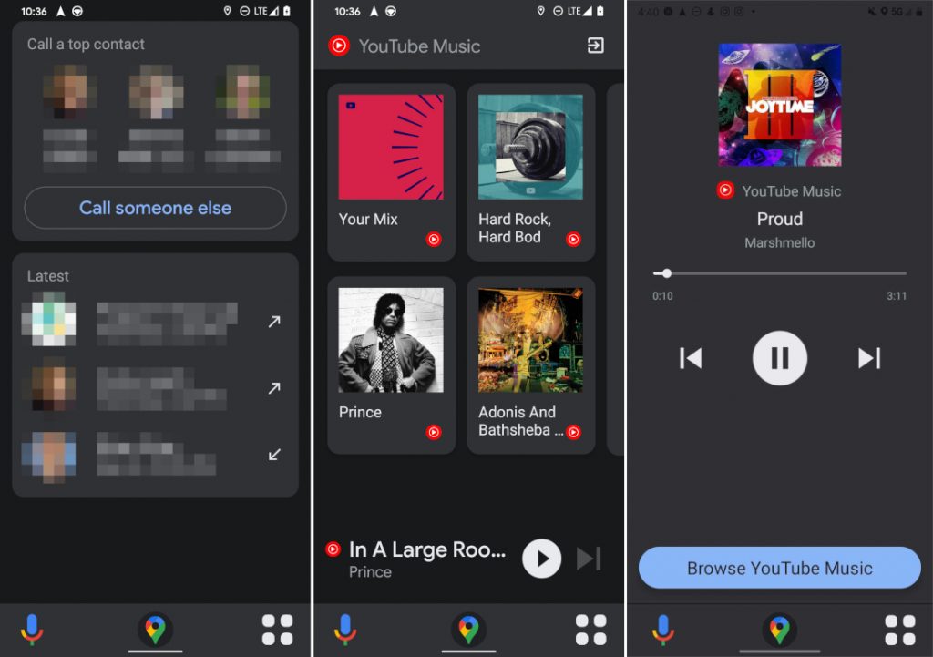
Clicking on each icon brings up their respective screens, also with large UI buttons and cards, such as top contacts for the Calls screen, and artists, playlists in the YouTube Music screen. Lastly, as soon as you click away from the main maps screen, a shortcut to go back to it appears in the the center of the bottom navigation bar.
The new car mode UI is still being tested as a server side switch by Google for some users. There is no apk out yet to force the UI change, so we have to wait until testing is complete before Google rolls it out to everyone.
