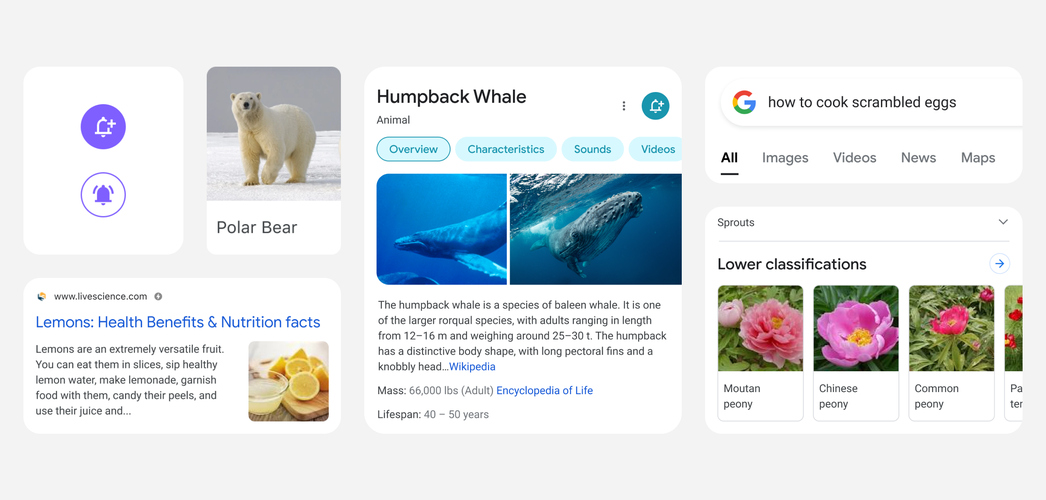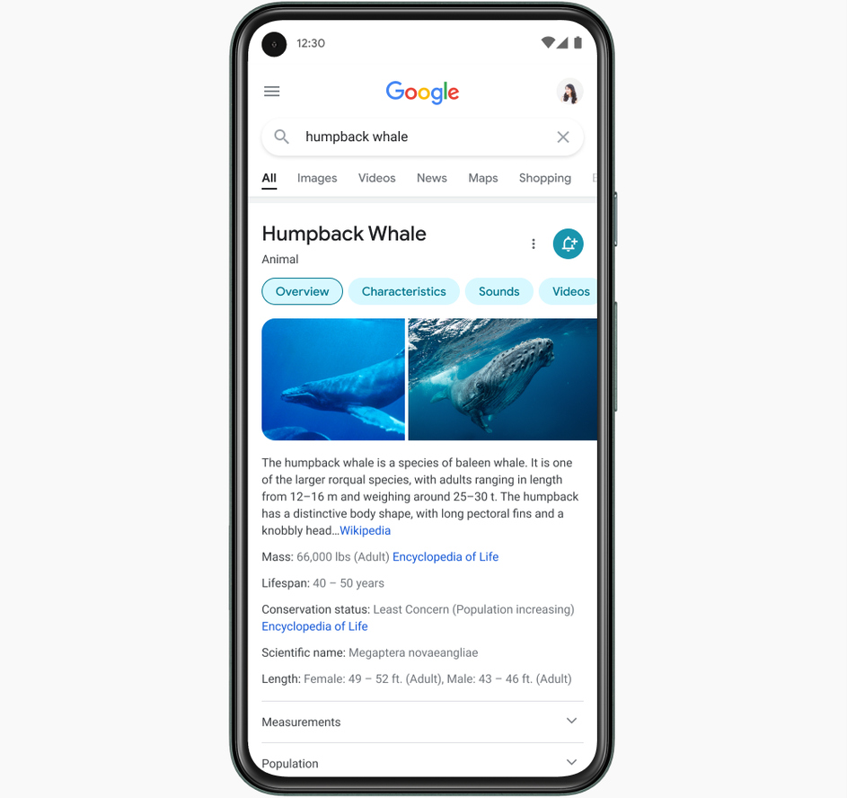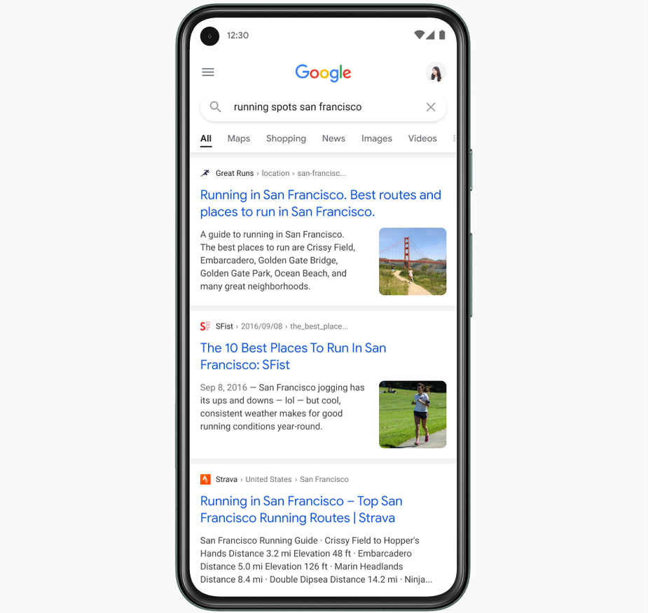
Google Search on mobile is one of Google’s most used service among their users on Android. To keep the interface feeling fresh, developers at Google are releasing a new update in the coming days that will bring focus to the information on the screen by adding colour, making text easier to read, and more

With the redesign, Google is trying to make it easier for users to absorb the information by making the design elements around the results less distracting. One way to highlight important information and guiding the user’s eye to it is by using colour against a clean background.

Text will become easier to read by making it bolder and larger, and Google is also including more of their own font across the service. This will add consistency across all of Google’s services such as Gmail, Android, and other apps. Search results will be shown from edge-to-edge, with lesser shadows overall, thereby creating a feeling of space within the results in the app.
Google will be rolling out these changes via updates to Search on mobile over the next few days.
