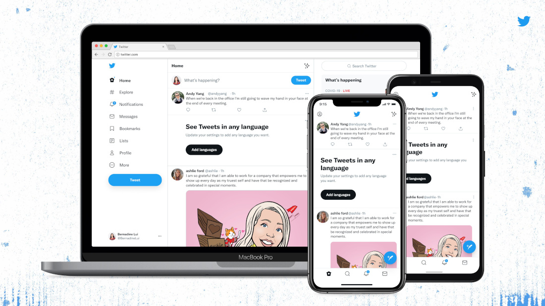

Over the last few months, Twitter has been introducing a number of smaller visual changes and updates to their platform. The latest update now adds support for their ‘Chirp’ font, an updated colour palette to draw attention to the content on the platform and more.
Twitter first introduced their ‘Chirp’ typeface back in January, and now has begun rolling it out platform wide on the web and the app. Along with this, all Western-language text now aligns left, making it easier to read when scrolling, while non-Western languages remain unchanged.
The colours have been updated to make them high contrast and a lot less blue, which should ideally make it easier to focus on photos and videos created and shared on the platform. Even the buttons have been updated to a high contrast colour palette.
And lastly, Twitter has removed a lot of visual clutter such unnecessary gray backgrounds divider lines, and also increased space to make text easier to read.
