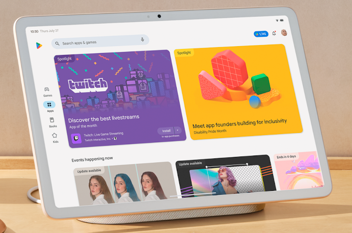
Google has taken strides to improve app support for tablets and large screens with the release of Android 14. The latest Android 14 beta 4 brings support for Pixel Tablets and Fold devices, and now, Google has introducesd a new Play Store specifically designed for larger screens.
Refreshed App Listing Pages for High-Quality Apps
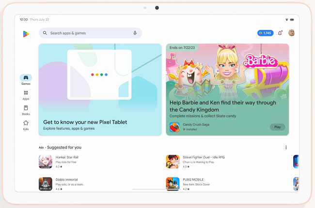
To provide a better user experience, Google has revamped the app listing pages, putting essential content front and center. High-quality games will showcase a video banner at the top of their app listing page, giving users an immersive preview of the gameplay.
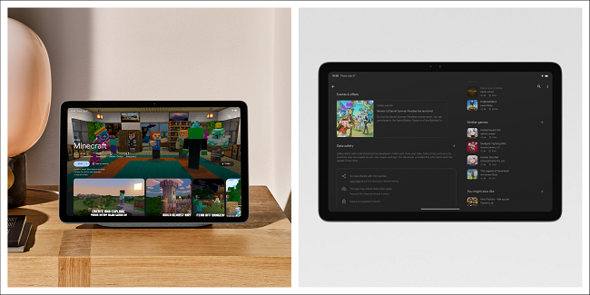
Additionally, the app and game details pages have been reorganized in a multi-column layout, prioritizing content and making it easily accessible.
Ranking and Quality Improvements
Google is committed to promoting high-quality apps that excel on large screens. To achieve this, they have made ranking changes to prioritize apps that adhere to the large screen app quality guidelines.
These changes boost the visibility of well-designed apps, which resize seamlessly, support portrait and landscape orientations, and avoid letterboxing. Apps meeting these criteria will be featured in Editors’ Choice and other curated collections, creating new opportunities for optimized apps.
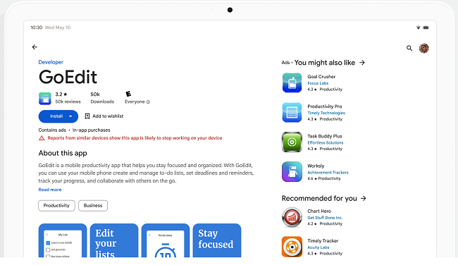
Google has also extended their app listing warnings and reduced visibility policy to include large screens. Apps and games with an 8% user-perceived crash rate or ANR (Application Not Responding) rate will receive warnings on their details page, helping users set realistic expectations about app performance.
These changes will be implemented from late August, providing developers with ample time to monitor and enhance their app’s stability metrics using Android vitals in Play Console or the reporting API.
New Content Forward Formats
Google aims to improve the in-app experience by featuring store listing assets directly on Apps and Games Home. New form factor-specific screenshots, videos, and descriptions will offer users a preview of the app experience, helping them make informed installation decisions.
Developers are encouraged to upload separate screenshots for each form factor, utilize high-quality images with proper aspect ratios, and avoid including device imagery to ensure their app stands out effectively.
Streamlined Store Navigation
For a seamless browsing experience, Google has simplified the store navigation on larger screens. The left-side navigation rail brings menu items closer to users’ thumbs, especially when using the device in landscape mode.
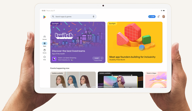
- The Top Charts and Categories sections have been relocated to Apps and Games Home, making popular and useful apps easier to discover.
- The Kids experience has become a primary tab on tablets and Chromebooks, considering these devices are often shared with children.
Split-Screen Search
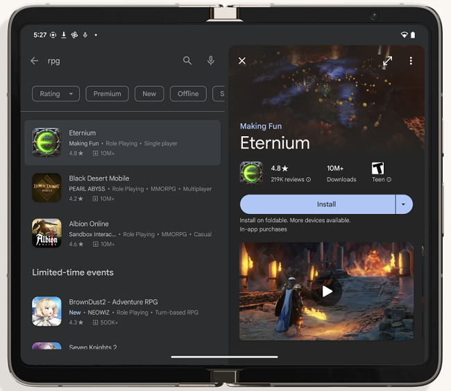
Google has introduced a new search experience, allowing users to discover and compare apps without switching back and forth. The split-screen search displays search results and app details pages side by side, streamlining the app discovery process.
Availability
Google plans to roll out these changes gradually over the upcoming weeks, improving the app experience for users on large screens.
Commenting on the new updates to Play Store, Allison Chang, Product Manager, Google Play, said:
To enhance the user experience on devices such as tablets, Chromebooks, and foldables, the Play Store has undergone a redesign with new updates including refreshed app listing pages, improved ranking and quality, streamlined navigation, and a split-screen search experience, all tailored for larger screens.
